GCSE Tutoring Programme
Our chosen students improved 1.19 of a grade on average - 0.45 more than those who didn't have the tutoring.
In order to access this I need to be confident with:
x and y axis Plotting graphs Factors and multiples DecimalsThis topic is relevant for:

Line Graph
Here we will learn about line graphs, including drawing, reading and interpreting them.
You can also download the following free line graph resources suitable for those following Edexcel, AQA or OCR exam boards:
What is a line graph?
A line graph is a way of displaying data to easily see a trend over time.
To draw a line graph, we need to plot individual items of data onto a set of axes, and then connect each consecutive data point with a line segment.
The x -axis or horizontal axis is labelled as time, and the y -axis or vertical axis is the variable that is being measured or tracked (ice cream sales, hours spent on homework, earnings, number of births etc).

The main benefit of this type of graph is that you can spot trends in the data over time.
This is a really useful tool in business to show sales trends or profits and losses over time or in science to show the growth rate of bacteria, change of pH or a change in temperature over time.
Patterns in data allow for more accurate predictions in the future.
What is a line graph?

How to draw a line graph
In order to draw a line graph:
- Label the axes and add an axis title.
- Plot each data point accurately.
- Connect each pair of consecutive points with a straight line.
How to draw a line graph


Line graph worksheet
Get your free line graph worksheet of 20+ questions and answers. Includes reasoning and applied questions.
DOWNLOAD FREE Line graph worksheet
Get your free line graph worksheet of 20+ questions and answers. Includes reasoning and applied questions.
DOWNLOAD FREERelated lessons on representing data
Line graph is part of our series of lessons to support revision on representing data. You may find it helpful to start with the main representing data lesson for a summary of what to expect, or use the step by step guides below for further detail on individual topics. Other lessons in this series include:
Line graph examples
Example 1: population change
The data shows the population of England from 1980 to 2005 . Draw a line graph to show the data in the table.

- Label the axes and add an axis title.
Here, the x -axis is labelled as the Year, and the y -axis is labelled as the Population (millions). Each axis value is spaced out equally, with enough room to place each data value in a more specific location, so the line graph is more accurate.

2Plot each data point accurately.
Plotting each point one at a time, we get the following plot:

3Connect each pair of consecutive points with a straight line.

Example 2: price fluctuations
The table shows the average price of fish and chips in the UK over 50 years.

Draw a line graph to show this information.
Here, the x -axis is labelled as the Year, and the y -axis is labelled as the Price (£). Each axis value is spaced out equally, with enough room to place each data value in a more specific location, so the line graph maintains the accuracy within the data.

Plotting each point one at a time, we get the following plot:


Example 3: hours of sleep
The following table of data values shows the amount of sleep in hours James had over one week.

Draw a line graph to represent this data.


Reading and interpreting line graphs
The purpose of drawing a line graph (or time series) is to spot trends over a period of time. This is much easier when looking at a plotted set of data, rather than data within a table.
How to read a value from a line graph
To read a value from a line graph, you need to identify which axis you are starting from, and so the data value will be estimated from the other axis.
E.g.
Using the line graph from Example 1 , we have the line graph that represents the population of England in millions between 1980 and 2005 .

If we wanted to estimate the population in 1992 , we would find the value of 1992 on the axis (here the x -axis), draw a vertical line up to the coordinate on the line graph, and then draw a horizontal line from this coordinate to the y -axis. This would state the estimate for the population in 1992 to be around 47.9 million people.

We can do the same if we wanted to find out which year the population exceeded 50 million people, by locating the value 50 on the y -axis, and reversing the process.

Here, the answer would be around the year 2003 .
How to interpret a line graph
Interpreting a line graph is a key skill. Here, we need to spot trends or changes in the data that are significant, if not just noticeable.
Looking at the same line graph from Example 1 , we can state a clear trend in the data: the population of England between 1980 and 2005 has increased. This is because, every year, the value for the population is higher than the previous year.

Here, the red line is a line of best fit for the population data, and the blue arrow indicates an upward trend. You may have to draw a line of best fit to represent the correlation of the data.
Step-by-step guide: Line of best fit (coming soon)
There are limitations to this that we have to consider. We only have the data for every 5 years. There may have been no population change at all between the year 2000 and the year 2004 , and then the population suddenly increased in 2005 . We simply drew a straight line between 2000 and 2005 , which assumes the population change over these 5 years was exactly the same every year, which is very unlikely!
This example of a limiting factor is one of the most common issues with a line graph (generalisations in the data / lack of accuracy / not enough data values etc).
Time series can show seasonal fluctuations, for example the sales of ice cream throughout a year is expected to be higher in the warm summer months than the cold winter months and so we would use a moving average.
Step-by-step guide: Moving averages (coming soon)
How to read a value from a line graph
In order to read a value from a line graph:
- Locate the value on the appropriate axis.
- Draw a horizontal / vertical line to the data point on the line graph.
- Draw a horizontal / vertical line from the data point to the other axis.
- Read the value from the axis.
How to read a value from a line graph
Reading line graphs examples
Example 4: reading line graphs – frequency of cars
The line graph shows the frequency of cars on a busy road between 5am and 11 am. Estimate the number of cars on the road at 8:30 am.


Here we will draw a vertical line to the data point on the line graph as time is on the x -axis.

As we need to reach the y -axis, we draw a horizontal line from the data point to the y -axis.

Here, the value on the y -axis is around 425 .

The frequency of cars on the road at 8 : 30am is 425 .
Example 5: reading line graphs – vaccinations
The line graph shows the number of people who received their flu vaccine per month over one year. The data was recorded on the last day of the month. What month did the number of people receiving their flu vaccine reach over 100,000 ?


Here we will draw a horizontal line to the data point on the line graph as the frequency of vaccinations is on the y -axis.

As we need to reach the x -axis, we draw a vertical line from the data point to the x -axis.

Here, the value on the x -axis is between October and November. This means that the number of vaccines reached over 100,000 in November as the previous data point recorded was on the last day in October.

The number of vaccinations exceeded 100,000 per month in November.
Example 6: reading line graphs – download speed
The time series shows the download speed of a video in megabytes per second (mbs^{-1} ). The download speed was recorded every second for the length of the download.

How many seconds did the download speed exceed 2mbs^{-1} ?
As we need to exceed 2mbs^{-1} , we need to locate 2mbs^{-1} on the y -axis.

Instead of drawing a horizontal line to the first point, we need to determine all the points that are above 2mbs^{-1} and so we draw a horizontal line across the entire plot.

Drawing a vertical line for each value where the line graph crosses our horizontal line, we get the following:

We have two values that we need to read from the axis.
These are 9.1 and 10.5 :

As the question asks us for the length of time the download speed exceeded 2mbs^{-1} , by calculating the range of these two values, we will calculate this value.
10.5 - 9.1 = 1.4 seconds.
The download speed exceeded 2mbs^{-1} for 1.4 seconds.
Common misconceptions
- x or y axis
A line graph does not have to be connected to the axis everytime. It all depends on the number the axis starts with.
- Reading values from a table
The values read in between plotted points on the graph are estimates because no exact values were collected at the times between the data points given. Any value taken from the graph that isn’t an exact plotted point is therefore an estimate.
- Time and the x axis
The time must be plotted on the x axis (horizontal axis).
Practice line graph questions
1. The data shows the mass of bacteria on a petri dish recorded every hour for 6 hours. Draw a line graph to represent the data.


As time is always written on the x -axis, the mass of bacteria is therefore written on the y -axis. Plotting the points at the exact values and joining these together with straight lines, we get the solution:

2. The data in the table below shows the average amount of rainfall in millimetres over 5 weeks in New York.

Draw a line graph to represent this data.


As time is always written on the x -axis, rainfall is written on the y -axis. Plotting the points at the exact values and joining these together with straight lines, we get the solution:

3. The table below shows the average temperature of two offices over 6 months.

Draw a comparative line graph to represent the temperatures from both offices over the 6 month period.


Draw each line graph separately. We plot the points for Office A first, and connect them using straight lines. We then draw the plot for Office B on the same set of axes, and join these consecutive points with straight lines. Do not connect the two plots together. This gives us the solution:

4. The line graph shows the number of ice creams sold by a vendor each day over one week in the middle of summer.

Which day of the week did it rain?
Monday
Tuesday
Wednesday
Saturday
As you would expect ice cream sales to correlate with the amount of warm sunshine (the more warm sunshine, the greater the number of ice cream sales), Tuesday has a very low number of ice creams sold so it is most likely to have rained that day.
5. A meteorologist was recording the temperature data from two different weather stations in a city. She recorded the temperature every 3 hours, and plotted the results using a time series. Here are her results:
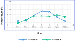
What is the highest temperature recorded in the city during this time period?
The highest temperature recorded during the day is the highest data point on the graph. This is at 1pm at Station B, where the temperature was recorded at 10.8^\circ C .
6. Kevin wanted to build a new home. He tracked the costs of the build and recorded the data into a time series. The build started in January 2019 and was completed in May 2021 .

Estimate the average cost of the build, per month.
Adding up the building costs for each item of data recorded, we get 4+10.9+8+5.3+10.5+8.8+3.4+8.5=59.4.
The mean for these 8 items of data is therefore: 59.4\div 8=7.425
As the data is recorded in £1000s, 7.425\times 1000=£7425 per month.
Line graph GCSE questions
1. The line graph below shows the number of cushions sold in a furniture shop over 6 weeks.

(a) Which week did the shop sell the most cushions?
(b) Which week did the shop sell the least cushions?
(c) How many cushions did the shop sell in week 4 ?
(3 marks)
(a)
Week 3
(1)
(b)
1
(1)
(b)
[83-87]
(1)
2. The graph below shows the recovery heart rate of an athlete immediately after sprinting 100m during his recovery. The results were taken by using a heart rate monitor.

(a) What was the heart rate of the athlete, 105 seconds after the sprint had finished?
(b) The athlete sat up at one point during his recovery. During which 30 second period did he sit up?
(c) Work out the difference in the heart rate from the moment the athlete finished the sprint to 3 minutes into his recovery.
(d) The table below measures an athlete’s fitness level, based on their recovery heart rate at 1 minute after exercise. Determine what category the athlete is placed in.

(5 marks)
(a)
90 bmp
(1)
(b)
2 minutes to 2 minutes 30
(1)
(c)
160 – [75-78]
(1)
[82-85]
(1)
Poor
(1)
3. The table shows the height of a sunflower over 6 months.

(a) Use the axes below to draw a line graph to represent the height of the sunflower over the 6 months.

(b) Between which two consecutive months did the sunflower grow the most?
(4 marks)
(a)

Axes labelled correctly.
(1)
All points plotted correctly.
(1)
All consecutive points connected using a straight line.
(1)
(b)
Months 4 and 5
(1)
Learning checklist
You have now learned how to:
The next lessons are
Still stuck?
Prepare your KS4 students for maths GCSEs success with Third Space Learning. Weekly online one to one GCSE maths revision lessons delivered by expert maths tutors.

Find out more about our GCSE maths tuition programme.