GCSE Tutoring Programme
Our chosen students improved 1.19 of a grade on average - 0.45 more than those who didn't have the tutoring.
This topic is relevant for:

Frequency Graph
Here we will learn about frequency graphs, including what they are and how to draw them.
You can also download the following free frequency graph resources suitable for those following Edexcel, AQA or OCR exam boards:
What is a frequency graph?
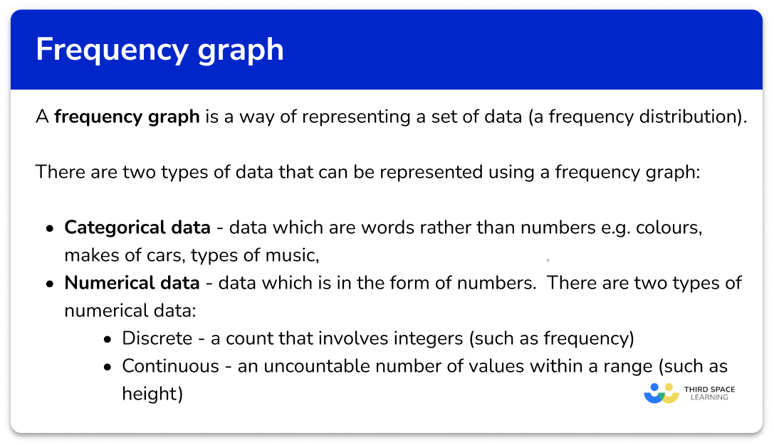
A frequency graph is a way of representing a set of data (a frequency distribution).
To represent data using a frequency graph we need to know which type of graph would be preferable for the data we are representing (and be able to justify why this type of frequency graph has been chosen), and how to draw each type of frequency graph.
There are two types of data that can be represented using a frequency graph.
- Categorical data – data which is in the form of words rather than numbers. For example, colours, makes of cars, or types of music.
- Numerical data – data which is in the form of numbers. There are two types of numerical data.
- Discrete – a count that involves integers (such as frequency)
- Continuous – an uncountable number of values within a range (such as height)
What is a frequency graph?
How to use a frequency graph
We can use different types of frequency graphs to display data in a variety of ways.
● Pie charts
Pie charts can be used for categorical data. Each sector of the pie chart (or “slice”) is proportional to the frequency of the item in the data set.
To calculate the angle for each sector, we use the formula
\text{Angle for the sector }=\frac{360}{T}\times{F}
where T is the total frequency and F is the category frequency.
Below is an example of drawing a pie chart to represent the favourite colours of a sample of 2 year old children.


Step-by-step guide: Pie chart
● Bar charts (and vertical line graphs)
Bar charts can also be used for categorical data. The horizontal axis ( x -axis) is for the data values. The vertical axis ( y -axis) is labelled frequency.
To draw a bar chart, we need to know the frequency for each category. Below is an example of a standard bar chart.

There are different types of bar charts including comparative and compound bar charts.
Step-by-step guide: Bar chart
Bar charts and vertical line graphs can be used for discrete numerical data.
For example,

Here is an example of a frequency diagram for grouped numerical data. This data is continuous and so there are no gaps between the bars.

Step-by-step guide: Frequency diagram
● Frequency polygons / line graphs
Grouped data can also be displayed in a frequency polygon. This is a type of line graph. The frequencies can be joined together using straight line segments because the horizontal axis is a continuous scale.

Here we can see the use of a break on the vertical axis as there are no data values between 0 and 14. We cannot use a break when drawing a bar chart.
Step-by-step guide: Frequency polygons
● Cumulative frequency graphs
A frequency graph represents individual frequencies of each category; a cumulative frequency shows the frequencies of each category accumulated together. This allows us to analyse the distribution of the data in more detail than if we used a frequency polygon and calculate statistics.
Below is an example of a cumulative frequency graph along with the data set.

The horizontal axis of a cumulative frequency graph is a continuous scale and the vertical axis represents the cumulative frequency. To calculate a cumulative frequency, the frequency of values in the next category is added to the frequency of all the previous values in the data set. This means that the data must be in order.
We can order data that is in numerical groups (see table 1 below).
We cannot add the frequencies of discrete categories such as favourite pet because there is no order to which pet is named first, or second, etc (see table 2 ).

A cumulative frequency graph can help us calculate statistics such as the median, the upper and lower quartiles, the interquartile range (IQR) and percentiles.
● Histograms
A histogram is different to a bar chart in multiple ways. The horizontal ( x -axis) is a continuous scale with no gaps between intervals and the vertical ( y -axis) is labelled frequency density instead of frequency.
For any histogram, the area of the bar represents the frequency of the class; not the height of the bar. The larger the area of the bar, the higher the frequency within that interval.

Step-by-step guide: Histogram
Frequency graph worksheet
Get your free frequency graph worksheet of 20+ questions and answers. Includes reasoning and applied questions.
DOWNLOAD FREE Frequency graph worksheet
Get your free frequency graph worksheet of 20+ questions and answers. Includes reasoning and applied questions.
DOWNLOAD FREERelated lessons on representing data
Frequency graph is part of our series of lessons to support revision on representing data. You may find it helpful to start with the main representing data lesson for a summary of what to expect, or use the step by step guides below for further detail on individual topics. Other lessons in this series include:
Frequency graph examples
Example 1: constructing a pie chart
The table below shows the frequency of purchases from an online football kit store.
Draw a pie chart for this set of data.

- Calculate the angle for each category.
To determine the angle for each sector of the pie chart, we can use the formula
\text{Angle of sector }=\frac{360}{\text{total frequency}}\times{\text{category frequency}}
or A=\frac{360}{T}\times{F}
where
- A is the angle of the sector,
- T is the total frequency,
- and F is the category frequency.

2Draw a circle, mark the centre and draw a radius.

3Measure and draw the angle for the first category.
The first category has an angle of 135^{\circ}. Drawing this angle from the radius in a clockwise direction, we have

We can label this category ‘Red and navy’.

4Measure and draw the angle for each further category, in order.
The next sector has an angle of 60^{\circ}. Using the previous line drawn from the sector before and measuring 60^{\circ} in a clockwise direction, we get

Labelling this sector, we have

Continuing the pie chart by drawing the next sector line which is 75^{\circ} clockwise around the centre of the circle, we have

We can then fill in the information for the final sector as the remaining angle should be exactly the same value as in the table.
5Add data labels / complete a key.

Adding the data label to the final category completes the pie chart.
Example 2: constructing a bar chart
A farmer was keeping track of the animals on the farm. Draw a bar chart for this set of data.

Draw a pair of axes and label them with frequency on the vertical axis ( y -axis) and animals on the horizontal axis ( x -axis).

Draw the heights of the bars depending on its frequency. Draw each bar the same width. There should be gaps between the bars as the data is discrete.

The last step is to add a title to the bar chart so that you can quickly see what the bar chart is representing. Here, ‘The frequency of animals on a farm’.

Example 3: constructing a vertical line graph
An estate agent was researching the number of bedrooms each house has in a small hamlet. Draw a vertical line graph for this set of data.

Draw a pair of axes and label them with frequency on the vertical axis ( y -axis) and bedrooms on the horizontal axis ( x -axis).

Draw the heights of the vertical lines depending on its frequency.


Example 4: constructing a frequency diagram for grouped data
21 students participated in a reaction time study where they were to catch a falling ruler. The measurements where they caught the ruler were recorded in the grouped frequency table below.

Construct a frequency diagram to represent the data in the table.
Draw a pair of axes and label them with ‘Frequency’ on the vertical axis ( y -axis) and ‘Measurement’ on the horizontal axis ( x -axis).

Draw the heights of the bars depending on its frequency. As the scale is continuous for the scores, we do not need gaps between the bars.
The horizontal axis has measurements from 0 to 80cm, and the highest frequency is 8 and so the vertical axis should be labelled from 0 to at least 8. Here, we have drawn the vertical axis to 9 so that we can clearly see the top of the highest bar.


Example 5: constructing a frequency polygon
The test scores for a sample of people were recorded in a grouped frequency table.

Construct a frequency polygon to show this data.
Draw a pair of axes and label them with ‘Frequency’ on the vertical axis ( y -axis) and ‘Score, x ’ on the horizontal axis ( x -axis).
The range of values for the frequency is 0 to 7 minimum. Increase in steps of 1.
The range of values for scores is 0 to 40. Increase in steps of 5.

We need to find the midpoints of the class intervals. These can be found by adding the lower class boundary to the upper class boundary and dividing by 2.

The plotted points are then joined by straight line segments.

Example 6: constructing a cumulative frequency graph
The number of hours students play games per week was recorded into the grouped frequency table below.

Draw a cumulative frequency graph to represent this information.
To calculate the cumulative frequency of the data, we add the current frequency value to all of the frequency values before the class interval.

The greatest number of hours is 10 and so we need a horizontal axis labelled in equal steps from 0 to at least 10.
The total frequency of the data is 70 and so we need to start the vertical axis at 0 (no break allowed) and increase in equal steps up to 70.

Remember: we can only know the location of all the data at the end of the class interval. This is why the data in a cumulative frequency graph is an estimated distribution of the data set because we do not know the exact values of all 70 items.
Plotting the endpoint and the cumulative frequency for the class intervals, we have

The line must be a single smooth curve.

Here, a suitable title would be,

Example 7: constructing a histogram
The word count for 30 books was recorded into a grouped frequency table.

Draw a histogram to represent this information.
Using the frequency density formula D=\frac{F}{W}, we substitute the information from each row to calculate the frequency density. Remember to calculate the class width for each class as well.

The maximum frequency density is 3.5 and the horizontal scale needs to go from 0 to 20.

Drawing each bar one after the other with no gaps, we have the completed histogram.

Common misconceptions
- Gaps between bars of a bar chart
There should be gaps between the bars of a bar chart when given discrete data.
- Inconsistent labelling on each axis of a bar chart / vertical line graph
Each axis must be labelled in equal steps. This will help keep the bars/lines at an equal width, and the height of each bar/line remains consistent.
- Not labelling axis
The horizontal and vertical axes need to have data labels.
- Total of the angles is \bf{360^{\circ}} for a pie chart
The total of the angles in a pie chart is 360^{\circ} . This is a good check. However, if you are drawing a pie chart using real life data, the total might not be quite 360^{\circ} as we may need to round values, which loses the accuracy of the data.
- The angle of the sector is equal to \bf{360} degrees, divided by the frequency
The angle of each sector is proportional to the frequency of that category. This is misinterpreted to mean that you divide 360^{\circ} by the frequency of each group to get the angle. Instead, we need to find the fraction of the frequency out of the total frequency, of 360^{\circ}.
- The frequency is multiplied by the total frequency to get the angle of the sector
Similarly to the previous misconception, the angle of the sector is incorrectly calculated to be the frequency, multiplied by the total frequency. Instead, we need to find the fraction of the frequency out of the total frequency, of 360^{\circ}.
- Pie charts and doughnut charts (donut charts)
Pie charts and donut charts are very similar. A pie chart displaces individual categories as slices of the circle, whereas donut graphs have a hole in the centre and displays the categories as arcs.
- Frequency vs frequency density (histograms)
A very common error that occurs in histogram questions is that the frequency is used instead of the frequency density. Frequency density must be found because the groups provided in the frequency table are usually not equal width.
- The height of the bar is the frequency, instead of the area
Similar to the previous misconception, the height of the bar for a histogram is the frequency whereas it is the area of the bar that represents the frequency for a histogram. The height of the bar is the frequency for a bar chart.
Practice frequency graph questions
1. Which is the correct pie chart for this set of data?


Calculating the angle for each sector, we have

The noticeable characteristics of this pie chart are that the ‘Green’ category is half of the pie chart, and the ‘Yellow’ and ‘Blue’ categories are of equal size.
2. An animal shelter is keeping track of the number of pets rehomed since the start of the month. Which one of these bar charts is the correct bar chart for this set of data?


The heights of each bar should match the frequency. The horizontal axis should allow for gaps between each bar, and the bars should be of equal width. The vertical axis must start from 0.
3. Which is the correct vertical line chart for this set of data?


The height of each vertical line should match the frequency for that age category. The horizontal axis should be labelled from 16 to 19, including a break between 0 and 16, and the vertical axis should be labelled 0 to 8.
4. The weight of 12 random objects in a classroom are recorded in the grouped frequency table. Which is the most suitable frequency diagram for this set of grouped data?


The horizontal axis is a continuous scale and so there should be no gaps between the bars. The category values are a multiple of 25 and so it is suitable to write these values, equally spaced, on the horizontal axis.
The vertical axis is the frequency. The highest frequency is 6 and so the axis should range from 0 to 7 so that the highest bar can be clearly readable.
5. The data in the grouped frequency table below is recorded from the time taken for 20 students to get to school. Which is the correct frequency polygon for this set of data?


The midpoints of the class intervals are 100, 300, 500 and 700. These should be used when plotting the points. The points are joined up with straight line segments. The last point does not connect back to the first point.
6. The grouped frequency table below shows the number of days on holiday for 135 members of staff in a company.

Which histogram correctly represents the data in the table?


The frequency density is calculated for each class interval. Using the formula D=\frac{F}{W}, we have

Each bar must be the width of the class and the height of each bar is the frequency density as the area of the bar represents the frequency.
Frequency graphs GCSE questions
1. Jackie recorded the different types of animals visiting a local woodland.
The table shows her results.

(a) Complete the bar chart to show Jackie’s results.

(b) How many animals were recorded altogether?
(3 marks)
(a)

Correct height for each bar: 15, 3, 5, and 9 .
(1)
Each bar is the same width.
(1)
(b)
44 animals
(1)
2. (a) Lucy records the makes of 90 cars.
She starts to draw a pie chart of the results.

How many cars were Ford?
(b) The table shows the other car makes.

Complete the table.
(c) Complete the pie chart.
(8 marks)
(a)
\frac{120}{360}=\frac{1}{3}
(1)
\frac{1}{3}\times{90}=30(1)
(b)
Audi
\frac{10}{90}\times{360}=40^\circ(1)
Volvo
\frac{64}{360}\times{90}=16 cars
(1)
Mini
90-(30+20+10+16)=14 cars
(1)
360-(120+80+40+64)=56^{\circ}(1)
Completed table:

(c)

For one sector correctly drawn and labelled.
(1)
For ALL sectors correctly drawn and labelled.
(1)
3. The frequency table shows some information about the heights of 60 plants.

On the grid, draw a frequency polygon for the information in the table.

(3 marks)
Midpoints are 10, 30, 50, 70, 90 and 110 .
(1)

All points plotted correctly.
(1)
Straight line segments connect each following point.
(1)
Learning checklist
You have now learned how to:
The next lessons are
Still stuck?
Prepare your KS4 students for maths GCSEs success with Third Space Learning. Weekly online one to one GCSE maths revision lessons delivered by expert maths tutors.
Find out more about our GCSE maths tuition programme.