GCSE Tutoring Programme
Our chosen students improved 1.19 of a grade on average - 0.45 more than those who didn't have the tutoring.
In order to access this I need to be confident with:
Tally charts Mean, median, mode Frequency tableThis topic is relevant for:

Bar Charts
Here we will learn about bar charts, including constructing and interpreting bar charts, comparative bar charts and compound bar charts.
You can also download the following free bar chart resources all suitable for those following Edexcel, AQA or OCR exam boards:
What is a bar chart?
A bar chart is a representation of a data set by using vertical or horizontal bars. The larger height of the bar, the higher the value for the individual category.
To draw a bar chart we need the following:
- A pair of axes. Usually the horizontal axis ( x -axis) is labelled with the categories of the data set and the vertical axis ( y -axis) is the frequency. Your axes must be labelled.
- The frequencies need to be labelled on the vertical axis in equal intervals.
- The bars need to have equal gaps between them as it is representing discrete data.
- The bars need to be of equal width.
- The chart needs a title.
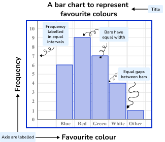
When bar charts are represented vertically they are sometimes called column charts.
Bar charts can also be represented horizontally where the vertical axis represents each class and the horizontal axis represents the frequency.
E.g.
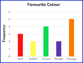
The bar chart below represents the frequencies of people’s favourite colour.
OR
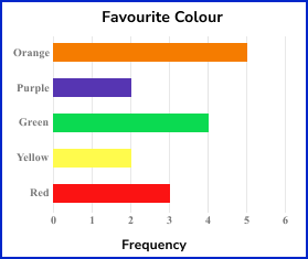
Bar charts can display numerical or categorical data.
The numerical data is discrete because the frequency will be something which is counted. This bar chart is showing categorical data (also known as qualitative data) each colour is a category. The horizontal axis has the category labels (Red, Yellow etc) and the vertical axis is labelled as a frequency.
Here, the taller the bar, the higher the frequency.
A grouped bar chart or histogram would be used for continuous data.
What is a bar chart?

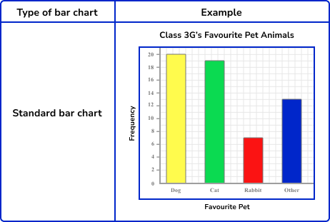
Types of bar chart/ bar graph
There are several different bar chart types.
The main benefit of using a bar chart to represent data is that we can quickly calculate statistics such as the mean, mode and range for a set of data. This allows us to spot certain trends and to compare the data against other data sets.
How to construct a bar chart
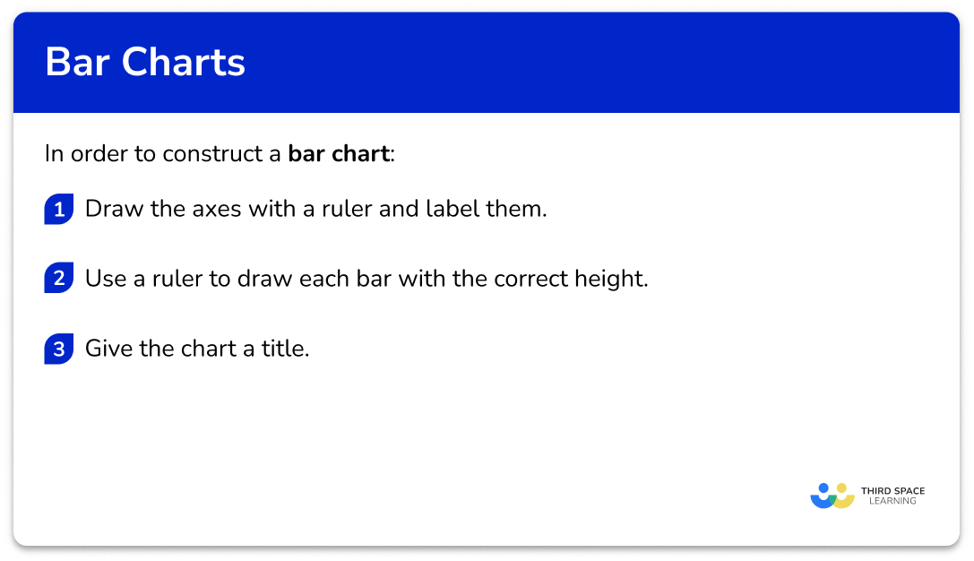
In order to construct a bar chart:
- Draw the axes with a ruler and label them.
- Use a ruler to draw each bar with the correct height.
- Give the chart a title.
Explain how to construct a bar chart
Bar chart worksheet
Get your free bar chart worksheet of 20+ questions and answers. Includes reasoning and applied questions.
DOWNLOAD FREE Bar chart worksheet
Get your free bar chart worksheet of 20+ questions and answers. Includes reasoning and applied questions.
DOWNLOAD FREERelated lessons on representing data
Bar chart is part of our series of lessons to support revision on representing data. You may find it helpful to start with the main representing data lesson for a summary of what to expect, or use the step by step guides below for further detail on individual topics. Other lessons in this series include:
Bar chart examples
Example 1: constructing a standard bar chart
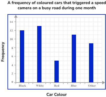
Draw a bar chart to represent the frequency of coloured cars that triggered a speed camera on a busy road during one month.
- Draw the axes with a ruler and label them.
2Use a ruler to draw each bar with the correct height.
There are 12 black cars in the first category, so we draw a bar with the height of 12 units on the vertical axis. Repeating this for each category, we get the bar chart:
3Give the chart a title.
Example 2: construct a bar chart using numerical data
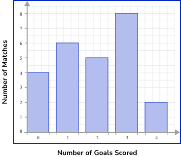
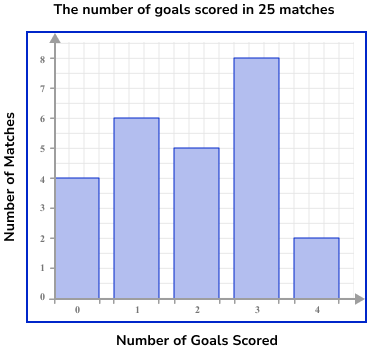
The table below shows the number of goals scored in 25 matches. Represent this information in a bar chart.
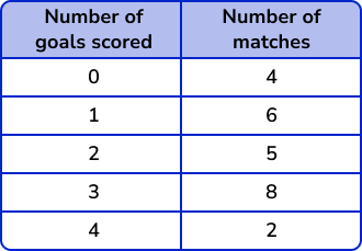
As the first column represents the number of goals, this is the axis label for the horizontal axis. The number of matches is therefore the vertical axis.
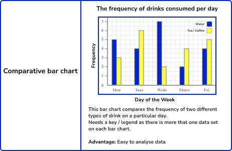
Example 3: constructing a comparative bar chart
The table below shows the student destinations from a sixth form college to the original six UK red brick universities over the past 5 years.
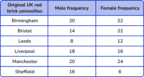
Draw a comparative bar chart to represent the data.
As we are constructing a comparative bar chart, we need each category to be slightly wider so that we can clearly see two vertical bars in each category. Each bar must be the same width, and the categories must have a space between them. There does not need to be a space between the two bars within the same category.
As the categories are the original six red brick universities, these will be the labels for the horizontal axis. Frequency will be the label for the vertical axis.
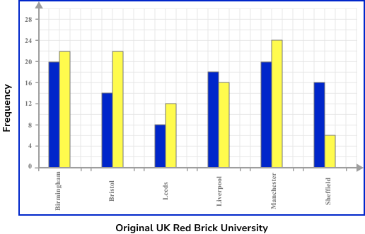
As we are looking at a comparative bar chart, we must also include a legend / key to inform the reader about what each bar represents. Here we have used Red for Male frequency, and Green for Female frequency.

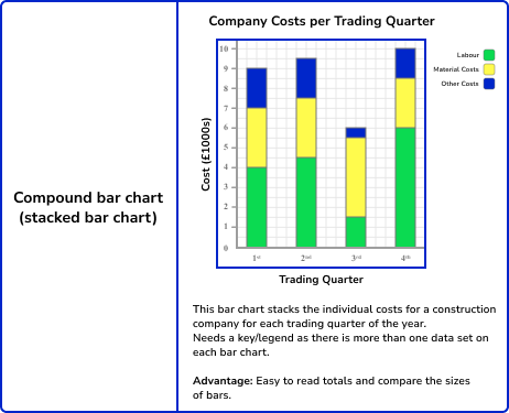
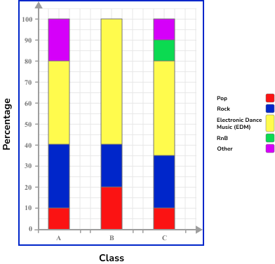
Example 4: construct a compound bar chart (percentages)
The table below shows the percentage of students from three classes and their favourite music genre.
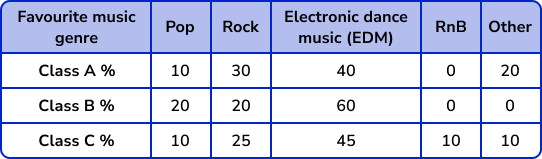
The horizontal axis is labelled with the three classes, and the vertical axis is labelled as percentage. Each bar can then be divided proportionally into the five categories of Favourite music genre, which we will label using a key.
Similar to the construction of a pie chart, each category within the pie chart lies next to the previous, but with a compound bar chart, the next category is stacked above. As the total percentage for each class is 100\% , each bar should reach the value 100\%.

Example 5: construct a compound bar chart (frequency)
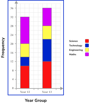
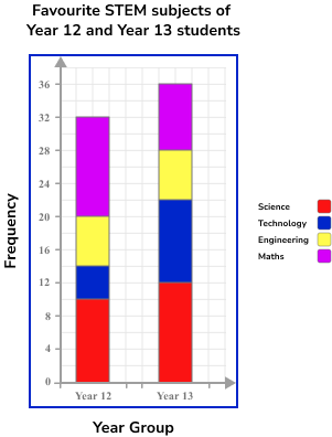
An Academic Mentor is researching the favourite STEM subject of 68 students across Year 12 and Year 13. The results are shown in a table below.
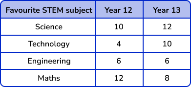
Represent the frequencies of the favourite STEM subjects for students in each year group, using a compound bar chart.
The horizontal axis should be labelled with the two year groups as it is the frequencies of the STEM subjects that is being highlighted in the bar chart.
The vertical axis is therefore labelled as frequency. The total frequency for each year group is 32 and 36 and so the scale must reach 36.
Do not include a break on either axis.
As we have a compound bar chart, we also need a key.
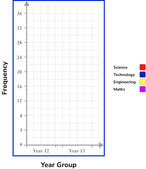
As the chart is a compound bar chart, each frequency for the STEM subject should be drawn above the previous bar, and labelled with the correct colour.
Analysing bar charts
There are two approaches when analysing data represented in a bar chart, depending on what information you are collecting from the chart.
- Option 1: how to determine a frequency
If we want to state how many items of data are in a category / categories, calculate averages (mean, mode, range), or compare the size of two bars, we need to determine the value(s) from the vertical axis. This will give us the frequency / frequencies required to then use in the solution.
In order to determine a frequency from a bar chart:
- Locate the necessary bar(s).
- Read the frequency from the vertical axis.
- Complete the calculation.
- Option 2: how to determine the category
If we need to determine a category from a frequency from a standard bar chart, we need to locate the required bar(s) and read the category label from the horizontal axis. If you have a composite / compound bar chart, you will also have to use the legend.
In order to determine a category from a bar chart:
- (Comparative or compound bar chart only) Use the legend to determine the specific category within the bar(s).
- Use the vertical axis to determine the size of the bar(s) required.
- Read the category label on the horizontal axis.
Analysing bar chart examples
Example 6: determine a frequency from a standard bar chart
Below is a bar chart that represents the number of minutes of exercise per day for an adult, over one week.
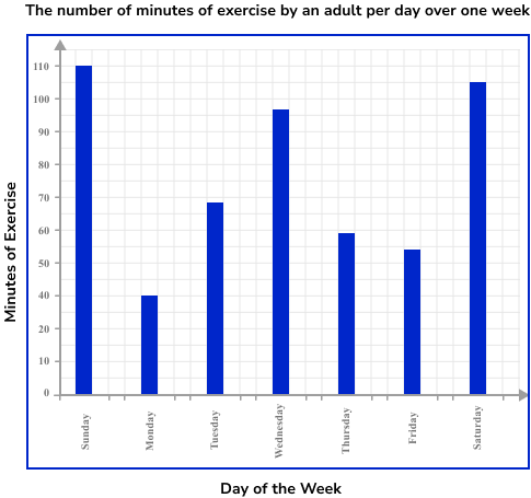
How many more minutes of exercise did she do on Saturday compared to Tuesday?
The two bars that we need to locate are Saturday and Tuesday.
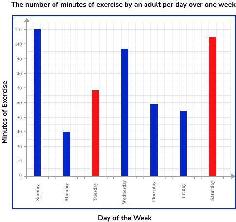
The frequency is read from the top of the bar.
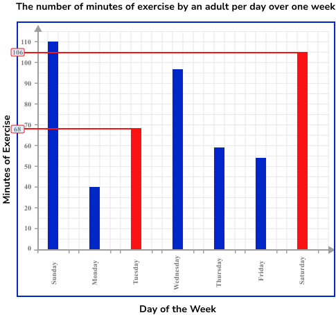
For Saturday, the number of minutes of exercise is 106.
For Tuesday, the number of minutes of exercise is 68.
As we want to calculate how many more minutes of exercise she did on Saturday compared to Tuesday, we need to calculate the difference between the two values.
106-68 = 38
She did 38 minutes more exercise on Saturday compared to Tuesday.
Example 7: determine a category from a comparative bar chart
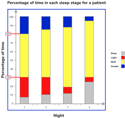
A somnologist is recording the sleep data for a patient between 10pm and 6am over four nights. He records the length of time the patient is in a different stage of sleep as a percentage. He records the results in a compound bar chart.
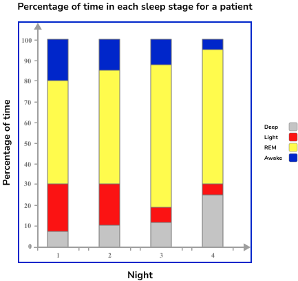
Which night did the patient have the least amount of Light sleep?
As we are comparing the amount of Light sleep, we need to look at the size of each yellow section on the bar chart.
It isn’t completely clear which bar will answer the question and so we need to calculate the percentages of Light sleep for each day. To do this, we need to calculate the height of the Light sleep section of each bar.
Using the vertical axis, the Light sleep section for Night 1 has the two readings 30\% and 80\%. We can therefore say that the height of this section is 80-30=50\%.
For Night 2, the readings are 30\% and 82\% and so the height of the section is 82-30=52\%.
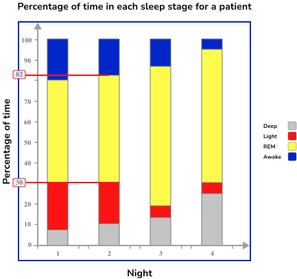
For Night 3, the readings are 18\% and 86\% and so the height of the section is 86-18=68\%.
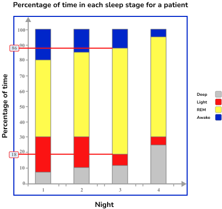
For Night 4, the readings are 30\% and 95\% and so the height of the section is 95-30=65\%.
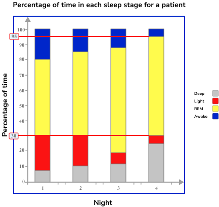
The night with the least amount of time in Light sleep is Night 1 as the patient has the lowest percentage of time in this stage at 50\%.
Common misconceptions
- Gaps between bars
There should be gaps between the bars so that data is easy to read.
- Inconsistent labelling on each axis
Each axis must be labelled in equal steps. This will help keep the bars at an equal width, and the height of each bar remains consistent.
- Reading the highest value of a section from a compound bar chart for a frequency
To determine the frequency of a section within a compound bar chart, we need to record the values where the section starts and finishes. The difference between these two values is the frequency.
If we break a compound bar chart into pieces, the bar is made from small blocks stacked on top of each other, not towers of blocks in front of each other.
- Not labelling axis
The horizontal and vertical axes need to have data labels.
- Bars of equal width
The bars need to be of equal width
- Using a bar graph for continuous data
Bar charts should only be used for discrete or categorical data. A histogram should be used for continuous data.
Practice bar chart questions
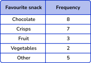
1. The table below provides information about the favourite snack of 25 students. Represent this information in the form of a bar chart.
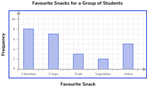

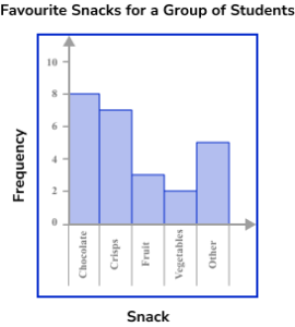

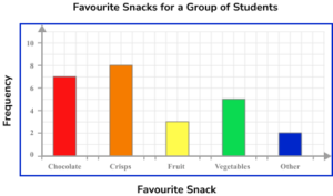
The bars are all drawn at the correct height, equal width apart with an equal space between each bar. The horizontal axis is labelled with the snack choices and the vertical axis is labelled as counting numbers, starting from 0 on the horizontal axis.
2. A florist sells 5 different types of bouquet. The number of sales for each bouquet in one day of trading is recorded in the table below. Represent this information using a bar chart.
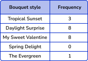
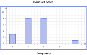
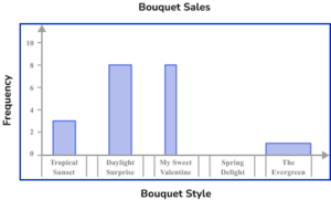
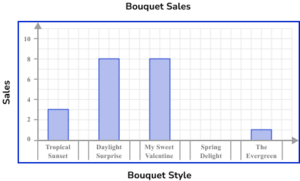
The horizontal axis is labelled with the bouquet style and the vertical axis is labelled with sales.
The bars are drawn to the correct height and all have the same width. There must also be gaps between the bars that are also a constant width. The category ‘Spring Delight’ has no bar because there were no sales.
3. 34 students in Class 7 C were asked about what they eat for breakfast. Below is a table of their results. Represent this data using a comparative bar chart.
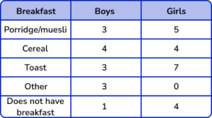
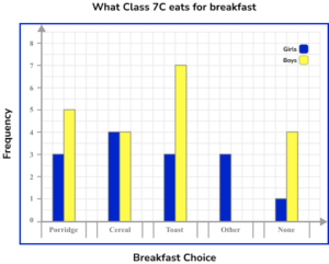

A comparative bar chart has multiple bars for each category. There are gaps between each category and each bar should be the correct height. The key is correctly labelled for each subcategory.
4. The table below shows the percentage popularity of different film genres for three age groups. Represent this data in a compound bar chart.
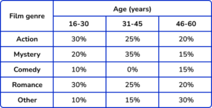

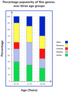
The horizontal axis is labelled as the age categories and the vertical axis as percentage. As the bar chart is compound, the subcategories are stacked on top of each other.
Each bar is still the same width. The key/legend matches the bar chart and labels the correct subcategories correctly.
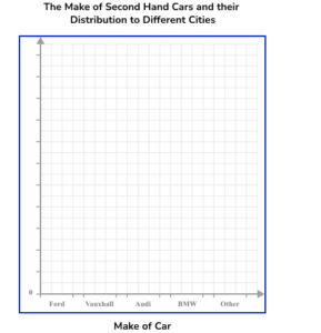
5. The table below describes the make of second hand cars and the city they were distributed to for resale. Using the set of axes below, complete a compound bar chart to represent the data.
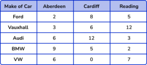
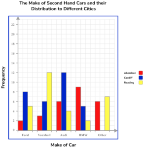
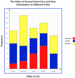
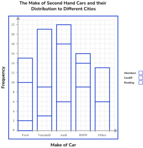
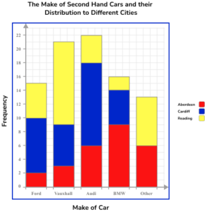
The bars are all drawn at the correct height, equal width apart with an equal space between each bar but no gap between the bars of each category. The vertical axis is labelled frequency and the scale goes up in equal steps. The key links correctly to the graph.
6. A sample of 318 students from Year 10 and Year 11 were asked about their favourite team sports. The results were represented in a comparative bar chart.
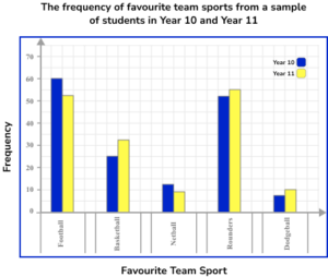
Use the bar chart to calculate the probability of choosing a student in Year 11 who chose Basketball as their favourite team sport.
The frequency of Year 11 students who chose Basketball is 32.
The total frequency of students is 318.
The probability of a Year 11 student choosing Basketball out of the sample is \frac{32}{318}.
Bar chart GCSE questions
1. John asked 110 gym members about their main type of exercise carried out in the gym. The bar chart shows the results of his research.
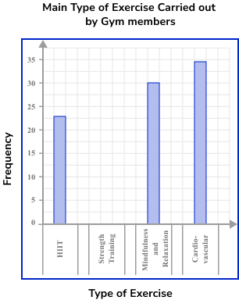
Complete the bar chart.
(1 mark)
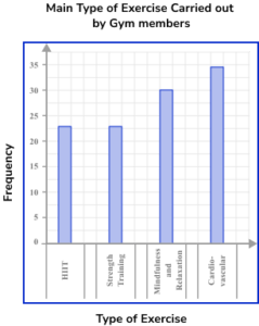
(1)
2. The bar chart below shows the type of transport that a sample of people use to get to work.
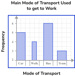
Give two reasons why this bar chart is misleading.
(2 marks)
Bars not equal width
(1)
Vertical axis does not start at zero
(1)
3. This chart shows the number of boys and girls on the School Council in each group.
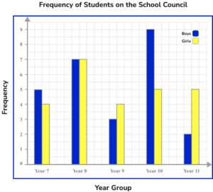
(a) Which year group has the most boys on the school council?
(b) Which year group has an equal number of boys and girls on the school council?
(c) How many more girls are there in Year 8 than in Year 7 on the council?
(d) There are 280 students in Year 8. What proportion of Year 8 students are on the School Council? Write your answer as a fraction in the simplest form.
(6 marks)
(a) Year 10
(1)
(b) Year 8
(1)
(c) 7 and 4
(1)
7-4=3(1)
(d) \frac{14}{280}
(1)
\frac{1}{20}(1)
Learning checklist
You have now learned how to:
The next lessons are
Still stuck?
Prepare your KS4 students for maths GCSEs success with Third Space Learning. Weekly online one to one GCSE maths revision lessons delivered by expert maths tutors.

Find out more about our GCSE maths tuition programme.