GCSE Tutoring Programme
Our chosen students improved 1.19 of a grade on average - 0.45 more than those who didn't have the tutoring.
This topic is relevant for:

Representing Data
Here we will learn about representing data, including how to create and interpret the different tables, charts, diagrams and graphs we can use to represent data.
You can also download a free Representing Data Diagnostic Questions, suitable for those following Edexcel, AQA or OCR exam boards.
What is representing data?
Representing data allows us to display and interpret collected data.
Different types of data need to be represented in different formats so we need to know how to construct different types of tables, charts, diagrams or graphs.
Here are some of the charts and graphs you may come across.
What is representing data?
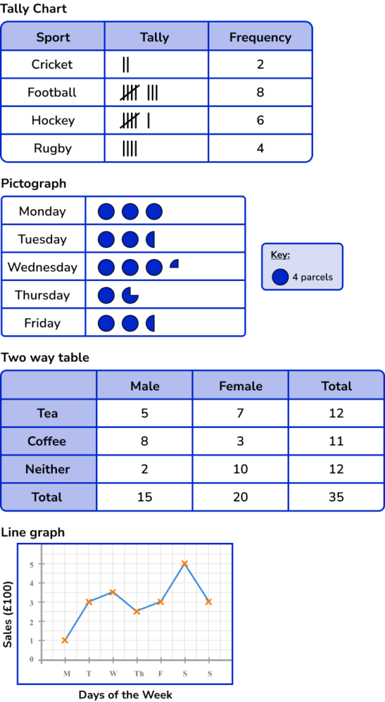
Tally charts
A tally chart is a simple way to organise data.
Tally charts can be used for different types of data.
For example,
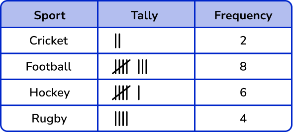
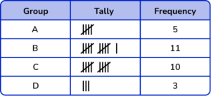
20 students were asked about their favourite sport. Here are their answers.
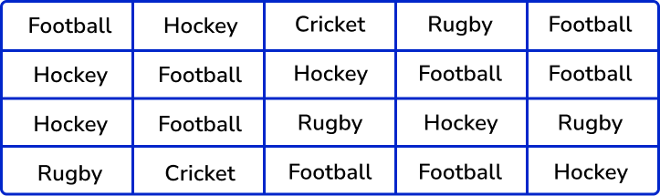
Here are these results in a tally chart.
Step-by-step guide: Tally charts
Pictograph
A pictograph (or pictogram) is a chart which uses a symbol to represent a certain frequency. This is then used in a chart.
For example, here is a pictogram to show the number of parcels an office sends in a week.
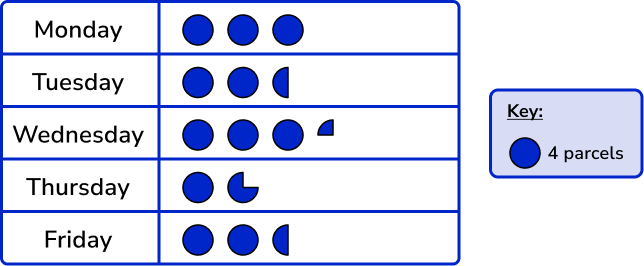
A full circle represents 4 parcels. So, a semi-circle represents 2 parcels and so on.
Step-by-step guide: Pictograph
Stem and leaf diagram
A stem and leaf diagram organises numerical data into groups, but also retains the value of each piece of data. We can then analyse the data in more depth and find the mode, or the median, and so on.
For example,
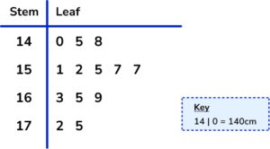
Here is a stem and leaf diagram for the heights of children.
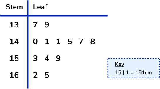
We can see that the smallest child is 137 \ cm and the tallest child is 165 \ cm. This means we can calculate the range of the data by subtracting the lowest value from the highest value.
Range =165-137=18 \ \text{cm}
Step-by-step guide: Stem and leaf diagram
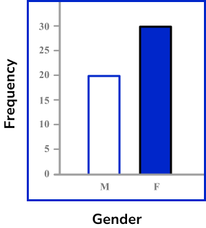
x and y axis
Many statistical graphs need a pair of axes drawn to start the graph. The x -axis is the name of the horizontal axis and the y -axis is the name of the vertical axis. Care needs to be taken with the scale on the axes. For statistics the x -axis and the y -axis are given different labels.
For example,
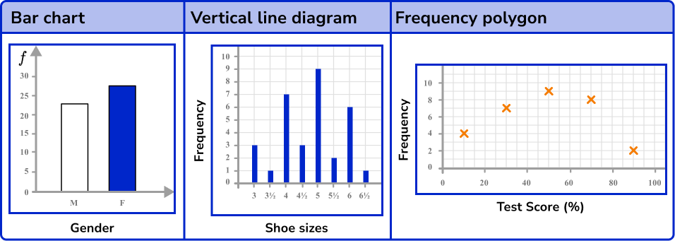
Here is a bar chart to show the gender of people working in a company. For this bar chart the y axis becomes frequency (f) and the x -axis has the label “gender”.
Step-by-step guide:
Bar chart
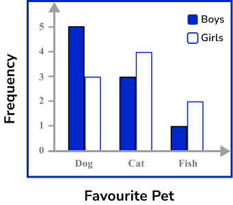
A bar chart represents data by using vertical (or horizontal) bars of equal width. They are used for categorical or discrete numerical data.
Bar charts can become more complicated and extend to comparative bar charts or compound bar charts (or stacked bar charts).
For example,
Here is a comparative bar chart showing the favourite pets of boys and girls in a class.
Step-by-step guide: Bar charts
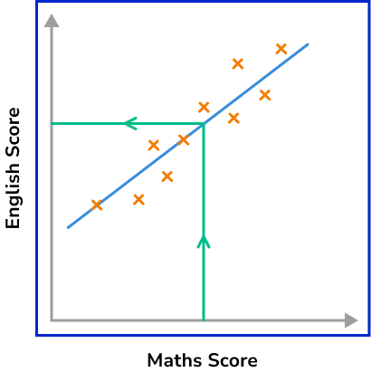
Scatter graphs
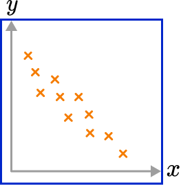
Scatter graphs are used to represent bivariate data (two variables). This is when data occurs in pairs of values. The data is plotted on a pair of axes as coordinates.
Scatter graphs can be used to comment about correlation, the relationship between the two variables.
A line of best fit can be drawn through the data and used to help estimate a missing value.
For example,
Here is a scatter graph showing the Maths and English scores of a group of students. There is a positive correlation. A line of best fit has been drawn and is being used to estimate a missing English score.
Step-by-step guide: Scatter graphs
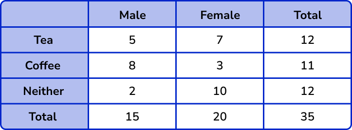
Two way tables
Two way tables are a type of table used to organise more complex data where there are two aspects which need to be looked at.
For example, here is a two way table to represent whether people in an office drink tea, or coffee, or neither. Whether the person is male or female is also seen in the table.
Step-by-step guide: Two way tables
Pie chart
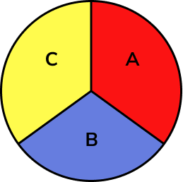
A pie chart is a chart with a visual representation of all items of data within a data set using a circle. The sectors of a pie chart are proportional to the different items in the data set. Pie charts are used to represent categorical data.
For example, here is a pie chart to show the favourite type of music.
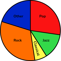
Step-by-step guide: Pie charts
Line graph
This is sometimes called a time series graph. Data is plotted on a pair of axes and the points connected by line segments.
For example, a line graph showing sales over a week.
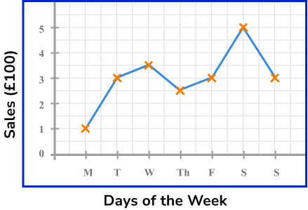
Step-by-step guide: Line graph
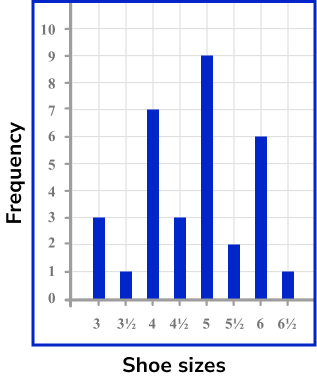
Vertical line diagram
A vertical line diagram is very similar to a bar chart. Vertical lines are used instead of bars.
For example, a vertical line diagram to show the shoe sizes of pupils in a dance school.
Time series graph
A time series graph is a line graph which shows data over a given time period. They can be used to show a trend in the data and are useful for making predictions about the future.
The horizontal axis is always used to show the time. The vertical axis represents the variable being recorded against time.
For example, a time series graph showing average temperature over two years. The years are split up into quarters.
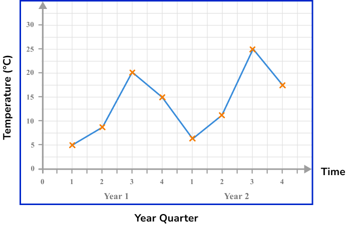
Step-by-step guide: Times series graph
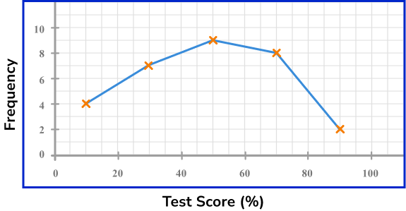
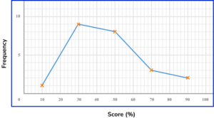
Frequency polygon
A frequency polygon is a graph that shows the frequencies of grouped data. The points are plotted using the midpoints of the class intervals against the frequencies and then the points are joined up with straight lines.
For example,
Here is the frequency table showing the results of a History test.
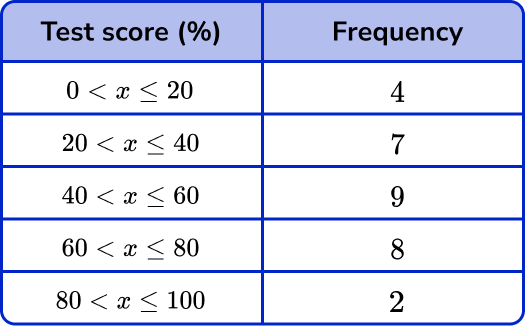
Here is the frequency polygon showing the results of the History test.
Step-by-step guide: Frequency polygon
Frequency diagram
Frequency diagrams are usually bar charts, vertical line diagrams or frequency polygons with frequency displayed on the vertical axis.
Step-by-step guide: Frequency diagram
Frequency graphs
Frequency graphs include the charts mentioned in frequency diagrams. But, it also extends to including more complex graphs such as cumulative frequency graphs and histograms.
Step-by-step guide: Frequency graphs
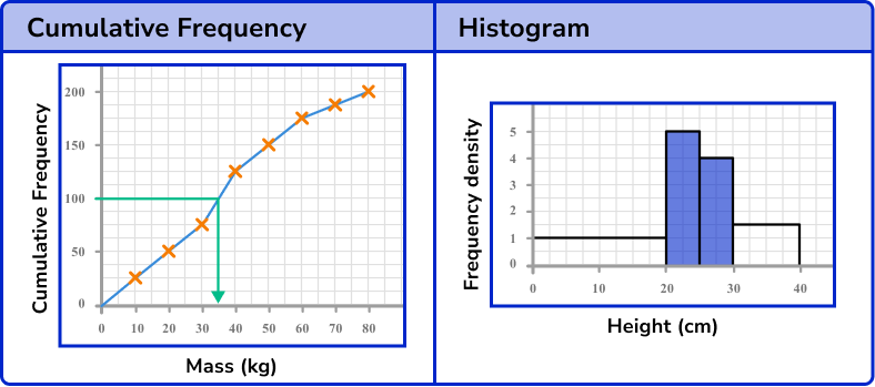
Histograms
A histogram is used to represent continuous numerical data. They look like bar charts, but they are different. In a bar chart, the heights of the bars represent the frequencies, whereas in a histogram the area of the bars represent the frequencies.
The vertical axis is labelled with frequency density.
The widths of the bars are usually different.
For example, here is a histogram representing the heights of samplings.
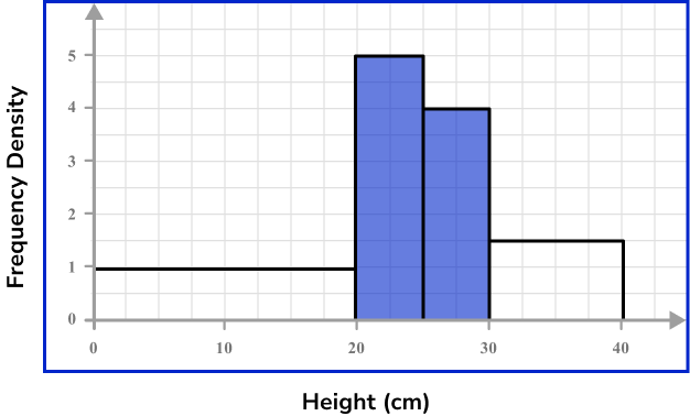
The frequency of the first bar is 20 \times 1=20. This means that 20 saplings were between 0 and 20 \ cm tall.
Step-by-step guide: Histograms
Cumulative frequency
Cumulative frequency is the running total of frequencies in a frequency distribution. It can be used to draw a cumulative frequency graph which is useful for representing or analysing the distribution of a large grouped data set.
Cumulative frequency is closely linked to box plots too.
Cumulative frequency can also be used to find estimates for the median value and quartiles of a data set.
For example, here is a cumulative frequency graph for the mass of apples produced by 200 apple trees.
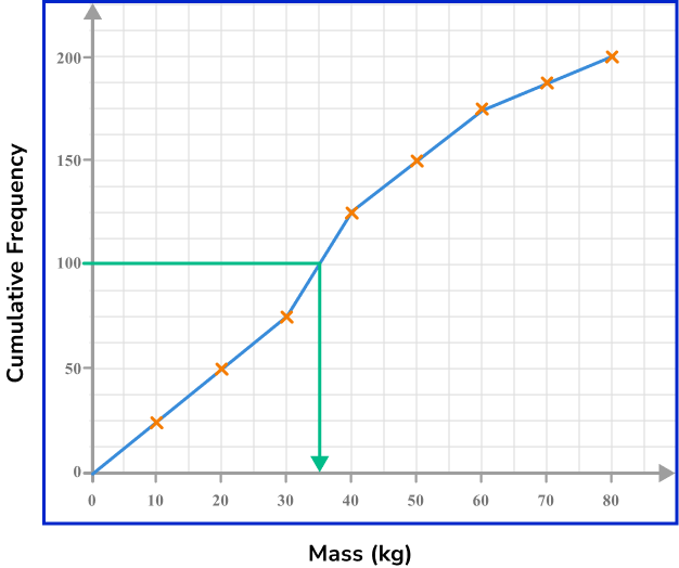
The estimate of the median is 36kg.
Step-by-step guide: Cumulative frequency
Box plots
A box plot is a diagram showing the following information for a set of data,
- Lowest value (or smallest value)
- Lower quartile
- Median
- Upper quartile
- Highest value (or largest value)
They are useful as they show the overall distribution of the data. They can be used to compare one or more sets of data.
For example, here is a box plot showing the amount of money shoppers spend in a local supermarket.
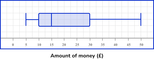
The median is £15.
Step-by-step guide: Box plots
How to represent data
In order to represent data:
Tip 1 Check the type of table, chart, diagram or graph.
Tip 2 Check labels, keys and titles.
Tip 3 Check the scale.
Tip 4 Be as accurate as you can.
Explain how to represent data
Representing data worksheet
Get your free representing data worksheet of 20+ questions and answers. Includes reasoning and applied questions.
COMING SOONRepresenting data worksheet
Get your free representing data worksheet of 20+ questions and answers. Includes reasoning and applied questions.
COMING SOONRepresenting data examples
Example 1: tally charts
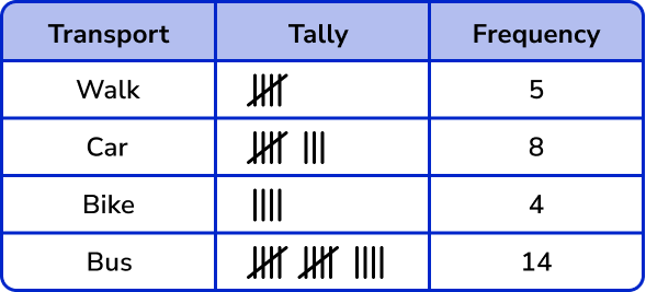
Complete the frequencies for the tally chart below.
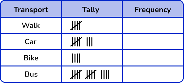
1 Check the type of table, chart, diagram or graph.
This is a tally chart.
4 Be as accurate as you can.
Be careful counting the tally marks.
This means 5,

Example 2: stem and leaf diagram
Members of a running club were asked their age. Their ages are in this stem and leaf diagram. Write down the mode of their ages.
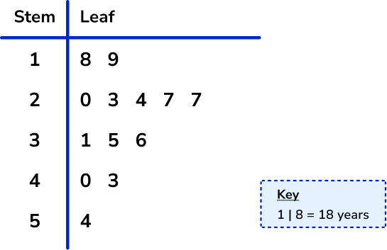
This is a stem and leaf diagram.
There is a key, which is needed to help us write down the correct age for the mode.
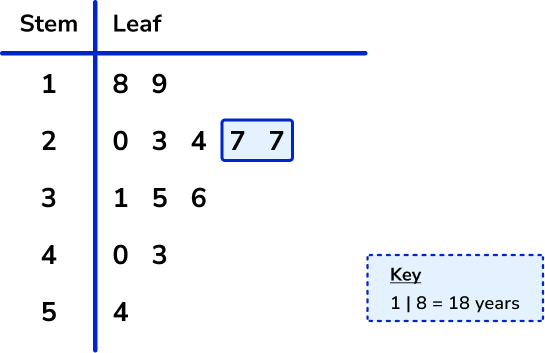
The mode of the ages of the people in the running club is 27 years.
Example 3: scatter graph
Here is a scatter graph. Clive was ill and missed paper 1. He scored 60 on paper 2.
Use the scatter graph and line of best fit to estimate the score on paper 1.
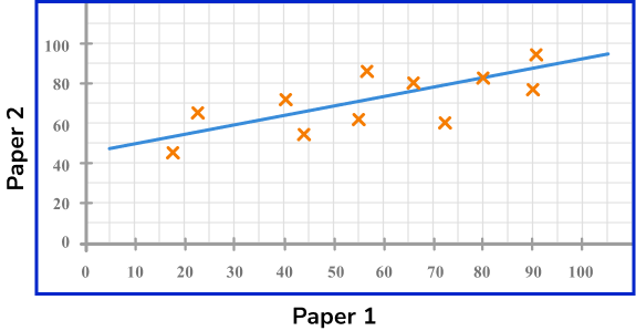
This is a scatter graph. It shows the relationship with bivariate data. The pairs of data are the scores on Paper 1 and Paper 2.
The horizontal axis is for Paper 1 scores and the vertical axis is for Paper 2 scores.
The scale on both axes are different.
Draw a straight line across from 60 on Paper 2. Then go straight down and read off the value for Paper 1.
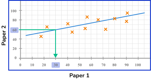
The estimated score on Paper 1 for Clive is 30 marks.
Example 4: pie chart
24 pupils were asked which subject was their favourite subject. Here is a pie chart to show the results. Work out how many pupils said Science was their favourite subject.
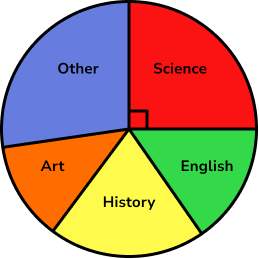
This is a pie chart, so the size of the sector represents the proportion of pupils who chose the different subjects as their favourite.
We need the Science section.
The Science section is a right-angle, so a quarter of the pupils.
24\div 4=6
So 6 pupils chose Science.
Example 5: two way tables
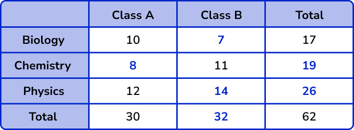
Complete the two way table.
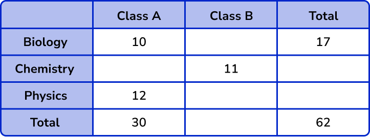
This is a two way table. We need to look at the column totals and the row totals. We look at a row (or a column) and find 1 missing value to fill in. We could start with the bottom row.
62-30=32
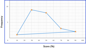
Example 6: frequency polygon
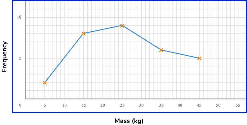
A vet weighs all the dogs she sees in a week. Here are the results.
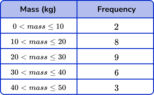
Draw a frequency polygon to show the results.
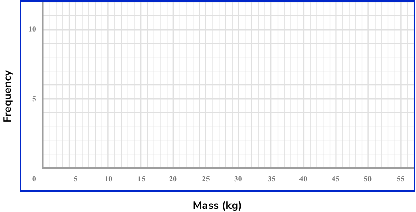
We need to draw a frequency polygon. We need to use the midpoints of the groups, 5, 15, 25 and so on.
Frequency is on the vertical axis and mass is on the horizontal axis.
There are two axes, both with different scales, so be careful plotting the points.
Plot points with a sharp pencil and crosses to be accurate. Join the points up to complete the frequency polygon.
Common misconceptions
- Use a pencil, a ruler and a protractor
When drawing graphs, diagrams and charts use a sharp pencil and a ruler so that you can be as accurate as possible. For pie charts, use a protractor to measure the angles accurately.
- Lines of best fit are straight
In GCSE maths the lines of best fit on scatter graphs are a straight line.
- Check the scale
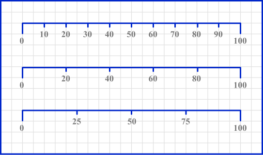
Check the scale and how it is broken up into smaller sections. Scales can come in a variety of styles.
Here is 0 to 100 split up into 10 equal sections, 5 equal sections and 4 equal sections.
Practice representing data questions
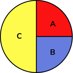
1. Which of these tally charts is NOT correct?
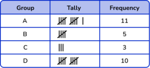

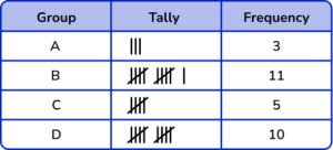
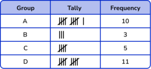

Remember that tally marks are grouped together in 5’s. Check that the frequencies match the number of tally marks.
2. What is the mode?
The value 157 \ cm occurs twice. Therefore the mode is 157.
3. Which type of correlation does this scatter graph show?
Negative correlation
Positive correlation
Inverse correlation
No correlation
There is a downward trend in the plots. This shows there is negative correlation.
4. Which pie chart represents the data in this frequency table?

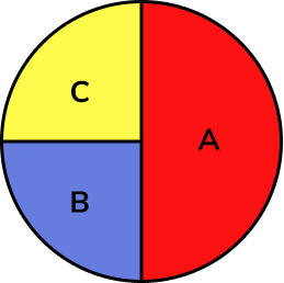
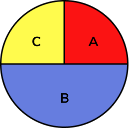
The total of the frequencies is 40. The frequency of A is 10, which is a quarter of 40. So, section A needs to be a quarter of the pie chart. Similarly section C needs to be a quarter too.
The frequency of B is 20, which is half of 40. Section B needs to be half of the pie chart.
5. Complete the two way table.
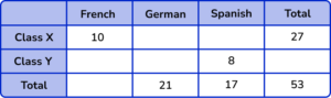

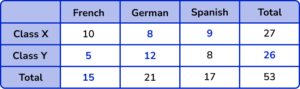

Check the rows and columns for a missing value. We could start with finding the missing value for Class X and Spanish,
17-8=9.
Then continue to fill in the missing values.
We can also check the column totals and the row totals to check if they are correct.
6. Which of these is the correct frequency polygon for the frequency table below?
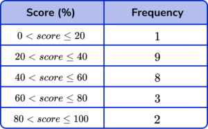
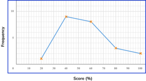
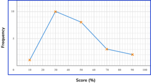
The points should be plotted using the midpoints of the groups: 10, 30, 50, 70 and 90.
They should be plotted using the correct frequencies: 1, 9, 8, 3 and 2.
The points need joining up, but NOT the last and the first points.
Representing data GCSE questions
1. Sam has drawn this bar chart. Give two criticisms of the bar chart.
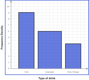
(2 marks)
For a valid criticism of the scale. For example, the scale on the vertical axis is missing the number 3.
(1)
For a valid criticism about the widths of the bars. For example, the bar for lemonade is too wide.
(1)
2. Ali conducts a survey on how long students spend on their maths homework in a week. Here are the results.
Draw a frequency polygon for the information in the table.
(2 marks)
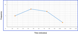
For plotting 3 or 4 points correctly.
(1)
For all points plotted correctly and joining up the points correctly.
(1)
3. Shelia spends £1440 each month running her household. Her household costs can be broken up into food, bills and rent.
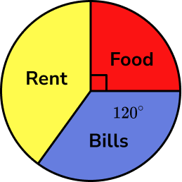
(a) Work out how much money Sheila spends on food a month.
(b) Work out how much more money Sheila spends on rent than bills each month.
(6 marks)
(a)
For using the right angle as a quarter. For example, 1440 \div 4.
(1)
£360(1)
(b)
For finding the angle for rent. For example, 360-90-120=150.
(1)
For finding the difference in angles between rent and bills. For example, 150-120=30.
(1)
For finding the proportion of the total costs. For example, \frac{30}{360} \times 1440.
(1)
£120(1)
Alternative Method:
For finding the angle for rent. For example, 360-90-120=150.
(1)
For finding the proportion for bills, \frac{120}{360} \times 1440=480 \ OR rent, \frac{150}{360} \times 1440=600.
(1)
For finding the difference in money between rent and bills, 600-480.
(1)
£120(1)
Learning checklist
You have now learned how to:
The next lessons are
Still stuck?
Prepare your KS4 students for maths GCSEs success with Third Space Learning. Weekly online one to one GCSE maths revision lessons delivered by expert maths tutors.
Find out more about our GCSE maths tuition programme.