GCSE Tutoring Programme
Our chosen students improved 1.19 of a grade on average - 0.45 more than those who didn't have the tutoring.
In order to access this I need to be confident with:
Coordinates maths Scale maths Interpreting dataThis topic is relevant for:

Time Series Graph
Here we will learn about time series graphs, including drawing, reading from and analysing the trend.
You can also download the following free time series graph resources suitable for those following Edexcel, AQA or OCR exam boards:
What is a time series graph?
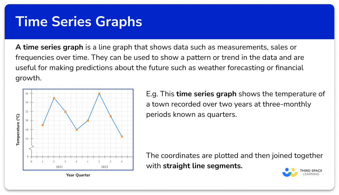
A time series graph is a line graph that shows data such as measurements, sales or frequencies over a given time period. They can be used to show a pattern or trend in the data and are useful for making predictions about the future such as weather forecasting or financial growth.
To draw a time series graph, we need a set of axes.
The horizontal axis always shows the time period, and the vertical axis represents the variable being recorded against time.
For example,
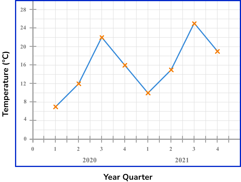
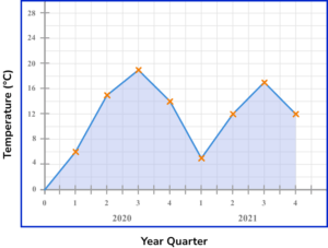
This time series graph shows the temperature of a town recorded over two years at three-monthly periods known as quarters.
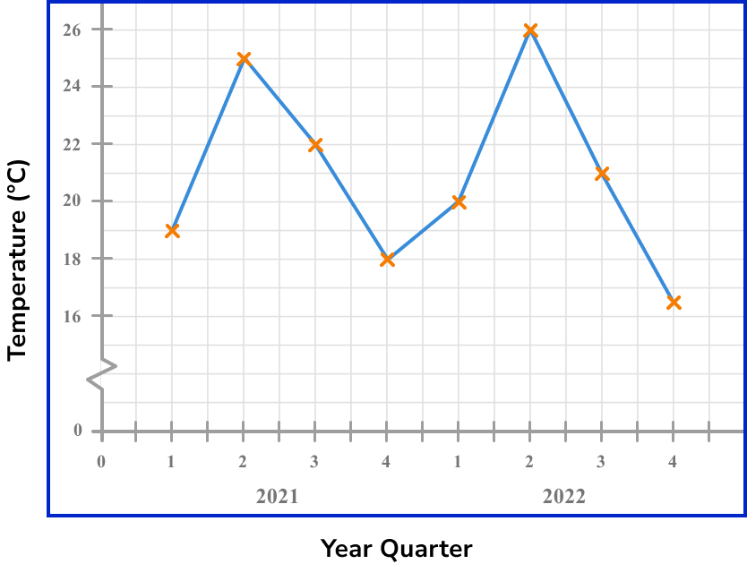
The coordinates are plotted and then joined together with straight line segments. It is important that the axis labels are clear so that the time series graph can be interpreted. The horizontal axis is always a continuous scale and both axes should increase in equal steps.
See also: Gradient of a line
A trendline is difficult to plot for a time series when the data is clearly fluctuating (rising and falling values over time). This type of data can be described as seasonal. Instead of plotting a line of best fit, we plot a moving average.
What is a time series graph?
How to draw a time series graph
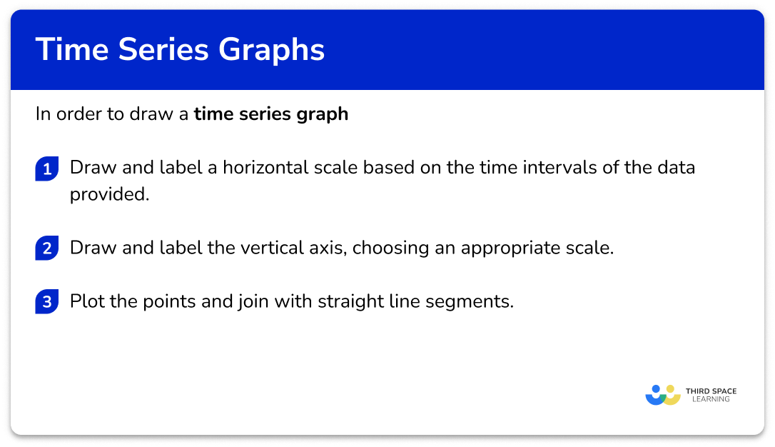
In order to draw a time series graph:
- Draw and label a horizontal scale based on the time intervals of the data provided.
- Draw and label the vertical axis, choosing an appropriate scale.
- Plot the points and join with straight line segments.
Explain how to draw a time series graph
Time series graph worksheet
Get your free time series graph worksheet of 20+ questions and answers. Includes reasoning and applied questions.
DOWNLOAD FREE Time series graph worksheet
Get your free time series graph worksheet of 20+ questions and answers. Includes reasoning and applied questions.
DOWNLOAD FREERelated lessons on representing data
Time series graph is part of our series of lessons to support revision on representing data. You may find it helpful to start with the main representing data lesson for a summary of what to expect, or use the step by step guides below for further detail on individual topics. Other lessons in this series include:
Time series graph examples
Example 1: drawing a time series graph (year and quarters)
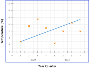
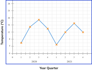
The table shows the average temperature in ^{o}C of a city recorded for each quarter for the years 2020 and 2021.
Draw a time series graph to show this data.
- Draw and label a horizontal scale based on the time intervals of the data provided.
The horizontal scale needs to show the eight quarters of the years 2020 and 2021.
2Draw and label the vertical axis, choosing an appropriate scale.
The lowest value is 7^{o}C and the highest is 25^{o}C. Starting from zero will be appropriate for this data.
3Plot the points and join with straight line segments.
As we know the value for each quarter and this is not grouped data, we plot the value in line with each quarter mark on the horizontal axis.
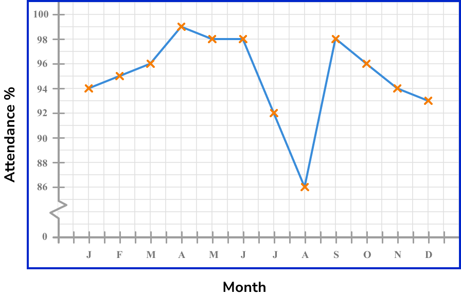
Example 2: drawing a time series graph with a break in the vertical axis
The table shows the percentage attendance of a group at a dance school over the period of a year.
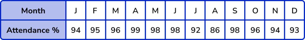
Draw a time series graph to show this data.
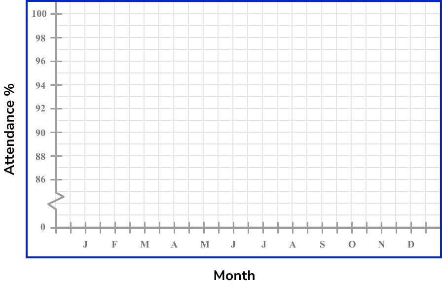
The horizontal scale needs to show the twelve months of the year.
The lowest value is 86\% and the highest is 99\%. Starting from zero will not be appropriate for this data. We therefore use a zigzag to show a break in the axis and start the scale from 86\%.
Example 3: continuous numerical horizontal axis
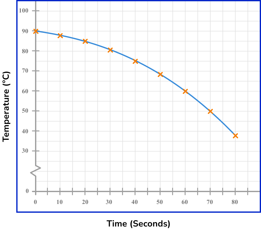
The table shows the temperature, in ^{o}C, of a hot drink, recorded every 10 seconds over a period of 80 seconds.
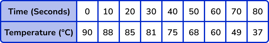
Draw a time series graph to show this data.
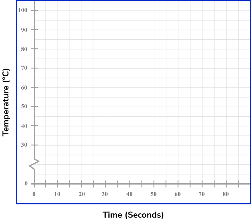
The range of values for the recorded times is 0 to 80. A suitable increase would be in steps of 10 for the horizontal axis.
The lowest value is 37^{o}C and the highest is 90^{o}C. So for the vertical axis, we can use a break, start at 30^{o}C and continue in equal steps of 10 up to 100^{o}C.
Plot each point on the exact value for each item of data.
Interpreting a time series graph
A line of best fit is required when analysing a trend in a time series or to estimate future values. If a time series shows seasonal data (seasonality), it is far more accurate to draw a moving average than a line of best fit.
However, a line of best fit is a quick way to be able to estimate values both within the data range (interpolation) and beyond the data range (extrapolation). This is exactly the same process for scatter graphs although the analysis is subtly different.
We cannot use correlation descriptors for data represented in a time series plot as we are not comparing two variables, we are tracking one variable over a period of time.
Drawing a line of best fit
To draw a line of best fit, draw a straight line through as many points as possible, making sure that the number of data points on either side of the line of best fit is the same. Extend the line of best fit beyond the data range if required.
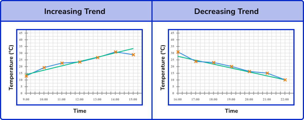
If the line of best fit has a positive gradient, this shows that the recorded values have a positive trend (trending upwards).
If the line of best fit has a negative gradient, this shows that the recorded values have a negative trend (trending downwards).
For example,
If we look at temperature change over time, an increasing trend would mean the temperature is increasing over time; a decreasing trend would mean the temperature is decreasing over time.
To find a specific value within the data, we need to use the line of best fit to locate the value from the opposing axis.
If we know the time of the data value, we draw a vertical line up to the line of best fit, and then a horizontal line to the other axis and read the value that it reaches.
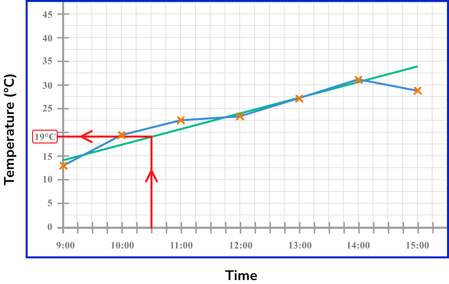
If we know the value on the vertical axis, we draw a horizontal line to the line of best fit, and then a vertical line down to the horizontal axis and read the time for that data value.
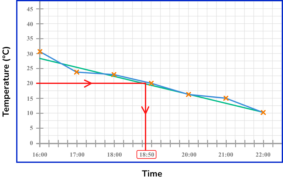
This is the same approach if the value is beyond the current data set. Here, we just need to extend the line of best fit in the same direction beyond the data and locate the required value using the method above.
Note: Any value that is interpreted using the line of best fit but which is beyond the data range, is always an estimate (or prediction) as we do not know what happens to the data beyond the known values.
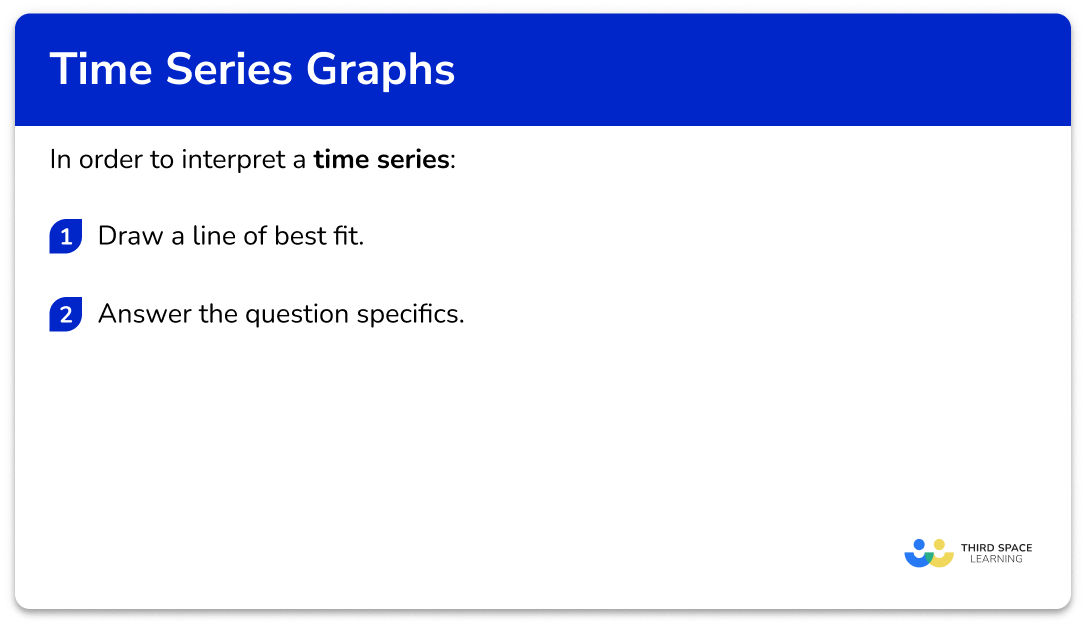
How to interpret a time series graph
In order to interpret a time series:
- Draw a line of best fit.
- Answer the question specifics.
Explain how to interpret a time series graph
Interpreting time series graphs examples
Example 4: describe the trend in the data
Below is a time series showing the number of people attending the cinema over a three week period.
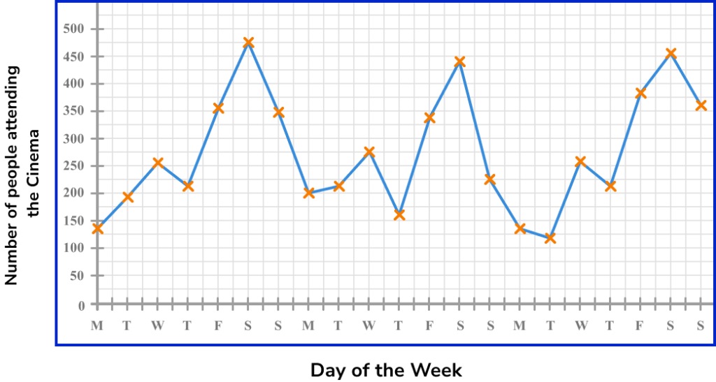
Describe the trend in the data over the three weeks.
Drawing a line of best fit, we have
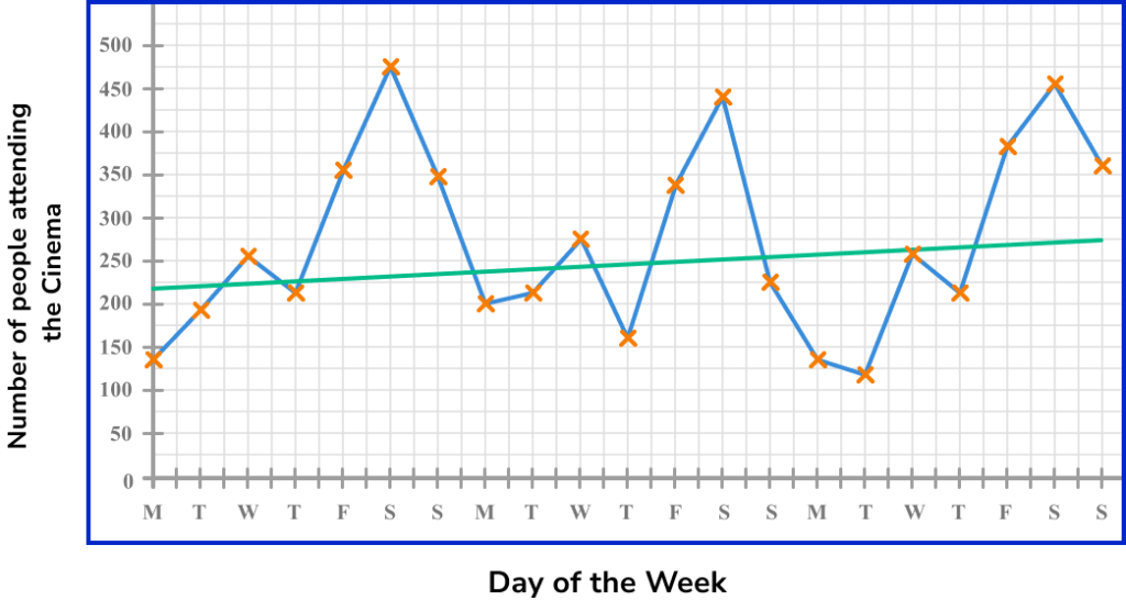
As we need to describe the trend in the data, we can see that the gradient of the line of best fit is slightly positive (going upwards). This means that the number of people attending the cinema is gradually increasing over the time period.
Note: For this example, the use of a line of best fit significantly limits the accuracy of the trend as it is clear that the data is seasonal (we can see that the number of people attending the cinema on Monday to Thursday each week is lower than for Friday to Sunday).
This is a reason why a moving average would provide a more detailed analysis of the trend.
Example 5: estimate a value within the data range (interpolation)
Below is a time series showing the viewing figures of a football match over 90 minutes, recorded every 10 minutes from the channel FOOTY LIVE.
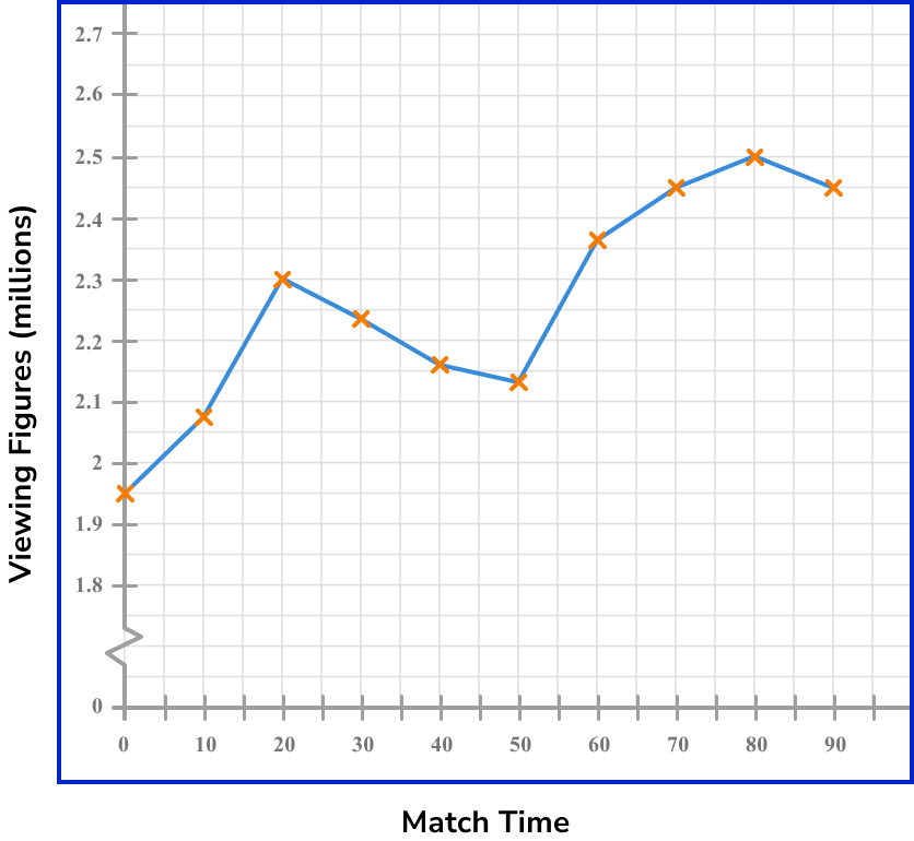
What time would you expect there to be 2.4 million viewers watching the football match on FOOTY LIVE?
Drawing a line of best fit through the data, we have
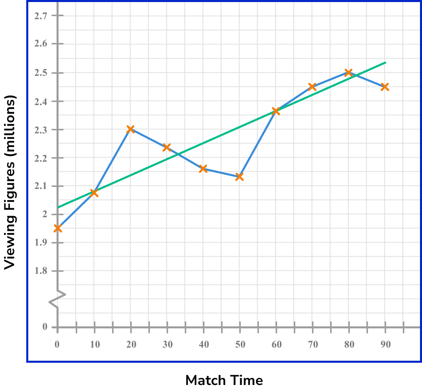
As we need to estimate the time in which 2.4 million viewers are watching the football match, we need to draw a horizontal line from the 2.4 million viewers value to the trendline, and then a vertical line to locate the estimated time on the horizontal axis.
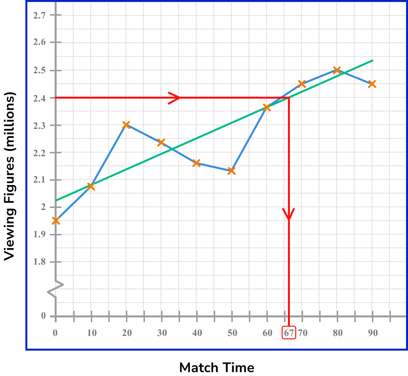
The time estimated for when 2.4 million viewers were watching the football match on FOOTY LIVE is 67 minutes into the match.
Example 6: estimate a value beyond the data range (extrapolation)
Below is a time series showing the number of bacteria in a petri dish. Every hour, 75\% of bacteria are extracted to make a new broth.
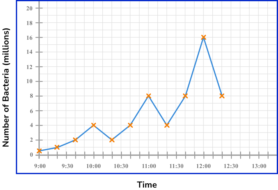
Estimate the number of bacteria in the petri dish at 12:50pm.
Drawing a line of best fit through the data, we have
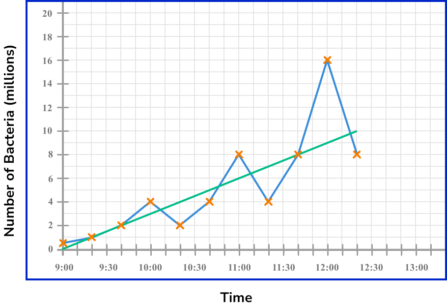
As we need to estimate the number of bacteria in the petri dish at 12:50pm, we need to extend the line of best fit until we have a value on the horizontal axis of 12:50pm.
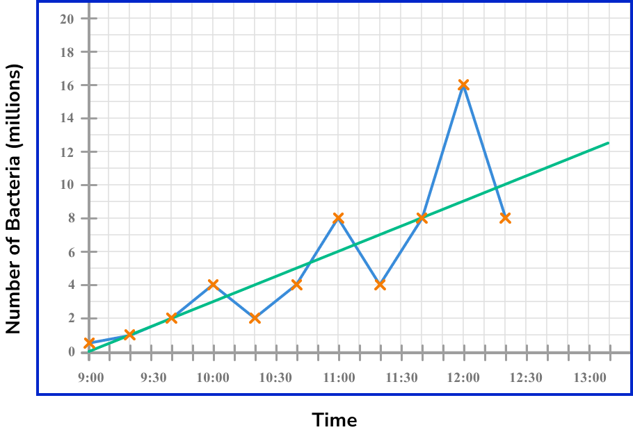
Now that we have a line of best fit for the data, we can draw a vertical line from the value 12:50pm to the line of best fit, and then read the value on the other axis by drawing a horizontal line to this value.
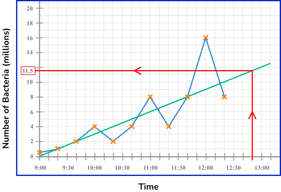
The estimated number of bacteria in the petri dish at 12:50pm is 11.5 million bacteria.
Common misconceptions
- Points on the time series graph joined using a curve
For the purposes of the time series graphs in GCSE mathematics it is important to use straight line segments to join the points of a time series graph. This can sometimes appear in exams in questions where you will be asked to explain any mistake made on a time series graph.
- The horizontal axis is labelled as the variable, with the vertical axis labelled as Time
For a time series, the horizontal axis is always labelled as Time.
- The first and last values of the time series are connected to the horizontal axis
It is not always the case where the first and last values are connected to the time series. This is only the case when both of these values are 0. For example, the temperature at midnight could be 0^{o}C, rise and fall throughout the day, and then be 0^{o}C at midnight, the following night. This would mean that the values would meet the horizontal axis.
- Two values for one time interval
A time series cannot have multiple values for one time period unless you are tracking two different variables. For example, we cannot record two values for the number of entrants to a zoo at 12:30pm but we can record the number of adults and the number of children who have entered a zoo at 12:30pm on the same axis.
- The line of best fit is drawn instead of connecting the data values with line segments
The data values are treated as a scatter plot and so they are not connected using line segments. Instead, the line of best fit is drawn, which is incorrect.
Practice time series graph questions
1. Which of the following time series graphs correctly represents the data in the table below.


Each data value must be plotted in the correct place. They should be joined together using straight line segments. There should only be one value per quarter as this is a plot for one variable.
2. The times series graph shows the attendance for the girls in a school class between January and July.
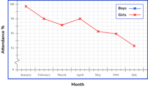
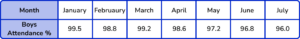
Use the information in the table provided to draw the time series for the Boys attendance on the same set of axes.
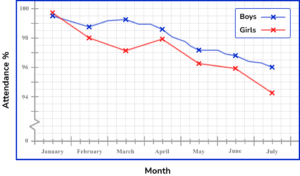
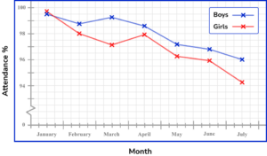

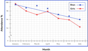
All of the data values must be plotted correctly with only one value for a time interval (here, per month). The plotted points are then connected using a straight line segment from the current to the next point only.
3. The table shows the sales (in thousands) of a toy produced by a company, over the period of a year.
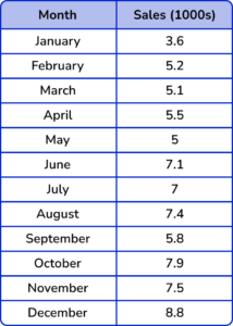
Which is the correct time series graph to show this data?
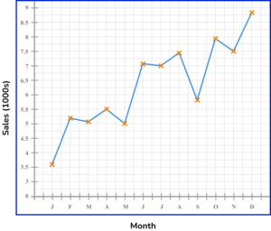

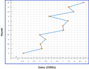
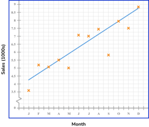
The horizontal axis is labelled as the time increment (here, the month) and the vertical axis is labelled Sales (1000s). Each data value is correctly plotted and connected using a straight line segment. A break is drawn in the vertical axis as there are no values for Sales between 0 and 3.5 (thousand).
4. The average pace for a runner was recorded every 5 minutes for one hour. The results are shown in the time series graph below.
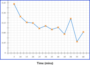
Describe the trend in the data.
Increasing (she is getting faster as time passes)
Increasing (she is getting slower as time passes)
Decreasing (she is getting faster as time passes)
Decreasing (she is getting slower as time passes)
Drawing a line of best fit, we have
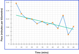
The trend is decreasing because as time passes, the values for the pace decrease (negative gradient). This means that the pace of the runner is running a kilometre in less time, and is therefore getting faster.
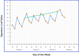
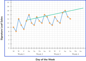
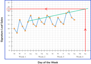
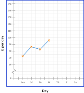
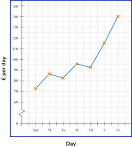
5. A bakery tracks the sales of their signature loaf of bread. The results are recorded every day up to the Tuesday of Week 4 (today) and is written up into a time series.
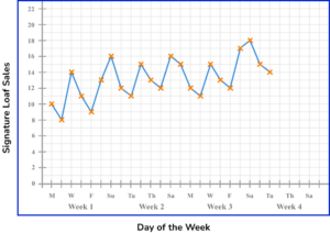
Estimate the number of sales of their signature loaf on Saturday of Week 4.
Draw a line of best fit for the data recorded on Saturdays.
Extending the line of best fit, we have
Drawing a vertical line from Saturday of Week 4 up to the line of best fit, and across to the other axis, this reads a value of 19 loaves.
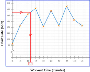
6. A person’s heart rate (measured in beats per minute, bpm) is measured throughout a workout, and recorded every 5 minutes in the time series below.
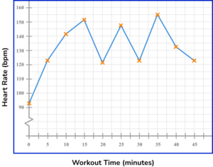
How many minutes does it take for the heart rate to reach 145bpm after commencing the workout?
15 minutes
37.5 minutes
12 minutes
24 minutes
Looking at the time series, drawing a horizontal line from the 145bpm mark on the vertical axis, we get to the line segment of the graph. The time at this point reads 12 minutes.
Time series graph GCSE questions
1. The table shows the amount of money a taxi driver earned during one week.
![]()
(a) Complete the time series graph for Thursday to Saturday.
(b) Describe the trend of the data.
(3 marks)
(a)
Points plotted correctly
(1)
Points joined with straight lines
(1)
(b) Increasing
(1)
2. The table shows the average daily sales of an ice cream van from January through to December of the same year.
![]()
(a) Complete the time series graph for the months August to December.
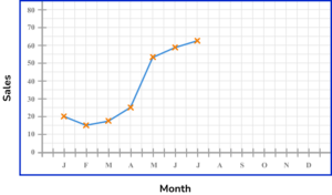
(b) How many months were the average daily sales of ice cream above 40 ice creams per day?
(3 marks)
(a)
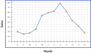
Points plotted correctly
(1)
Points joined with straight lines
(1)
(b) 6 months
(1)
3. Below is a time series plot showing the amount of rainfall.
State the three mistakes that have been made with the time series graph.
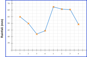
(3 marks)
Scale on the y -axis not correct, gaps not consistent.
(1)
Points are not joined with straight lines.
(1)
Horizontal axes ( x -axis) not labelled, so not clear what the 1,2,3,4 represent.
(1)
Learning checklist
You have now learned how to:
The next lessons are
Still stuck?
Prepare your KS4 students for maths GCSEs success with Third Space Learning. Weekly online one to one GCSE maths revision lessons delivered by expert maths tutors.

Find out more about our GCSE maths tuition programme.