GCSE Tutoring Programme
Our chosen students improved 1.19 of a grade on average - 0.45 more than those who didn't have the tutoring.
In order to access this I need to be confident with:
Factors and multiples Types of graphs Plotting graphs Frequency tablesThis topic is relevant for:

x and y axis
Here we will learn about the x and y axis, including drawing axes, and reading scales on a variety of statistical graphs.
You can also download a free X and Y Axis Worksheet, suitable for those following Edexcel, AQA or OCR exam boards.
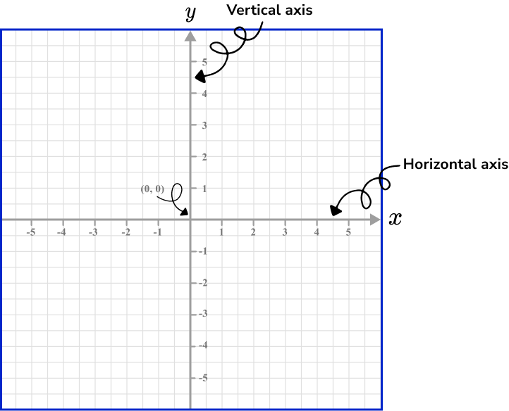
What are the x and y axis?
The \textbf{x} and \textbf{y} axis are axes in the Cartesian coordinate system. They are straight lines that form a coordinate plane where each point on the plane can be represented as a coordinate of the form (x,y).
The \textbf{x} -axis is a horizontal line (left to right).
The \textbf{y} -axis is a vertical line (up and down).
The x -axis and y -axis intersect at the origin (0,0).
Coordinates must be written as a pair of values, separated by a comma, and surrounded by a set of round brackets e.g. (3,2), (-4,0), (-6.3,5.7).
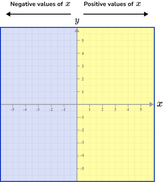
From the origin, we label equal steps on each axis to show the location of values. In the diagram above, we have shown that every two unit squares is marked with a tick mark, and each of these values increases (or decreases) in steps of 1.
We can see that x is a positive value for all of the coordinates on the right side of the y -axis (yellow shading), and x is a negative value for all the coordinates on the left side of the y -axis (blue shading).
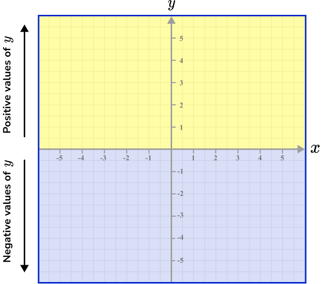
Furthermore, y is a positive value for every coordinate above the x -axis, and y is a negative value for any coordinate below the x -axis.
What are the x and y axis?
How to use a scale on an axis
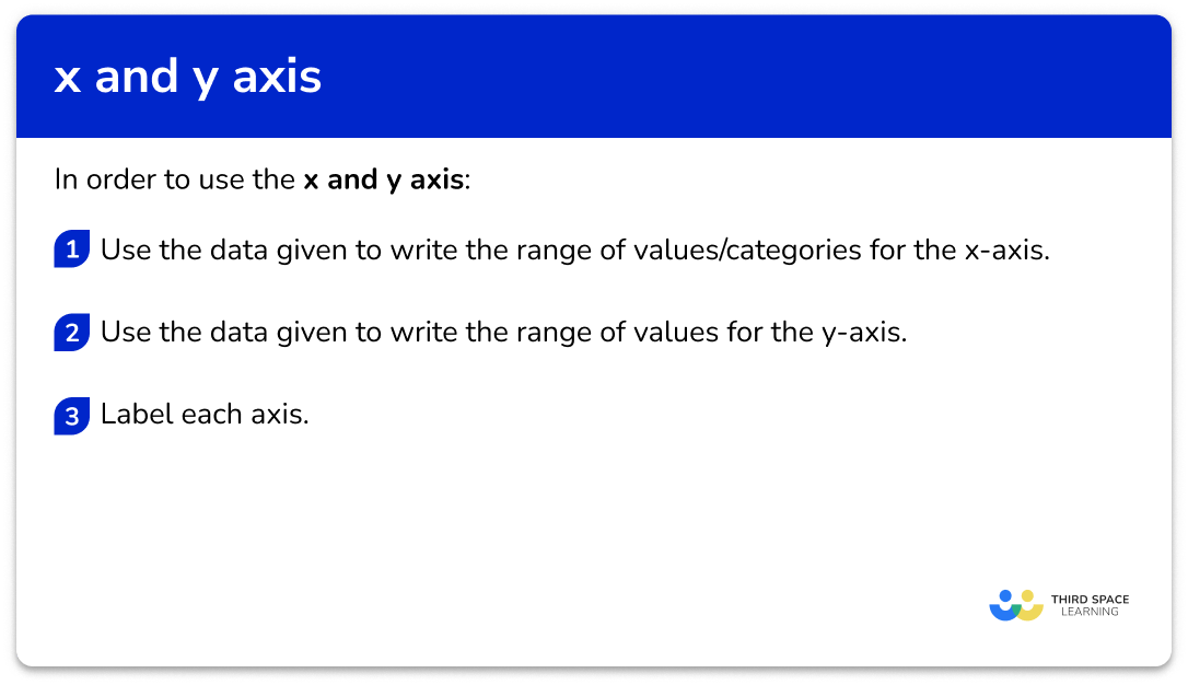
In order to use the x and y axis:
- Use the data given to write the range of values/categories for the \textbf{x} -axis.
- Use the data given to write the range of values for the \textbf{y} -axis.
- Label each axis.
Explain how to use a scale on an axis
x and y axis worksheet
Get your free x and y axis worksheet of 20+ questions and answers. Includes reasoning and applied questions.
DOWNLOAD FREE
x and y axis worksheet
Get your free x and y axis worksheet of 20+ questions and answers. Includes reasoning and applied questions.
DOWNLOAD FREERelated lessons on representing data
x and y axis is part of our series of lessons to support revision on representing data. You may find it helpful to start with the main representing data lesson for a summary of what to expect, or use the step by step guides below for further detail on individual topics. Other lessons in this series include:
x and y axis examples
Example 1: bar chart axis with discrete data
Construct a bar chart axis for the following data.
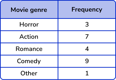
- Use the data given to write the range of values/categories for the \textbf{x} -axis.
As the data is discrete, the x -axis will have the names of the Movie genre.
Remember a bar chart must have gaps between each bar when representing discrete data.
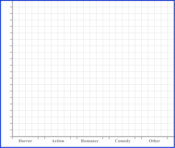
2Use the data given to write the range of values for the \textbf{y} -axis.
The y -axis should have the frequency on it. The frequencies range from 1 to 9 so we can start the axis at 0 , and label equal steps up to 10.
3Label each axis.
Step-by-step guide: Bar charts
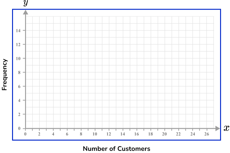
Example 2: bar chart axis with grouped discrete data
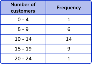
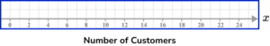
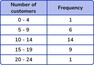
Construct a bar chart axis for the following data.
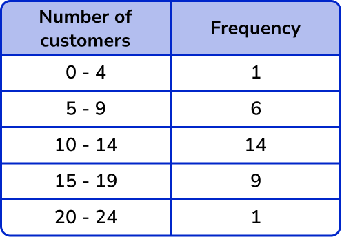
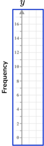
The x -axis will represent the number of customers with the values ranging from 0 to 24. As there are 28 squares on the x -axis, an appropriate scale would be 1 square for every value. As this will look very crowded, we can label every two squares as a multiple of 2.
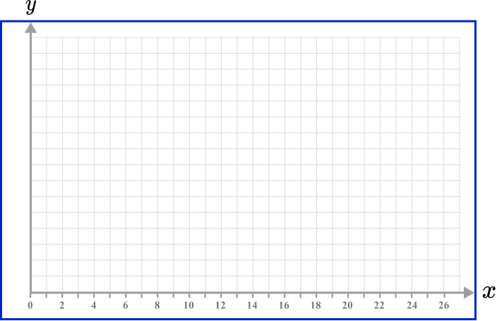
The data range is from 1 to 14 for the frequency values and so it is appropriate again to use a scale of 1 unit per square and write the value for every multiple of 2 so that the axis is not overcrowded.
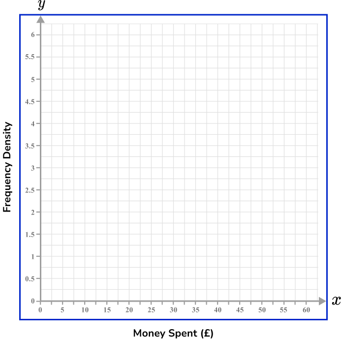
Example 3: histogram axis with continuous data
Construct a histogram for the following data.
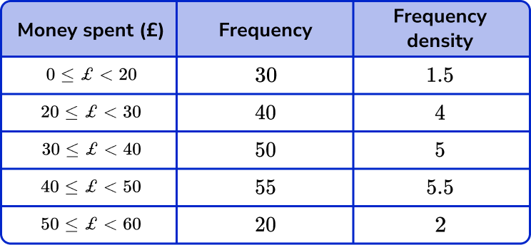
The values for the x -axis here represent Money spent (£). The range of values is therefore 0 to 60. As the limits of each class interval are multiples of 10, we can label the x -axis (horizontal axis) in steps of 5 as each value of 10 would hence be clearly labelled.
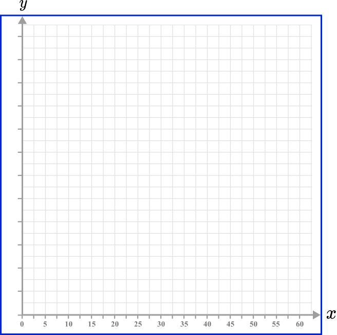
The area of each bar within a histogram represents the frequency and so the y -axis (vertical axis) represents the frequency density of the class interval. As the frequency density values range between 1.5 and 5.5, we can label the y -axis in steps of 0.5, up to the value of 6.
Step-by-step guide: Histogram
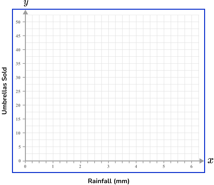
Example 4: scatter graph axis with independent and dependent variables
Construct a set of axes for a scatter graph to represent the following data.
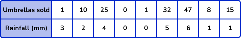
The x -axis of a scatter graph should always have the independent variable plotted on it; in this case Rainfall (mm). The range of values is between 0 and 6 \ mm so the values should be spread out but still remain equally spaced.
Remember that 0 is labelled at the intersection of the two axes.
The y -axis should always have the dependent variable (the value that changes dependent on the rainfall) plotted. Here this is the number of umbrellas sold.
As the values for umbrellas sold ranges from 0 to 47, we can label the axis in equal steps of 5, up to the value of 50.
Step-by-step guide: Scatter graphs
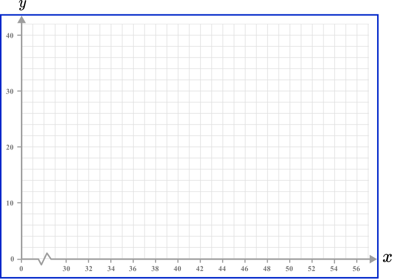
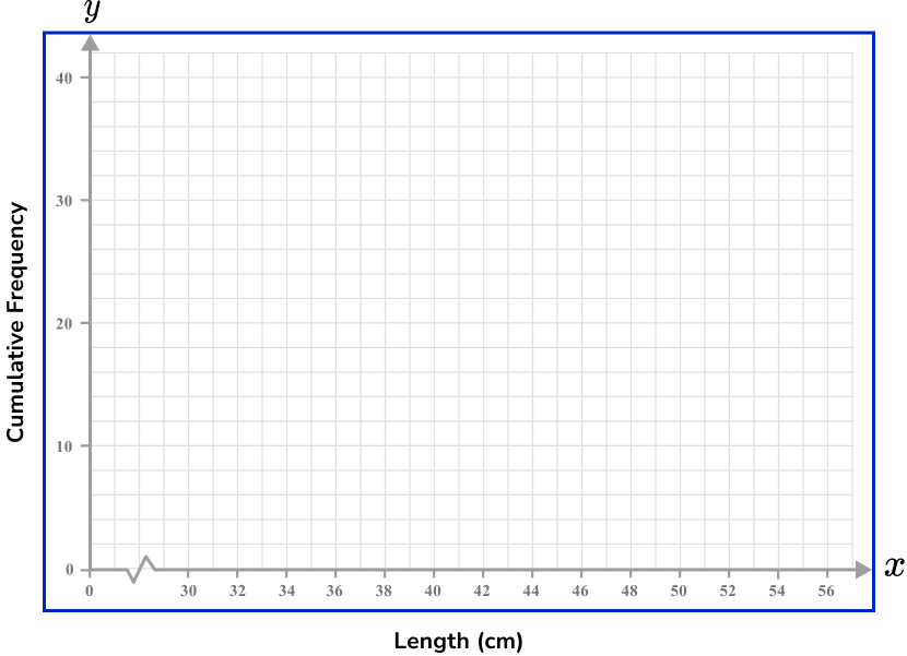
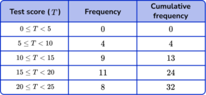
Example 5: cumulative frequency including a break
Construct a set of axes for a cumulative frequency graph to represent the following data.
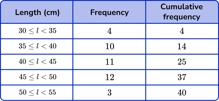
As the values for the x -axis range between 30 and 55, there is no data between 0 and 30. As this is a cumulative frequency plot, we can include a break between 0 and 30, which is represented using a zig-zag shaped line.
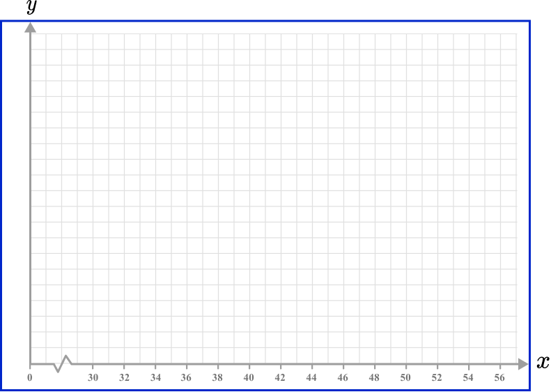
In a cumulative frequency diagram the cumulative frequency is plotted on the y -axis. The values must start from 0, and as the total frequency is 40, we can label the axis so that every 5 square units is labelled as a multiple of 10.
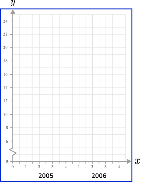
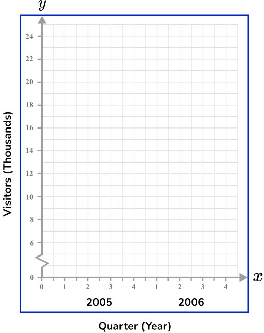
Example 6: line graph (time series graph) including a break
Construct a set of axes for a line graph axis to represent the following set of data.
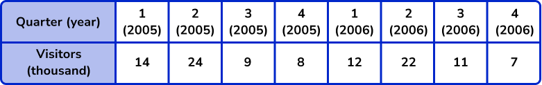
The x -axis for a line graph (time series graph) is always labelled as the time increment. Here, we need to write the 2 years ( 2005 and 2006 ), divided into 4 quarters.
This means that we need at least 8 tick marks on the x -axis, equally spaced, labelled as: 1, 2, 3, 4, 1, 2, 3, and 4. We can state the year below each group of four quarters.
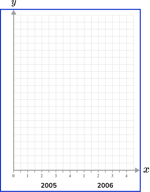
The values for the number of visitors (thousands) ranges from 7 to 24 and so we could introduce a small break on the y -axis, start the values at 6, and go up in equal steps of 2, up to 24. The height of each square can represent 1000 people (remember the scale is in thousands).
Step-by-step guide: Line graphs
Common misconceptions
- The gaps between the values on either axis have to be equal
The scale on the axis is very important as if the values are not spaced correctly then the chart will not represent the data accurately.
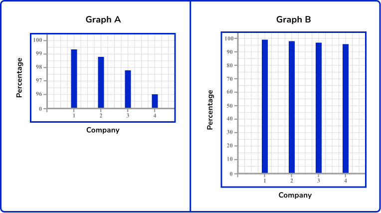
For example: The two graphs below show the amount of product sold by 4 rival companies. Graph A has an incorrectly plotted y -axis. This misrepresents the data and makes it appear that company number 1 is doing much better than its rivals. Graph B is scaled correctly and the graph shows a true picture of company performance.
- Unequal spacing between tick marks on a single axis
When drawing a set of axes, the spacing between each tick mark must be the same; if four squares represents 1 unit increase, the next tick mark should be 4 squares along and labelled 1 more than the previous tick mark.
- Incorrect axis labels (missing units)
Make sure that the row / column title of the table matches the axis on the graph. If the column title is “Time (mins)”, you must write “Time (mins)” and not “Time” as the unit is not specified and so any value taken from the graph may be misinterpreted.
- Incorrect axis labels (switched labels)
Make sure that the row / column title of the table matches the axis on the graph. The scale on the axis should be labelled with the correct title (e.g. the horizontal axis for a bar chart with categories: Dog, Cat, Rabbit, Horse, Other, should be labelled as “Favourite pet” and not “Frequency”.
- The axis scale does not allow for all points to be plotted
You must make sure that the scale for each axis will allow all values in the data set to be plotted.
- The axis labels and step marks are too close together / too far apart
When the axis is drawn, you do not need to label every square with a value. Conversely, do not only write the highest value at the end of the axis, and 0 at the origin. Most of the time you will be given a suitable grid for you to plot a graph or chart to a suitable size.
Practice x and y axis questions
1. Using this table of values, select the most appropriate scale to use for the x -axis on the grid provided.
0-24 using multiples of 2

0-100 increasing in multiples of 10

0-15 increasing in multiples of 1
4-24 increasing in multiples of 10
The x -axis, for this data, will have the number of customers plotted on it. The range of data is from 0 to 24 so an appropriate scale is to increase in multiples of 2.
2. Using this table of values select the appropriate scale to use on the y -axis.

0-24 increasing in multiples of 2
0-100 increasing in multiples of 10
0-16 increasing in multiples of 1
1-14 increasing in multiples of 0.5
The range of data for the frequency is from 1 to 14 so an appropriate scale is to increase in multiples of 1 for each square, so two squares would be labelled as a multiple of 2.
3. The range of values for a set of data is 14 to 20. How is a broken scale shown on this axis?
A dotted line which hides any value above the number 20.
A zigzag line which compresses the axis as there are no data values in this location.
A dotted line which hides the numbers before 14.
A zigzag drawn in the axis so that the data values are equally spread out.
Graphs / charts that feature a broken scale are useful in situations when there are no data values to plot onto a graph, close to zero.
4. For this table of values, what is the best scale to use for the x -axis?
0-12 increasing in multiples of 1.
0-26 increasing in multiples of 2.
0-22.5 increasing in multiples of 0.5.
A broken axis from 4-11 increasing in multiples of 2.
The range of the data for the test score is between 0 and 25 and so it is suitable to write an axis from 0 to 26 and increase in multiples of 2.
5. The table below shows the number of strides and the time taken in seconds to run 100m. Which of the following four sets of axes would allow for an accurate scatter plot for the data set in the table below?
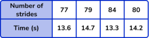
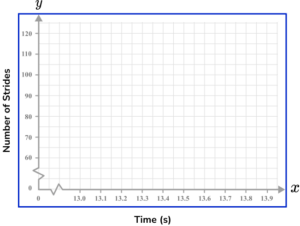

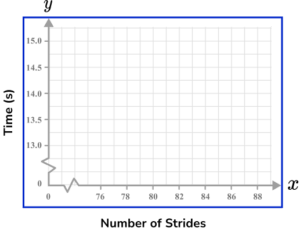
Time should be on the x -axis (horizontal axis) and so the Number of strides will be on the y -axis (vertical axis). Each axis can have a break as this is a scatter graph and there is no data for values close to zero.
Each value must appear in the plotting area, and the scales should allow each point to be plotted with a suitable degree of accuracy.
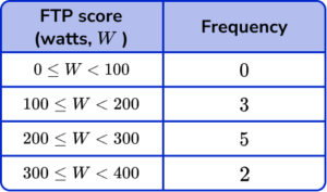
6. The table below shows the Functional Threshold Power score of 10 cyclists. Which set of axes would allow for an accurate cumulative frequency plot for the data set below?
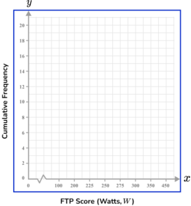
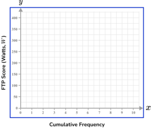
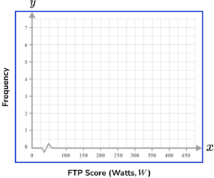
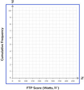
The vertical axis (the y -axis) is labelled as Cumulative Frequency when constructing a cumulative frequency graph. Also, the scale should not greatly over-exceed the data values and so should range from 0 to 10 for this data set.
The horizontal axis (the x -axis) should increase in equal steps and should not feature a break because the lowest FTP score can be 0.
x and y axis GCSE questions
1. Complete the scale on the diagram for a time series. Use a 24 hour clock.
(2 marks)
12 : 15 and 12 : 45
(1)
13 : 00 and 13 : 15
(1)
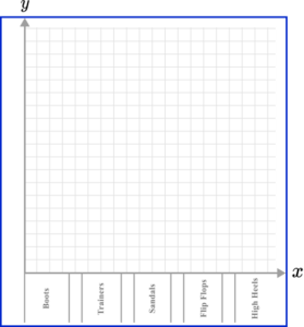
2. (a) A group of people were asked what their favourite type of footwear is. Below is a table showing the results.
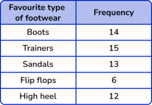
Circle the type of data represented in the table.
Discrete Continuous Secondary Random
(b) Using an appropriate scale, complete the y -axis for the table of data above.
(3 marks)
(a) Discrete data
(1)
(b)
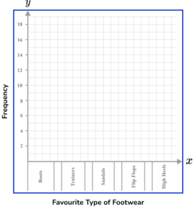
Axis labelled from 0-15 (minimum).
(1)
Appropriately spaced (using 2 squares for each unit).
(1)
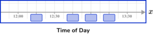
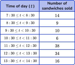
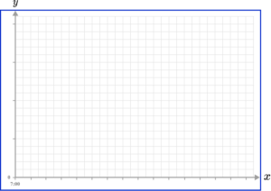
3. A sandwich shop is recording the number of sandwiches sold per hour during one day of trade. The shop opens at 7 : 30am. Draw a time series to represent the data set. Use the axes below to help you.
(4 marks)
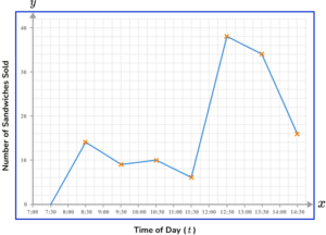
Time of day (t) labelled with a clear, equal scale on x -axis.
(1)
Appropriate scale used on the y -axis and labelled Frequency or Number of sandwiches sold.
(1)
All points plotted correctly.
(1)
Straight line segments drawn between each data value.
(1)
Learning checklist
You have now learned how to:
The next lessons are
Still stuck?
Prepare your KS4 students for maths GCSEs success with Third Space Learning. Weekly online one to one GCSE maths revision lessons delivered by expert maths tutors.

Find out more about our GCSE maths tuition programme.