High Impact Tutoring Built By Math Experts
Personalized standards-aligned one-on-one math tutoring for schools and districts
x and y axis
Here you will learn about the x and y axis, including what it is and how to use it to create the scales for a graph.
Students will first learn about the x and y axis as part of geometry in 5th grade. This knowledge will be expanded upon in statistics and probability in 6th grade.
Every week, we teach lessons on the x and y axis to students in schools and districts across the US as part of our online one-on-one math tutoring programs. On this page we’ve broken down everything we’ve learnt about teaching this topic effectively.
What are the x and y axis?
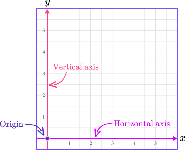
The x and y axis are axes in the Cartesian coordinate system.
They are two perpendicular lines that form a coordinate plane (coordinate grid), where the location of a point on the plane can be represented as a coordinate of the form (x,y) .
The x -axis is a horizontal line (left to right).
The y -axis is a vertical line (up and down).
The x -axis and y -axis intersect at the origin (0,0) .
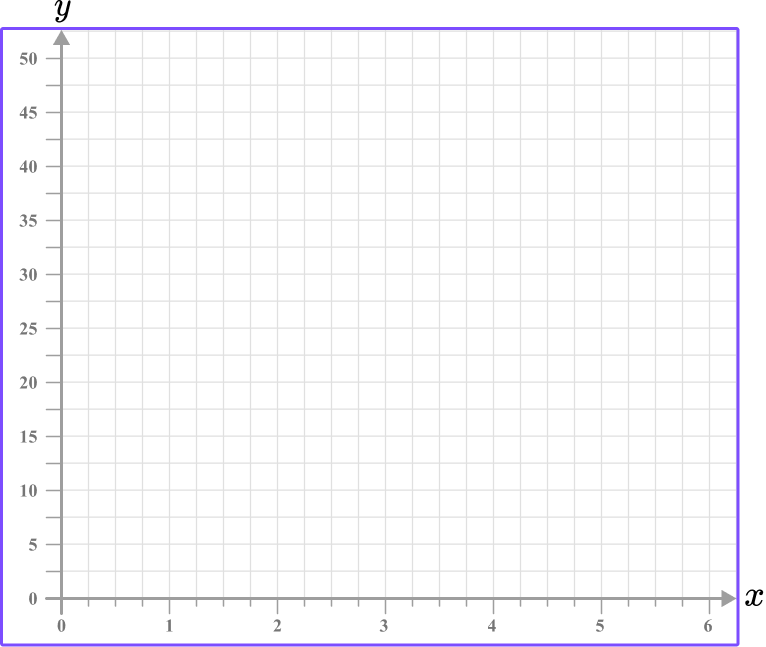
Here is an example of the first quadrant of the coordinate plane:
It is important to remember that the x and y axes can be adjusted to have any scale.
This is particularly important when graphing bar graphs, line graphs, histograms and other numerical data sets.
For example,
| Total hours | 1 | 2 | 3 | 4 |
| Pages read | 15 | 30 | 45 | 60 |
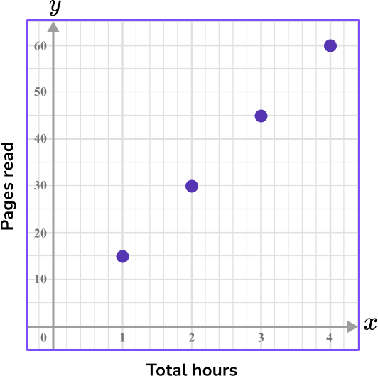
The y -axis is labeled ‘pages read,’ since it is the dependent variable.
This is because the pages read depends on how many hours have been spent reading.
On the y -axis, every two units are labeled as 10 . This means each individual unit is 5 .
The x -axis is labeled ‘total hours,’ since it is the independent variable.
The hours range from 1 to 4 .
On the x -axis, every five units are labeled as 1 .
That means each individual unit is 0.2 .
What is x and y axis?
Common Core State Standards
How does this relate to 5 th grade math and 6 th grade math?
- Grade 5 – Geometry – (5.G.A.1)
Use a pair of perpendicular number lines, called axes, to define a coordinate system, with the intersection of the lines (the origin) arranged to coincide with the 0 on each line and a given point in the plane located by using an ordered pair of numbers, called its coordinates.
Understand that the first number indicates how far to travel from the origin in the direction of one axis, and the second number indicates how far to travel in the direction of the second axis, with the convention that the names of the two axes and the coordinates correspond (for example, x -axis and x -coordinate, y -axis and y -coordinate).
- Grade 5 – Geometry – (5.G.A.2)
Represent real world and mathematical problems by graphing points in the first quadrant of the coordinate plane, and interpret coordinate values of points in the context of the situation.
- Grade 6 – Expressions and Equations – (6.EE.C.9)
Use variables to represent two quantities in a real-world problem that change in relationship to one another; write an equation to express one quantity, thought of as the dependent variable, in terms of the other quantity, thought of as the independent variable. Analyze the relationship between the dependent and independent variables using graphs and tables, and relate these to the equation.
For example, in a problem involving motion at constant speed, list and graph ordered pairs of distances and times, and write the equation d = 65t to represent the relationship between distance and time.
- Grade 6 – Statistics and Probability – (6.SP.B.4)
Display numerical data in plots on a number line, including dot plots, histograms, and box plots.
How to use a scale on an axis
In order to use the x and y axis:
- Use the data given to write the range of values/categories for the \textbf{x} -axis.
- Use the data given to write the range of values for the \textbf{y} -axis.
- Label each axis.
![[FREE] <tnr>x</tnr> and <tnr>y</tnr> Axis Worksheet (Grade 5 and 8)](https://thirdspacelearning.com/wp-content/uploads/2024/04/X-and-Y-Axis-Worksheet-listing-image.png)
[FREE] x and y Axis Worksheet (Grade 5 and 8)
Use this worksheet to check your 5th to 8th grade students’ understanding of the
[FREE] x and y Axis Worksheet (Grade 5 and 8)
Use this worksheet to check your 5th to 8th grade students’ understanding of the
x and y axis examples
Example 1: bar graph axis with categorical data
Construct a bar graph axis for the following data.
| Movie genre | # of movies |
|---|---|
| Horror | 3 |
| Action | 7 |
| Romance | 4 |
| Comedy | 9 |
| Other | 1 |
- Use the data given to write the range of values/categories for the \textbf{x} -axis.
Since the data is categorical, the x -axis will have the names of the Movie genre.
Remember, a bar graph must have gaps between each bar when representing categorical data.
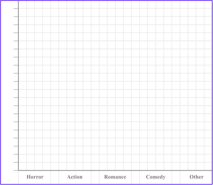
2Use the data given to write the range of values for the \textbf{y} -axis.
The y -axis should have the number of movies on it. The number of movies range from 1 to 9 .
The graph has 20 units from the origin to the top, so you can start the axis at 0 and label every 2 units as a multiple of 1 .
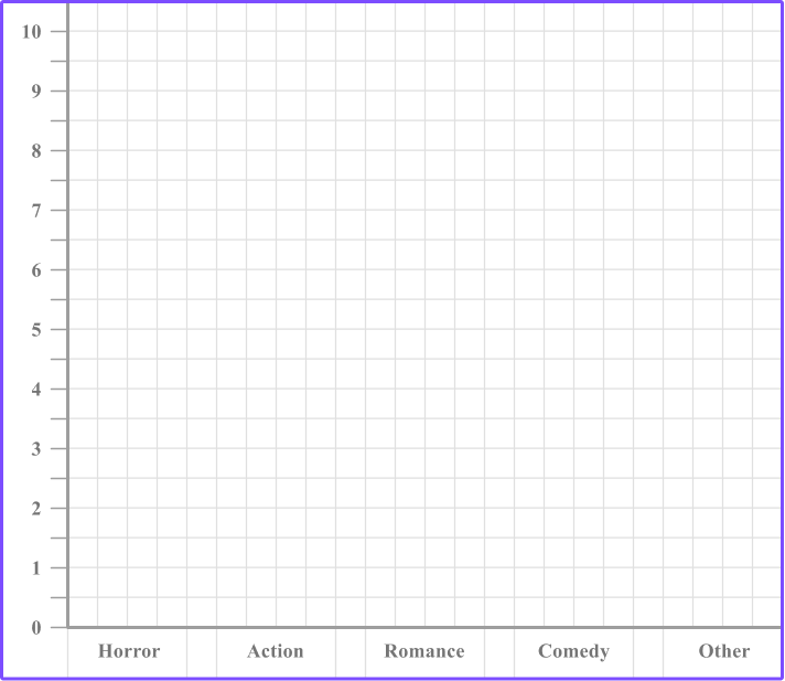
*Note, if you had labeled each unit as a multiple of 1 , the y -axis would have gone from 0 to 20 . Since the largest data point is 9 , this would leave too much empty space on the graph.
3Label each axis.
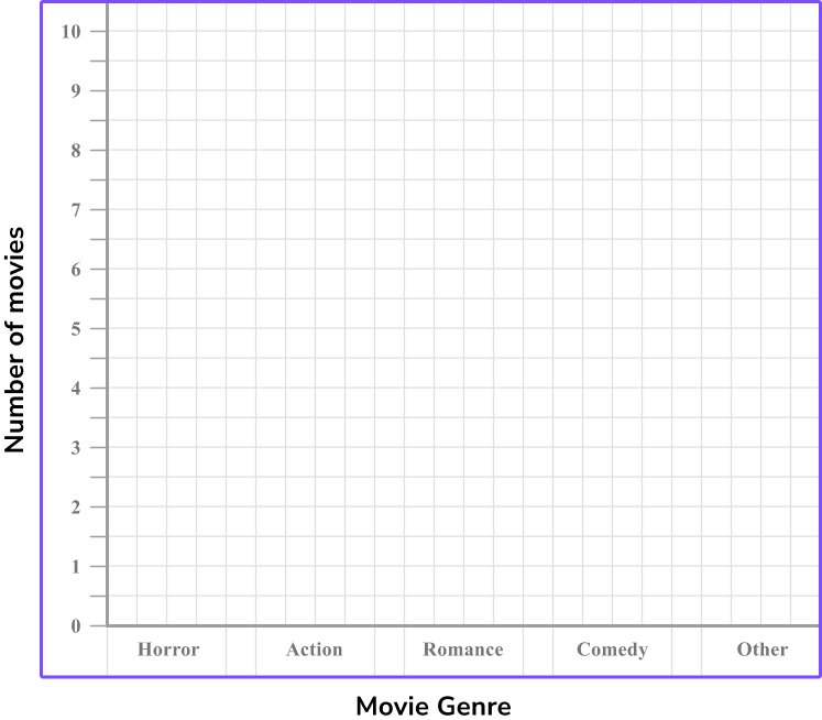
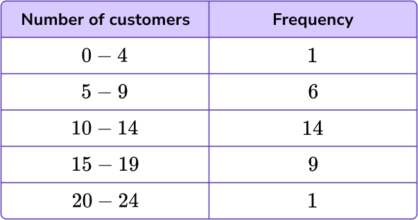
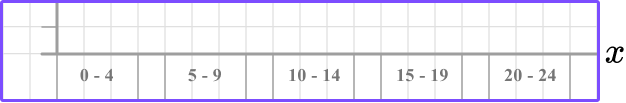
Example 2: bar graph axis with grouped discrete numerical data
Construct a bar graph axis for the following data.
| Number of customers | Frequency |
|---|---|
| 0-4 | 1 |
| 5-9 | 6 |
| 10-14 | 14 |
| 15-19 | 9 |
| 20-24 | 1 |
The x -axis will represent the number of customers. The numerical data is grouped, but because it is discrete data, (you cannot have 4.2 customers), we should treat these groups as categories. There are 6 categories, we can use three squares width per category and one square gap in between.
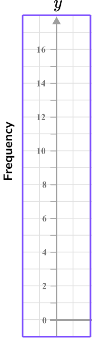
The data range is from 1 to 14 for the frequency values and there are 16 square units given on the y -axis.
It is appropriate again to use a scale of 1 unit per square, but write the value for every multiple of 2 so that the axis is not overcrowded.


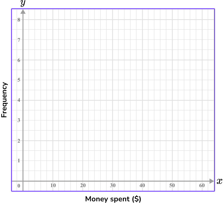
Example 3: histogram axis with continuous data
Construct a histogram axis for the following data.
| Money spent ($) | Frequency |
|---|---|
| 0 \leq \$ < 10 | 2 |
| 10 \leq \$ < 20 | 6 |
| 20 \leq \$ < 30 | 1 |
| 30 \leq \$ < 40 | 8 |
| 40 \leq \$ < 50 | 3 |
| 50 \leq \$ < 60 | 7 |
The values for the x -axis here represent money spent (\$). The range of values is therefore 0 to 60, and each bin is a multiple of 10 .
Since there are 30 units from 0 on the x -axis, each unit can represent 2 . To avoid crowding and show the multiples of 10 , label every 5 units.
The height of the bar shows the frequency, so the y -axis needs to represent the frequency values.
Since the frequency values range from 1 and 8 and there are 16 square units on the y -axis, let each unit be a half, so that every other 1 is labeled as the next whole.
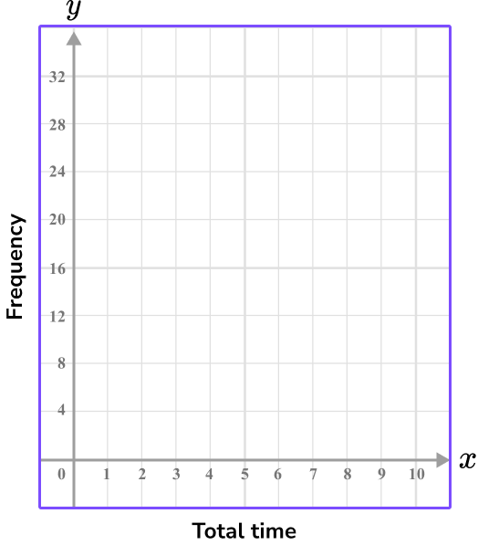
Example 4: histogram axis with continuous data
Construct a histogram axis for the following data.
| Total time | Frequency |
|---|---|
| 0 \leq t < 2 | 20 |
| 2 \leq t < 4 | 32 |
| 4 \leq t < 6 | 28 |
| 6\leq t < 8 | 19 |
The values for the x -axis here represent the total time. The range of values is therefore 0 to 8 .
Each unit on the x -axis can represent 1 since there are 10 square units on the x -axis.

The height of the bar shows the frequency, so the y -axis needs to represent the frequency values.
Since the frequency values range from 19 and 32 , let each unit be 4 , so that the last value is 32 .
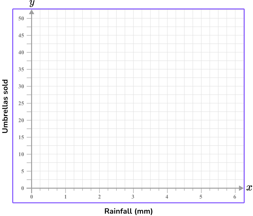
Example 5: scatter graph axis with independent and dependent variables
Construct a set of axes for a scatter graph to represent the following data.
| Umbrellas sold | 1 | 10 | 25 | 0 | 1 | 32 | 47 | 8 | 15 |
| Rainfall (mm) | 3 | 2 | 4 | 0 | 0 | 5 | 6 | 1 | 1 |
The x -axis of a scatter graph should always have the independent variable plotted on it; in this case rainfall (mm) .
The range of values is between 0 and 6 \, mm, so the values should be spread out but still remain equally spaced.
Remember that 0 is labeled at the intersection of the two axes.
The y -axis should always have the dependent variable (the value that changes dependent on the rainfall) plotted. Here, this is the number of umbrellas sold.
As the values for umbrellas sold ranges from 0 to 47 , you can label the axis in equal increments of 5 , up to the value of 50 .
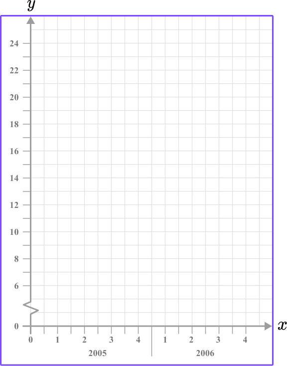
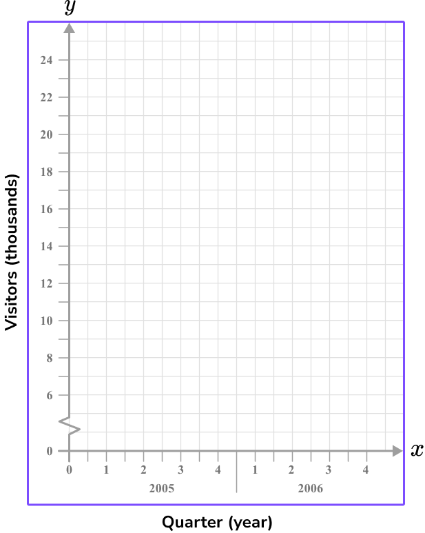
Example 6: line graph – time series graph – including a break
Construct a set of axes for a line graph axis to represent the following set of data:
| Quarter year | 1
(2005) | 2
(2005) | 3
(2005) | 4
(2005) | 1
(2006) | 2
(2006) | 3
(2006) | 4
(2006) |
| Visitors (thousands) | 14 | 24 | 9 | 8 | 12 | 22 | 11 | 7 |
The x -axis for a line graph (time series graph) is always labeled as the time increment. Here, you need to write the 2 years (2005 and 2006) , divided into 4 quarters.
This means that you need at least 8 tick marks on the x -axis, equally spaced, labeled as: 1, 2, 3, 4, 1, 2, 3, and 4 . State the year below each group of four quarters.
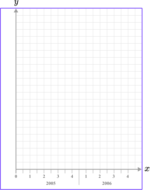
The values for the number of visitors (thousands) range from 7 to 24 , so introduce a small break on the y -axis, start the values at 6 , and go up in equal increments of 2 , up to 24 .
The height of each square can represent 1,000 people (remember, the scale is in thousands).
Teaching tips for x and y axis
- When working on this skill, include both worksheets that give a data set and ones that allow for students to collect the data – particularly if this is being covered during a statistics unit.
- Give student opportunities to vary the visual representation of the same data set. This can be done by hand or more quickly with a digital application, but either way, it allows students to see how the same data can look different when the x and y axis are scaled differently or when a different type of graph is used to represent the data.
- Provide students with plenty of examples for when the values of x increase by something other than 1 . This helps avoid the misconception that the values always increase by 1 .
Easy mistakes to make
- Thinking the scale has to be the same for the \textbf{x} and \textbf{y} axes
When graphing data, it may not always be appropriate to use the same scale. Always use the scale that makes the most sense for the data given.
- Unequal spacing between tick marks on a single axis
When drawing a set of axes, the spacing between each tick mark must be the same; if four squares represents 1 unit increase, the next tick mark should be 4 squares along and labeled 1 more than the previous tick mark.
- Incorrect axis labels (missing units)
Make sure that the row / column title of the table matches the axis on the graph. If the column title is “Time (mins)”, you must write “Time (mins)” and not “Time” as the unit is not specified and so any value taken from the graph may be misinterpreted.
- Incorrect axis labels (switched labels)
Make sure that the row / column title of the table matches the axis on the graph. The scale on the axis should be labeled with the correct title (for example, the horizontal axis for a bar graph with categories: Dog, Cat, Rabbit, Horse, Other, should be labeled as “Favorite pet” and not “Frequency”.
- Using an axis scale that does not allow for all points to be graphed
You must make sure that the scale for each axis will allow all values in the data set to be graphed. If a value from the data cannot be graphed, then the scale needs to be changed.
- Making the axis labels too close together / too far apart
When the axis is drawn, you do not need to label every square with a value. Conversely, do not only write the highest value at the end of the axis, and 0 at the origin. Most of the time you will be given a suitable grid for you to plot a graph or chart to a suitable size.
Related coordinate plane lessons
Practice x and y axis questions
1. Using this table of values, select the most appropriate scale to use for the y -axis on the grid provided.
0 \, – \, 100 increasing in multiples of 10

0 \, – \, 20 increasing in multiples of 1

0 \, – \, 10 increasing in multiples of 0.5
0 \, – \, 30 \, increasing in multiples of 5
The x -axis for this data will have the number of people plotted on it.
The range of data is from 1 to 17, so an appropriate scale is to increase in multiples of 1 .
2. Using this table of values, select the most appropriate scale or labelling to use for the x -axis on the grid provided.

0 \, – \, 24 using multiples of 2
0 \, – \, 100 increasing in multiples of 10
Categories of 0-4, \, 5-9, \, 10-14, \, 15-19, \, 20-24, with one square gap in between.
4 \, – \, 24 increasing in multiples of 10
The x -axis, for this data, will have the number of customers plotted on it.
The range of data is from 0 to 24 so an appropriate scale is to increase in multiples of 2.
3. Using this table of values, select the appropriate scale to use on the y -axis.


0 \, – \, 24 increasing in multiples of 2
0 \, – \, 100 increasing in multiples of 10
0 \, – \, 16 increasing in multiples of 1
1 \, – \, 14 increasing in multiples of 0.5
The range of data for the frequency is from 1 to 14 so an appropriate scale is to increase in multiples of 1 for each square, so two squares would be labeled as a multiple of 2 .
4. For this table of values, what is the best scale to use for the x -axis?
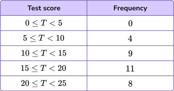
0 \, – \, 14 increasing in multiples of 4
0 \, – \, 22.5 increasing in multiples of 0.5
0 \, – \, 28 increasing in multiples of 2
0 \, – \, 25 increasing in multiples of 1
The range of the data for the test score is between 0 and 25 , so it is suitable to write an axis from 0 to 28 and increase in multiples of 2 .
5. The table below shows the number of miles traveled after a certain number of hours. Which of the following graphs shows the appropriate x and y axis for the data set?
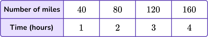

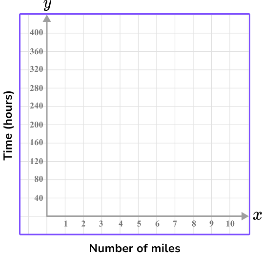
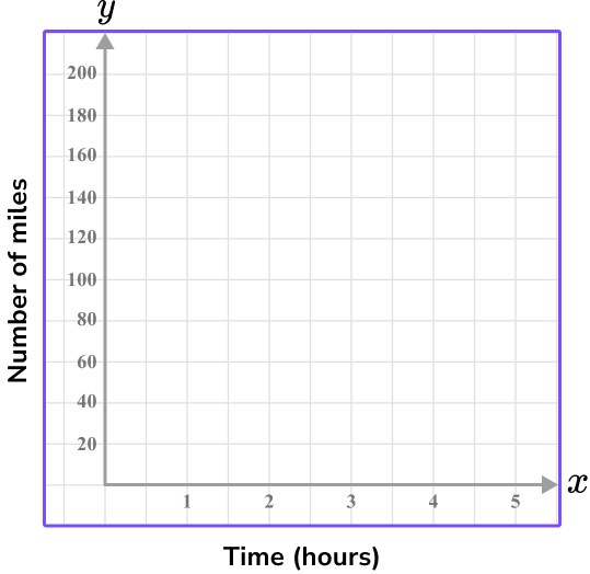

Time is the independent variable, so it is on the x -axis.
The time ranges from 1 to 4 hours, so using every 2 units as 1 hour shows the values 1 to 5 on the graph.
The y -axis is the dependent variable, total miles traveled, which ranges from 40 to 160 .
Since there are 10 units on the y -axis, going up by 20 each time shows the values 0-200.
These scales on the x and y axis will leave little empty space because they are appropriate for the data set.
6. The table below shows the number of strides and the time taken in seconds to run 100 {~m} . Which of the following four sets of axes would allow for an accurate scatter plot for the data set in the table below?
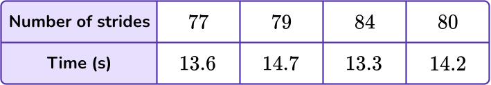
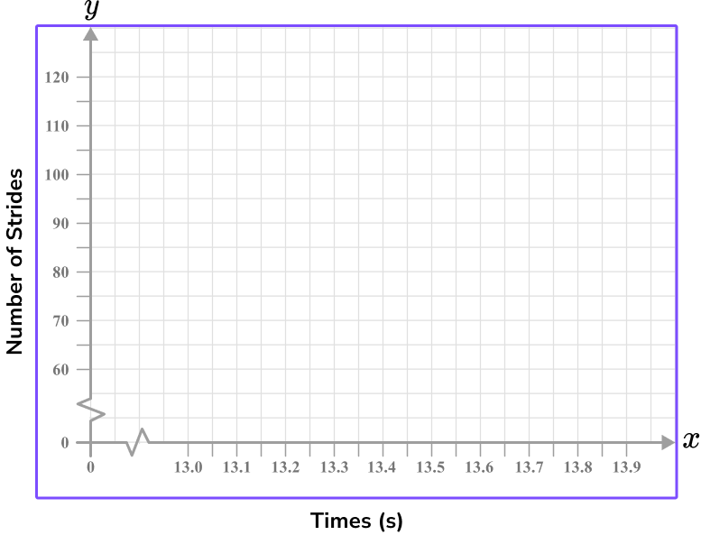


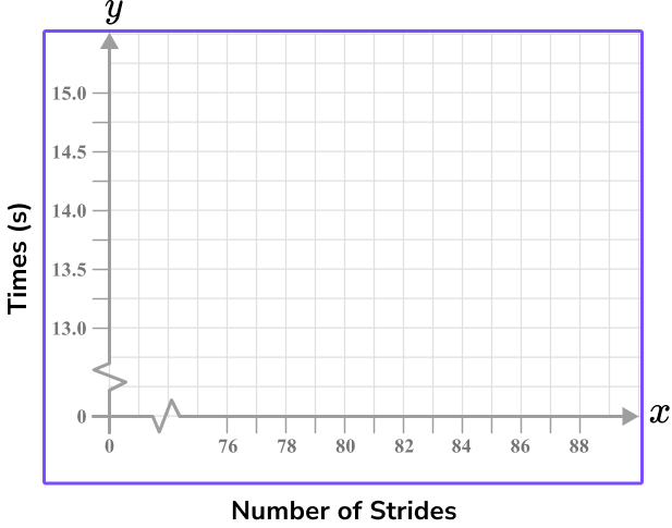
Time should be on the x -axis and so the Number of strides will be on the y -axis.
Each axis can have a break as this is a scatter graph and there is no data for values close to zero.
Each value must appear in the plotting area, and the scales should allow each point to be plotted with a suitable degree of accuracy.
x and y axis FAQs
Yes, being able to recognize the x and y axis and their scales is important when finding the slope of a line or the slope intercept, and it is also useful when graphing a linear equation.
Yes, this page overviews examples from Quadrant 1 only – which is positive numbers, but there are quadrants where negative numbers can be graphed.
The next lessons are
Still stuck?
At Third Space Learning, we specialize in helping teachers and school leaders to provide personalized math support for more of their students through high-quality, online one-on-one math tutoring delivered by subject experts.
Each week, our tutors support thousands of students who are at risk of not meeting their grade-level expectations, and help accelerate their progress and boost their confidence.

Find out how we can help your students achieve success with our math tutoring programs.
[FREE] Common Core Practice Tests (3rd to 8th Grade)
Prepare for math tests in your state with these 3rd Grade to 8th Grade practice assessments for Common Core and state equivalents.
Get your 6 multiple choice practice tests with detailed answers to support test prep, created by US math teachers for US math teachers!