GCSE Tutoring Programme
Our chosen students improved 1.19 of a grade on average - 0.45 more than those who didn't have the tutoring.
In order to access this I need to be confident with:
Factors and multiples Arithmetic Mean, median, mode Range InequalitiesThis topic is relevant for:

Tally Chart
Here we will learn about tally charts, including frequency tables, and drawing tally charts using frequency.
You can also download the following free tally chart resources suitable for those following Edexcel, AQA or OCR exam boards:
What is a tally chart?
A tally chart is a simple way of recording data and counting the amount of something (frequency). To do this we collect the data, sort it into categories and tally the marks, to find the frequencies.
We represent the frequency using the five-bar gate notation.
For example,
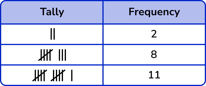
The advantage of using a tally chart is that it can be immediately clear which item(s) occurs the most/least frequently and can be helpful when analysing data.
For example,
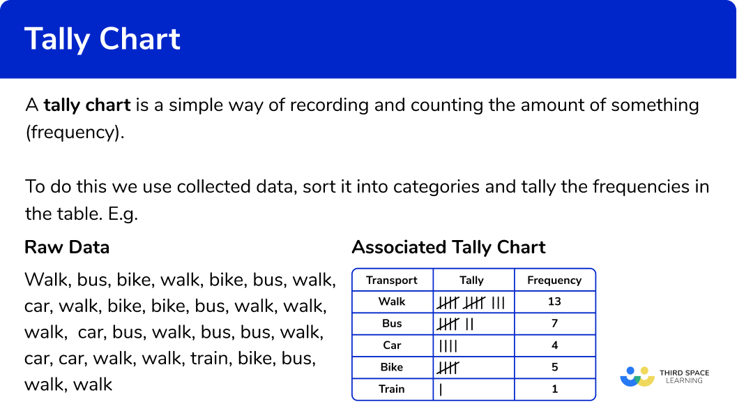
Let’s say we wanted to collect some data on the ways of transport used by students to get to school. We would start collecting data and writing the answers in a list.
The best way to sort this data set is to use tally charts.
The data collection looks like this:
walk, bus, bike, walk, bike, bus, walk, car, walk, bike, bike, bus, walk, walk, walk, car, bus, walk, bus, bus, walk, car, car, walk, walk, train, bike, bus, walk, walk
The tally chart for the same data looks like this:
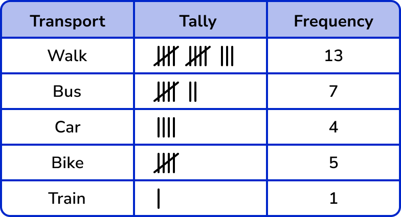
Other graphs/charts (such as bar charts, frequency diagrams, pie charts and pictograms) can be produced from tally charts.
What is a tally chart?
Interpreting tally charts
Tally charts display frequencies of data in a suitable structure which helps us to analyse it more quickly than if we were just given the raw data.
- We can calculate the averages of the data (the mean, median, and mode).
- We can investigate the spread of the data (range, interquartile range).
- We can state probabilities within the data (what is most / least likely).
For example,
Here is a tally chart that shows the favourite subjects of 40 students.
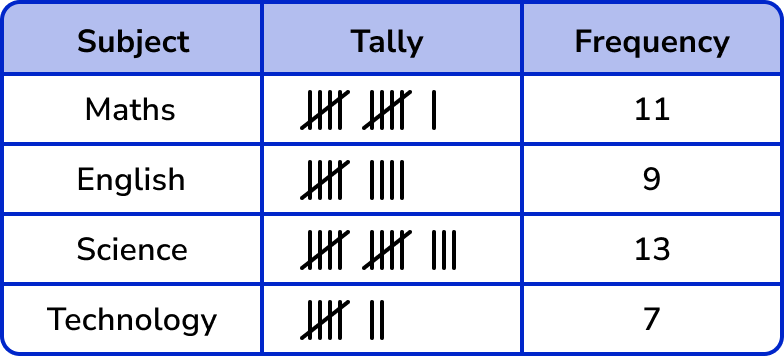
From the data presented in the table above:
- The modal class is Science.
- The probability of picking a student whose favourite subject is English is \frac{9}{40} .
- The probability of someone not choosing Technology as their favourite subject is \frac{33}{40} .
- The least popular subject for this data set is English.
- 32.5\% of students have chosen Science as their favourite subject.
- 2 more students have chosen Maths as their favourite subject, compared to English.
The purpose of collecting data is to find relationships, spot trends, or predict future outcomes from current information. This is called Data Analysis.
How to draw a tally chart
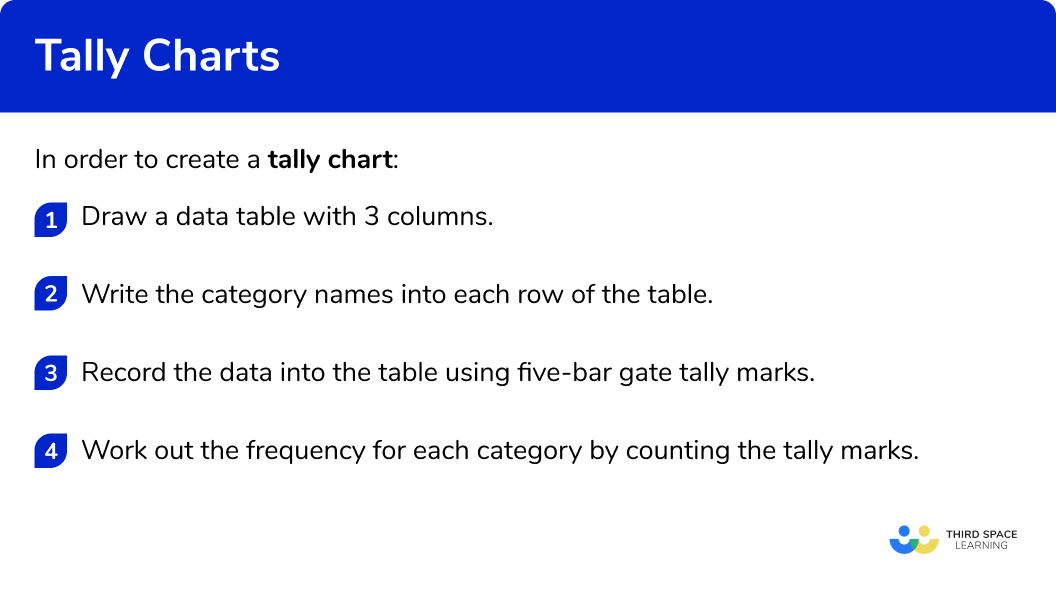
In order to draw a tally chart:
- Draw a data table with \bf{3} columns.
- Write the category names into each row of the table.
- Record the data into the table using five-bar gate tally marks.
- Work out the frequency for each category by counting the tally marks.
Explain how to draw a tally chart
Tally chart worksheet
Get your free tally chart worksheet of 20+ questions and answers. Includes reasoning and applied questions.
DOWNLOAD FREE Tally chart worksheet
Get your free tally chart worksheet of 20+ questions and answers. Includes reasoning and applied questions.
DOWNLOAD FREERelated lessons on representing data
Tally chart is part of our series of lessons to support revision on representing data. You may find it helpful to start with the main representing data lesson for a summary of what to expect, or use the step by step guides below for further detail on individual topics. Other lessons in this series include:
Tally chart examples
Example 1: journey to school
Below is a list of the methods of transport used to get to school by class 9 A.
bus, bus, bus, walk, bus, walk, bike, bus, walk, bus, car, car, walk, walk, walk, walk, bus, bus, bike, bus, car, walk, bus, walk, bus, bike, walk, bike, bike, car, walk, walk, car, walk, bike, bus, walk, walk, car, car.
Draw a tally chart to display this information.
- Draw a data table with \bf{3} columns.
Here we are looking at modes of transport, so the title of the first column is ‘Transport’, then we have our ‘Tally’ column, and then the ‘Frequency’ column:
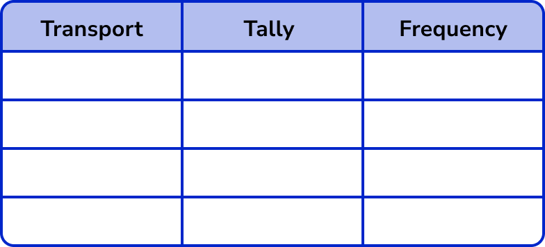
2Write the category names into each row of the table.
The data can be divided into four categories: walk, bus, car and bike.
These are the labels for each row.
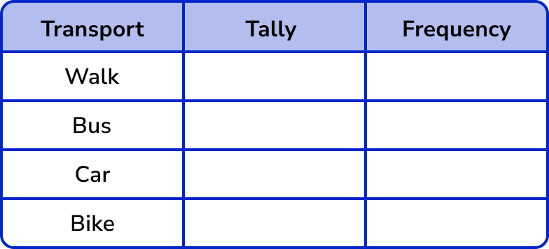
3Record the data into the table using five-bar gate tally marks.
Tally each value in the data one at a time.
Tip: put a small mark next to the item of data once you have written it into the tally. If you cross it out, you may not be able to recover the word if you have made a mistake.
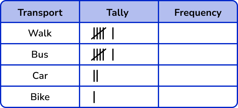
If we tally the first 15 items of data in order, the tally chart looks like this:
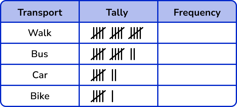
Continuing the tally chart for the rest of the data, we get:
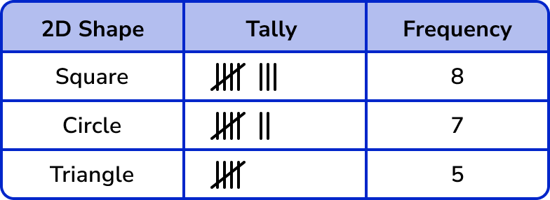
4Work out the frequency for each category by counting the tally marks.
Remember that a five-bar gate represents 5 tally marks.
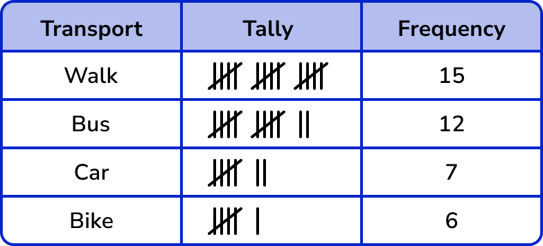
The tally makes it easy to see the most popular transport (walking) and the least popular transport (bike).
By adding the frequency column we can also find the total frequency (40) .
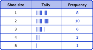
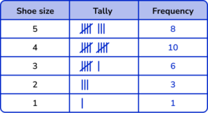
Example 2: shoe size
A children’s shoe shop took a survey of their customers shoe size over one day.
Here is a list of their responses.
Draw a frequency table (tally chart) to show the results.
Here we are looking at shoe sizes and so the title for the first column is ‘Shoe size’. We then have the ‘Tally’ column and the ‘Frequency’ column.
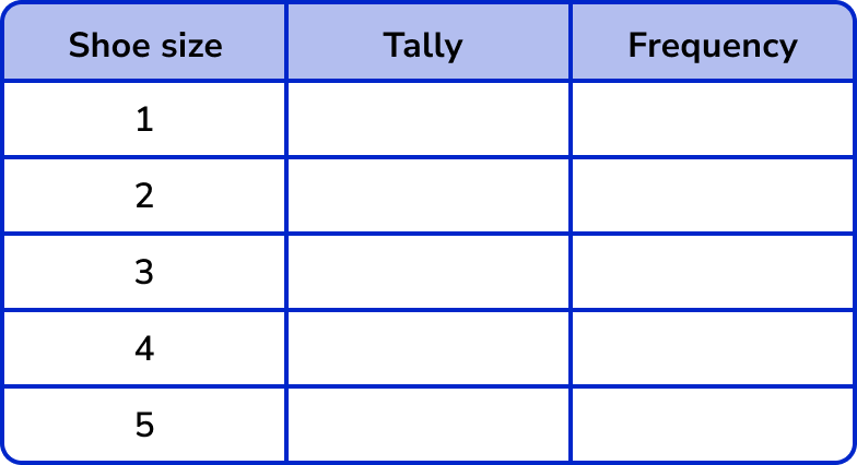
Tally each value in the data one at a time.


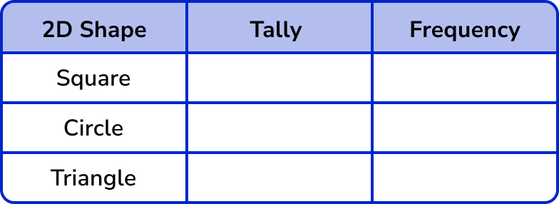
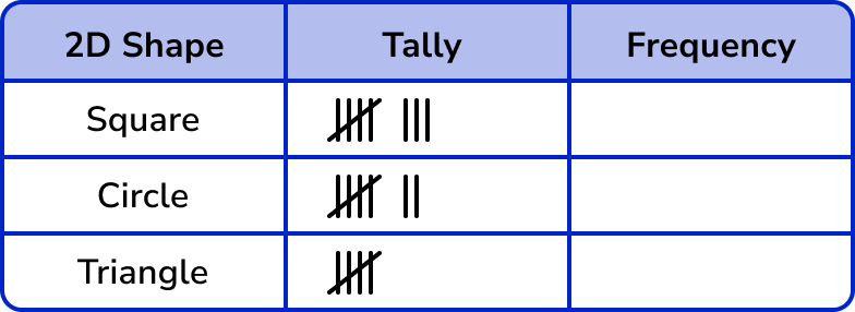
Example 3: 2 D shapes
Draw a tally chart to show the frequency of these shapes.

As we are looking at 2D shapes, the first column title is ‘ 2D shape’. The next two column titles are ‘Tally’ and ‘Frequency’.
Here we have three categories, Square, Circle and Triangle. These can be listed in any order in the table:
Example 4: grouped data
Here are the times (in t seconds) recorded by 24 students who ran 100m.
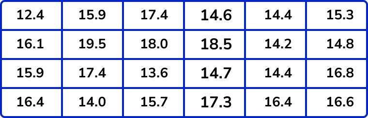
Complete the following tally chart using the data above.
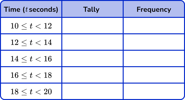
We already have the framework for the tally chart, so we can move straight on to Step 3 .
Tally each value in the data one at a time.
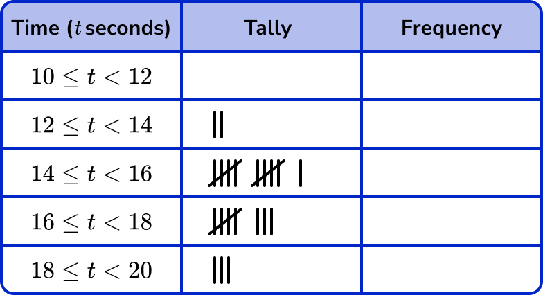

Note: The disadvantage of grouping data is that we lose the precision of each data value and so we can only estimate the mean, the median, and the range from this tally chart.
Example 5: grouped data
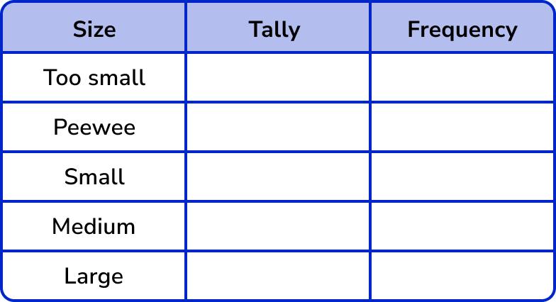
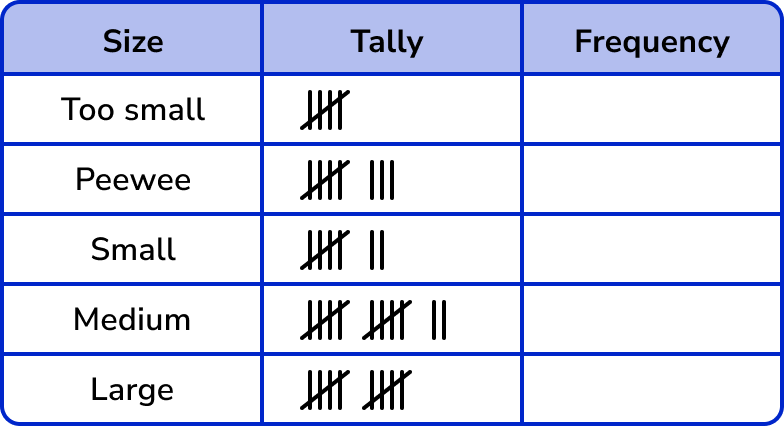
Eggs are sold in boxes of 6 of the following sizes: Peewee, Small, Medium and Large. The minimum mass of each size egg is given in the table below.
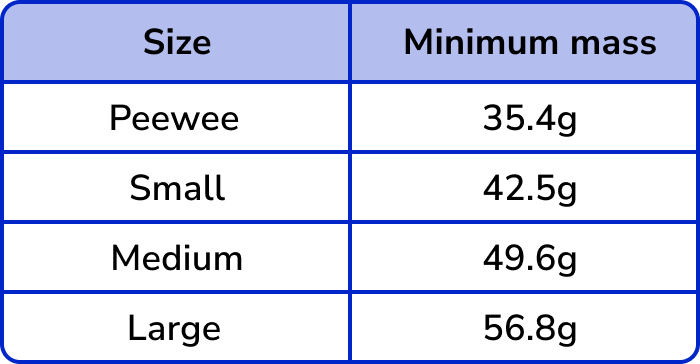
A smallholding produces 42 eggs in one day. The mass of each egg is given below to the nearest gram. By drawing a tally chart, determine how many whole boxes of eggs can be sold on that day?
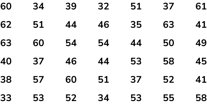
Here, the first column will be the size of the egg ‘Size’, then followed by the two columns ‘Tally’ and ‘Frequency’.
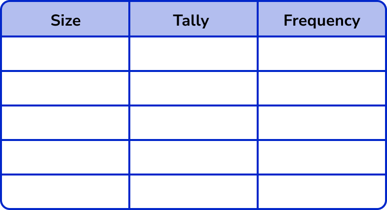
There are four sizes but we also need to include the category for eggs that have a mass less than 35.4g as these would be too light. Let’s call this category ‘Too small’.
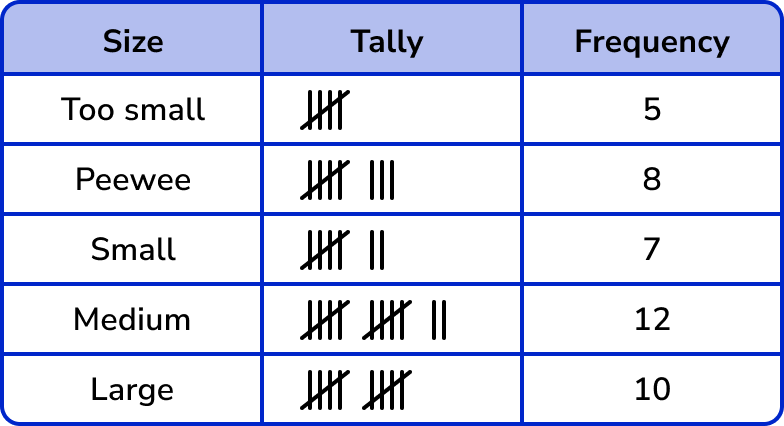
The question was “How many whole boxes of eggs can be sold on that day?”
Each whole box of eggs contains 6 eggs and so they can sell
8 \div 6=1.\dot{3}=1 Peewee box
7 \div 6=1.1\dot{6}=1 Small box
12 \div 6=2 Medium boxes
And 10 \div 6=1.\dot{6}=1 Large box.
Example 6: two-way tally chart
A research group wanted to find out how many items in a list people could remember. They split the participants into Males and Females, and whether they could remember more than 12 items on the list. The results are shown below.
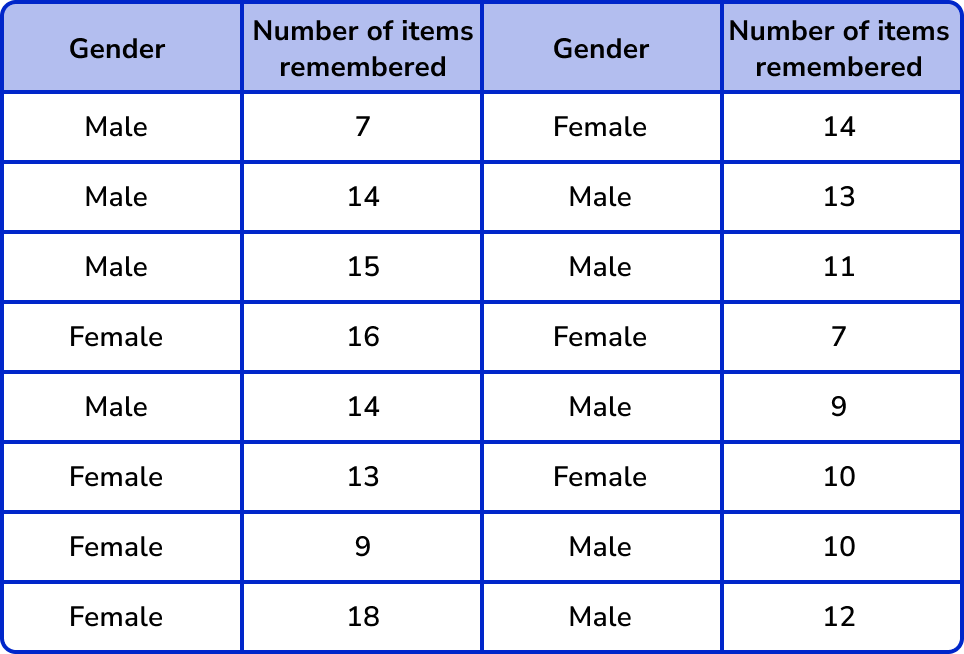
Complete the following two way tally table for the set of data above.
We already have the framework for the tally chart, so we can move straight on to Step 3 .
Tally each value in the data one at a time.
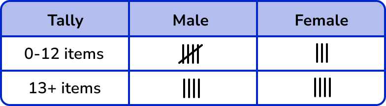
As this is a two-way tally table, a frequency table would usually be drawn separately and just contain the frequencies from the previous table.
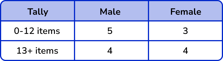
Note: The advantage of two-way tally tables is that they give us an insight into two pieces of data (here, gender and the number of items remembered). The disadvantage of two-way tally tables is that the frequency table is drawn separately, otherwise they can look very messy.
Common misconceptions
- Number of categories is not the same as the total frequency
Be careful when asked for the total number. This means the total frequency NOT the number of categories.
For example,
In example 1, there are 4 different transport types – this is not the total frequency. The total frequency is 15+12+7+6=40.
- Incorrectly grouping the tallys
A fifth tally line should be drawn through the previous four tallys to group them together (a five bar gate).
For example,
To represent 7 :
➜ Correct: ||||
➜ Incorrect: |||||||
Practice tally chart questions
1. A children’s shoe shop took a survey of their customers shoe size over one day. Here is a list of their responses.

Select the correct tally chart that represents the information above.

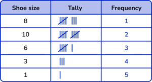
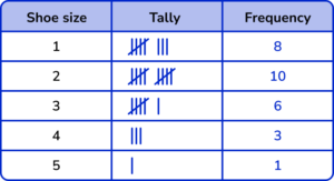

The shoe sizes should be in ascending order.
Five-bar gate notation should be used.
All the frequencies should be correct.

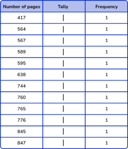
2. The number of pages in 12 books were recorded by a librarian.
Which grouped tally chart correctly represents the following data:

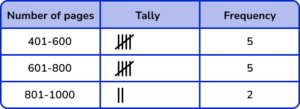
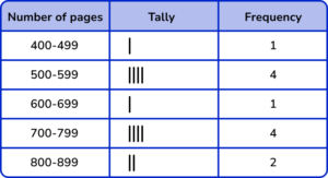
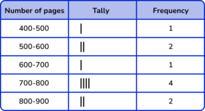
The group / class intervals should be in ascending order and not overlapping.
Five-bar gate notation should be used.
All the frequencies should be correct.
3. 20 cards were picked at random from a deck. By grouping them into their suit, draw a tally chart of the results.

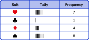
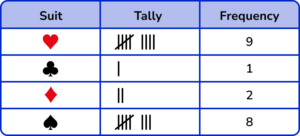
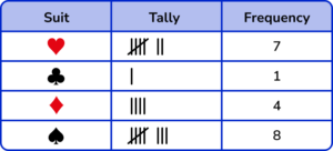
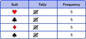
The number of tally marks for each suit should be correct.
Five-bar gate notation should be used.
All the frequencies should match the number of tally marks.
4. A raffle draws tickets from a bowl. A winning ticket ends in a 5 or a 0. Below is a list of the first 16 tickets drawn. Draw a tally chart to show the number of winning tickets, to the number of losing tickets.
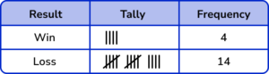
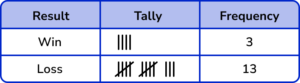
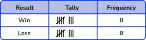
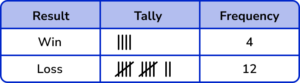
The number of tally marks for each suit should be correct.
Five-bar gate notation should be used.
All the frequencies should match the number of tally marks.
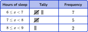
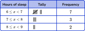
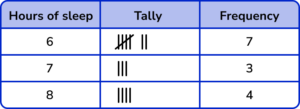
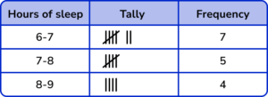
5. Over a fortnight, Dora recorded the number of hours of sleep she had using a smart watch. Her results are shown below.
![]()
Which tally chart is correct for this set of data?
The number of tally marks for each suit should be correct.
Five-bar gate notation should be used.
All the frequencies should match the number of tally marks.
6. A car records its miles per gallon (mpg) every minute for a 15 minute journey. Below are the results.
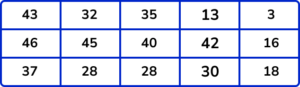
Which tally chart is the most accurate for this set of data?
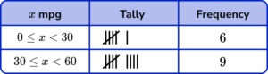
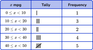
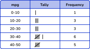

The number of tally marks for each suit should be correct.
Five-bar gate notation should be used.
All the frequencies should match the number of tally marks.
Tally chart GCSE questions
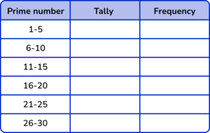
1. 25 students are asked to write down any prime number between 1 and 30. Below are their answers.
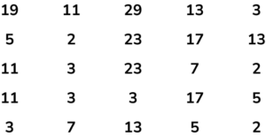
(a) Complete the grouped tally chart below to show the frequency of prime numbers within each category.
(b) Which is the modal class?
(c) Which class would you expect to see the highest frequency of prime numbers. Explain why.
(5 marks)
(a)
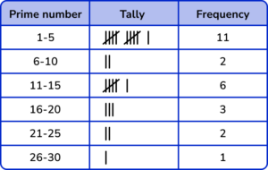
(2)
(b)
1-5
(1)
(c)
1-5
(1)
The class contains three prime numbers (2,3,5) whereas the other groups contain 2 or 1 prime number so it is more likely that this class will have the highest frequency.
(1)
2. This tally chart shows information about people’s favourite colour.
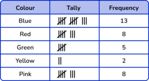
(a) Write down one thing that is wrong with the tally chart.
(b) Which is the modal class?
(c) Why can we not calculate the median for this data?
(3 marks)
(a) The frequency for Red is 7
(1)
(b) Blue
(1)
(c) The data cannot be ordered
(1)
3. The tally chart shows some information about the number of ice creams sold by a shop last week.
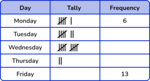
(a) Complete the tally chart.
(b) Which day were the fewest number of ice creams sold?
(3 marks)
(a)
Friday tally: |||| |||| |||
Missing frequencies: 7, 10, 2
(1)
(b) Thursday
(1)
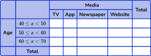
4. A journalist is collecting information about how different age groups keep informed with the news. The raw data from 14 people is shown below.
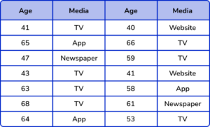
(a) Complete the two way tally chart to represent the data from the table above.
(b) Which type of media is the mode?
(c) Describe a limitation of using grouped data for this study?
(d) What is the probability of picking a person who is between 60 and 70 years old who uses the App to keep up to date with the news? Write your answer as a fraction in its simplest form.
(6 marks)
(a)
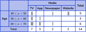
(2)
(b)
TV
(1)
(c)
Using grouped data loses the accuracy of the raw data.
(1)
(d)
\frac{2}{14}
(1)
\frac{1}{7}
(1)
Learning checklist
You have now learned how to:
The next lessons are
Still stuck?
Prepare your KS4 students for maths GCSEs success with Third Space Learning. Weekly online one to one GCSE maths revision lessons delivered by expert maths tutors.
Find out more about our GCSE maths tuition programme.