GCSE Tutoring Programme
Our chosen students improved 1.19 of a grade on average - 0.45 more than those who didn't have the tutoring.
In order to access this I need to be confident with:
Frequency table Angles Arithmetic Decimals Negative numbersThis topic is relevant for:

Pie Chart
Here we will learn about pie charts including what a pie chart is and how to draw them. We will also look at interpreting pie charts and how to use them.
You can also download the following free pie chart resources all suitable for those following Edexcel, AQA or OCR exam boards:
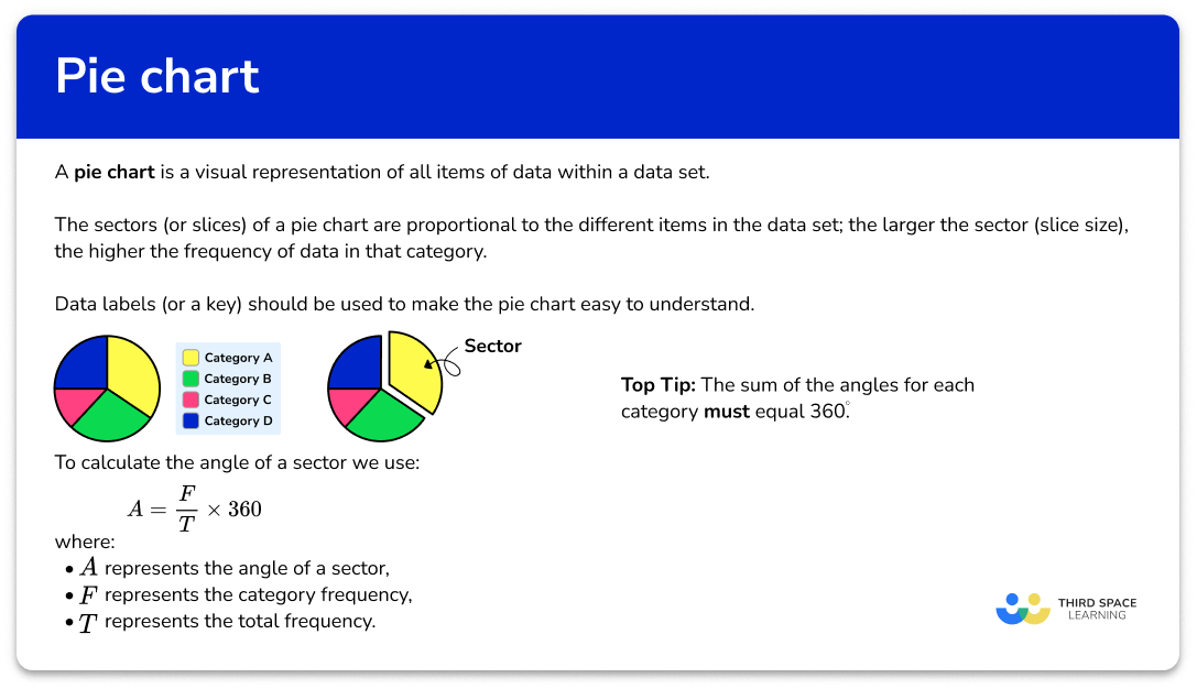
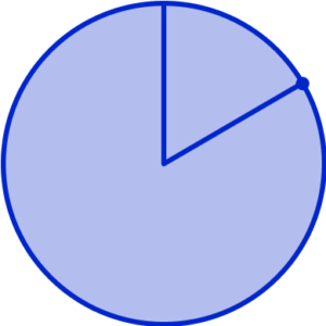
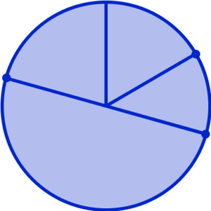
What is a pie chart?
A pie chart is one of several chart types that provide a visual representation of all items of data within a data set. The sectors (or slices) of a pie chart are proportional to the different items in the data set; the larger the sector (slice size), the higher the frequency of data in that category.
We can use pie charts to give a sense of overall proportions.
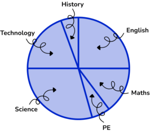
Pie charts (sometimes called circle charts) are used to represent categorical data for example: colours, makes of cars, different sports.
A benefit of using a pie chart over other types of graph is that the data for each category is easily comparable. A disadvantage is that the frequency for each sector is not usually stated and so they would need to be calculated (we will look at this later).
When constructing a pie chart, data labels (or a key) should be used to make the pie chart easy to understand.

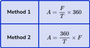
To calculate the angle size of a sector within a pie chart we can use one of two methods.
What is a pie chart?
Method 1
For this method we are going to work out the fraction of the total frequency that each sector represents and then multiply this by 360^{\circ} . As the total number of degrees in a full turn is 360^{\circ} , the angle for each sector is a fraction of 360^{\circ}.
\text{Angle for the sector }=\frac{\text{category frequency}}{\text{total frequency}}\times{360}
E.g.
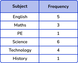
20 people were asked what their favourite genre of TV is. 5 people said Comedy.
The data is represented as a pie chart. Calculate the angle of the sector for Comedy.
As 5 out of 20 people said Comedy, we find \frac{5}{20} of 360^{\circ}.
\frac{5}{20}\times{360}^{\circ}=(360\div{20})\times{5}=90^{\circ}.
So the angle for the sector Comedy would be 90^{\circ}.
This is the same as calculating the fraction of an amount.
Step-by-step guide: Fractions of amounts
Method 2
Alternatively, we can find the size of the angle that represents one item of data by dividing 360^{\circ} by the total frequency. Once we know this angle we then multiply it by the frequency to get the angle for the sector.
\text{Angle for the sector }=\frac{360}{\text{total frequency}}\times{\text{category frequency}}
E.g.
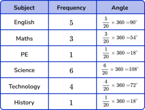
20 people were asked what their favourite genre of TV is. 4 people said Documentary.
The data is represented as a pie chart. Calculate the angle of the sector for Documentary.
The size of the angle for each item of data is equal to 360 \div 20=18^{\circ}.
As 4 people said Documentary, 18 \times 4 = 72^{\circ}.
So the angle for the sector Documentary would be 72^{\circ}.
Top tip: the sum of the angles for each category must equal 360^{\circ}.
Using A to represent the angle of a sector, T to represent the total frequency, and F to represent the category frequency, we have the two permutations of the formula.
We can make 3D pie chart in a similar way.
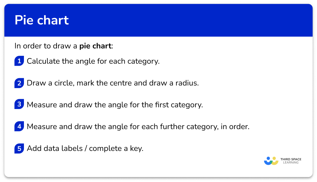
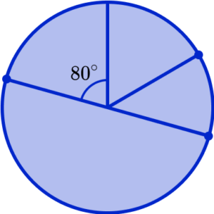
How to draw a pie chart
In order to draw a pie chart:
- Calculate the angle for each category.
- Draw a circle, mark the centre and draw a radius.
- Measure and draw the angle for the first category.
- Measure and draw the angle for each further category, in order.
- Add data labels / complete a key.
Explain how to draw a pie chart
Pie chart worksheet
Get your free pie chart worksheet of 20+ questions and answers. Includes reasoning and applied questions.
DOWNLOAD FREE Pie chart worksheet
Get your free pie chart worksheet of 20+ questions and answers. Includes reasoning and applied questions.
DOWNLOAD FREERelated lessons on representing data
Pie chart is part of our series of lessons to support revision on representing data. You may find it helpful to start with the main representing data lesson for a summary of what to expect, or use the step by step guides below for further detail on individual topics. Other lessons in this series include:
Pie chart examples
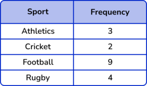
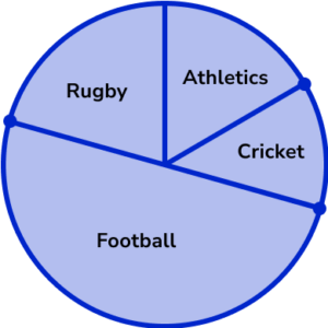
Example 1: four category frequency table
Draw a pie chart for this frequency table.
- Calculate the angle for each category.
To calculate the total frequency, we add up all of the frequency for each category. The total frequency is 3+2+9+4=18.
Note: the total frequency is usually a factor of 360. It is unlikely that you will be calculating with an angle that has a non-terminating decimal.
Using the alternative method, we have
A=\frac{360}{T}\times{F}
For Athletics, we have
\begin{aligned} A&=\frac{360}{T}\times{F}\\\\ &=\frac{360}{18}\times{3}\\\\ &=60^{\circ} \end{aligned}
Using a table, we can continue this method for each category.
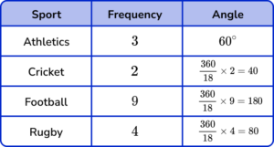
A quick check of the angle sum, we have 60+40+180+80=360^{\circ} and so we can assume that each angle is correct.
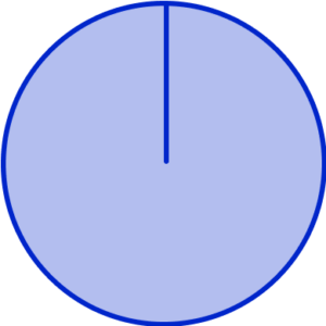
2Draw a circle, mark the centre and draw a radius.
Note: usually you will be given the outline of a pie chart.
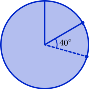
3Measure and draw the angle for the first category.
You will need to use a protractor to draw each angle accurately. Place the centre of the protractor on the centre of the circle with the 0line on the drawn radius.
Measure the angle for the first category (here 60^{\circ} ) and mark the outside of the circle with a small dot or cross.
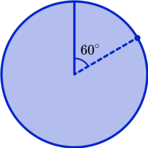
Remove the protractor and join the centre to the mark on the outside of the circle.
4Measure and draw the angle for each further category, in order.
You must now realign the protractor at the centre of the circle but with the 0^{\circ} line on top of the new line you have just drawn. This is because we are now drawing the angle for the second category and so this angle is measured from the end of the previous category.
Measuring the angle for the next category ( 40^{\circ} ) we have
Removing the protractor, and joining the centre of the pie chart to the next mark on the outside of the circle, we have
Repeating this process for the next category, Football, we need to measure and draw an angle of 180^{\circ} .
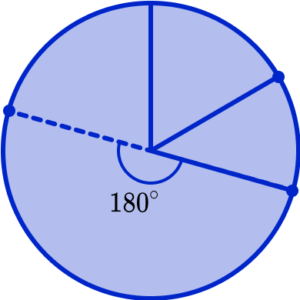
which becomes
The final category, Rugby, should measure 80^{\circ} . By using your protractor, you should be able to measure the angle of the final sector, without drawing any more lines. This is because the sector should meet the radius that was originally drawn.
Important note: if the final sector does not measure the angle required, you will need to measure all of the other angles you have drawn to check your accuracy. This is the reason why we check the angles add up to 360^{\circ} before drawing the pie chart, otherwise it is very difficult to rectify any mistakes.
There is a very small tolerance zone for each angle in a pie chart, so make sure you draw it correctly the first time!
5Add data labels / complete a key.
Now that the pie chart has been drawn, we can label each sector with the category title.
Example 2: large frequencies
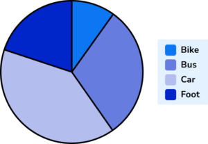
100 people were asked about how they travel to work. Draw a pie chart to represent the data in the frequency table.
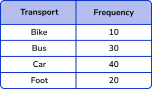
The total frequency is 100. Using the formula A=\frac{360}{T}\times{F}, we have the angles written in the table.
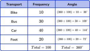

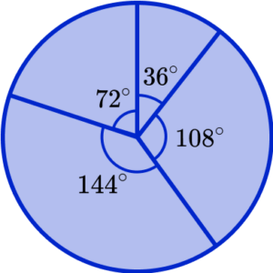
Here, we will use a key to label the pie chart.
Example 3: drawing a pie chart
20 students were asked about which subject they had before lunch. Draw a pie chart to show the data in the frequency table.
Using the formula A=\frac{F}{T}\times{360}, the angles in the table are

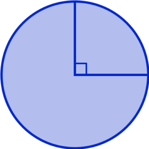
As the first sector has an angle of 90^{\circ} , we highlight this as a right angle using a square angle notation.
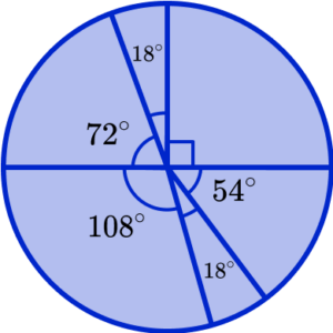
Here, we have labelled each section on the outside of the pie chart (this can be useful if the label is too large for the size of the sector).
Interpreting a pie chart
You may need to calculate the frequency of a category given the total frequency.
This can be done by rearranging the formula that calculates the angle of a sector, so that the frequency ( F ) is the subject.
\begin{aligned} A&=\frac{F}{T}\times{360}\\\\ A\times{T}&=F\times{360}\\\\ \frac{A\times{T}}{360}&=F\\\\ F&=\frac{AT}{360} \end{aligned}
Therefore, to calculate the missing frequency, we use the formula
F=\frac{AT}{360}
Note: it is not essential to remember this permutation as you can simply substitute values into a previous version of the formula, and solve.
How to interpret a pie chart
In order to interpret a pie chart:
- State or measure the necessary angle.
- Substitute into the formula.
- Solve to find the frequency.
Interpreting pie chart examples
Example 4: calculating the frequency of one sector
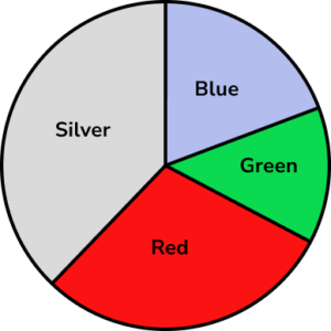
The pie chart shows the colour of 30 cars in a car park. Calculate the number of Green cars in the car park.
Here, we need to measure the angle for the Green sector. Remember, you will need to line up your zero-line on your protractor with the line between the Blue and Green sectors to measure the angle for Green only.
The Green slice of the pie chart is 48^{\circ}.
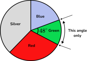
We know that the angle of the sector A= 48^{\circ} , and the total frequency T=30 (stated in the question).
Using the formula F=\frac{AT}{360} , we have F=\frac{48\times{30}}{360}
Solving the equation for F , we have
\begin{aligned} F&=\frac{48\times{30}}{360}\\\\ &=\frac{1440}{360}\\\\ &=4 \end{aligned}
The frequency of Green cars is 4.
Example 5: interpreting a pie chart using the key
The pie chart shows how £400 of income is spent. Calculate the amount of money not spent on clothes.
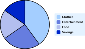
As we want to calculate the amount of money not spent on clothes, we can either measure the angle for clothes and subtract from 360^{\circ} , or measure the angle of the three remaining sectors, and add them together. We will calculate the angle for clothes, and subtract this from 360^{\circ} .
The Clothes slice of the pie chart measures 135^{\circ}.
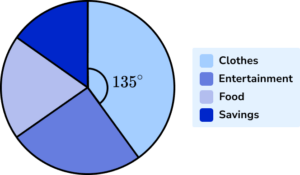
Subtracting 135^{\circ} from 360^{\circ} , we have the angle for the pie chart that represents the three sectors:
Entertainment, Food, and Savings to be: \ 360-135=225^{\circ}.
We know that the angle of the sector required is 225^{\circ} , and the Total frequency (or total amount of money) is £400 .
Using the formula F=\frac{AT}{360} , we can calculate the frequency (F).
F=\frac{225\times400}{360}
Solving the equation for F , we have
\begin{aligned} F&=\frac{225\times400}{360}\\\\ &=\frac{90000}{360}\\\\ &=250 \end{aligned}
The amount of money not spent on clothes is £250.
Note: we could have calculated the amount of money spent on clothes ( £150 ), and subtracted this from the £400 total to get £250.
Example 6: interpreting a pie chart given the frequency of another sector
The pie chart shows student destinations after their Year 11 exams. Given that 25 students went to College, calculate the number of students who went into Employment.
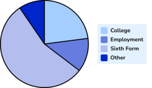
Here, we need to measure the angle for College first, so that we can calculate the total frequency.
The angle for College is 75^{\circ}.
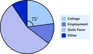
We now need to calculate the total frequency first, so that we can use this to find the frequency of students who went into Employment after Year 11 .
As we know 25 students went to College, and the angle of the sector A=75^{\circ} , we can use the same formula to calculate the total frequency (T).
\begin{aligned} 75&=\frac{360}{T}\times{25}\\\\ 75\div{25}&=\frac{360}{T}\\\\ 3&=\frac{360}{T}\\\\ 3T&=360\\\\ T&=360\div{3}=120 \end{aligned}
The total frequency T=120 students.
Now we know the total frequency of students, we can calculate the number of students who went into Employment given the angle of the sector for Employment.
The angle of the sector for Employment is 45^{\circ}.
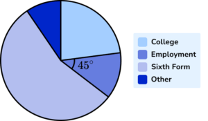
As the total frequency T=120 students and the angle of the sector for Employment is A=45^{\circ} we can substitute these values into the formula to calculate the category frequency (F).
\begin{aligned}
F&=\frac{AT}{360}\\\\
F&=\frac{45\times{120}}{360}
\end{aligned}
\begin{aligned} F&=\frac{5400}{360}\\\\ F&=15 \end{aligned}
The number of students who went into Employment after their Year 11 exams was 15.
Common misconceptions
- Total of the angles is \bf{360^{\circ}}
The total of the angles in a pie chart is 360^{\circ} . This is a good check. However, if you are drawing a pie chart using real life data, the total might not be quite 360^{\circ} as we may need to round values, which loses the accuracy of the data.
- Be as accurate as you can
As you measure and draw angles try to be as accurate as you can. The last slice of the pie chart should be the correct size.
- The angle of the sector is equal to \bf{360^{\circ}} degrees, divided by the frequency
The angle of each sector is proportional to the frequency of that category. This is misinterpreted to mean that you divide 360^{\circ} by the frequency of each group to get the angle. Instead, we need to find the fraction of the frequency out of the total frequency, of 360^{\circ}.
- The frequency is multiplied by the total frequency to get the angle of the sector
Similarly to the previous misconception, the angle of the sector is incorrectly calculated to be the frequency, multiplied by the total frequency. Instead, we need to find the fraction of the frequency out of the total frequency, of 360^{\circ}.
- Pie charts and doughnut charts (donut charts)
Pie charts and donut charts are very similar. A pie chart displaces individual categories are slices of the circle, whereas donut graphs have a hole in the centre and displays the categories as arcs.
Practice pie chart questions
1. Calculate the size of the angle for the sector Fizzy pop.
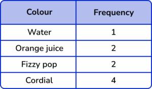


Divide 360^{\circ} by the total frequency (9) to calculate the angle per item of data.
360^{\circ} \div 9=40^{\circ}
Multiplying this by the frequency for Fizzy pop (2) , we get
2\times 40^{\circ} \div 9=80^{\circ}
2. Calculate the size of the angle in the pie chart that represents the sector Yellow.
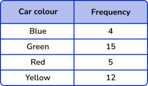
The total frequency is 4+15+5+12=36.
The fraction of cars that are Yellow is \frac{36}{360}=\frac{1}{10}
Multiplying 360^{\circ} by \frac{1}{10} we get the angle for the sector.
360\times\frac{1}{10}=36^{\circ}.
3. A school is researching the number of hours of sporting activity the students participate in per week in hours, h. The results are shown in the table below. Calculate the size of the angle for the sector 1<h\leq{2}
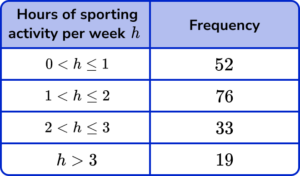
The total frequency T of students is 52+76+33+19=180.
The frequency F of students who are in the group 1<h\leq{2} is 76.
Using the formula A=\frac{F}{T}\times{360}, the angle for the sector A is therefore
A=\frac{76}{180}\times{360}=152^{\circ}.
4. 200 people were asked about what genre of film they last saw at the cinema. How many people saw a Sci-fi film?
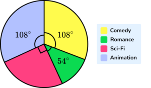
The fraction of the pie chart which represents Sci-fi is
\frac{90}{360}=\frac{1}{4}
\frac{1}{4}\times{200}=50
5. 120 postgraduate students who study a STEM course were asked about their specialism. The results are shown in the pie chart below.
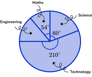
How many students specialised in Engineering?
The remaining angle for Engineering is
360-(210+60+54)=36^\circ
As T=120 , and A=36 , substituting these into the formula F=\frac{AT}{360} , we get
\begin{aligned} F&=\frac{36\times{120}}{360}\\\\ F&=12 \end{aligned}
6. An estate agent was carrying out research on the types of properties that they have sold in the past 18 months. The pie chart below shows the results.
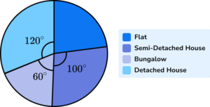
Given that 240 flats were sold, how many bungalows were sold?
The missing angle for Flats is
360-(100+60+120)=80^\circ .
Using the formula A=\frac{F}{T}\times{360} , the total frequency T is
\begin{aligned} 80&=\frac{240}{T}\times{360}\\\\ 80\times{T}&=240\times{360}\\\\ 80T&=86400\\\\ T&=86400\div{80}\\\\ T&=1080 \end{aligned}
Now we can calculate the frequency of Bungalows sold by using the rearranged formula F=\frac{AT}{360} with the new information T=1080 and A=60^{\circ}.
\begin{aligned} F&=\frac{60\times{1080}}{360}\\\\ F&=180 \end{aligned}
Pie chart GCSE questions
1. In a pie chart, one sector represents \frac{1}{6} of the data.
What is the angle of that sector?
| A | B | C | D |
| 60° | 36° | 12° | 90° |
(1 mark)
(1)
2. (a) Abi records the scores of 120 goals.
She starts to draw a pie chart of the results.
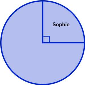
How many goals did Sophie score?
(b) The table shows the other players who scored goals.
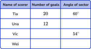
Complete the table.
(c) Complete the pie chart using the table from part b).
(7 marks)
(a)
30 goals
(1)
(b)
Una =36^\circ
(1)
Vic = 18 goals
(1)
Wei = 40 goals and 120^{\circ}
(1)
(c)
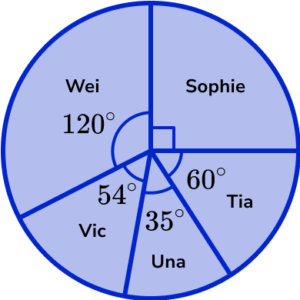
For one sector correctly drawn and labelled
(1)
For two sectors correctly drawn and labelled
(1)
For all sectors correctly drawn and labelled
(1)
3. The pie chart shows information about workers in an office.
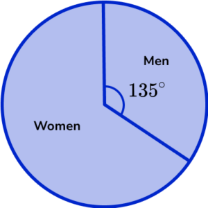
There are 20 more women than men.
Find the total number of workers in the office.
(4 marks)
(1)
225^{\circ}-135^{\circ}=90^{\circ}
(1)
\frac{360}{90}\times{20}
(1)
= 80 workers in total
(1)
Learning checklist
You have now learned how to:
The next lessons are
Still stuck?
Prepare your KS4 students for maths GCSEs success with Third Space Learning. Weekly online one to one GCSE maths revision lessons delivered by expert maths tutors.

Find out more about our GCSE maths tuition programme.