GCSE Tutoring Programme
Our chosen students improved 1.19 of a grade on average - 0.45 more than those who didn't have the tutoring.
This topic is relevant for:

Scatter Graphs
Here we will learn about scatter graphs, including how to plot scatter graphs, describe correlation, draw an estimated line of best fit and interpolate and extrapolate data.
You can also download the following free scatter graphs resources suitable for those following Edexcel, AQA or OCR exam boards:
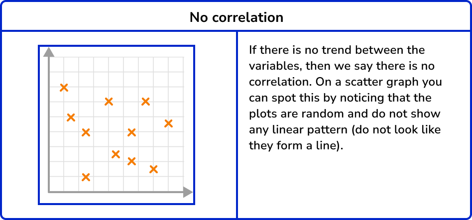
What are scatter graphs?
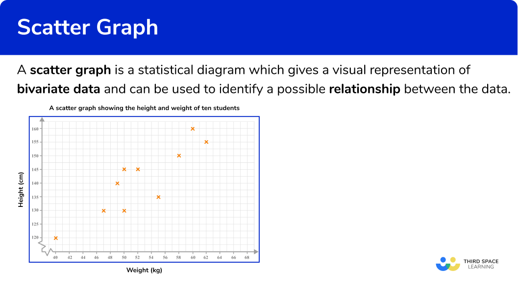
Scatter graphs are a statistical diagram which gives a visual representation of bivariate data (two variables) and can be used to identify a possible relationship between the data. A scatter graph can also be referred to as a scatter diagram or scatter plot.
E.g.
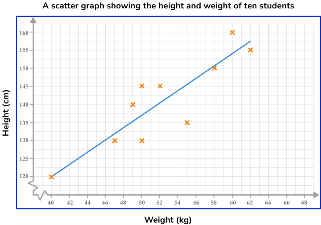
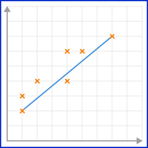
Here is a set of bivariate data showing the height and weight of ten students and the corresponding scatter graph.
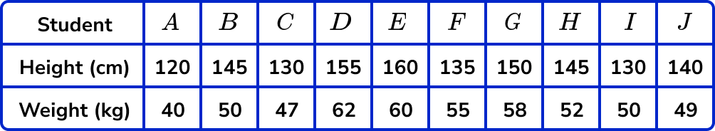
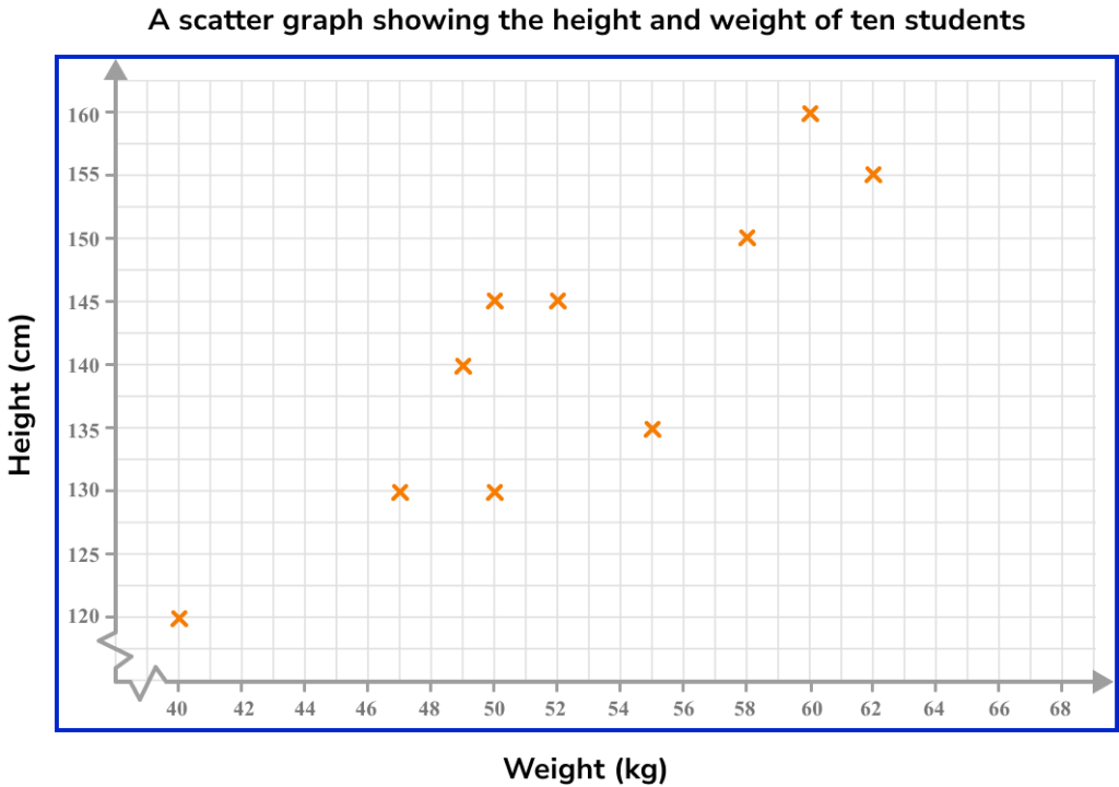
The graph helps us to see if there is a relationship between height and weight. For this data the relationship can be described as the taller a student is, the heavier a student is and vice versa.
If there is a relationship for a set of bivariate data, it is referred to as a correlation. This graph shows a positive correlation.
What are scatter graphs?
Scatter diagrams and outliers
An outlier is a piece of data which does not fit with the rest of the data set. It can be recognised as a point by itself.
For example, here is a scatter diagram with an outlier.
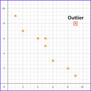
Outliers can occur for different reasons so it is important to look at the context of the graph to determine possible reasons for them.
Scatter diagram and correlation
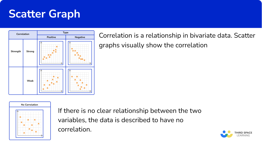
Correlation is a relationship in bivariate data. Scatter graphs visually show the correlation between two variables.
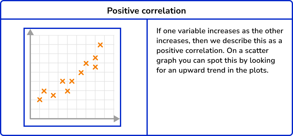
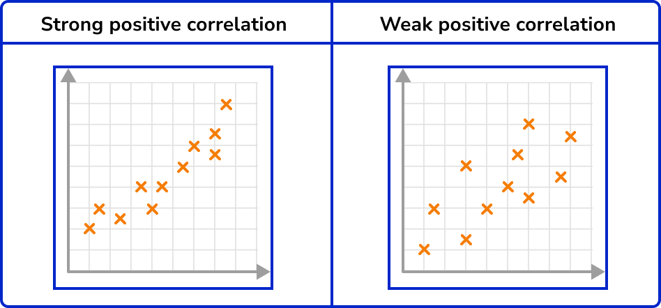
Correlation can vary in strength. Sometimes there is a strong relationship between data and other times the relationship is weak. You can see this visually on a scatter graph by observing how close the plots are together in forming a line.
What is correlation?
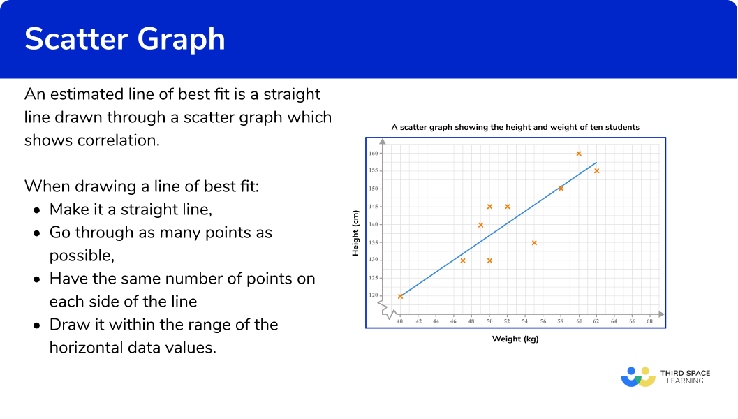
The line of best fit
A line of best fit is a straight line drawn through a scatter graph which shows correlation. It is referred to as an estimated line of best fit because it is drawn by hand following some guidelines. There is a small range of acceptable answers.
The aim is to draw a straight line in the direction of the correlation shown, with points distributed either side of the line as equally as possible along its length. Your line may also pass directly through a number of points.
A line of best fit can also be referred to as a trend line.
What is line of best fit?
Interpolation
An estimated line of best fit can be used to estimate the value of one variable given a value of the other within the range of the highest and lowest data values. This is called interpolation.
E.g.
Here, the line of best fit has been used to estimate the height of a student given that their weight is 56kg.
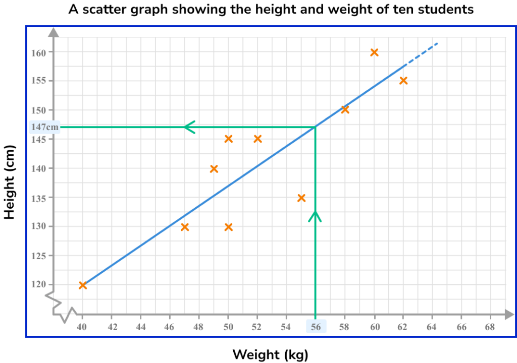
This line of best fit estimates that someone weighing 56kg will be approximately 147cm tall.
If there is a strong correlation, then the line of best fit can provide relatively reliable estimates within the data set. If there is a weak correlation, then estimates will be less reliable.
Extrapolation
Here the line of best fit has been extended so that it stretches beyond the data set (it is no longer surrounded by plotted points). If this section of the line is used to estimate the value of a variable given a value of the other, then this is known as extrapolation.
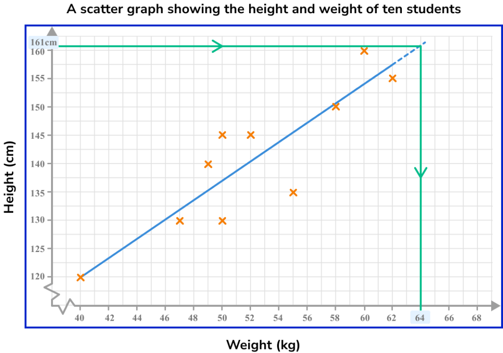
This line of best fit estimates that someone who is 161cm tall will weigh approximately 64kg. This is extrapolation and therefore this estimate comes with potential problems.
It is unknown whether the data will continue with the same trend beyond the recorded values. Therefore, extrapolated values should be treated with caution and are generally viewed as unreliable estimates.
How to plot scatter graphs
In order to plot scatter graphs:
- Identify that you have a set of bivariate data.
- Draw suitable axes and label them.
- Plot each pair of coordinates.
Explain how to plot scatter graphs
Scatter graphs worksheet
Get your free scatter graphs worksheet of 20+ questions and answers. Includes reasoning and applied questions.
DOWNLOAD FREE Scatter graphs worksheet
Get your free scatter graphs worksheet of 20+ questions and answers. Includes reasoning and applied questions.
DOWNLOAD FREERelated lessons on representing data
Scatter graphs is part of our series of lessons to support revision on representing data. You may find it helpful to start with the main representing data lesson for a summary of what to expect, or use the step by step guides below for further detail on individual topics. Other lessons in this series include:
Scatter graphs examples
Example 1: plotting a scatter graph
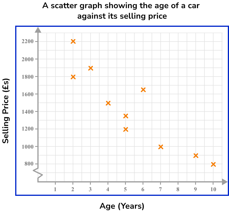
A garage sells second-hand cars. One week the garage sells ten cars. The table below shows the age and the selling price of each car.
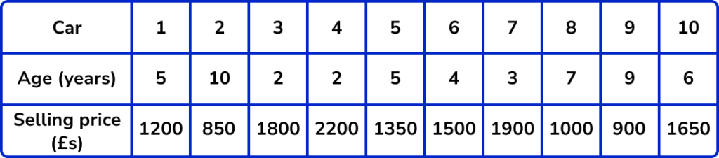
Represent this data on a scatter graph.
- Identify that you have a set of bivariate data.
Bivariate data is a set of data which has two pieces of information for each subject. In this question the subjects are the ten cars. Two pieces of data have been recorded for each car, age and selling price.
Therefore, this is bivariate data.
2Draw suitable axes and label them.
Each axis should have one of the variables and the scale should be appropriate for the given values.
One axis will show the age of the car. This variable has the lowest value of 2 and highest of 10. A sensible scale would be 0 to 10 going up in unit steps.
The other axis will show the selling price of the car. This variable has the lowest value of 850 and highest value of 2200. A sensible scale would be 800 to 2200 in steps of 100. This will require drawing a break in the scale from the origin to 800.
3Plot each pair of coordinates.
Plot each car as a cross on the graph one at a time. Make sure you read the scale carefully. Make sure you give your graph a suitable title.
To plot the coordinate for Car 1, we locate 5 on the horizontal axis (Age = 5 ), and then travel vertically along that line until we locate £1200 on the vertical axis (Selling price = £1200 ). Place an x at this point (5,1200).
Continuing this method, we get the following scatter graph:
Example 2: plotting a scatter graph
A gardener is researching a crop of sunflowers. He selects 6 sunflowers at random and measures their height and the number of leaves. The table below shows the results.
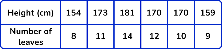
Represent this data using a scatter graph.
We have two variables for this data, Height (cm) and Number of leaves. This means we have bivariate data.
Each axis should have one of the variables and the scale should be appropriate for the given values.
The range of heights is 154-181cm and so we can draw the horizontal axis from 150-190cm in 5cm steps.
The range of the number of leaves is 8-14 , so we can label the axis from 0-16 in steps of 2.

Example 3: plotting a scatter graph
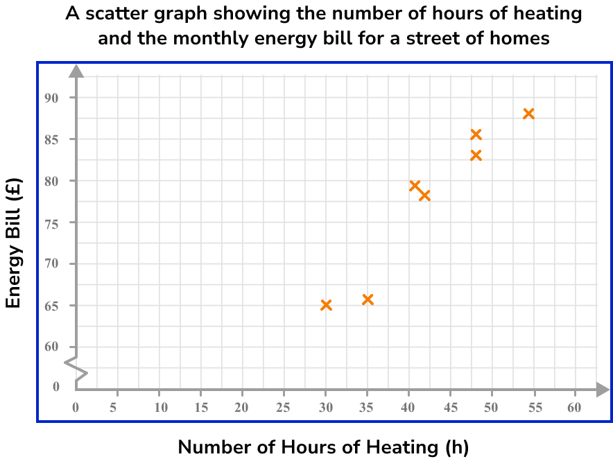
An energy company was researching the monthly bills of a street of homes in December. The results were recorded in a table, alongside the number of hours the heating was on in each house.
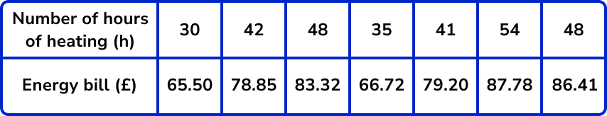
Represent this data using a scatter graph.
As we are looking at the relationship between two variables (the number of hours of heating and the monthly energy bill), we have bivariate data.
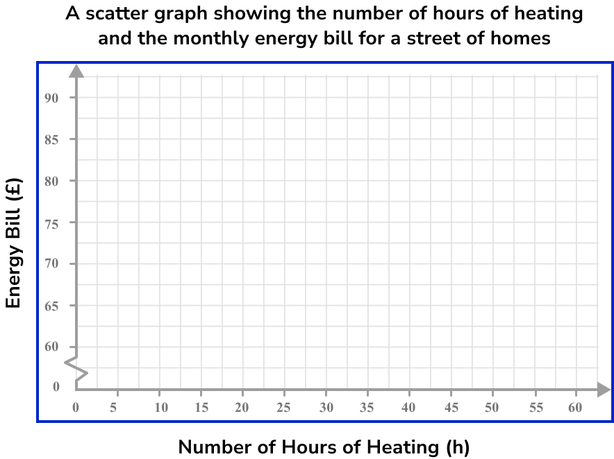
The range of values for the number of hours of heating is 30-54 with no decimal values, so we can label the horizontal axis from 0 to 60 and mark every 5 hours on the axis.
The range of values for the energy bill cost is from £65.50-£87.78 and so if we draw a break and start the axis from 60, we can mark each £5 up to £90 on the vertical axis, giving us a reasonable amount of detail in the plot.
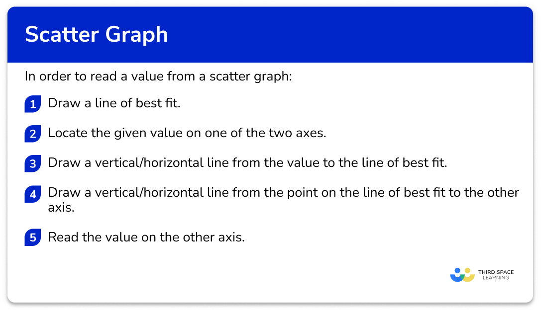
How to read values from a scatter graph
In order to read a value from a scatter graph:
- Draw a line of best fit.
- Locate the given value on one of the two axes.
- Draw a vertical/horizontal line from the value to the line of best fit.
- Draw a vertical/horizontal line from the point on the line of best fit to the other axis.
- Read the value on the other axis.
Explain how to read values from a scatter graph
Reading values from scatter graphs examples
Example 4: reading a value from the vertical axis
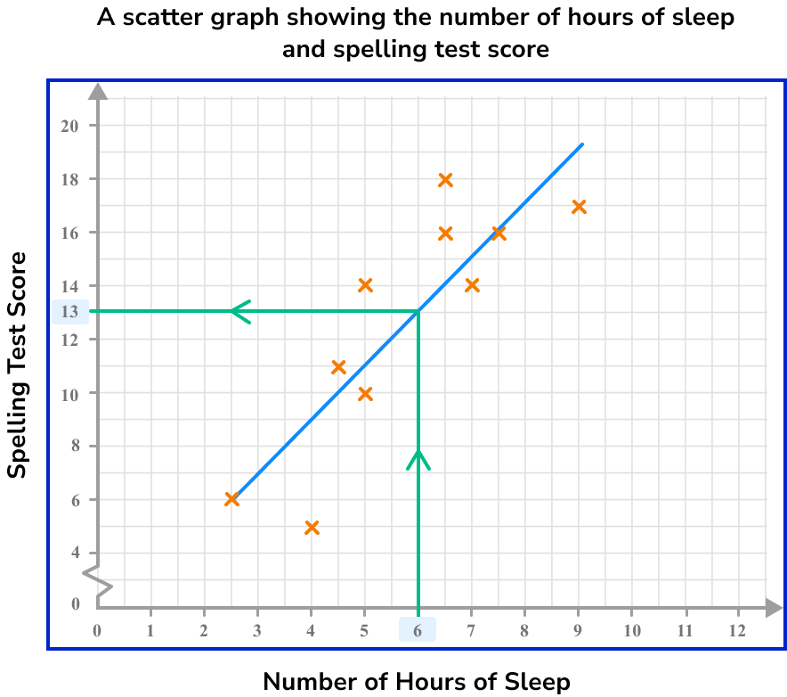
Below is a scatter graph that represents the number of hours of sleep per night of 10 students and the score they achieved in a spelling test.
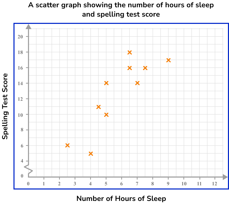
What spelling test score would you predict for a student who has an average of 6 hours of sleep per night?
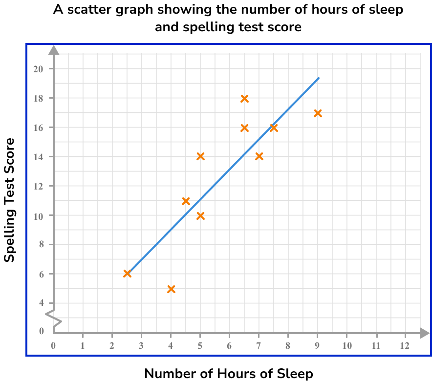
Here, the line of best fit is approximately
As we know that the student has an average of 6 hours of sleep, we label this value on the horizontal axis.
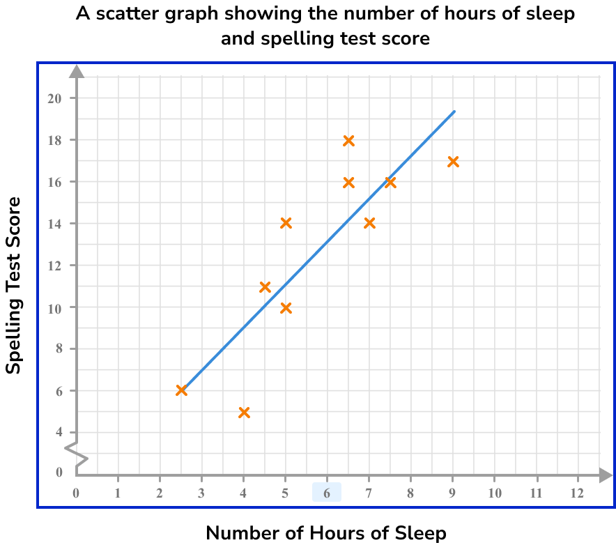
We need to draw a vertical line to get to the line of best fit.
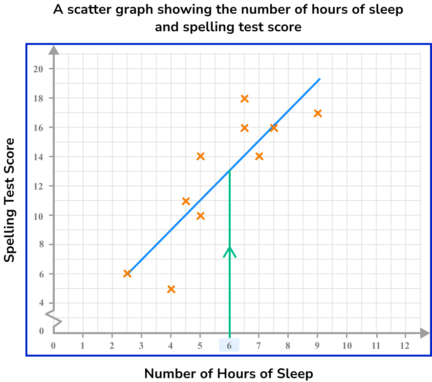
We now draw a horizontal line from the line of best fit to the other axis.
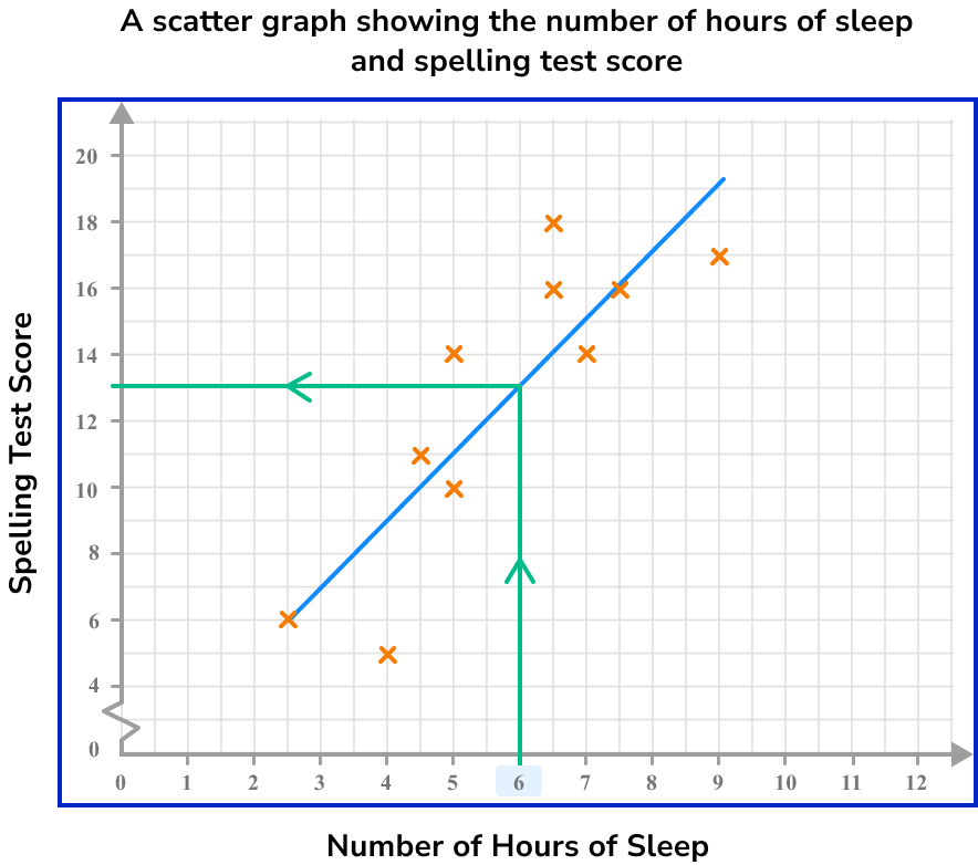
Here, the spelling test score is 13.
Example 5: reading a value from the horizontal axis
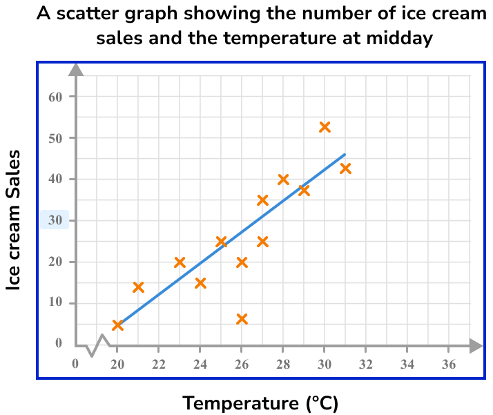
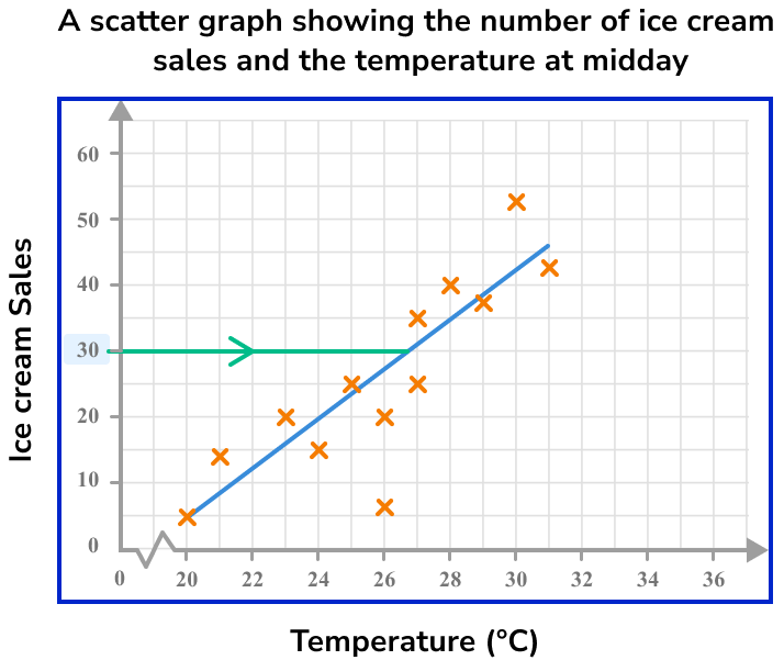
Below is a scatter graph that represents the number of ice cream sales against the outside temperature at midday during the month of July in the UK.
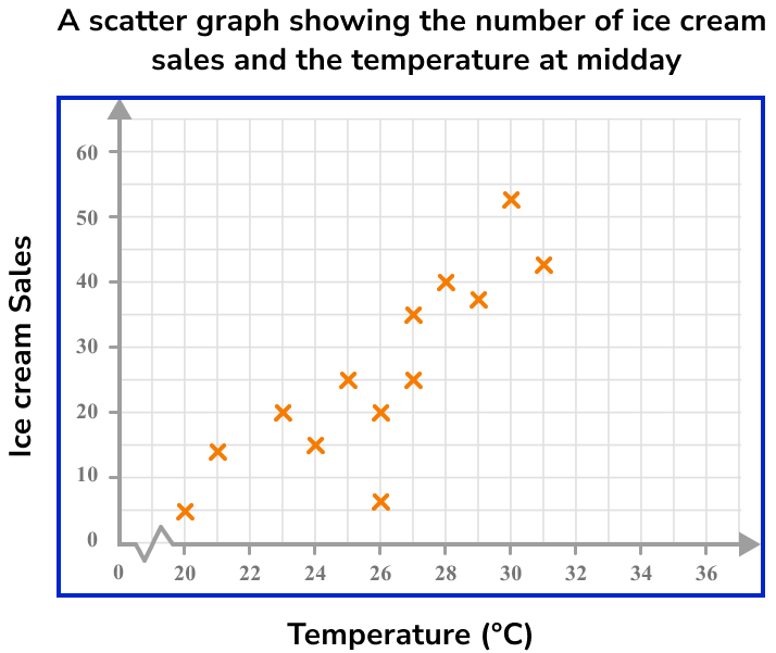
Use the graph to determine an estimate for the temperature for 30 ice cream sales
Drawing a line of best fit, we have:
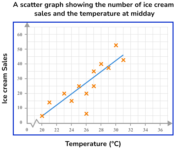
As we want the temperature for 30 ice cream sales, we need to locate 30 on the vertical axis.
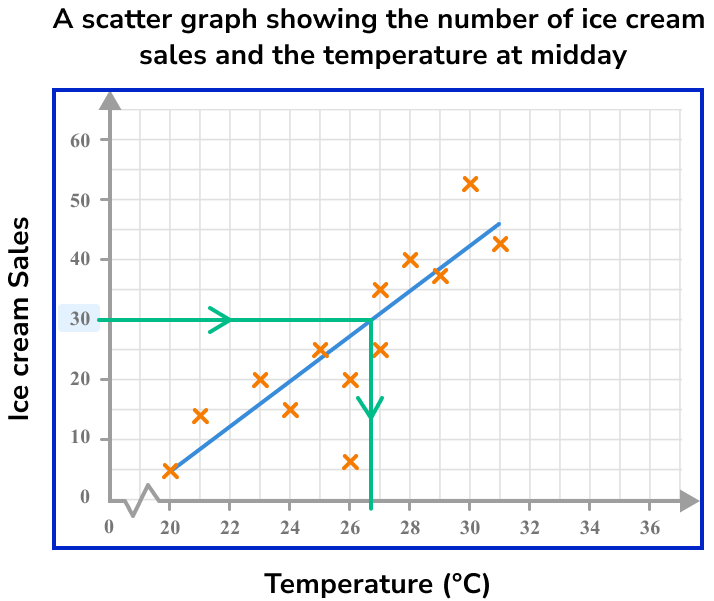
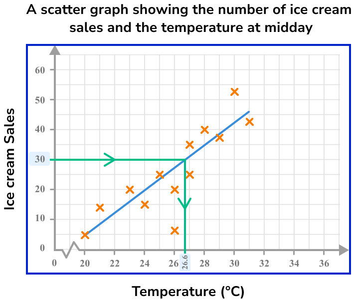
The temperature that can be expected for 30 ice cream sales is 26.6^{\circ}C.
Example 6: reading a value from outside the data set
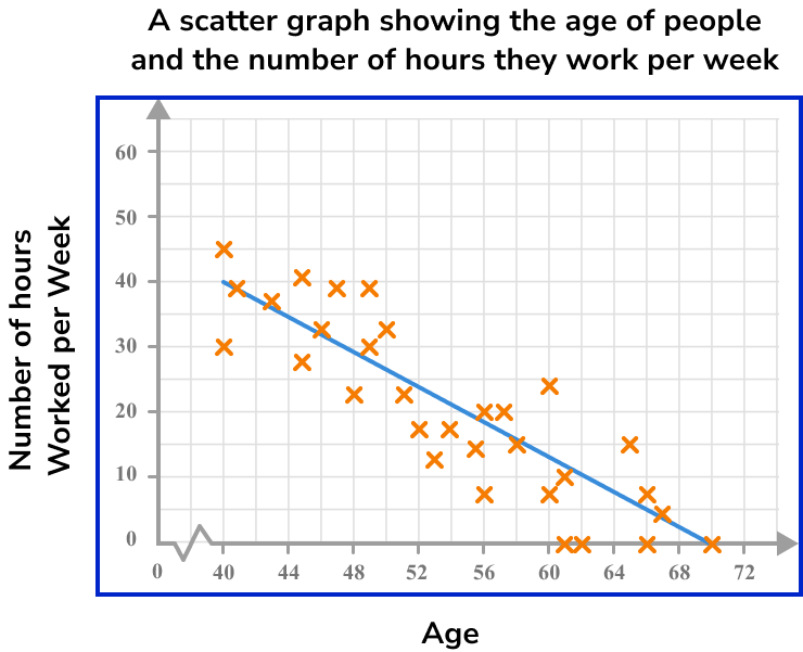
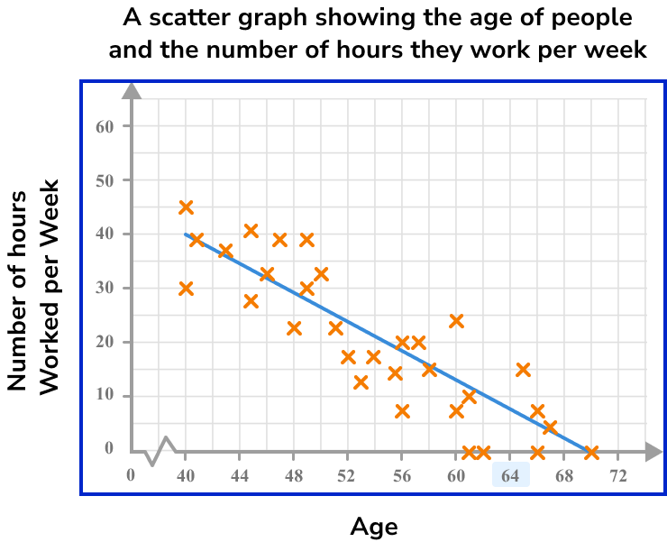
The scatter graph below represents the age of people and the number of hours they work per week.
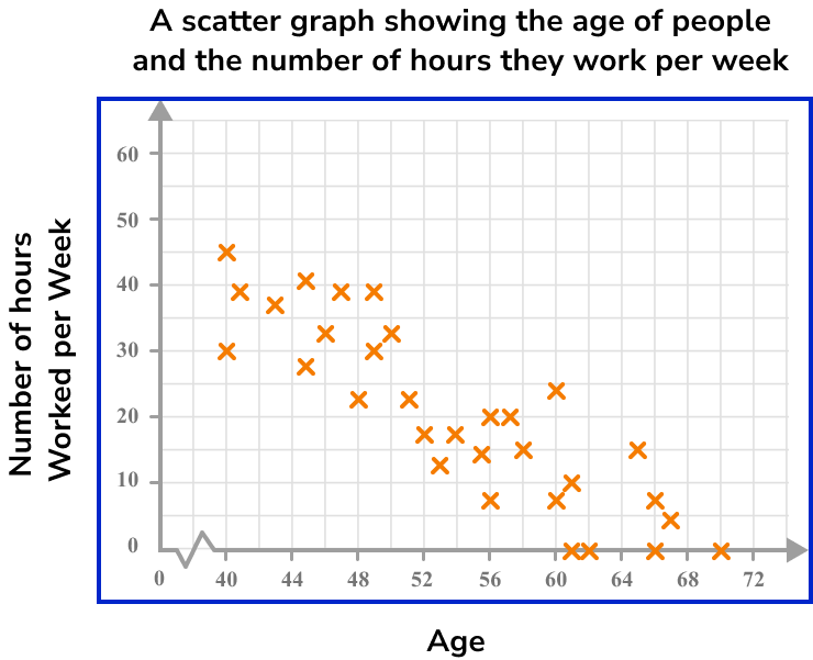
How many hours of work would you predict for a person who is 64 years old?
As we are looking for a person who is 64 years old, we need to locate 64 on the horizontal axis.

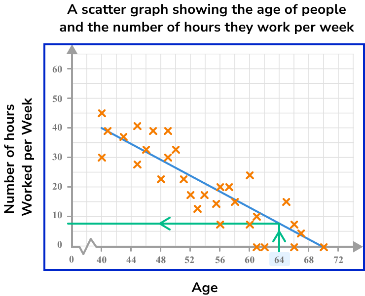
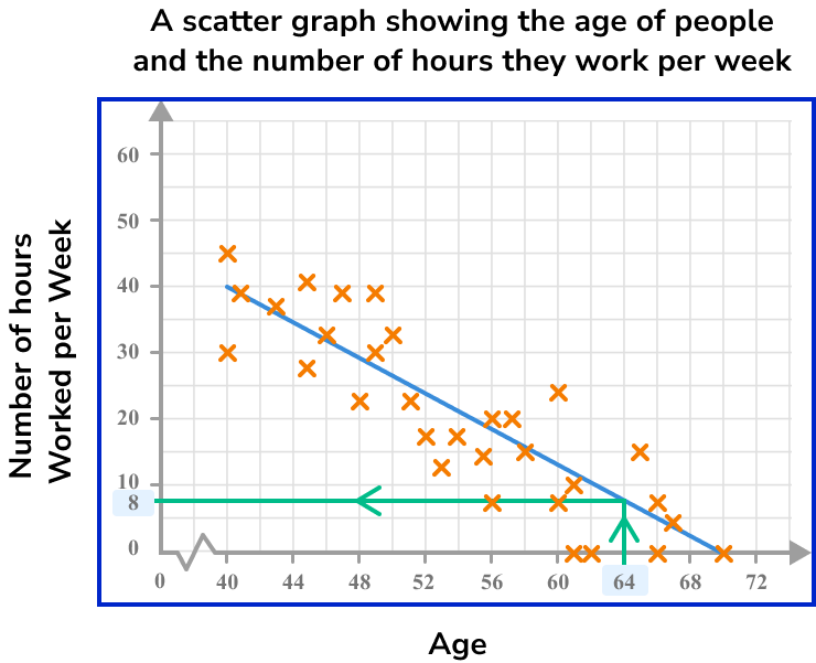
The estimated number of hours worked per week by a person aged 64 is 8 hours.
Common misconceptions
- Correlation and causation
When interpreting scatter graphs, it is important to know that correlation does not indicate causation. In other words, a relationship between two variables does not indicate that one variable causes another.
For example, you may find a positive correlation between temperature and the number of ice-creams sold. You can describe the relationship as the hotter the temperature, the greater the number of ice-creams sold. It might then be tempting to say that this indicates that hot weather causes higher ice cream sales.
However, there is not sufficient evidence for you to make this assumption both scientifically and statistically. In the same way you cannot say that higher ice cream sales cause hotter temperatures.
- Bivariate data
Sometimes bivariate data can appear to have 3 variables and not just two. For example, the table below shows information from a small independent electronics shop. They have recorded the year, the number of TVs sold, and the amount of money spent on advertising. As the table has 3 rows of data it may appear to have 3 variables.
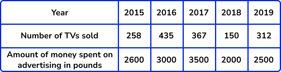
However, you must remember that bivariate data has a subject and two variables are recorded for each subject. In this case the subject is the year. For each year the number of TV sales and money spent on advertising has been recorded.
On a graph one axis will be labelled as ‘number of TVs sold’, and the other as ‘amount of money spent on advertising’ and then each cross will indicate each year.
It is good to remember that the points on scatter graphs represent subjects. The number of points on the graph tells us the number of subjects.
Practice scatter graphs questions
1. A student recorded how many glasses of water they drank and how many packets of crisps they ate each day for 3 days.

Which diagram shows this data correctly plotted on a scatter graph?
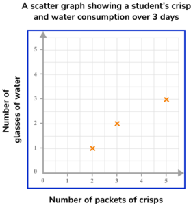

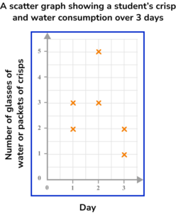
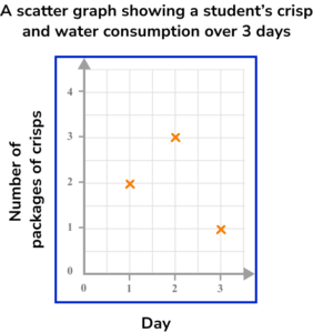
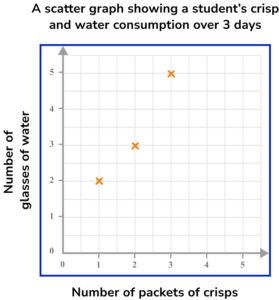

Step 1: This is bivariate data. For each subject (each day), two pieces of information have been recorded (number of glasses of water and number of packets of crisps).
Step 2: The axes should be labelled with the two variables (number of glasses of water and number of packets of crisps). The scale should be appropriate for the values.
Step 3: When plotting the coordinates make sure to get them the correct way round. Each day is represented by a cross.
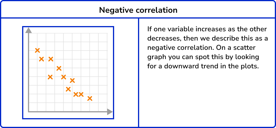
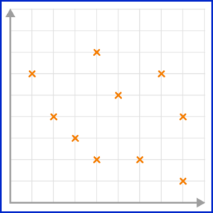
2. Which scatter graph shows a negative correlation?
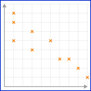

A negative correlation is shown on a scatter graph by the points forming a linear pattern in a downward trend. As one variable increases, the other variable decreases.
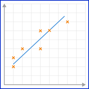
3. Which scatter graph shows a weak positive correlation?
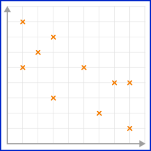
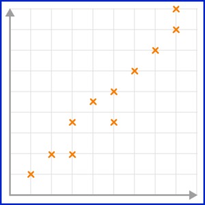
A positive correlation is shown on a scatter graph by the points forming a linear pattern in an upward trend. When a correlation is strong, the points lie closely to the line of best fit.
4. Which scatter graph has the best estimated line of best fit?
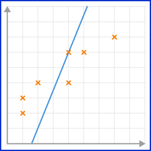
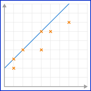
The line of best fit must go through as many points as possible, with the same number of points on either side of the line.
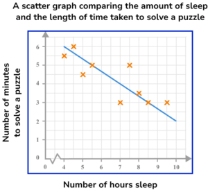
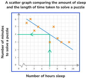
5. This scatter graph compares the number of hours of sleep 10 adults had the previous night, and the length of time taken to solve a puzzle. The line of best fit has also been drawn.
Use the line of best fit to predict the length of time it would take an adult to solve the puzzle if they had 7 hours sleep.
Drawing a vertical line from 7 on the horizontal axis to the line of best fit, and then across to the other axis, we would expect that a person who has 7 hours of sleep should solve the puzzle in 4 minutes.
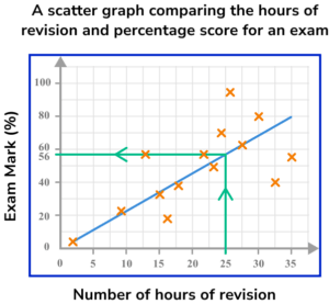
6. This scatter graph compares the number of hours of revision for an upcoming exam, and the score on the exam, as a percentage. The exam is out of 80. A line of best fit has been drawn on the scatter graph.
Use the line of best fit to predict the exam mark percentage of a student who revised for 25 hours for the exam.
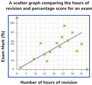
As the student did 25 hours of revision, we locate 25 hours on the horizontal axis. Drawing a vertical line up to the line of best fit, and then across to the vertical axis, we get a percentage of 56\%.
Scatter graphs GCSE questions
1. What type of correlation is shown on this scatter graph?
(1 mark)
Negative correlation
(1)
2. A shop sells 14 different magazines. The shop manager decides to record the cost of each magazine and the number of pages it has. The manager then displays this information on a scatter graph.
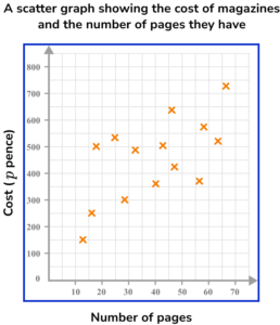
(a) Describe the relationship shown on the scatter graph.
(b) Estimate the cost of a magazine with 45 pages.
(c) Comment on the reliability of your answer to part (b).
(4 marks)
(a)
The greater the number of pages in a magazine, the higher the price.
or
Positive correlation
or
Weak positive correlation
(1)
(b)
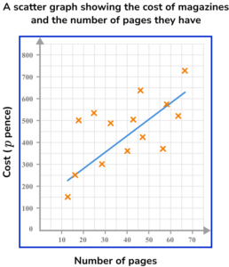
Estimated line of best fit is a straight line in an upwards direction positioned so that the plotted points are equally distributed along its length (see below).
(1)
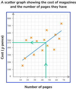
A magazine with 45 pages is estimated to cost approximately 475p or £4.75.
NB: Your answer will be judged as correct based on your estimated line of best fit (see below).
(1)
(c)
As the scatter graph shows a weak correlation between the number of pages in a magazine and its cost, the answer to part (b) is not very reliable and should only be considered a rough estimate.
(1)
3. Simon is studying GCSE music. He finds that he gets bored listening to long pieces of music and prefers listening to short pieces. He decides to conduct an experiment to see if his friend Rajveen shares his views.
He plays Rajveen 8 pieces of music of varying lengths and asks her to rate them out of ten. He hypothesised that “The longer a piece of music, the lower its score out of ten”.
Here is the data Simon collected.

(a) Draw a scatter graph to represent this data.
(b) Does the data support Simon’s hypothesis? Explain your answer.
(4 marks)
(a)
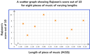
Axes are drawn with appropriate scales for the given data.
(1)
Axes are labelled and the graph has been given an appropriate title.
(1)
Coordinates have all been plotted correctly.
(1)
(b)
No, and no correlation.
(1)
Learning checklist
You have now learnt how to:
The next lessons are
Still stuck?
Prepare your KS4 students for maths GCSEs success with Third Space Learning. Weekly online one to one GCSE maths revision lessons delivered by expert maths tutors.

Find out more about our GCSE maths tuition programme.