FREE DOWNLOAD
Line Graphs Worksheet
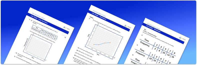
Help your students prepare for their Maths GCSE with this free straight line graphs worksheet of 24 questions and answers
- Section 1 of the straight line graphs worksheet contains 21 skills-based straight line graphs questions, in 3 groups to support differentiation
- Section 2 contains 1 applied straight line graphs questions with a mix of word problems and deeper problem solving questions
- Section 3 contains 2 foundation and higher level GCSE exam style questions on straight line graphs
- Answers and a mark scheme for all straight line graphs questions are provided
- Questions follow variation theory with plenty of opportunities for students to work independently at their own level
- All questions created by fully qualified expert secondary maths teachers
Suitable for GCSE maths revision for AQA, OCR and Edexcel exam boards
Raise maths attainment across your school with hundreds of flexible and easy to use GCSE maths worksheets and lessons designed by teachers for teachers.
Line graphs at a glance
A line graph (or line plot) is used to display related data that changes continuously over a given time period. The x and y values are plotted on the graph and the points are plotted and then joined with straight lines. When introducing line graphs, a good starting point is a line graph to show temperature change over a week in the local area – here, the days of the week would be marked off on the x axis, with temperatures on the y axis.
Students should be able to draw line graphs and also interpret their graphs, describing the change over time or comparing two data sets. A double line graph has two sets of related data plotted – for example, the changes in temperature over a week in summer and in winter. This makes it easier to compare and analyse the data sets. The gradient of a straight line segment joining two points on a line graph tells us about the rate of change in that time period – a steeper gradient represents a larger change.
See also: Gradient of a line
Unlike pie graphs and pictographs, line graphs are not suitable for displaying discrete data, as joining the points implies that the data is continuous.
Looking forward, students can then progress to additional Statistics worksheets, for example a mean, median, mode and range printable worksheet or frequency table worksheet.
For more teaching and learning support on Statistics our GCSE maths lessons provide step by step support for all GCSE maths concepts.
Do you have students who need additional support?

With Third Space Learning's secondary maths tutoring programmes, students in Year 7-11 receive regular one to one maths tutoring to address gaps, build confidence and boost progress.
"My confidence in the tutoring is high. We've had some phenomenal results. I even had one girl get a Grade 8 this year; she came to every tutoring session."
Stacey Atkins, Maths Director, Outwood Grange Academies Trust