High Impact Tutoring Built By Math Experts
Personalized standards-aligned one-on-one math tutoring for schools and districts
In order to access this I need to be confident with:
Coordinate planeTime series graph
Here you will learn about time series graphs, including drawing, reading from, and analyzing the trend.
Students will first learn about a time series graph as part of statistics and probability in high school.
What is a time series graph?
A time series graph is a line graph that shows data such as measurements, sales, or frequencies over a given time period. They can be used to show a pattern or trend in the data and are useful for making predictions about the future such as weather forecasting or financial growth.
To draw a time series graph, you need a set of axes.
The horizontal axis (x- axis ) always shows the time period, and the vertical axis (y- axis ) represents the variable being recorded against time.
For example,
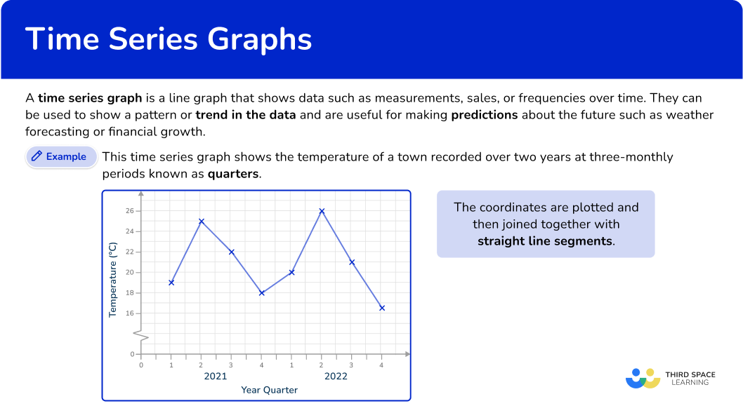
This time series graph shows the temperature of a town recorded over two years at three-monthly periods known as quarters.
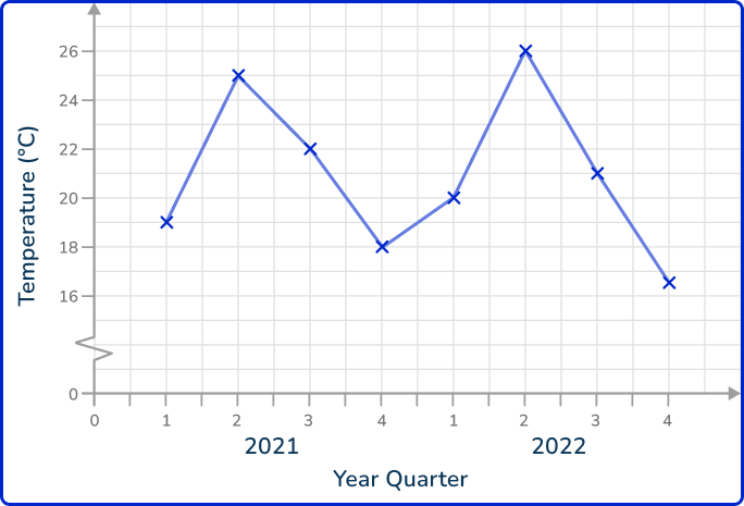
The coordinates are plotted and then joined together with straight line segments. It is important that the axis labels are clear so that the time series graph can be interpreted. The horizontal axis is always a continuous scale and both axes should increase in equal steps.
A trendline is difficult to plot for a time series when the data is clearly fluctuating (rising and falling values over time). This type of data can be described as seasonal. Instead of plotting a line of best fit, you plot a moving average.
![[FREE] Representing Data Worksheet (Grade 6 to 7)](https://thirdspacelearning.com/wp-content/uploads/2023/11/Representing-Data-listing-image.png)
[FREE] Representing Data Worksheet (Grade 6 to 7)
![[FREE] Representing Data Worksheet (Grade 6 to 7)](https://thirdspacelearning.com/wp-content/uploads/2023/11/Representing-Data-listing-image.png)
Use this quiz to check your grade 6 to 7 students’ understanding of representing data. 10+ questions with answers covering a range of topics on how to represent and interpret data topics to identify areas of strength and support!
DOWNLOAD FREE![[FREE] Representing Data Worksheet (Grade 6 to 7)](https://thirdspacelearning.com/wp-content/uploads/2023/11/Representing-Data-listing-image.png)
[FREE] Representing Data Worksheet (Grade 6 to 7)
![[FREE] Representing Data Worksheet (Grade 6 to 7)](https://thirdspacelearning.com/wp-content/uploads/2023/11/Representing-Data-listing-image.png)
Use this quiz to check your grade 6 to 7 students’ understanding of representing data. 10+ questions with answers covering a range of topics on how to represent and interpret data topics to identify areas of strength and support!
DOWNLOAD FREEInterpreting a time series graph
A line of best fit is required when analyzing a trend in a time series or to estimate future values. If a time series shows seasonal data (seasonality), it is far more accurate to draw a moving average than a line of best fit.
However, a line of best fit is a quick way to be able to estimate values both within the data range (interpolation) and beyond the data range (extrapolation). This is exactly the same process for scatter graphs although the analysis is subtly different.
You cannot use correlation descriptors for data represented in a time series plot as you are not comparing two variables, you are tracking one variable over a period of time.
Drawing a line of best fit
To draw a line of best fit, draw a straight continuous line through as many points as possible, making sure that the number of data points on either side of the line of best fit is the same. Extend the line of best fit beyond the data range if required.
If the line of best fit has a positive gradient, this shows that the recorded values have a positive trend (trending upwards).
If the line of best fit has a negative gradient, this shows that the recorded values have a negative trend (trending downwards).
For example,
If you look at temperature change over time, an increasing trend would mean the temperature is increasing over time; a decreasing trend would mean the temperature is decreasing over time.
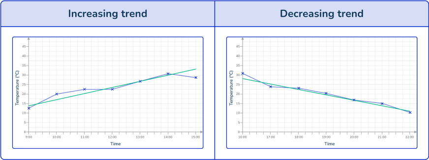
To find a specific value within the data, you need to use the line of best fit to locate the value from the opposing axis.
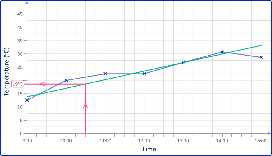
If you know the time of the data value, you draw a vertical line up to the line of best fit, and then a horizontal line to the other axis and read the value that it reaches.
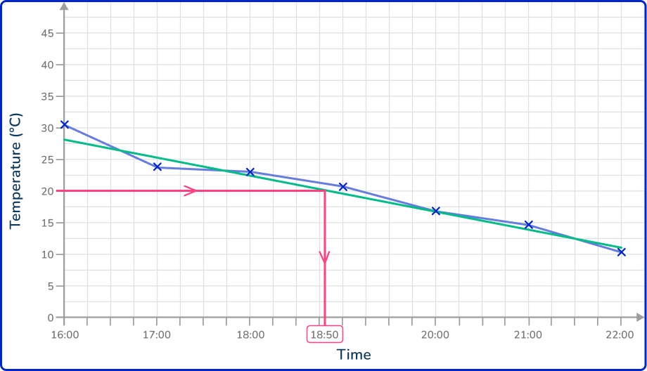
If you know the value on the vertical axis, you draw a horizontal line to the line of best fit, and then a vertical line down to the horizontal axis and read the time for that data value.
This is the same approach if the value is beyond the current data set. Here, you just need to extend the line of best fit in the same direction beyond the data and locate the required value using the method above.
Note: Any value that is interpreted using the line of best fit but which is beyond the data range, is always an estimate (or prediction) as you do not know what happens to the data beyond the known values.
What is a time series graph?
Common Core State Standards
How does this relate to high school math?
- High School – Statistics & Probability – Interpreting Categorical & Quantitative Data (HS.S.ID.A.1)
Represent data with plots on the real number line (dot plots, histograms, and box plots).
How to draw a time series graph
In order to draw a time series graph:
- Draw and label a horizontal scale based on the time intervals of the data provided.
- Draw and label the vertical axis, choosing an appropriate scale.
- Plot the points and join with straight line segments.
Time series graph examples
Example 1: drawing a time series graph (year and quarters)
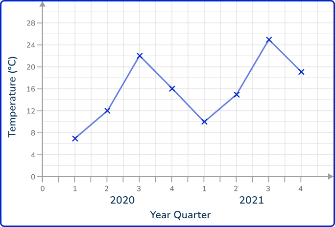
The table shows the average temperature in ^{\circ} C of a city recorded for each quarter for the years 2020 and 2021.

Draw a time series graph to show this data.
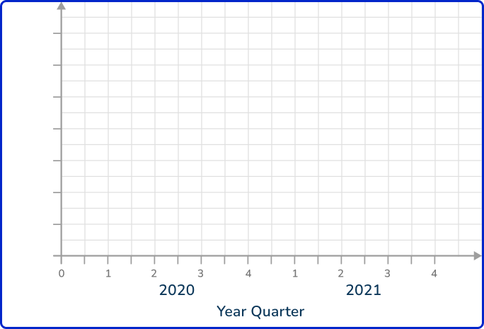
- Draw and label a horizontal scale based on the time intervals of the data provided.
The horizontal scale needs to show the eight quarters of the years 2020 and 2021.
2Draw and label the vertical axis, choosing an appropriate scale.
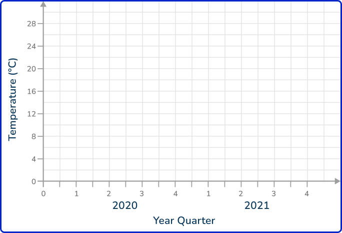
The lowest value is 7^{\circ} C and the highest is 25^{\circ} C. Starting from zero will be appropriate for this data.
3Plot the points and join with straight line segments.
As you know the value for each quarter and this is not grouped data, you plot the value in line with each quarter mark on the horizontal axis.
Example 2: drawing a time series graph with a break in the vertical axis
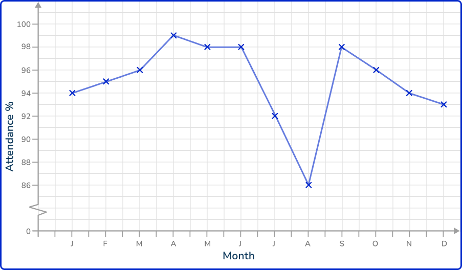
The table shows the percentage attendance of a group at a dance school over the period of a year.

Draw a time series graph to show this data.
The horizontal scale needs to show the twelve months of the year.
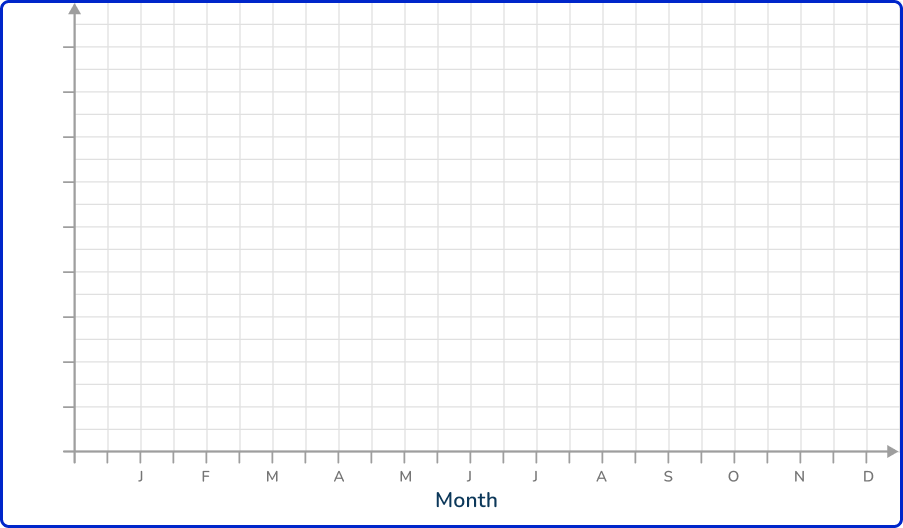
The lowest value is 86\% and the highest is 99\%. Starting from zero will not be appropriate for this data. You therefore use a zigzag to show a break in the axis and start the scale from 86\%.

Example 3: continuous numerical horizontal axis
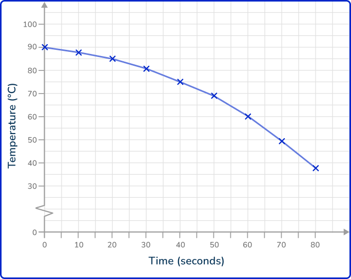
The table shows the temperature, in ^{\circ} C, of a hot drink, recorded every 10 seconds over a period of 80 seconds.

Draw a time series graph to show this data.
The range of values for the recorded times is 0 to 80. A suitable increase would be in steps of 10 for the horizontal axis.
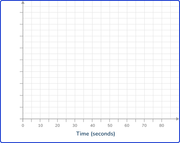
The lowest value is 37^{\circ} C and the highest is 90^{\circ} C, so for the vertical axis, you can use a break, start at 30^{\circ} C, and continue in equal steps of 10 up to 100^{\circ} C.

Plot each point on the exact value for each item of data.
How to interpret a time series graph
In order to interpret a time series:
- Draw a line of best fit.
- Answer the question specifics.
Interpreting time series graphs examples
Example 4: describe the trend in the data
Below is a time series showing the number of people attending the cinema over a three week period.
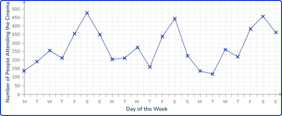
Describe the trend in the data over the three weeks.
Drawing a line of best fit, you have
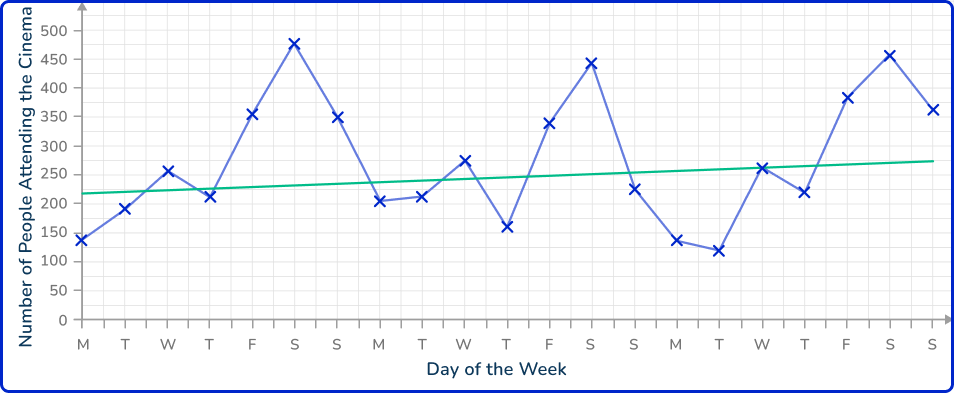
As you need to describe the trend in the data, you can see that the gradient of the line of best fit is slightly positive (going upwards). This means that the number of people attending the cinema is gradually increasing over the time period.
Note: For this example, the use of a line of best fit significantly limits the accuracy of the trend as it is clear that the data is seasonal (you can see that the number of people attending the cinema on Monday to Thursday each week is lower than for Friday to Sunday). This is a reason why a moving average would provide a more detailed analysis of the trend.
Example 5: estimate a value within the data range (interpolation)
Below is a time series showing the viewing figures of a football game over 90 minutes, recorded every 10 minutes from the NFL network.
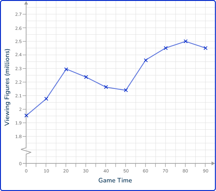
What time would you expect there to be 2.4 million viewers watching the football game on the NFL network?
Drawing a line of best fit through the data, you have
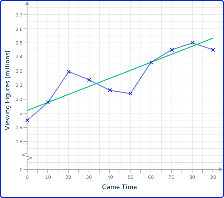
As you need to estimate the time in which 2.4 million viewers are watching the football game, you need to draw a horizontal line from the 2.4 million viewers value to the trendline, and then a vertical line to locate the estimated time on the horizontal axis.
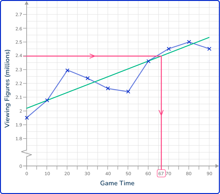
The time estimated for when 2.4 million viewers were watching the football game on the NFL network is 67 minutes into the game.
Example 6: estimate a value beyond the data range (extrapolation)
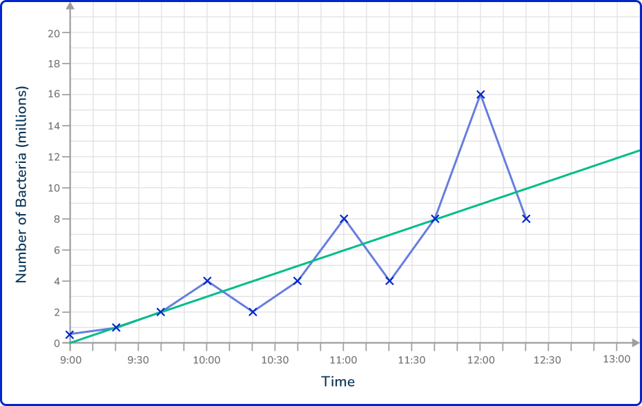
Below is a time series showing the number of bacteria in a petri dish. Every hour, 75\% of bacteria are extracted to make a new broth.

Estimate the number of bacteria in the petri dish at 12:50 pm.
Drawing a line of best fit through the data, you have
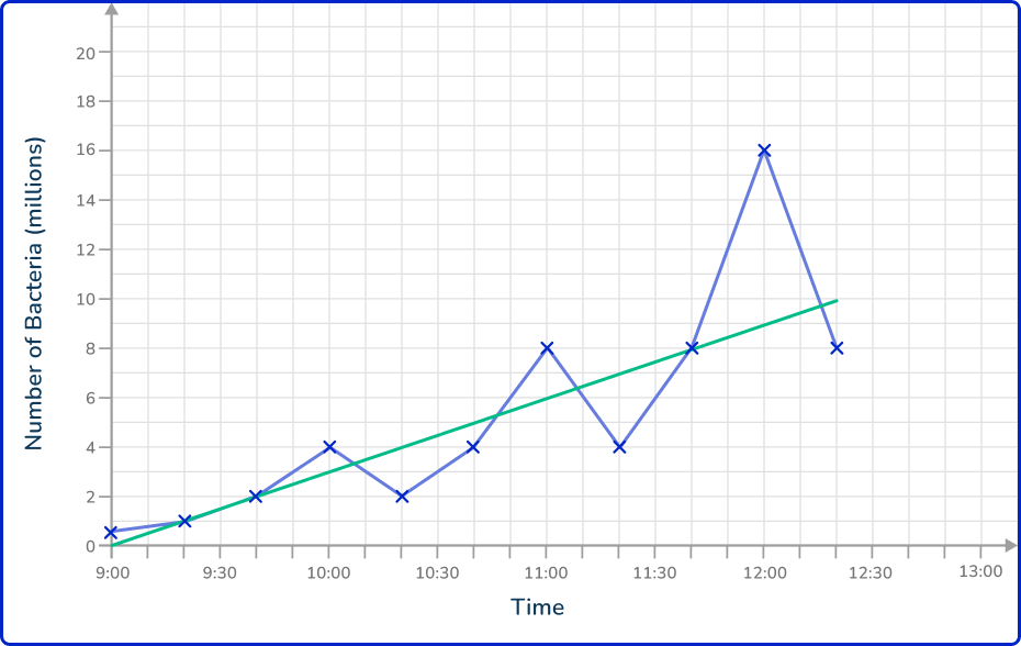
As you need to estimate the number of bacteria in the petri dish at 12:50 pm, you need to extend the line of best fit until you have a value on the horizontal axis of 12:50 pm.
Now that you have a line of best fit for the data, you can draw a vertical line from the value 12:50 pm to the line of best fit, and then read the value on the other axis by drawing a horizontal line to this value.
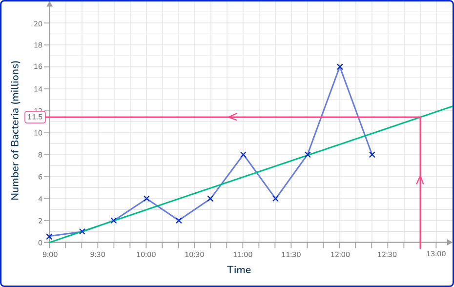
The estimated number of bacteria in the petri dish at 12:50 pm is 11.5 million bacteria.
Teaching tips for time series graph
- Begin by introducing the concept of time series data, which involves collecting data at regular intervals over time. Use real-life examples like daily temperatures or stock prices to help students visualize the relevance of such data.
Use a time series chart of daily temperatures for a week as a visual aid. Ask students to interpret how the data changes over time (data analysis).
- Clarify the axes of a time series chart: the x- axis represents time, and the y-axis represents the data being measured. This is a foundational aspect of data visualization.
By clearly labeling each axis, students can better understand how to interpret the time series data. Create a worksheet where students label different parts of a time series chart and identify important elements like the time intervals and data points.
- Teach students to recognize seasonality in time series analysis. Seasonal patterns repeat at regular intervals (for example, monthly sales increases during holiday seasons). Use examples where this pattern is clear, like the spike in ice cream sales during summer.
Easy mistakes to make
- Points on the time series graph joined using a curve
It is important to use straight line segments to join the points of a time series graph. This can sometimes appear in questions where you will be asked to explain any mistake made on a time series graph.
- The horizontal axis is labeled as the variable, with the vertical axis labeled as Time
For a time series, the horizontal axis is always labeled as Time (the time scale).
- The first and last values of the time series are connected to the horizontal axis
It is not always the case where the first and last values are connected to the time series. This is only the case when both of these values are 0.
For example, the temperature at midnight could be 0^{\circ} C, rise and fall throughout the day, and then be 0^{\circ} C at midnight, the following night. This would mean that the values would meet the horizontal axis.
- Two values for one time interval
A time series cannot have multiple values for one time period unless you are tracking two different variables.
For example, you cannot record two values for the number of entrants to a zoo at 12:30 pm but you can record the number of adults and the number of children who have entered a zoo at 12:30 pm on the same axis.
- The line of best fit is drawn instead of connecting the data values with line segments
The data values are treated as a scatter plot and so they are not connected using line segments. Instead, the line of best fit is drawn, which is incorrect.
Related representing data lessons
Practice time series graph questions
1. Which of the following time series graphs correctly represents the data in the table below?

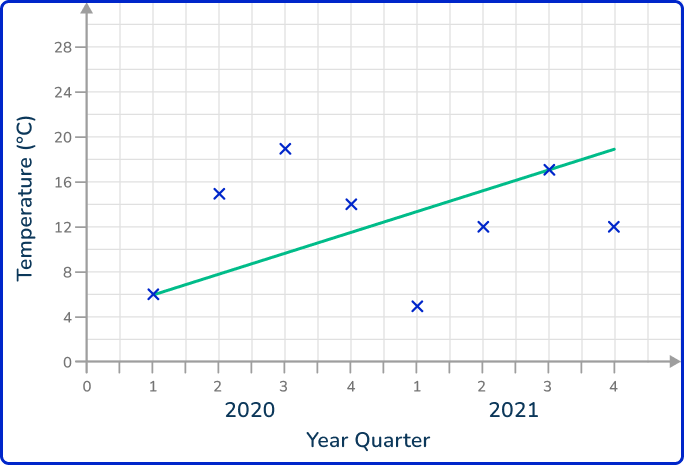

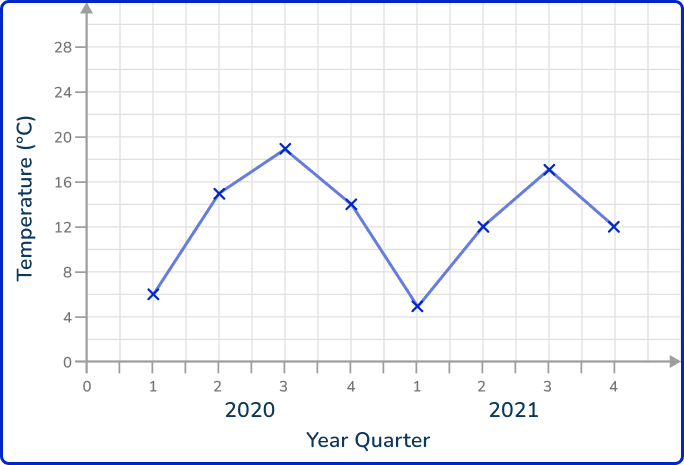

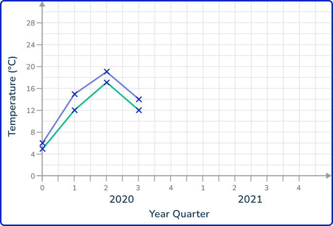

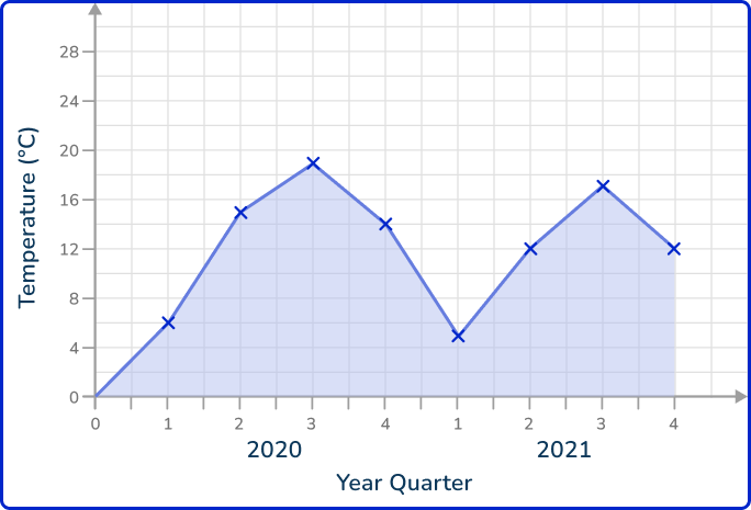

Each data value must be plotted in the correct place. They should be joined together using straight line segments.
There should only be one value per quarter as this is a plot for one variable.
2. The times series graph shows the attendance for the girls in a school class between January and July.
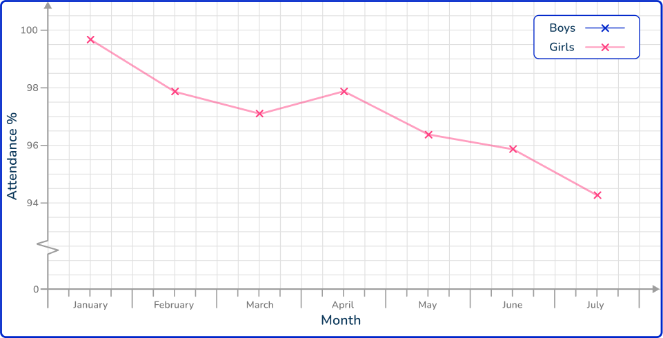
Use the information in the table provided to draw the time series for the Boys attendance on the same set of axes.

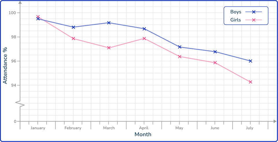

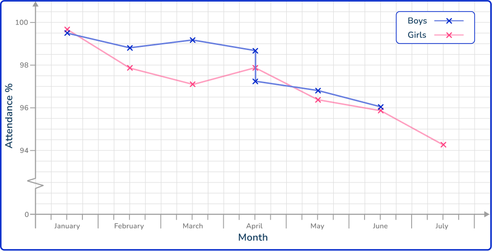

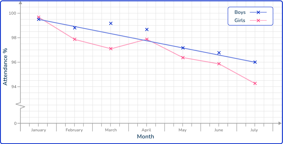


All of the data values must be plotted correctly with only one value for a time interval (here, per month).
The plotted points are then connected using a straight line segment from the current to the next point only.
3. The table shows the sales (in thousands) of a toy produced by a company, over the period of a year.
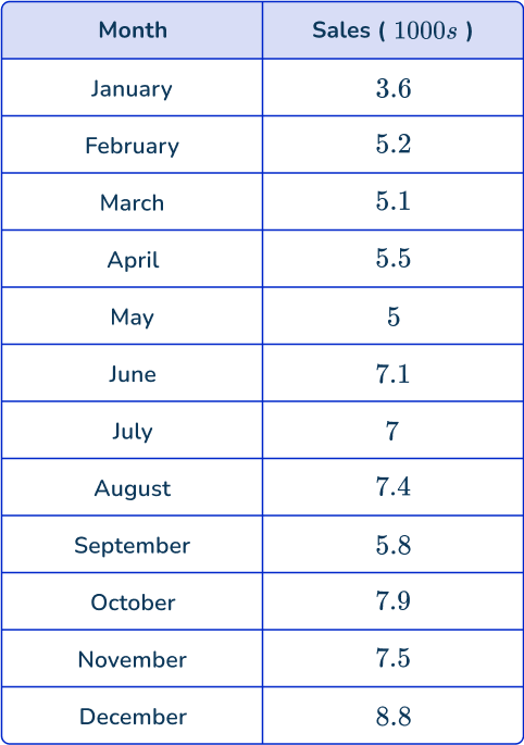
Which is the correct time series graph to show this data?
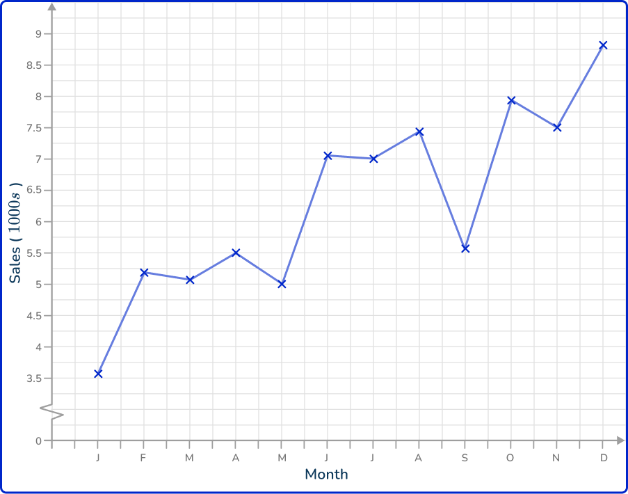

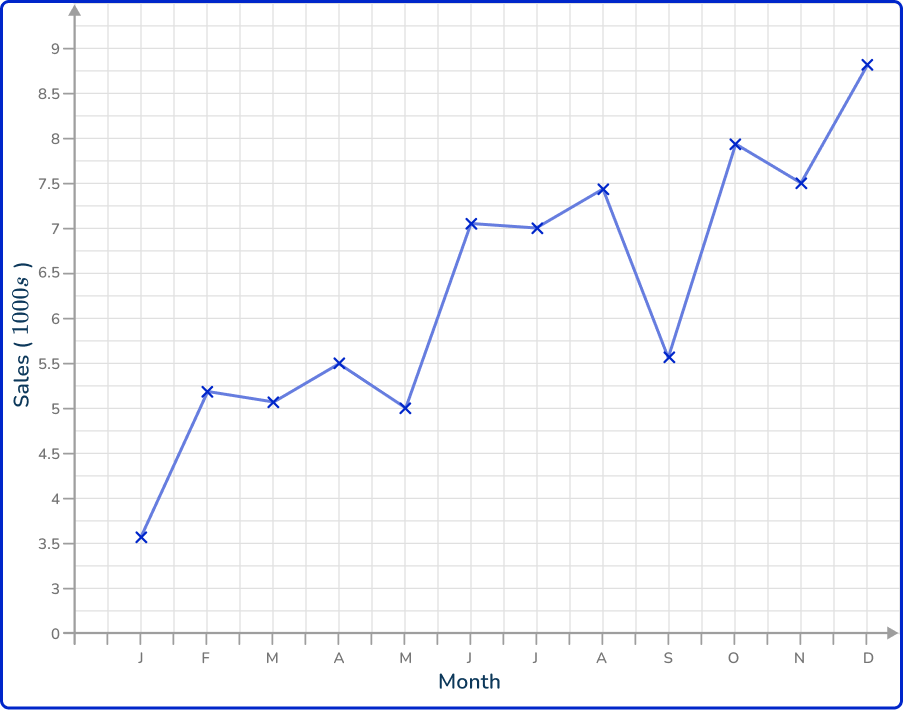

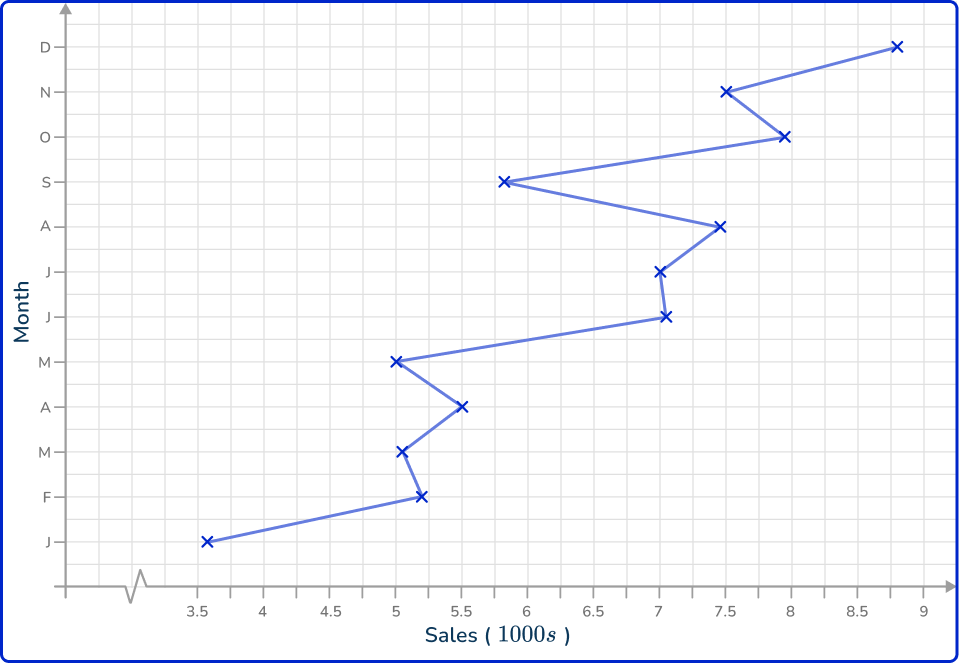

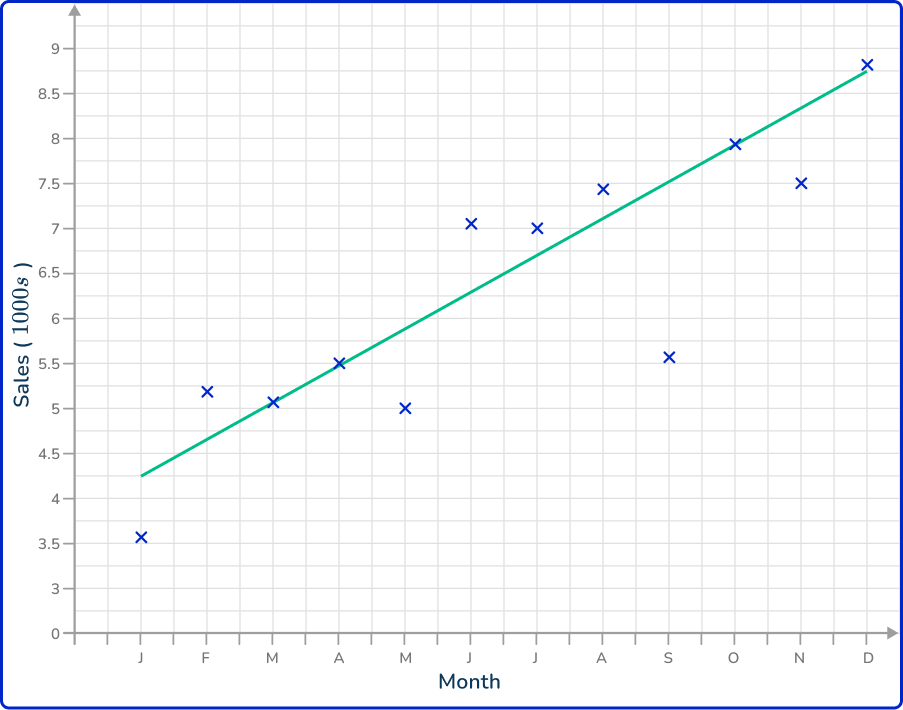

The horizontal axis is labeled as the time increment (here, the month) and the vertical axis is labeled Sales (1000s). Each data value is correctly plotted and connected using a straight line segment.
A break is drawn in the vertical axis as there are no values for Sales between 0 and 3.5 (thousand).
4. The average pace for a runner was recorded every 5 minutes for one hour. The results are shown in the time series graph below.
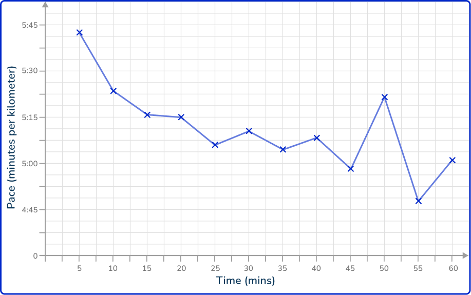
Describe the trend in the data.
Increasing (she is getting faster as time passes)

Increasing (she is getting slower as time passes)

Decreasing (she is getting faster as time passes)

Decreasing (she is getting slower as time passes)

Drawing a line of best fit, you have
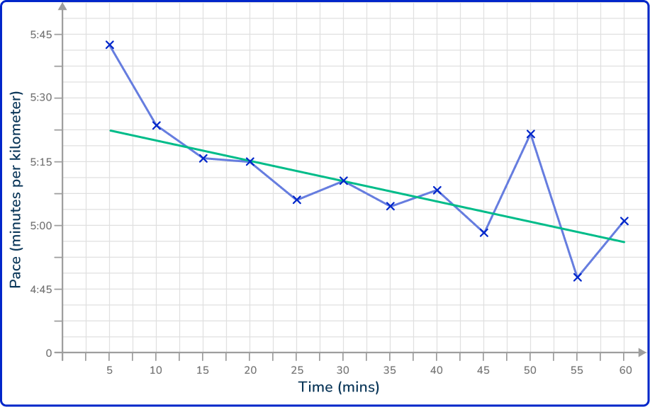
The trend is decreasing because as time passes, the values for the pace decrease (negative gradient).
This means that the pace of the runner is running a kilometer in less time, and is therefore getting faster.
5. A bakery tracks the sales of their signature loaf of bread. The results are recorded every day up to the Tuesday of Week 4 (today) and is written up into a time series.
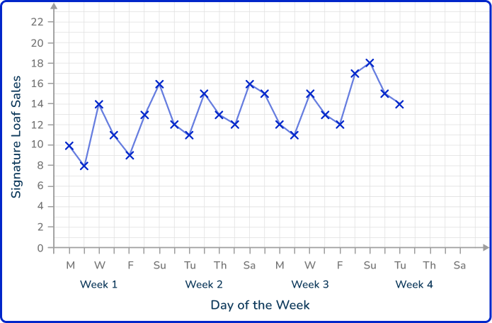
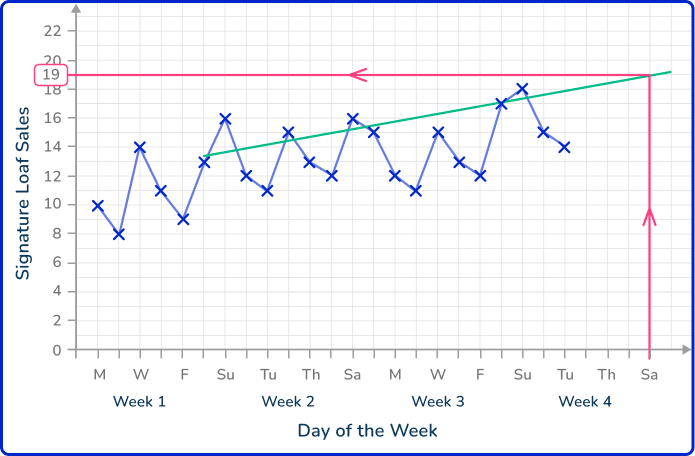
Estimate the number of sales of their signature loaf on Saturday of Week 4.


As you are predicting a future value based on a specific day, you can draw a line of best fit for the previous sales on each Saturday, then extend this line to predict the value for the following Saturday.
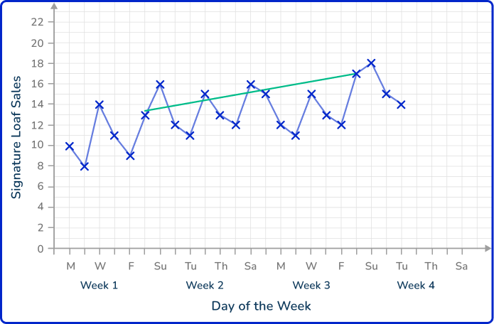
Extending the line of best fit, you have
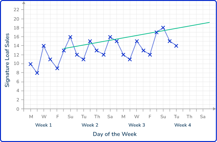
Drawing a vertical line from Saturday of Week 4 up to the line of best fit, and across to the other axis, this reads a value of 19 loaves.
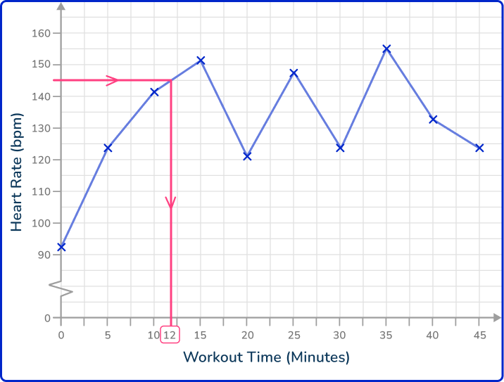
6. A person’s heart rate (measured in beats per minute, bpm) is measured throughout a workout and recorded every 5 minutes in the time series below.
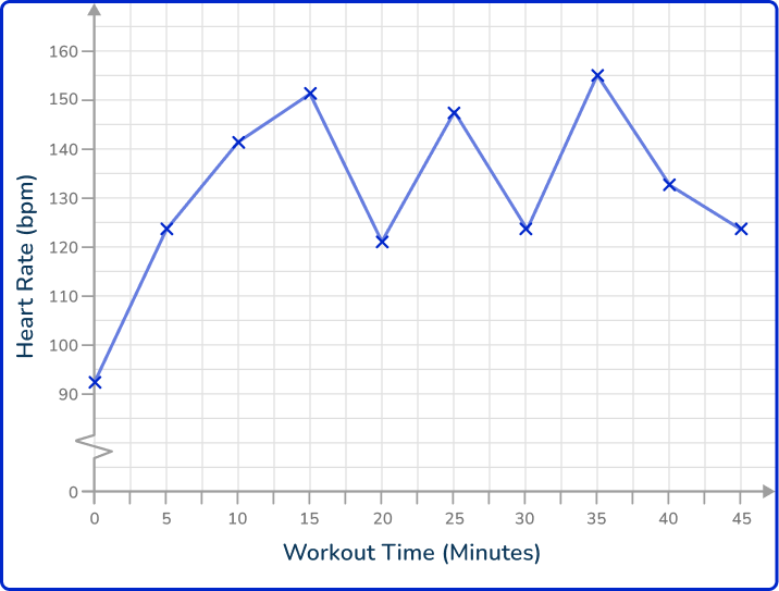
How many minutes does it take for the heart rate to reach 145 bpm after commencing the workout?
12 minutes

15 minutes

37.5 minutes

24 minutes

Looking at the time series, drawing a horizontal line from the 145 bpm mark on the vertical axis, you get to the line segment of the graph.
The time at this point reads 12 minutes.
Time series graph FAQs
A time series graph is a data visualization tool that plots time series data—data collected at regular intervals—on a graph. The x- axis represents time, and the y- axis represents the measured variable.
A time series graph is a type of line graph specifically used to represent data points measured at regular intervals over time.
The key focus is the relationship between the variable and time, whereas general line graphs can show the relationship between any two variables.
Time series forecasting is a technique used to predict future values of a variable based on past time series data.
In a time series, data points are collected at regular intervals over time (for example, daily, monthly, or yearly), and the goal of forecasting is to use this historical data to make informed predictions about future trends or behaviors.
Outliers are data points that deviate significantly from the overall trend in the time series chart. They could be caused by one-time events or errors in data collection. Identifying them is important for accurate time series analysis.
You can create a time series chart using spreadsheet tools like Excel or Google Sheets. These tools allow you to input time series data, choose appropriate intervals, and visualize trends using line graphs.
Time series graphs track data points over time, with the x- axis always representing time and the y- axis showing the measured variable.
They focus on visualizing trends, patterns, and seasonality in time series data collected at regular intervals, making them ideal for forecasting.
In contrast, other chart types (for example, bar charts, pie charts) are used to compare categories, relationships, or proportions and do not necessarily represent changes over time.
The next lessons are
- Frequency table
- Frequency graph
- Types of sampling
Still stuck?
At Third Space Learning, we specialize in helping teachers and school leaders to provide personalized math support for more of their students through high-quality, online one-on-one math tutoring delivered by subject experts.
Each week, our tutors support thousands of students who are at risk of not meeting their grade-level expectations, and help accelerate their progress and boost their confidence.

Find out how we can help your students achieve success with our math tutoring programs.
[FREE] Common Core Practice Tests (3rd to 8th Grade)
Prepare for math tests in your state with these 3rd Grade to 8th Grade practice assessments for Common Core and state equivalents.
Get your 6 multiple choice practice tests with detailed answers to support test prep, created by US math teachers for US math teachers!