High Impact Tutoring Built By Math Experts
Personalized standards-aligned one-on-one math tutoring for schools and districts
Frequency graph
Here you will learn about frequency graphs, including what they are and how to create them.
Students will first learn about frequency graphs as part of measurement and data in 2 nd grade and will expand upon their knowledge of frequency graphs throughout elementary and middle school.
What is a frequency graph?
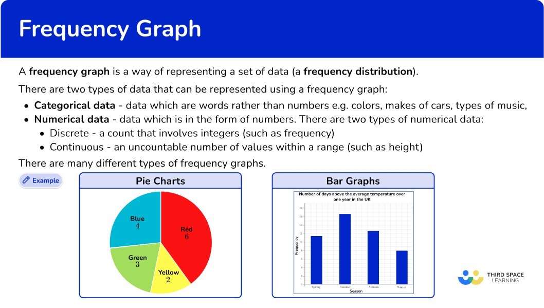
A frequency graph is a way of representing a set of data (a frequency distribution).
To represent data using a frequency graph, you need to know which type of graph would be preferable for the data you are representing (and be able to justify why this type of frequency graph has been chosen), and how to draw each type of frequency graph.
There are two types of data that can be represented using a frequency graph.
- Categorical data – data that are words rather than numbers, for example, colors, makes of cars, types of music.
- Numerical data – data that is in the form of numbers. There are two types of numerical data.
- Discrete – a count that involves integers (such as frequency)
- Continuous – an uncountable number of values within a range (such as height)
You can use different types of frequency graphs to display data in a variety of ways.
![[FREE] Frequency Graphs and Tables Worksheet (Grades 2 to 6)](https://thirdspacelearning.com/wp-content/uploads/2023/02/end-of-year-math-assessment-grade-4-grade-5.png)
[FREE] Frequency Graphs and Tables Worksheet (Grades 2 to 6)
Use this quiz to check your grades 2 to 6 students’ understanding of frequency graphs and tables. 10+ questions with answers covering a range of 2nd, 3rd, 4th, 5th and 6th grade topics to identify learning gaps!
DOWNLOAD FREE [FREE] Frequency Graphs and Tables Worksheet (Grades 2 to 6)
Use this quiz to check your grades 2 to 6 students’ understanding of frequency graphs and tables. 10+ questions with answers covering a range of 2nd, 3rd, 4th, 5th and 6th grade topics to identify learning gaps!
DOWNLOAD FREEPie charts
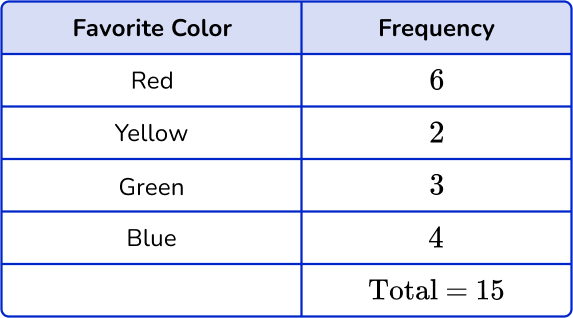
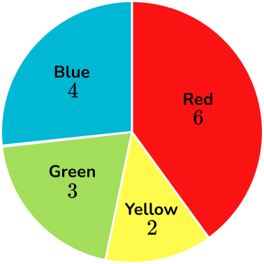
Pie charts can be used for categorical data. Each sector of the pie chart (or “slice”) is proportional to the frequency of the item in the data set.
Below is an example of drawing a pie chart to represent the favorite colors of a sample of 2 year old children.
See also: Pie chart
Bar graphs (and vertical line graphs)
Bar graphs, also called bar charts, can also be used for categorical data. The horizontal axis (x -axis ) is for the data values. The vertical axis (y -axis ) is labeled frequency.
To draw a bar graph, you need to know the frequency of each category. Below is an example of a standard bar graph.
There are different types of bar graphs, including comparative and compound bar graphs.
See also: Bar graphs
Bar graphs and vertical line graphs can be used for discrete numerical data.
For example,
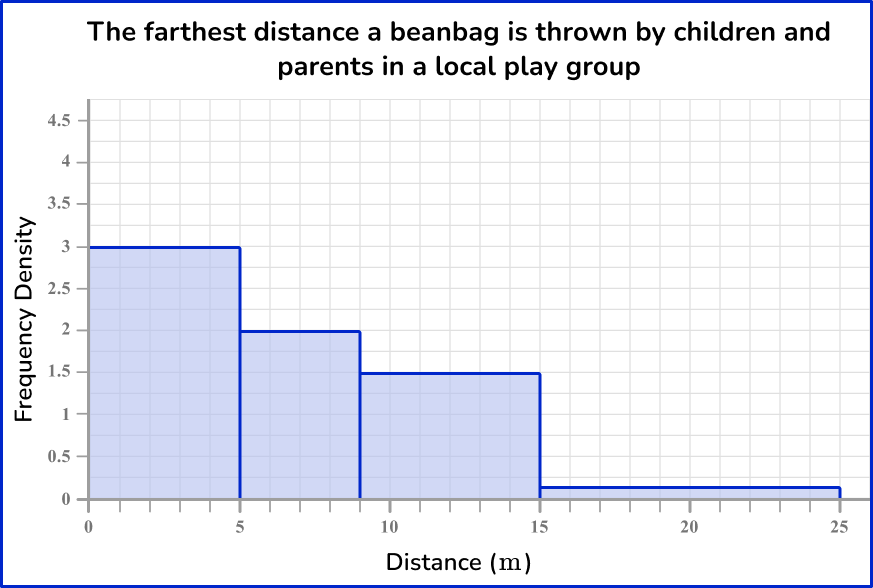
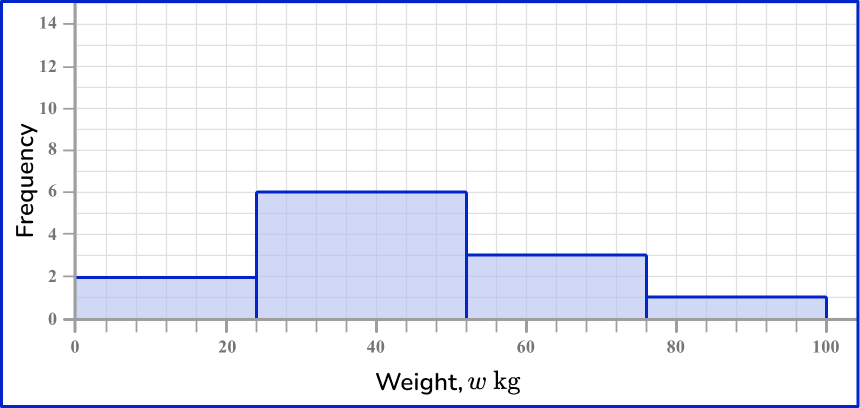
Here is an example of a frequency diagram for grouped numerical data. This data is continuous, so there are no gaps between the bars.
Line plots / Dot plots
In a line plot (or dot plot), individual data points are displayed, usually as Xs or dots, along a single axis. It is used to show the distribution of data points, the frequency of different values, or the spread of data.
Frequency polygons / line graphs
Grouped data can also be displayed in a frequency polygon. This is a type of line graph. The frequencies can be joined together using straight line segments because the horizontal axis is a continuous scale.
Here you can see the use of a break on the vertical axis as there are no data values between 0 and 14. You cannot use a break when drawing a bar graph.
Step-by-step guide: Frequency polygon
Cumulative frequency graphs
A frequency graph represents the individual frequencies of each category; a cumulative frequency graph, also called an ogive, shows the frequencies of each category accumulated together.
This allows us to analyze the distribution of the data in more detail than if you used a frequency polygon and calculate statistics.
Below is an example of a cumulative frequency graph along with the data set.
The horizontal axis of a cumulative frequency graph is a continuous scale, and the vertical axis represents the cumulative frequency.
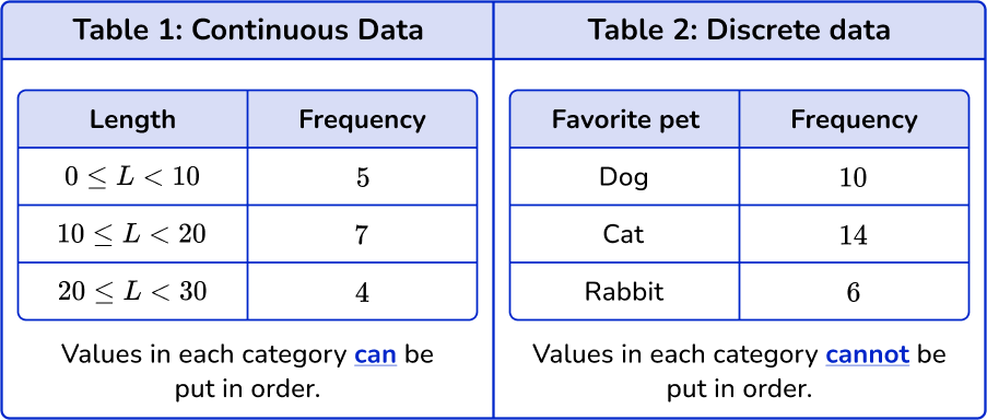
To calculate a cumulative frequency, the frequency of values in the next category is added to the frequency of all the previous values in the data set, so you keep a running total of the data throughout the table. This means that the data must be in order.
You can order data that is in numerical groups (see table 1 below).
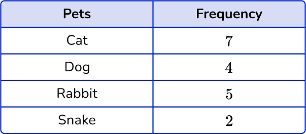
You cannot add the frequencies of discrete categories such as favorite pet because there is no order to which pet is named first, second, etc. ( see table 2).
A cumulative frequency graph can help us calculate statistics such as the median, the upper and lower quartiles, the interquartile range (IQR) and percentiles.
Step-by-step guide: Cumulative frequency
Histograms
A histogram is different to a bar graph in multiple ways. The horizontal (x -axis ) is a continuous scale with no gaps between intervals and the vertical (y-axis ) is labeled frequency density instead of frequency.
For any histogram, the area of the bar represents the frequency of the class; not the height of the bar. The larger the area of the bar, the higher the frequency within that interval.
Step-by-step guide: Histogram
What is a frequency graph?
Common Core State Standards
How does this relate to elementary math?
- Grade 2 – Measurement and Data (2.MD.D.9)
Generate measurement data by measuring lengths of several objects to the nearest whole unit, or by making repeated measurements of the same object. Show the measurements by making a line plot, where the horizontal scale is marked off in whole-number units.
- Grade 3 – Measurement and Data (3.MD.B.4)
Generate measurement data by measuring lengths using rulers marked with halves and fourths of an inch. Show the data by making a line plot, where the horizontal scale is marked off in appropriate units— whole numbers, halves, or quarters.
- Grade 4 – Measurement and Data (4.MD.B.4)
Make a line plot to display a data set of measurements in fractions of a unit (\cfrac{1}{2}, \cfrac{1}{4}, \cfrac{1}{8}). Solve problems involving addition and subtraction of fractions by using information presented in line plots. For example, from a line plot find and interpret the difference in length between the longest and shortest specimens in an insect collection.
- Grade 5 – Measurement and Data (5.MD.B.2)
Make a line plot to display a data set of measurements in fractions of a unit (\cfrac{1}{2}, \cfrac{1}{4}, \cfrac{1}{8}). Use operations on fractions for this grade to solve problems involving information presented in line plots.
For example, given different measurements of liquid in identical beakers, find the amount of liquid each beaker would contain if the total amount in all the beakers were redistributed equally.
- Grade 6 – Statistics and Probability (6.SP.B.4)
Display numerical data in plots on a number line, including dot plots, histograms, and box plots.
How to create a frequency graph
In order to create a frequency graph:
- Read the question and determine what type of graph you need to create.
- Use the data to create the specific frequency graph.
Frequency graph examples
Example 1: constructing a bar graph
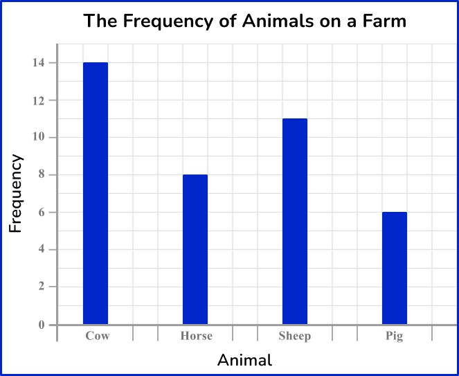
A farmer was keeping track of the animals on the farm. Draw a bar graph for this set of data.
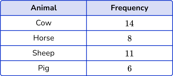
- Read the question and determine what type of graph you need to create.
The question asks you to create a bar graph to represent this set of data.
2Use the data to create the specific frequency graph.
First, draw a pair of axes and label them with frequency on the vertical axis (y -axis ) and animals on the horizontal axis (x -axis ).
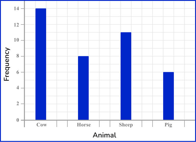
Next, use a ruler to draw each bar with the correct height.
Draw the heights of the bars depending on its frequency. Draw each bar the same width. There should be gaps between the bars as the data is discrete.
The last step is to add a title to the bar graph so that you can quickly see what the bar graph is representing. An appropriate title for this graph is ‘The frequency of animals on a farm.’
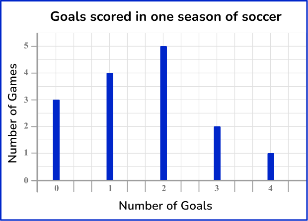
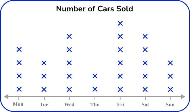
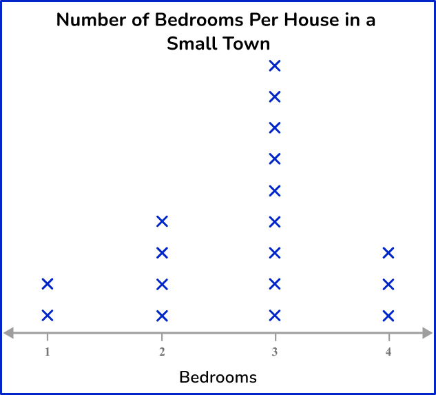
Example 2: constructing a line plot
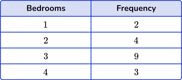
An estate agent was researching the number of bedrooms each house has in a small town. Draw a line plot for this set of data.
This question asks you to create a line plot to represent the data.
A line plot only uses a single axis, so the first step is to draw a horizontal axis and label it with the number of bedrooms.
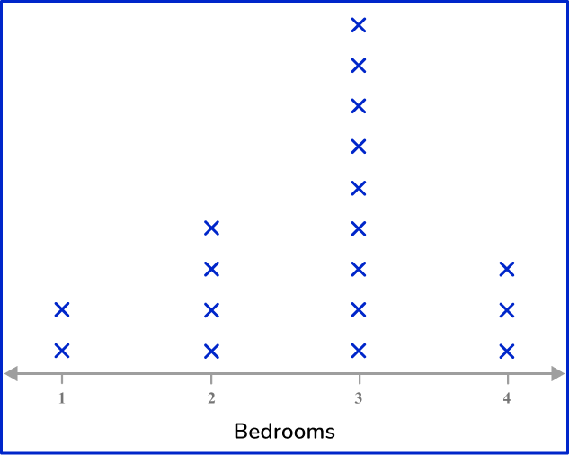
Next, draw a line of Xs above each number to represent its frequency.
Finally, give the chart a title.
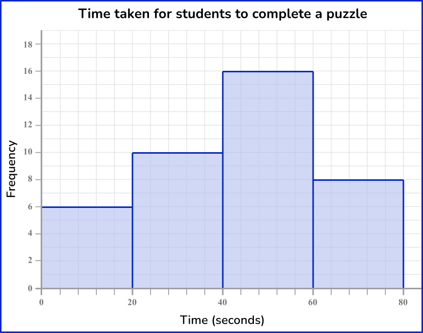
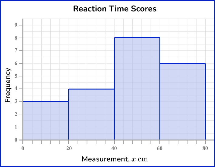
Example 3: constructing a frequency diagram for grouped data
21 students participated in a reaction time study where they were to catch a falling ruler. The measurements where they caught the ruler were recorded in the grouped frequency table below.
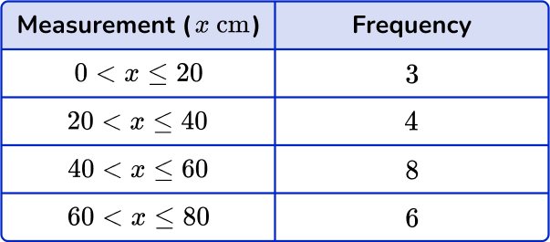
Construct a frequency diagram to represent the data in the table.
This question asks you to create a frequency diagram to represent the data.
First, draw a pair of axes and label them with ‘Frequency’ on the vertical axis (y -axis ) and ‘Measurement’ on the horizontal axis (x -axis ).

Next, draw the heights of each bar depending on its frequency. As the scale is continuous for the scores, you do not need gaps between the bars.
The horizontal axis has measurements from 0 to 80{~cm}, and the highest frequency is 8 and so the vertical axis should be labeled from 0 to at least 8. Here, you have drawn the vertical axis to 9 so that you can clearly see the top of the highest bar.
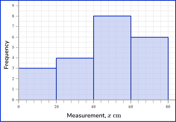
Finally, give the chart a title.
Example 4: constructing a frequency polygon
The test scores for a sample of people were recorded in a grouped frequency table.
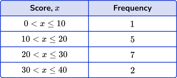
Construct a frequency polygon to show this data.
This question asks you to create a frequency polygon to represent the data.
First, draw a pair of axes and label them with ‘Frequency’ on the vertical axis (y -axis ) and ‘ Score, x’ on the horizontal axis (x -axis ).
The range of values for the frequency is 0 to 7 minimum. Increase in steps of 1.
The range of values for scores is 0 to 40. Increase in steps of 5.
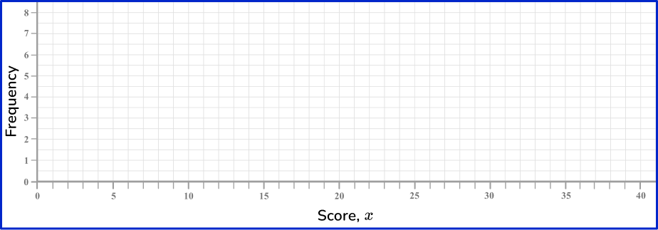
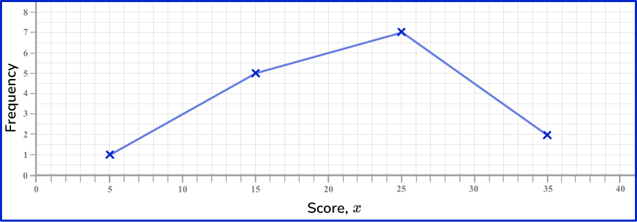
Next, plot each data point accurately.
You need to find the midpoints of the class intervals. These can be found by adding the lower class boundary to the upper class boundary and dividing by 2.
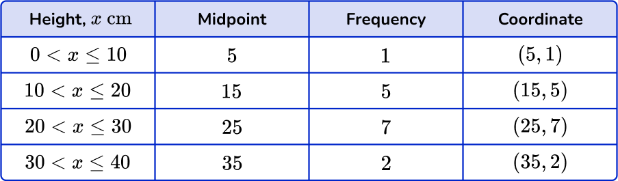
Finally, connect each pair of consecutive points with a straight line.
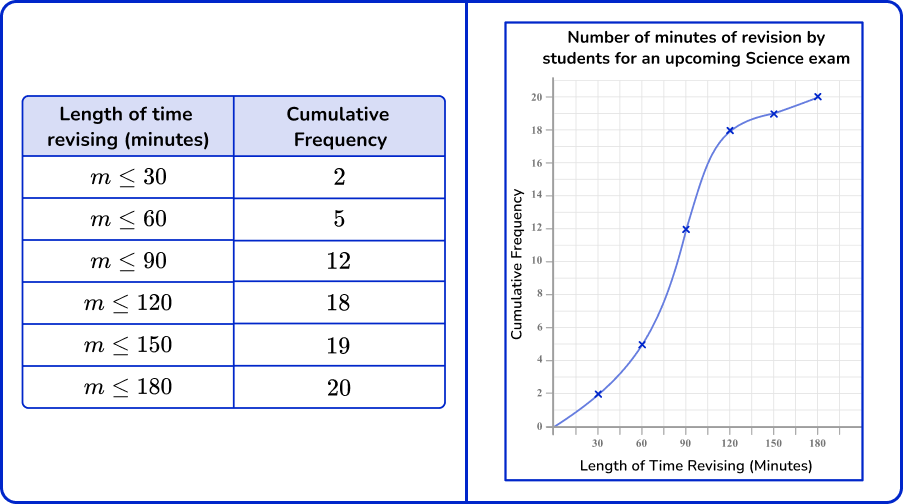
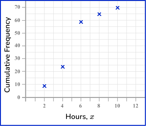
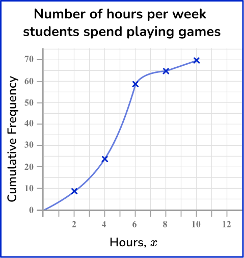
Example 5: constructing a cumulative frequency graph
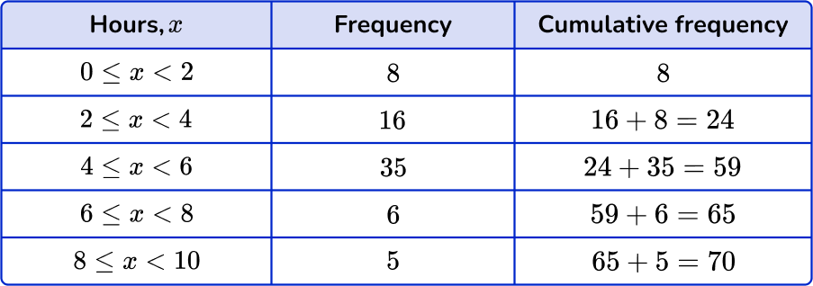
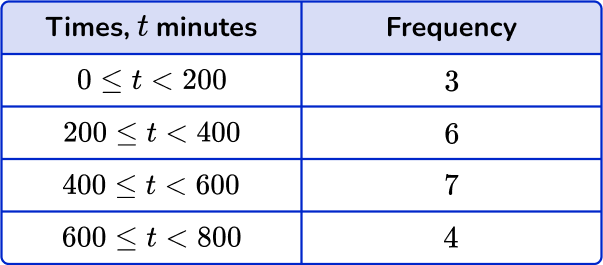
The number of hours students play games per week was recorded into the grouped frequency table below.
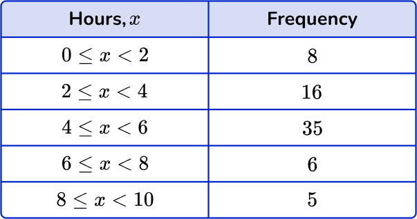
Draw a cumulative frequency graph to represent this information.
This question asks you to create a cumulative frequency graph to represent the data.
Before creating the graph, you need to calculate the cumulative frequency values for the data set in the cumulative frequency table.
To calculate the cumulative frequency of the data, you add the current frequency value to all of the frequency values before the class interval.
Next, draw a set of axes with suitable labels.
The greatest number of hours is 10 and so you need a horizontal axis labeled in equal steps from 0 to at least 10.
The total frequency of the data is 70 and so you need to start the vertical axis at 0 (no break allowed) and increase in equal steps up to 70.
Then, plot each value at the end of the interval.
Remember: you can only know the location of all the data at the end of the class interval. This is why the data in a cumulative frequency graph is an estimated distribution of the data set because you do not know the exact values of all 70 items.
Plotting the endpoint and the cumulative frequency for the class intervals, you have:
Now join the points with a smooth curved line.
The line must be a single smooth curve.
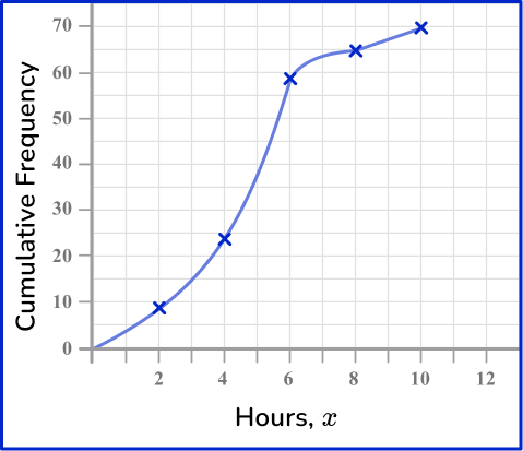
The last step is to add a title to the cumulative frequency graph.
Here, a suitable title would be
Example 6: constructing a histogram
The word count for 30 books was recorded into a grouped frequency table.
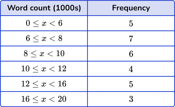
Draw a histogram to represent this information.
This question asks you to create a histogram to represent the data.
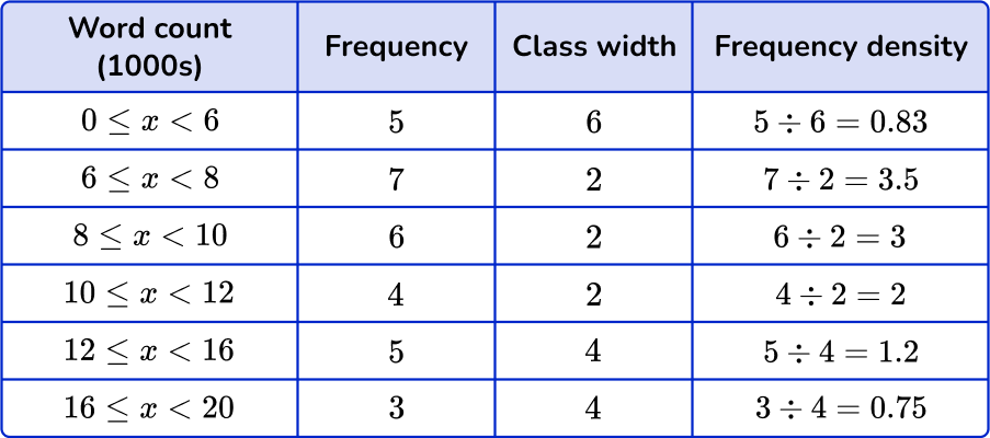
Before you create the histogram, you need to calculate the frequency density for each class interval.
Using the frequency density formula D=\cfrac{F}{W}, you substitute the information from each row to calculate the frequency density. Remember to calculate the class width for each class as well.
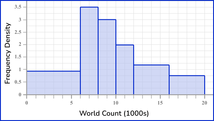
Next, use the frequency density and class intervals to create suitable vertical and horizontal axes.
The maximum frequency density is 3.5 and the horizontal scale needs to go from 0 to 20.

Finally, draw bars for each class interval using the frequency density as the height of the bar.
Drawing each bar one after the other with no gaps, you have the completed histogram.
Teaching tips for frequency graph
- Begin by showing real-life examples of frequency graphs that are relatable to the students. For instance, you can ask them about their favorite colors, animals, or ice cream flavors and create a frequency graph based on their responses.
- Involve the students in data collection. Have them survey each other on various topics and record the responses. This will make the concept of frequency more meaningful and practical for them.
- Visual Aids: Use visual aids like charts, pictures, or drawings to explain the concept of frequency and how a particular value is represented in a graph. Visuals can make the learning experience more enjoyable and memorable.
- Show students how to create visual graphs using digital tools such as Google Sheets.
Easy mistakes to make
- Leaving gaps between bars of a bar graph
There should be gaps between the bars of a bar graph when given discrete data.
- Inconsistent labeling on each axis of a bar graph / vertical line graph
Each axis must be labeled in equal steps. This will help keep the bars/lines at an equal width, and ensure that the height of each bar/line remains consistent.
- Not labeling axes
The horizontal and vertical axes need to have data labels.
- Not having the total of the angles as \bf{360^{\circ}} for a pie chart
The total of the angles in a pie chart is 360^\circ. This is a good check. However, if you are drawing a pie chart using real life data, the total might not be quite 360^\circ as you may need to round values, which reduces the accuracy of the data.
- Confusing pie charts and doughnut charts (donut charts)
Pie charts and donut charts are very similar. A pie chart displaces individual categories as slices of the circle, whereas donut graphs have a hole in the center and displays the categories as arcs.
- Confusing frequency with frequency density (histograms)
A very common error that occurs in histogram questions is that the frequency is used instead of the frequency density. Frequency density must be found because the groups provided in the frequency table are usually not equal width.
- Misunderstanding that the height of the bar is the frequency, instead of the area
Similar to the previous misconception, the height of the bar for a histogram is the frequency, whereas it is the area of the bar that represents the frequency for a histogram. The height of the bar is the frequency of a bar graph.
Practice frequency graph questions
1) Which is the correct pie chart for this set of data?
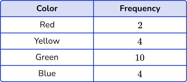
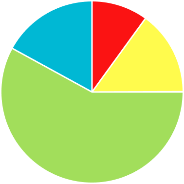

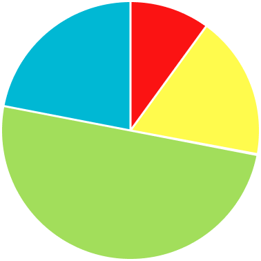


The noticeable characteristics of this pie chart are that the ‘Green’ category is half of the pie chart, and the ‘Yellow’ and ‘Blue’ categories are of equal size.
2) Marcia measured the lengths of the ribbons she has in her craft room. Which is the correct line plot for this set of data?
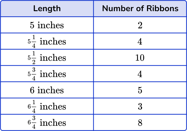
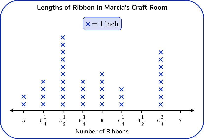
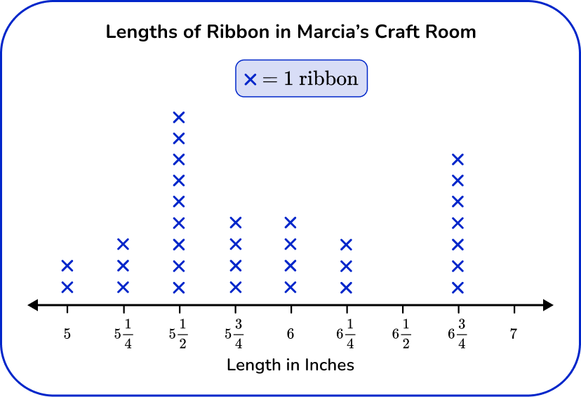
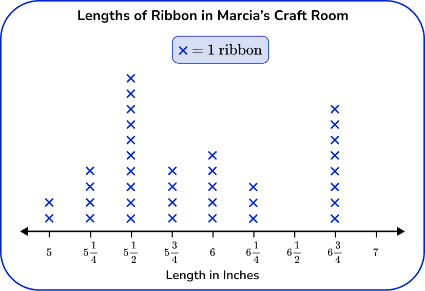
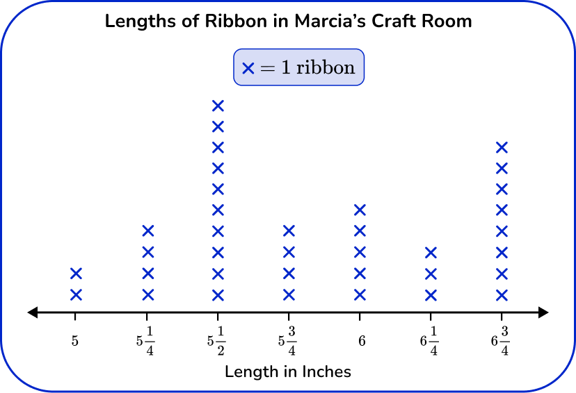
Since this line plot represents measurement data, the horizontal axis works as a number line and should have equal intervals, in this case of \cfrac{1}{4} . The number line shows the lengths in inches and each X represents 1 ribbon.
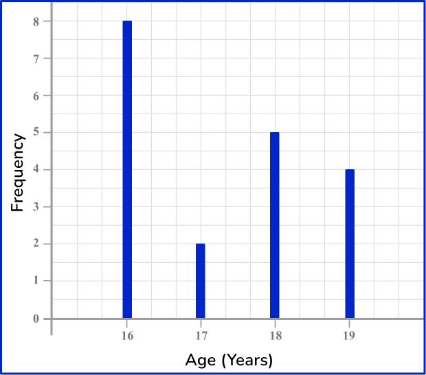
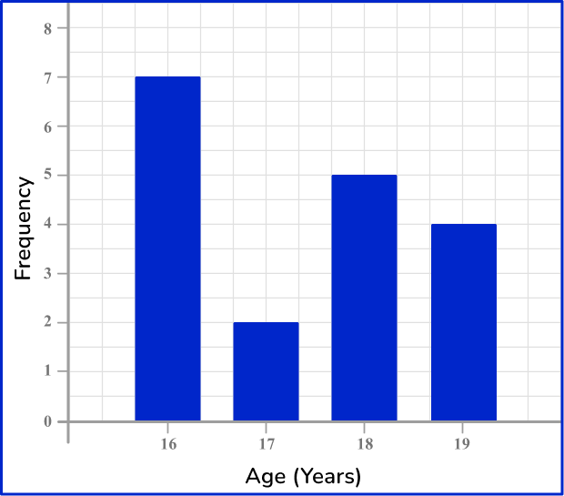
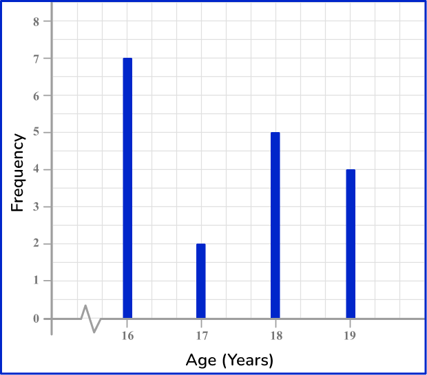
3) An animal shelter is keeping track of the number of pets rehomed since the start of the month. Which one of these bar graphs is the correct bar graph for this set of data?
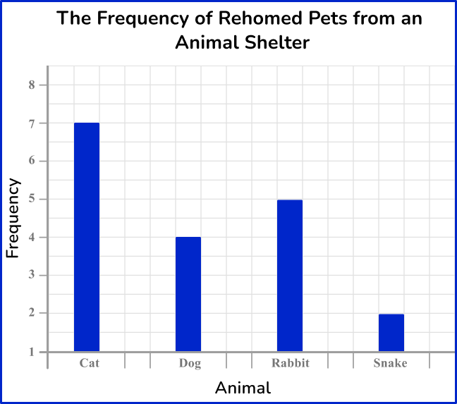
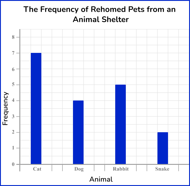
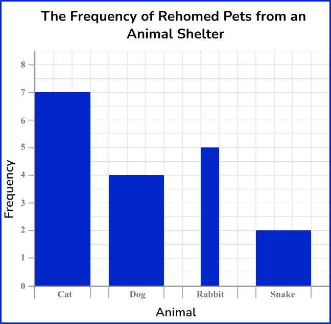
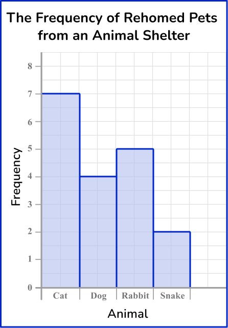
The heights of each bar should match the frequency. The horizontal axis should allow for gaps between each bar, and the bars should be of equal width. The vertical axis must start from 0.
4) Which is the correct vertical line chart for this set of data?
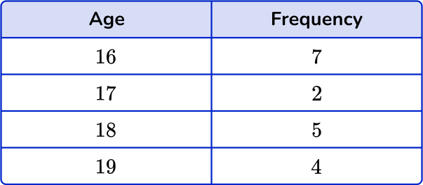
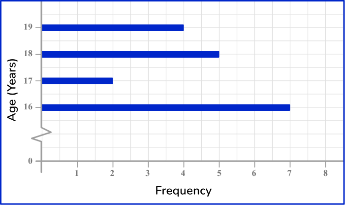
The height of each vertical line should match the frequency for that age category. The horizontal axis should be labeled from 16 to 19, including a break between 0 and 16, and the vertical axis should be labeled 0 to 8.
5) The weight of 12 random objects in a classroom are recorded in the grouped frequency table. Which is the most suitable frequency diagram for this set of grouped data?
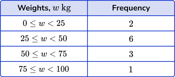
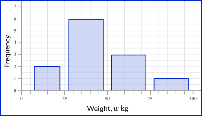

The horizontal axis is a continuous scale, so there should be no gaps between the bars. The category values are a multiple of 25 and so it is suitable to write these values, equally spaced, on the horizontal axis.
The vertical axis is the frequency. The highest frequency is 6 and so the axis should range from 0 to 7 so that the highest bar can be clearly readable.
6) The data in the grouped frequency table below is recorded from the time taken for 20 students to get to school. Which is the correct frequency polygon for this set of data?
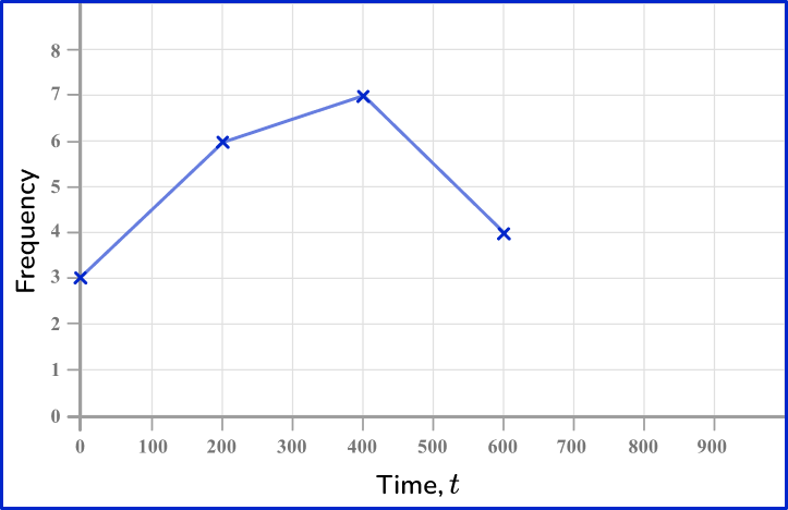
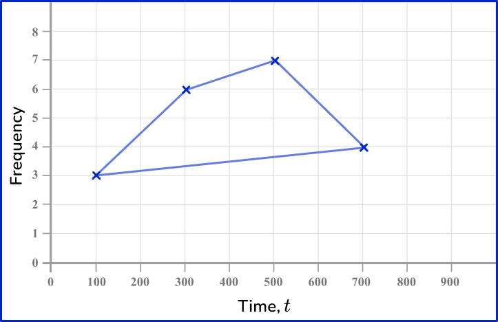
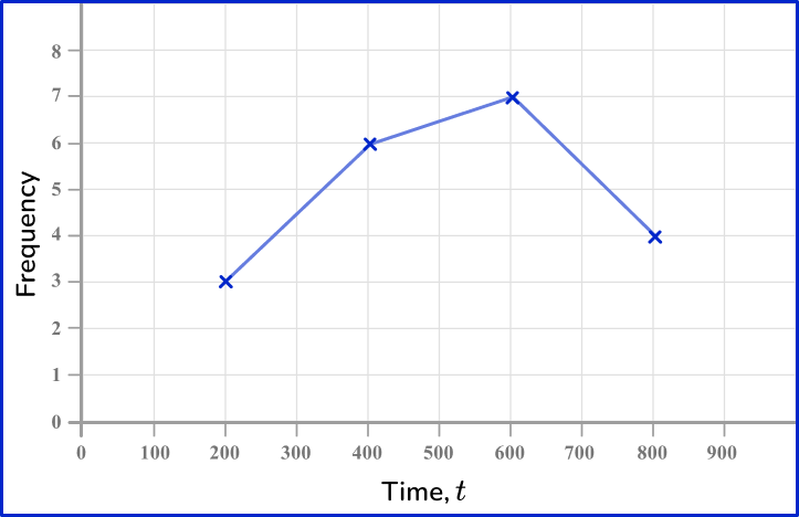
The midpoints of the class intervals are 100, \, 300, \, 500 and 700. These should be used when plotting the points. The points are joined up with straight line segments. The last point does not connect back to the first point.
Frequency graph FAQs
A frequency graph is a graphical representation that shows the number of times different values or categories occur in a set of data.
Grouped data is when the numbers or information are organized into groups or categories. Ungrouped data is a list of individual numbers or information without any organization.
A frequency graph can show relative frequency by using percentages or proportions instead of actual numbers on the vertical axis (Y -axis ). This way, it represents how often something happens compared to the total occurrences in the data.
The main difference between a cumulative frequency graph and a cumulative frequency curve lies in the way the data points are connected. The graph uses straight line segments to connect the points, while the curve uses a smooth, continuous line to represent the cumulative frequencies.
The next lessons are
- Sampling methods
- Probability
- Compound probability
- Units of measurement
- Represent and interpret data
- Frequency distribution
Still stuck?
At Third Space Learning, we specialize in helping teachers and school leaders to provide personalized math support for more of their students through high-quality, online one-on-one math tutoring delivered by subject experts.
Each week, our tutors support thousands of students who are at risk of not meeting their grade-level expectations, and help accelerate their progress and boost their confidence.

Find out how we can help your students achieve success with our math tutoring programs.
[FREE] Common Core Practice Tests (3rd to 8th Grade)
Prepare for math tests in your state with these 3rd Grade to 8th Grade practice assessments for Common Core and state equivalents.
Get your 6 multiple choice practice tests with detailed answers to support test prep, created by US math teachers for US math teachers!