High Impact Tutoring Built By Math Experts
Personalized standards-aligned one-on-one math tutoring for schools and districts
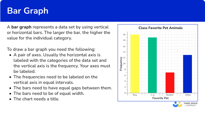
Bar graph
Here you will learn about bar graphs, including constructing and interpreting bar graphs, and how to solve problems using information presented in the bar graph.
Students will first learn about bar graphs as part of measurement and data in the 2 nd grade. They will continue to build on that knowledge throughout elementary and middle school.
What is a bar graph?
A bar graph (bar chart) represents a data set by using vertical or horizontal bars. The larger the height of the bar, the higher the value for the individual category. Bar graphs provide a visualization of the value of the data being recorded.
To draw a bar graph you need the following:
- A pair of axes. Usually the horizontal axis (x -axis ) is labeled with the categories of the data set and the vertical axis (y -axis ) is the frequency. Your axes must be labeled.
- The frequencies need to be labeled on the vertical axis in equal intervals.
- The bars need to have equal gaps between them as it is representing discrete data.
- The bars need to be of equal width.
- The chart needs a title.
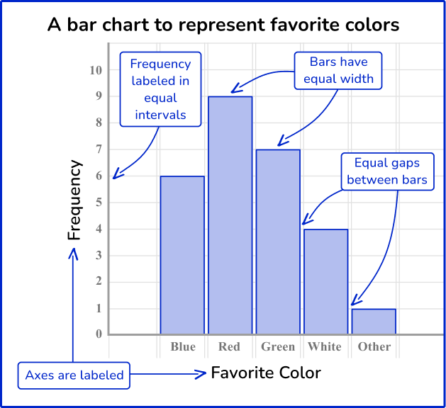
When bar graphs are represented vertically they are sometimes called column charts. Bar graphs can also be represented horizontally where the vertical axis represents each class and the horizontal axis repressents the frequency.
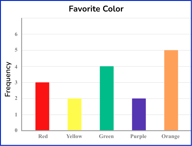
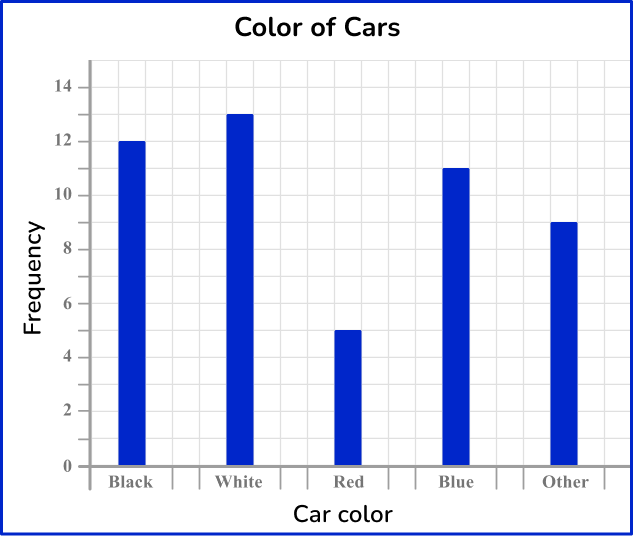
For example, the bar graph below represents people’s favorite color.
Vertical bar graph (vertical bar chart)
OR
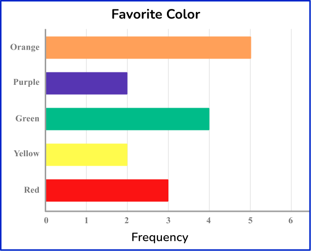
Horizontal bar graph (horizontal bar chart)
Discrete data can be counted and is described as numerical or categorical data (categorical variable).
The data is discrete because each color has a category. The horizontal axis has the category labels with colored bars (Red, Yellow, etc.), and the vertical axis is labeled as a frequency. Here, the taller the bar, the higher the frequency.
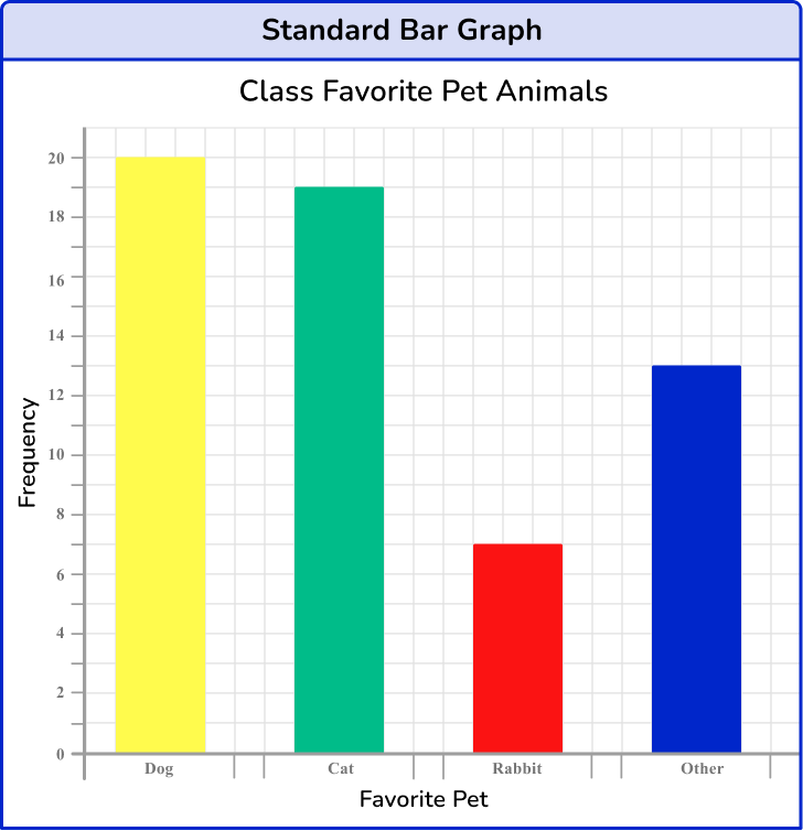
There are several different bar graph types. On this page, the focus will be on standard bar graphs.
What is a bar graph?
Common Core State Standards
How does this relate to 2 nd grade and 3 rd grade math?
- Grade 2: Measurement and Data (2.MD.D.10)
Draw a picture graph and a bar graph (with single-unit scale) to represent a data set with up to four categories. Solve simple put together, take-apart, and compare problems using information presented in a bar graph.
- Grade 3: Measurement and Data (3.MD.B.3)
Draw a scaled picture graph and a scaled bar graph to represent a data set with several categories. Solve one- and two-step “how many more” and “how many less” problems using information presented in scaled bar graphs.
How to construct a bar graph
In order to construct a bar graph:
- Draw the axes with a ruler and label them.
- Use a ruler to draw each bar with the correct height.
- Give the chart a title.
![[FREE] Bar Graph Worksheet (Grade 2 and 3)](https://thirdspacelearning.com/wp-content/uploads/2025/01/Bar-Graph-Worksheet-listing-image.png)
[FREE] Bar Graph Worksheet (Grade 2 and 3)
Use this worksheet to check your 2nd and 3rd grade students’ understanding of bar graph. 15 questions with answers to identify areas of strength and support!
DOWNLOAD FREE [FREE] Bar Graph Worksheet (Grade 2 and 3)
Use this worksheet to check your 2nd and 3rd grade students’ understanding of bar graph. 15 questions with answers to identify areas of strength and support!
DOWNLOAD FREEBar graph examples
Example 1: constructing a standard bar graph
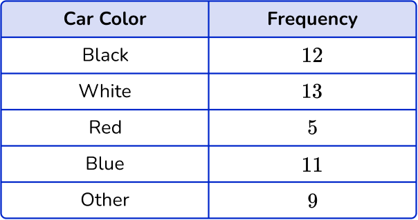
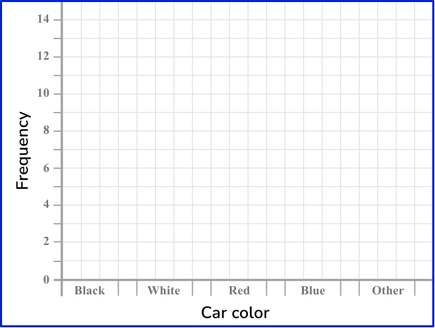
Draw a bar graph to represent the number of colored cars that passed in front of the school building.
- Draw the axes with a ruler and label them.
2Use a ruler to draw each bar with the correct height.
There are 12 black cars in the first category, so draw a bar with the height of 12 units on the vertical axis. Repeating this for each category, you get the bar graph:
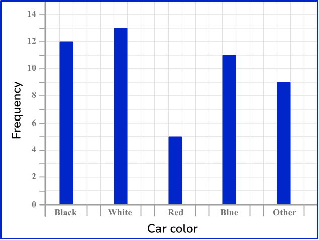
3Give the chart a title.
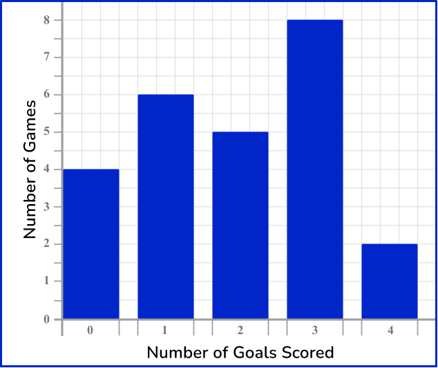
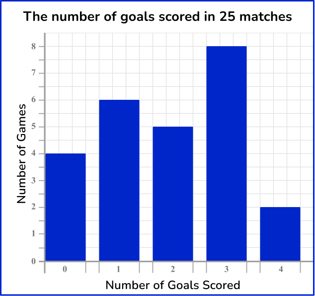
Example 2: construct a bar graph using numerical data
The table below shows the number of goals scored in 25 soccer games. Represent this information in a bar graph.
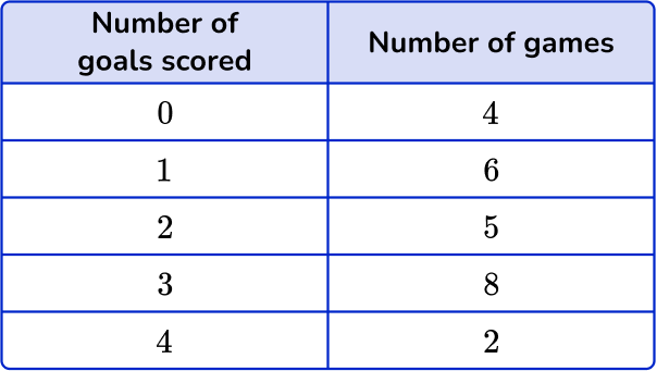
As the first column represents the number of goals, this is the axis label for the horizontal axis. The number of matches is therefore the vertical axis.
Solving problems from a bar graph
In order to solve problems from a bar graph:
- Locate the necessary bar(s).
- Read the frequency from the vertical axis.
- Complete the calculation.
Example 3: solving problems from a bar graph
Below is a bar graph that represents the number of points scored by soccer teams during their games on Saturday afternoon.
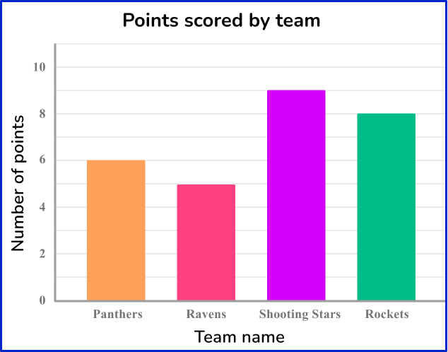
How many points did the Ravens score?
The bar you need to use for this question is the Ravens’ bar.
The frequency is read from the top of the bar.

The Ravens scored 5 points.
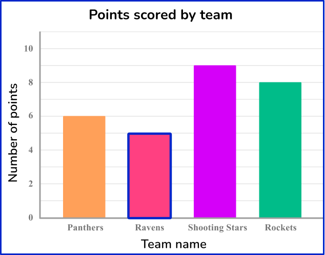
Example 4: solving problems from a bar graph
Below is a bar graph that represents the number of points scored by soccer teams during their games on Saturday afternoon.

How many points did the Panthers and the Rockets score in total on Saturday?
The two bars that you need to locate are the Panthers and the Rockets.
The frequency is read from the top of the bar.
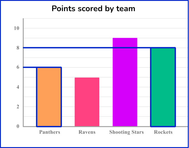
The Panthers scored 6 points on Saturday.
The Rockets scored 8 points on Saturday.
To calculate the points scored on Saturday by the Panthers and the Rockets, you will add the two quantities.
8 + 6 = 14
The Panthers and the Rockets scored 14 points combined on Saturday afternoon.
Example 5: solving problems from a bar graph
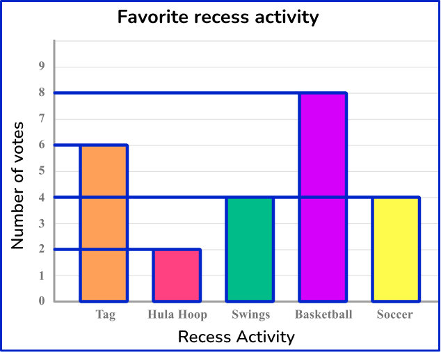
Ms. Sampson’s class voted on which activity was their favorite to play at recess. The bar graph below represents the results.

How many more students voted for basketball than hula hoop?
The two bars that you need to locate are basketball and hula hoop.
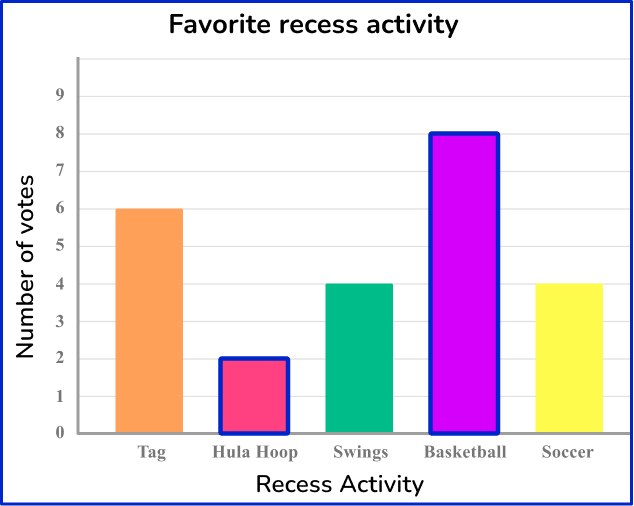
The frequency is read from the top of the bar.
2 students voted for hula hoop as their favorite activity.
8 students voted for basketball as their favorite activity.
To calculate how many more students voted for basketball than hula hoop, you will subtract the two quantities.
8 - 2 = 6
6 more students voted for basketball than hula hoop as their favorite recess activity.
Example 6: solving problems from a bar graph
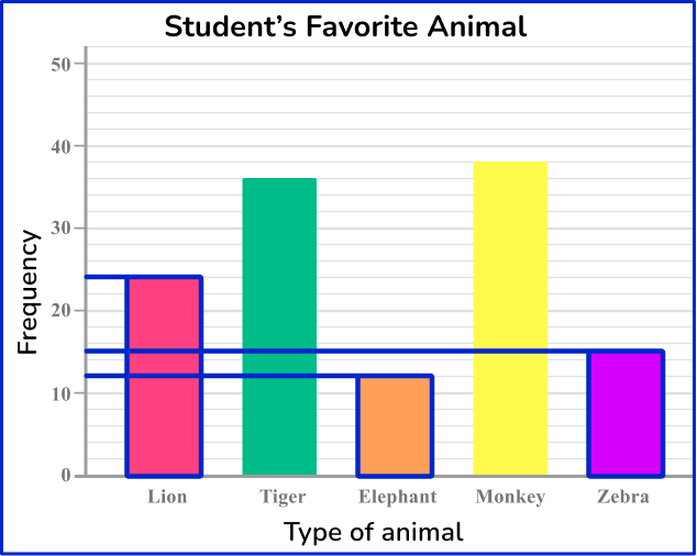
Kevin asked 5 th grade students which was their favorite animal from their trip to the zoo. The bar graph below represents the results.
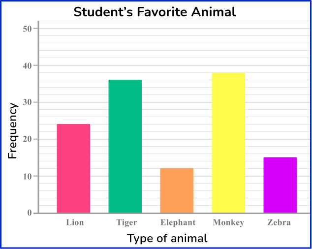
How many students went on the field trip to the zoo?
For this question, you will need the information from all 5 bars.
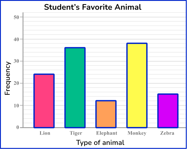
The frequency is read from the top of the bar. Each line represents 2 students that voted for the animal.
24 students voted for the lion as their favorite animal.
36 students voted for the tiger as their favorite animal.
12 students voted for the elephant as their favorite animal.
38 students voted for the monkey as their favorite animal.
15 students voted for the zebra as their favorite animal.
To find how many students went on the field trip to the zoo, you will add all of the votes together.
24 + 36 + 12 + 38 + 15 = 125
125 students went on a field trip to the zoo.
Teaching tips for bar graph
- For students struggling to plot data on a bar graph, a template is a useful tool to allow students to focus on the data, rather than drawing the graph itself.
- Once students are comfortable with creating a bar graph, it’s important to teach them how to interpret data. You can use the same bar graph to ask many different types of questions.
Easy mistakes to make
- Not leaving space between bars
It’s important to leave space between the bars so that the data is easier to read. This also signals that the data is discrete (not continuous) and assures that a bar graph looks visually different from a histogram.
- Not labeling axis
The horizontal and vertical axes need to have data labels. Otherwise there is no way to interpret or use the data given.
- Creating the bars with inconsistent widths
The bars need to be of equal width.
Related represent and interpret data lessons
Practice bar graph questions
1) The table below provides information about the favorite snack of 25 students. Represent this information in the form of a bar graph.
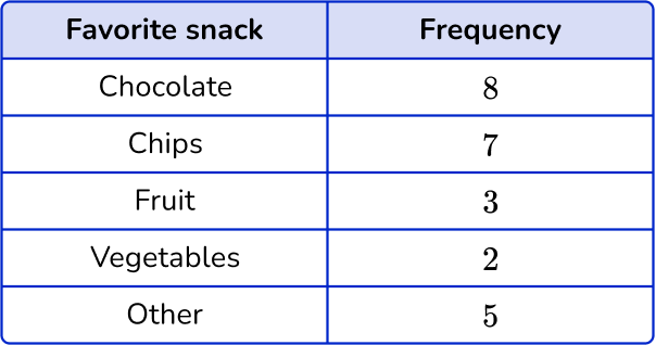
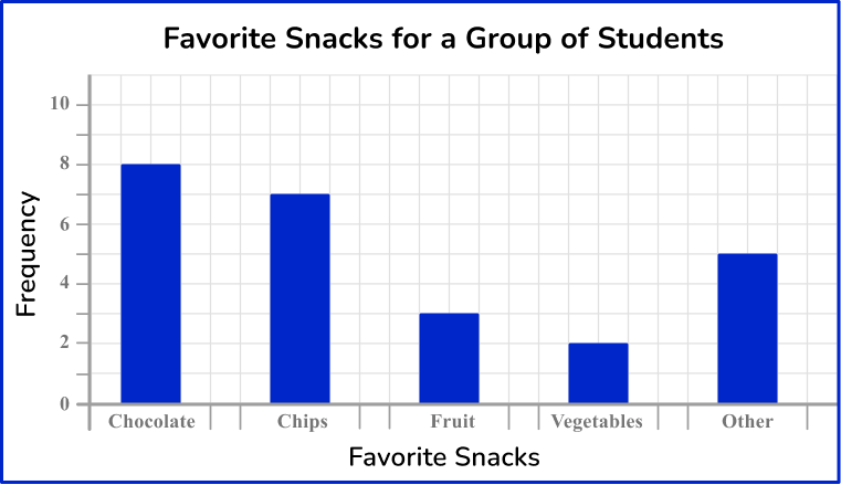

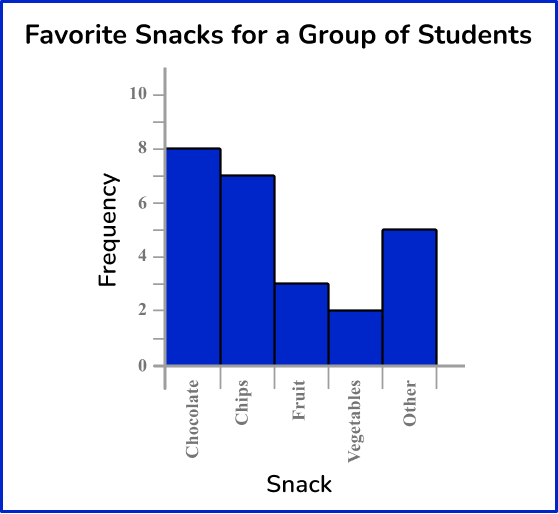

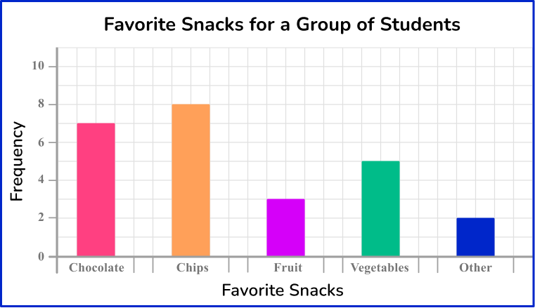
The bars are all drawn at the correct height, equal width apart with an equal space between each bar.
The horizontal axis is labeled with the snack choices and the vertical axis is labeled as counting numbers, starting from 0 on the horizontal axis.
2) A florist sells 5 different types of bouquets. The number of sales for each bouquet in one day is recorded in the table below. Represent this information using a bar graph.
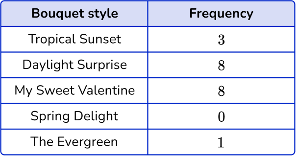
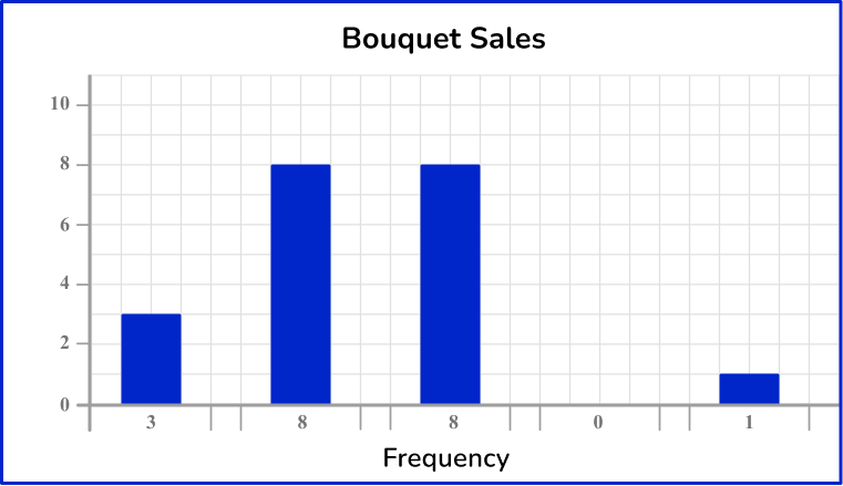
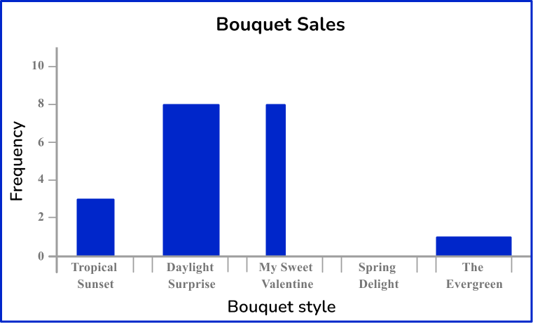
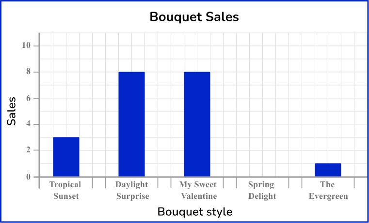
The horizontal axis is labeled with the bouquet style and the vertical axis is labeled with sales.
The bars are drawn to the correct height and all have the same width. There must also be gaps between the bars that are also a constant width. The category ‘Spring Delight’ has no bar because there were no sales.
3) Ms. Sampson’s class voted on which activity was their favorite to play at recess. The bar graph below represents the results.

How many students chose Soccer as their favorite recess activity?
You need to locate the necessary bar to answer the question, which will be the bar labeled soccer.
Find the frequency by reading from the top of the bar.
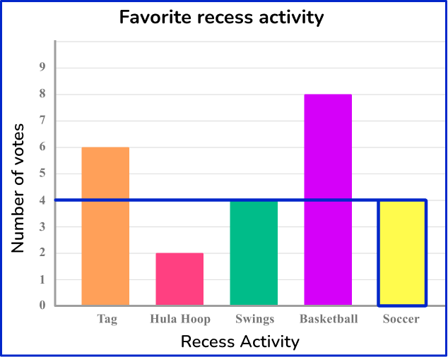
4 students chose soccer as their favorite recess activity.
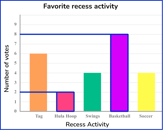
4) Ms. Sampson’s class voted on which activity was their favorite to play at recess. The bar graph below represents the results.

How many students were in Ms. Sampson’s class?
8 students
24 students
To find the number of students in Ms. Sampson’s class, you will need to add the total number of votes from the students.
Find the frequency by reading from the top of the bars.
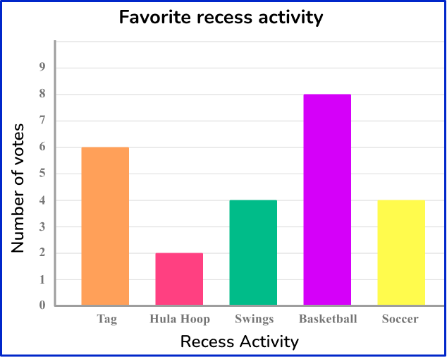
To find the total number of students in Ms. Sampson’s class, add all the frequencies together:
6 + 2 + 4 + 8 + 4 = 24
There were 24 students in Ms. Sampson’s class.
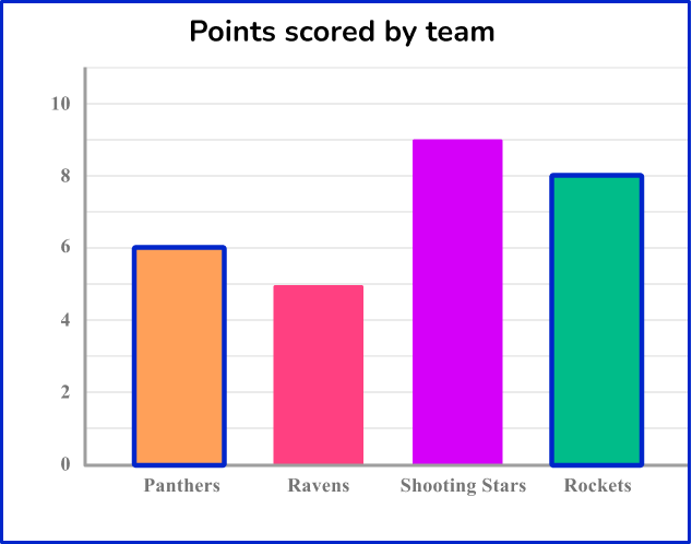
5) Below is a bar graph that represents the number of points scored in a soccer game on Saturday afternoon.

How many more points were scored by the Shooting Stars than the Panthers?
3 points
6 points
9 points
5 points
To find how many more points scored, you will need information from the Panthers and the Shooting Stars.
Find the frequency by reading from the top of the two bars.
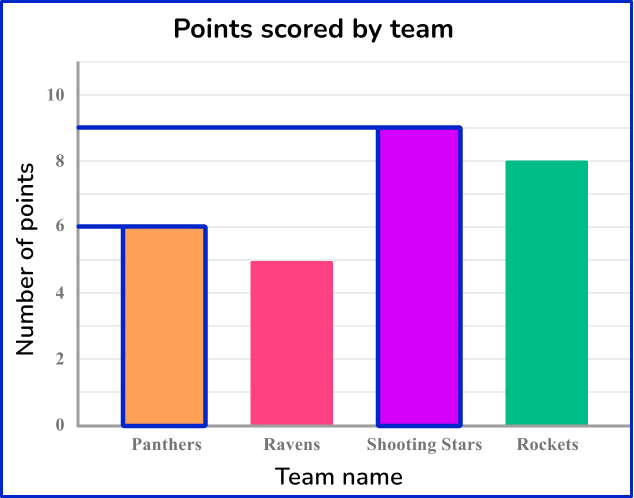
You will subtract the number of points scored by the Panthers from the points scored by the Shooting Stars.
9-6=3
The Shooting Stars scored 3 more points than the Panthers.
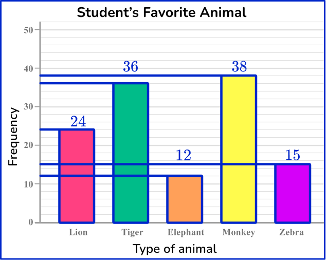
6) Kevin asked 5 th grade students which was their favorite animal from their trip to the zoo. The bar graph below represents the results.

How many students chose the lion, elephant or zebra as their favorite animal at the zoo?
17 students
39 students
36 students
51 students
To find how many students chose the lion, elephant or zebra as their favorite animal, you will need the information from the bars labeled as lion, elephant and zebra.
Find the frequency by reading from the top of the bars.
You will add the frequencies together to find the total:
12+15+24=51
51 students chose either the lion, elephant, or zebra as their favorite animal from the zoo.
Bar graph FAQs
Bar graphs are used to show categorical data. To represent continuous data, you would use another type of graph, like a histogram.
A bar graph is used to compare different groups or track changes over time using rectangular bars, where the length of the bar represents the quantity of the data. A pie chart is used to show the proportion of whole, represented in ‘slices’ where the size of the slide represents the quantity of the data.
See also: Pie chart
A bar graph is used to compare different groups or track changes over time using rectangular bars, where the length of the bar represents the quantity of the data. A line graph, or line chart, is used to show trends or changes over a period of time, showing the relationship between 2 variables. Line graphs are represented by plotting points of a 2-D graph with a line connecting the data points.
Yes, bar graphs are useful when representing data across different categories or groups. There are single data set bar graphs, multiple data set bar graphs and stacked bar graphs.
The next lessons are
Still stuck?
At Third Space Learning, we specialize in helping teachers and school leaders to provide personalized math support for more of their students through high-quality, online one-on-one math tutoring delivered by subject experts.
Each week, our tutors support thousands of students who are at risk of not meeting their grade-level expectations, and help accelerate their progress and boost their confidence.

Find out how we can help your students achieve success with our math tutoring programs.
[FREE] Common Core Practice Tests (3rd to 8th Grade)
Prepare for math tests in your state with these 3rd Grade to 8th Grade practice assessments for Common Core and state equivalents.
Get your 6 multiple choice practice tests with detailed answers to support test prep, created by US math teachers for US math teachers!