Here you will learn how to represent and interpret data, including how to show categorical and discrete data with tally charts, pictographs and bar graphs.
Students will first learn how to represent and interpret data as part of measurement and data in 1 st grade and continue to grow in their skills through elementary school.
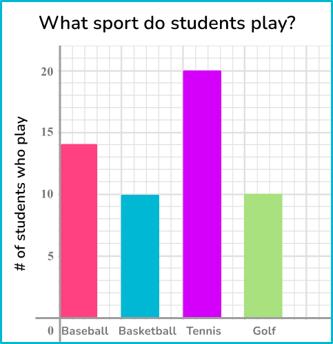
What does it mean to represent and interpret data?
To represent and interpret data, first collect data and then show it visually – in a table or on a graph. This is representing data. Interpreting data is using data analysis to answer questions.
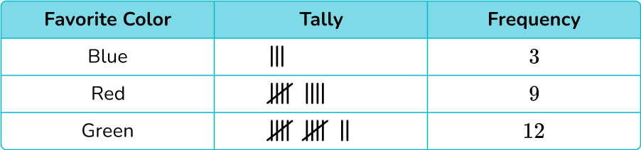
One easy way to collect and represent data is with a tally chart. To do this, sort the data into categories and use tally marks to show the frequencies.
For example,
A benefit of the tally chart is that it is very clear which category occurs the most or least frequently, and can be helpful when analyzing data.
For example,
Which color is most popular? Green ← This can be clearly seen by the amount of tally marks
*Note: Tally charts can be useful both during data collection and data analysis.
[FREE] Represent and Interpret Data Worksheet (Grade 1 to 3)
Use this quiz to check your 1st, 2nd and 3rd grade students’ understanding of representing and interpreting data. 15+ questions with answers covering a range of 1st, 2nd and 3rd grade represent and interpret data topics to identify learning gaps!
Grade 1: Measurement and Data (1.MD.C.4) Organize, represent, and interpret data with up to three categories; ask and answer questions about the total number of data points, how many in each category, and how many more or less are in one category than in another.
Grade 2: Operations and algebraic thinking (2.OA.C.3) Determine whether a group of objects ( up to 20) has an odd or even number of members, example, by pairing objects or counting them by 2 s; write an equation to express an even number as a sum of two equal addends.
Grade 3 – Measurement and Data (3.MD.B.3) Draw a scaled picture graph and a scaled bar graph to represent a data set with several categories. Solve one- and two-step “how many more” and “how many less” problems using information presented in scaled bar graphs.
Grade 4 – Number and Operations – Fractions (4.NF.B.3.b) Decompose a fraction into a sum of fractions with the same denominator in more than one way, recording each decomposition by an equation. Justify decompositions, example, by using a visual fraction model.
Grade 5 – Number and Operations – Base Ten (5.NBT.A.2) Explain patterns in the number of zeros of the product when multiplying a number by powers of 10, and explain patterns in the placement of the decimal point when a decimal is multiplied or divided by a power of 10. Use whole number exponents to denote powers of 10.
How to represent and interpret data
There are a lot of ways to represent and interpret data. For more specific step-by-step guides, check out the pages linked in the “What does it mean to represent and interpret data?” section above or read through the examples below.
Represent and interpret data examples
Example 1: favorite school subject
Below is a list of the favorite school subjects for students in class 2 a.
math, science, english, english, social studies, science, social studies, math, science, social studies, social studies, english, science, english, social studies, math, science, science, english, social studies, social studies, english, science, math, social studies, math, science, science, english.
Draw a tally chart to display this information.
Draw a data table with \bf{3} columns.
Here you are looking at modes of transport, so the title of the first column is ‘Subject’, then you have our ‘Tally’ column, and then the ‘Frequency’ column:
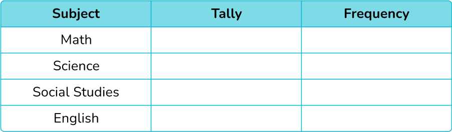
2Write the category names into each row of the table.
The data can be divided into four categories: math, science, social studies, english.
These are the labels for each row.
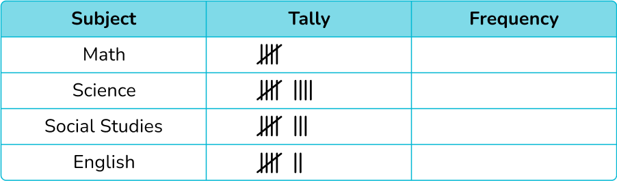
3Record the data into the table using five-bar gate tally marks.
Tally each value in the data one at a time.
The final tally chart should look like:
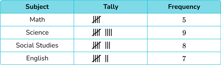
4Work out the frequency for each category by counting the tally marks.
Remember that a five-bar gate represents 5 tally marks.
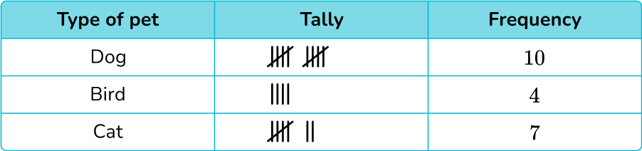
Example 2: tally chart word problems
The tally chart below shows the favorite pet of first grade students in Ms. Ortega’s class.
(a) How many students were asked about their favorite pet?
(b) How many more students wanted a cat as a pet than a bird?
(a) How many students were asked about their favorite pet?
(b) How many more students wanted a cat as a pet than a bird?
(a) How many students were asked about their favorite pet?
To find the total number of students asked about their favorite pet, you will add up the frequency of each category.
10+4+7=21
21 students were asked about their favorite pet.
(b) How many more students wanted a cat as a pet than a bird?
To find how many more students want a cat as a pet than a bird, you will subtract the frequencies.
7-4=3
3 more students wanted a cat as a pet than a bird.
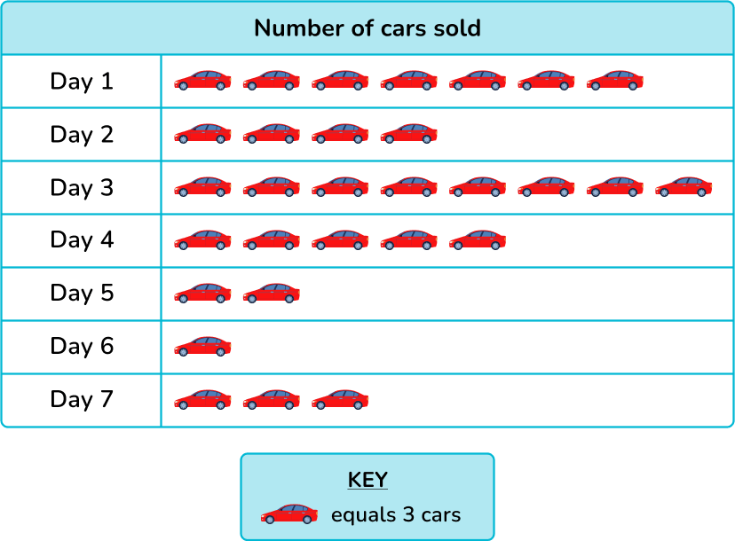
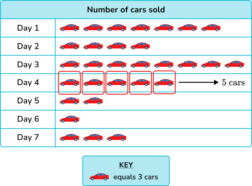
Example 3: read/interpret pictograph
The pictograph below shows the number of cars sold over the course of 7 days. How many cars were sold on Day 4?
Each car symbol represents 3 cars.
On the pictograph, Day 4 has 5 cars.
You can skip count starting with 3.
OR
You can add,
3+3+3+3+3=15
There were 15 cars sold on Day 4.
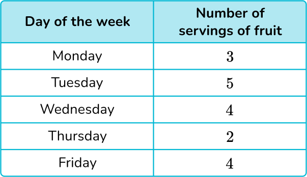
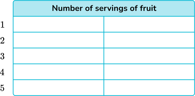
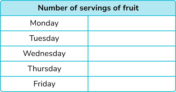
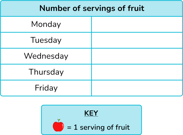
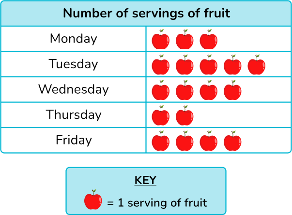
Example 4: construct a pictograph with graphic symbol equal to 1 unit
Use the information in the following table to construct a pictogram of the number of servings of fruit eaten each day over 5 days.
There are 5 days on the tally chart, so there should be 5 rows on the pictograph.
Since the key is 1, the number of apples will be the same as the total fruit servings.
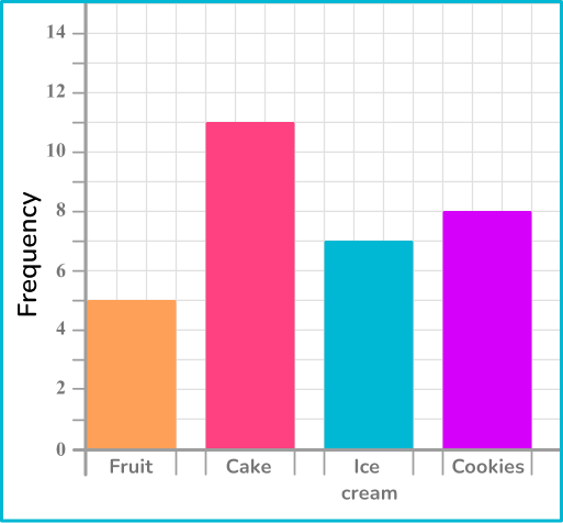
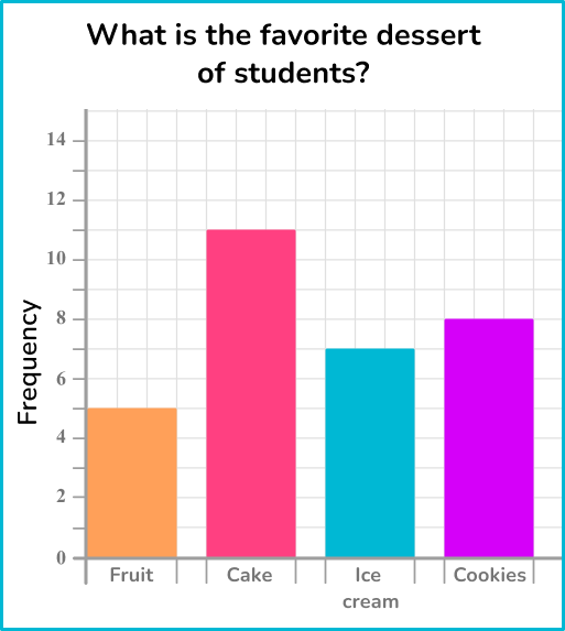
Example 5: constructing a standard bar graph
Draw a bar graph to represent the favorite dessert of students.
There are 5 in the first category, so draw a bar with the height of 5 units on the vertical axis. Repeating this for each category, you get the bar graph:
Example 6: solving problems from a bar graph
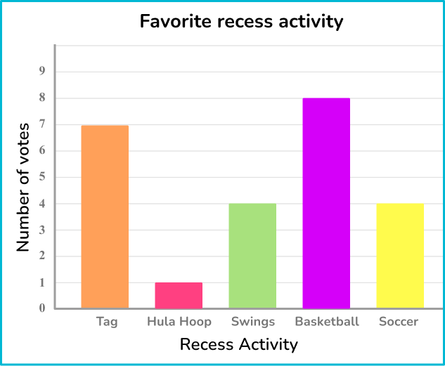
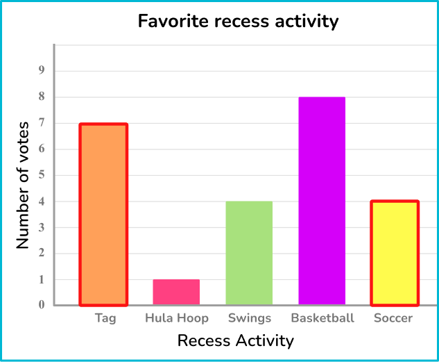
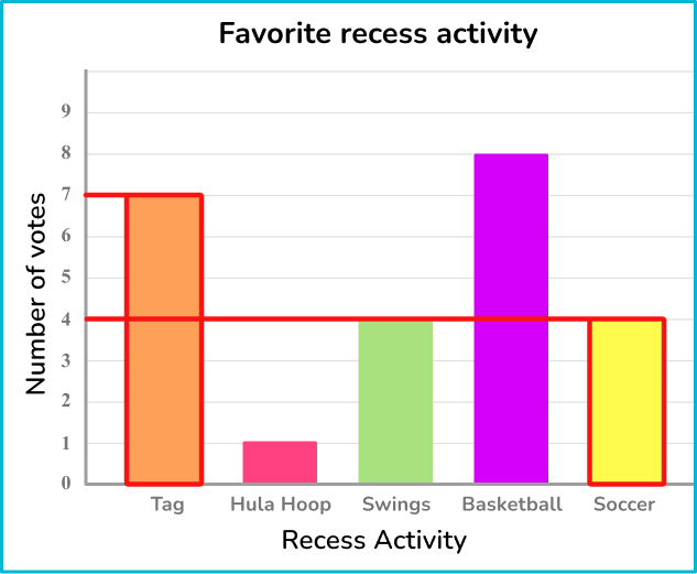
Mr. Li’s class voted on which activity was their favorite to play at recess. The bar graph below represents the results.
How many more students voted for tag than soccer?
The two bars that you need to locate are tag and soccer.
The frequency is read from the top of the bar.
7 students voted for tag as their favorite activity.
4 students voted for soccer as their favorite activity.
To calculate how many more students voted for tag than soccer, you will subtract the two quantities.
7-4=3
3 more students voted for tag than soccer as their favorite recess activity.
Teaching tips to represent and interpret data
Use back to school math activities to introduce students to each other and data in a fun way that involves problem solving. Ask each student to collect data about their new classmates – what is their favorite food, how many siblings do they have, how many books did they read over the summer, etc.
Then have students represent their collected data with a tally chart, pictograph or bar graph. Lastly students can create questions that prompt their classmates to interpret the data.
Instead of just using math printable worksheets to teach students how to collect, represent and interpret data, utilize interactive online resources and apps in your lesson plans to make learning fun and engaging.
Easy mistakes to make
Confusing the total frequency and the number of categories The number of categories is not the same as the total frequency. Be careful when asked for the total number. This means the total frequency NOT the number of categories.
For example, In example 1, there are 4 different school subjects – this is not the total frequency. The total frequency was the total number of students represented by the data.
Forgetting to group tally marks in fives A fifth tally line should always be drawn through the previous four tally marks, creating a five bar gate.
For example, To represent 8\text{:} ➜ Correct: |||| ||| ➜ Incorrect: ||||||||
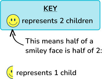
Thinking part of a pictograph symbol cannot be a whole number The use of part of a symbol, does not mean that the actual value is fractional. For example,
In the pictograph above, the smiley face represents 4 people, so half of a smiley face would represent 2 people, which is NOT fractional, but a whole number.
Not leaving space between bars in a bar graph It’s important to leave space between the bars so that it is clear that each bar represents a different group. This also makes the data easier to read and ensures that the bar graph does not look like a histogram.
Not labeling an axis The horizontal and vertical axes need to have labels to name what they represent. This allows you to correctly use and interpret the data given.
Practice represent and interpret data questions
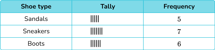
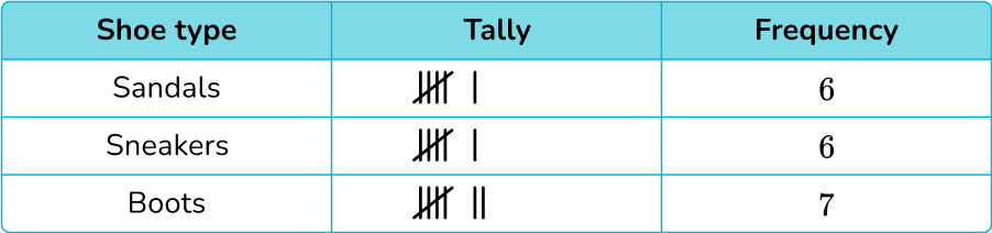
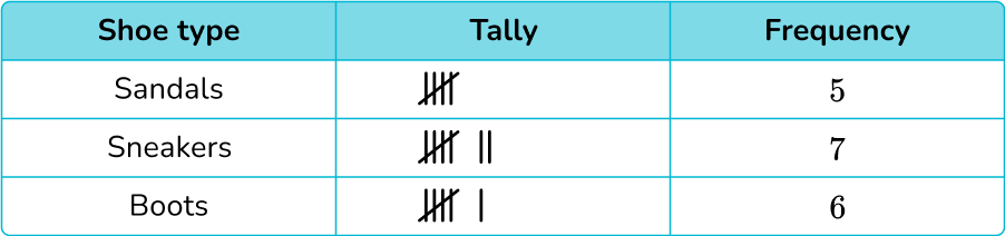
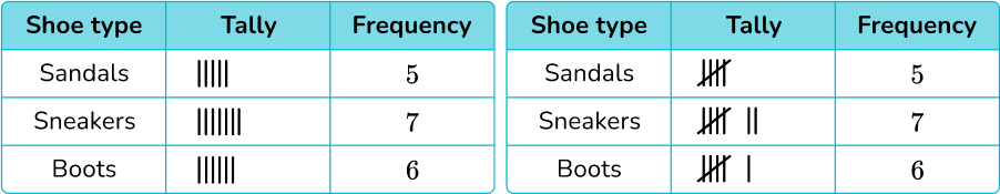
1. A children’s shoe shop took a survey of types of shoes sold over one day. Here is a list of their responses.
Select the correct tally chart that represents the information above.
After counting the data points, the shoe store sold 5 pairs of sandals, 7 pairs of sneakers and 6 pairs of boots, which only leaves two answer choices:
Five-bar gate notation should be used, which leaves only one correct tally chart:
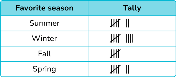
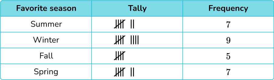
2. The tally chart below shows the favorite season of students in a class.
How many students does the data represent?
25 students
28 students
14 students
8 students
To find the number of students, you will add the frequency:
7+9+5+7=28
The data represents 28 students.
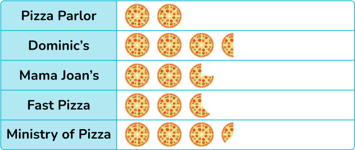
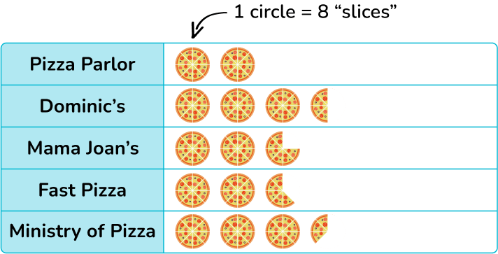
3. Some 2 nd grade and 3 rd grade students were asked what their favorite pizza place was. The pictograph below shows their responses.
If 32 students like Pizza Parlour, how many like Mama Joan’s?
6 students
38 students
44 students
22 students
Pizza Parlor has 2 circles, with a total of 16 slices. Since 16 \times 2=32 students, that means each slice represents 2 students.
Mama Joan’s has 22 slices and 22 \times 2=44 students.
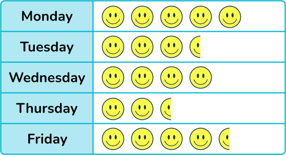
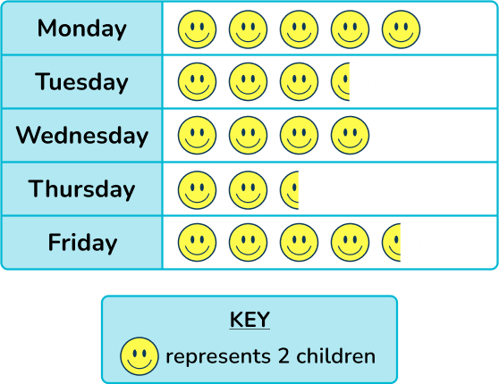
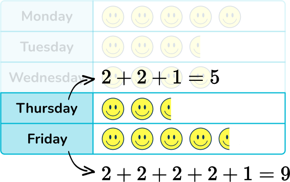
4. A pre-k program records the number of children that attend their after school program in a week. The pictogram below shows their results.
How many more children attended on Thursday than Friday?
1 student
2 students
3 students
4 students
Now we can use these values to find the totals for Thursday and Friday.
To find the difference, use subtraction:
9-5=4
4 more children attended on Friday than Thursday.
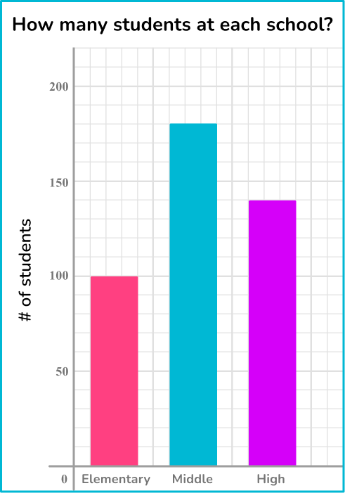
5. The graph below shows the number of students who attend an elementary school, middle school and a high school.
How many more students attend the middle school than the high school?
40 students
4 students
8 students
20 students
Each line in the grid represents 10, so the graph is counting up by 10 s.
This means the total for middle school is 180 and the total for high school is 140.
180-140=40, so middle school is 40 more than high school.
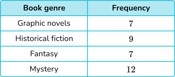
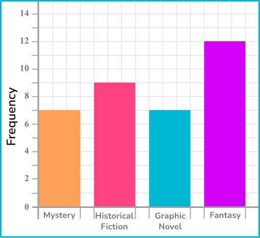
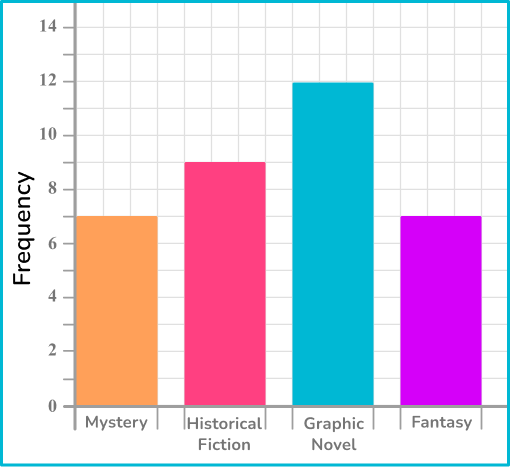
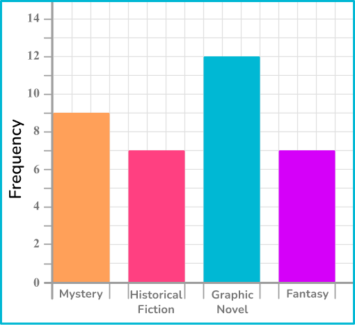
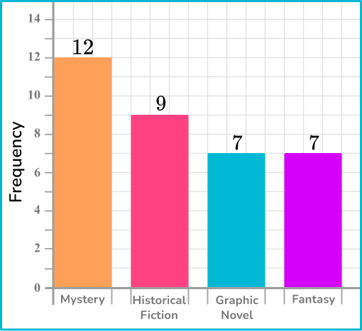
6. Draw a bar graph to represent the favorite book genres of students.
Bar graphs do not have to be in the same order as they are listed on the table. However, they do have to have the same values from the table.
The graph below matches the data from the table.
Represent and interpret data FAQs
What are frequency tables?
A frequency table shows the total of a group within a data set. Students begin to explore frequency tables in elementary school and continue advancing in complexity through middle school and high school.
What are line plots?
Line plots are a way to represent numerical data – as they use a number line to plot data. Students begin exploring line plots in elementary school.
Pie charts are a way to represent data out of a whole. Specifically a whole represented by 100\%. The area of the circle that a data category takes up is proportional to its percentage of the data. Students explore pie charts in middle school.
At Third Space Learning, we specialize in helping teachers and school leaders to provide personalized math support for more of their students through high-quality, online one-on-one math tutoring delivered by subject experts.
Each week, our tutors support thousands of students who are at risk of not meeting their grade-level expectations, and help accelerate their progress and boost their confidence.
We use essential and non-essential cookies to improve the experience on our website. Please read our Cookies Policy for information on how we use cookies and how to manage or change your cookie settings.Accept
Privacy & Cookies Policy
Privacy Overview
This website uses cookies to improve your experience while you navigate through the website. Out of these, the cookies that are categorized as necessary are stored on your browser as they are essential for the working of basic functionalities of the website. We also use third-party cookies that help us analyze and understand how you use this website. These cookies will be stored in your browser only with your consent. You also have the option to opt-out of these cookies. But opting out of some of these cookies may affect your browsing experience.
Necessary cookies are absolutely essential for the website to function properly. This category only includes cookies that ensures basic functionalities and security features of the website. These cookies do not store any personal information.
Any cookies that may not be particularly necessary for the website to function and is used specifically to collect user personal data via analytics, ads, other embedded contents are termed as non-necessary cookies. It is mandatory to procure user consent prior to running these cookies on your website.
![[FREE] Represent and Interpret Data Worksheet (Grade 1 to 3)](https://thirdspacelearning.com/wp-content/uploads/2023/11/Represent-and-Interpret-Data-listing-image.png)