High Impact Tutoring Built By Math Experts
Personalized standards-aligned one-on-one math tutoring for schools and districts
Tally chart
Here you will learn about tally charts, including drawing tally charts using frequency, and how to interpret tally charts.
Students will first learn about tally charts as part of measurement and data in 1 st grade.
What is a tally chart?
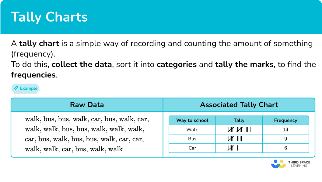
A tally chart is a simple way of recording data and counting the amount of something (frequency). To do this, collect the data, sort it into categories, and tally the marks to find the frequencies.
You represent the frequency using the five-bar gate notation.
For example,
The advantage of using a tally chart is that it can be very clear which item(s) occur the most or least frequently, which can be helpful when analyzing data.
For example,
Let’s say you wanted to collect data on the ways students get to school. You would start collecting data and writing the answers in a list. The best way to sort this data set is to use tally charts.
The data collection looks like this:
walk, bus, bus, walk, car, bus, walk, car, walk, walk, bus, bus, walk, walk, walk, car, bus, walk, bus, bus, walk, car, car, walk, walk, car, bus, walk, walk
The tally chart for the same data looks like this:
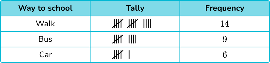
Other graphs/charts (such as bar charts, pie charts and pictograms) can be produced from tally charts.
Interpreting tally charts
Tally charts display frequencies of data in an easy way, which helps you analyze it more quickly than if you were just given the raw data.
- You can find the total number of data points.
- You can find how many are in each category.
- You can find how many more or less are in one category than another.
For example,
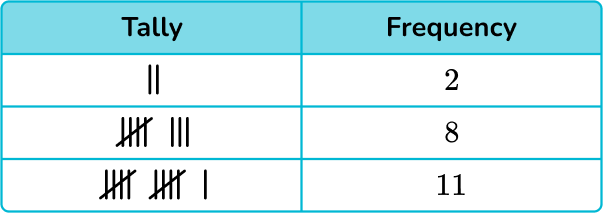
Here is a tally chart that shows the favorite subjects of second grade students.
From the data presented in the table above:
- The most popular subject for this data set is Math.
- The least popular subject for this data set is Reading.
- There were a total of 20 students in Mr. Smith’s class when the data was recorded.
- 4 more students have chosen Math as their favorite subject, compared to Reading.
- 3 less students have chosen social studies as their favorite subject, compared to Math.
What is a tally chart?
Common Core State Standards
How does this relate to 1 st and 2 nd grade math?
- Grade 1: Measurement and Data (1.MD.C.4)
Organize, represent, and interpret data with up to three categories; ask and answer questions about the total number of data points, how many in each category, and how many more or less are in one category than in another.
- Grade 2: Operations and algebraic thinking (2.OA.C.3)
Determine whether a group of objects ( up to 20) has an odd or even number of members, for example, by pairing objects or counting them by 2 s; write an equation to express an even number as a sum of two equal addends.
How to draw a tally chart
In order to draw a tally chart, you need to:
- Draw a data table with \textbf{3} columns.
- Write the category names into each row of the table.
- Record the data into the table using five-bar gate tally marks.
- Work out the frequency for each category by counting the tally marks.
![[FREE] Represent and Interpret Data Check for Understanding (Grade 1 to 3)](https://thirdspacelearning.com/wp-content/uploads/2023/11/Represent-and-Interpret-Data-listing-image.png)
[FREE] Represent and Interpret Data Check for Understanding (Grade 1 to 3)
Use this quiz to check your 1st, 2nd and 3rd grade students’ understanding of representing and interpreting data. 15+ questions with answers covering a range of 1st, 2nd and 3rd grade represent and interpret data topics to identify areas of strength and support!
DOWNLOAD FREE [FREE] Represent and Interpret Data Check for Understanding (Grade 1 to 3)
Use this quiz to check your 1st, 2nd and 3rd grade students’ understanding of representing and interpreting data. 15+ questions with answers covering a range of 1st, 2nd and 3rd grade represent and interpret data topics to identify areas of strength and support!
DOWNLOAD FREETally chart examples
Example 1: journey to school
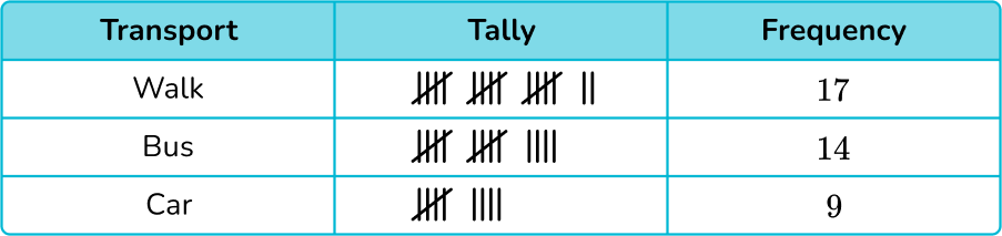
Below is a list of the methods of transport used to get to school by class 9 A.
bus, bus, bus, walk, bus, walk, bus, bus, walk, bus, car, car, walk, walk, walk, walk, bus, bus, walk, bus, car, walk, bus, walk, bus, walk, walk, car, bus, car, walk, walk, car, walk, car, bus, walk, walk, car, car.
Draw a tally chart to display this information.
- Draw a data table with \textbf{3} columns.
Here you are looking at modes of transport, so the title of the first column is ‘Transport’, then you have our ‘Tally’ column, and then the ‘Frequency’ column:
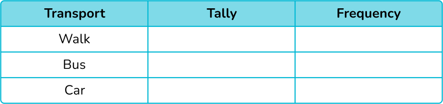
2Write the category names into each row of the table.
The data can be divided into three categories: walk, bus, and car. These are the labels for each row.
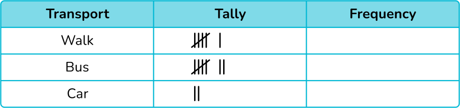
3Record the data into the table using five-bar gate tally marks.
Tally each value in the data one at a time.
TIP: put a small mark next to the item of data once you have written it into the tally. If you cross it out, you may not be able to recover the word if you have made a mistake.
If you tally the first 15 items of data in order, the tally chart looks like this:
Continuing the tally chart for the rest of the data, you get:
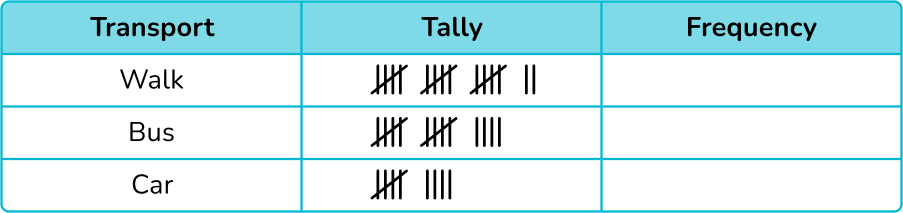
4Work out the frequency for each category by counting the tally marks.
Remember that a five-bar gate represents 5 tally marks.
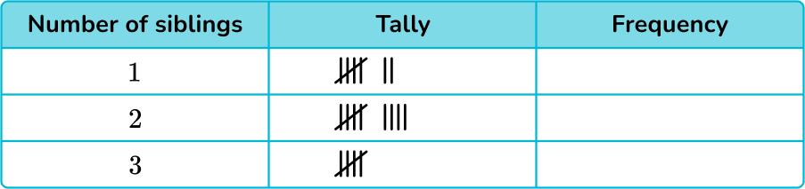
Example 2: number of siblings
A children’s doctor’s office took a survey of the number of siblings their patients had for one day.
Here is a list of their responses.
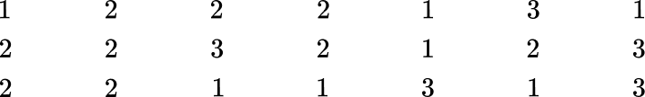
Draw a frequency table (tally chart) to show the results.
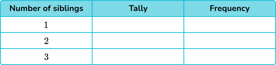
Here you are looking at the number of siblings, so the title for the first column is ‘Number of siblings’. You then have the ‘Tally’ column and the ‘Frequency’ column.
Tally each value in the data one at a time.

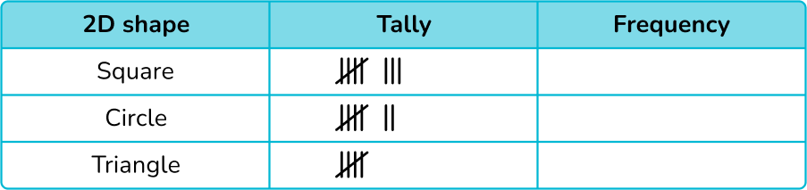
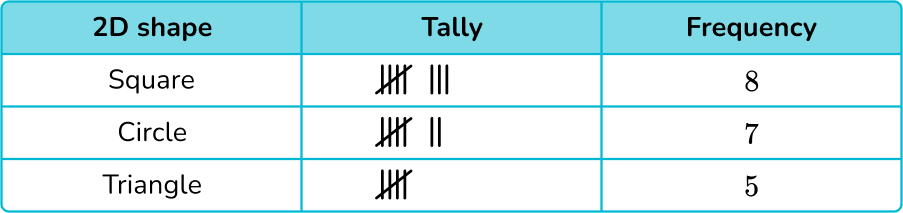
Example 3: 2D shapes
Draw a tally chart to show the frequency of these shapes.

As you are looking at 2D shapes, the first column title is ‘2D shape’. The next two column titles are ‘Tally’ and ‘Frequency’.
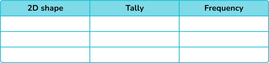
Here there are three categories: square, circle, and triangle. These can be listed in any order in the table:

How to interpret a tally chart
In order to interpret a tally chart, you need to:
- Read the question(s).
- Use the information in the tally chart to answer the question(s).
Example 4: tally chart word problems
The tally chart below shows the number of shape blocks in a bag in a pre-k classroom.
(a) How many shape blocks were in the bag?
(b) How many more square blocks are there than triangle blocks?
(a) How many shape blocks were in the bag?
(b) How many more square blocks are there than triangle blocks?
(a) How many shape blocks were in the bag?
To find the total number of shapes in the bag, you will add up the frequency of each shape.
8+7+5=20
There were 20 shaped blocks in the bag.
(b) How many more square blocks are there than triangle blocks?
To find how many more square blocks there are than triangle blocks, you will subtract the number of triangle blocks from the number of square blocks.
8-5=3
There were 3 more square blocks than triangle blocks.
Example 5: tally chart word problems
The tally chart below shows 2 nd grade student’s lunch orders for the field trip.
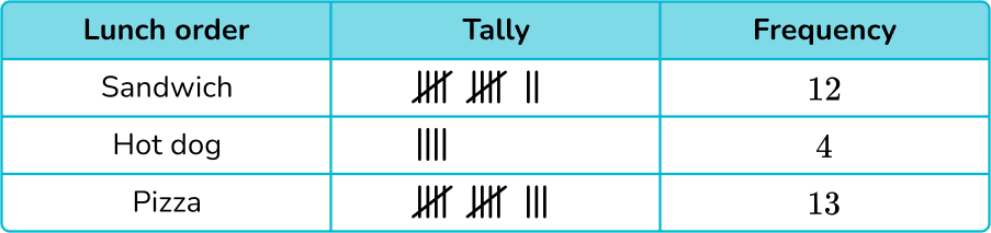
(a) How many students went on the field trip?
(b) How many students wanted a sandwich or a hot dog?
(a) How many students went on the field trip?
(b) How many students wanted a sandwich or a hot dog?
(a) How many students went on the field trip?
To find the total number of students who went on the field trip, you will add up the frequency of each lunch order.
12+4+13=29
29 students went on the field trip.
(b) How many students wanted a sandwich or a hot dog?
To find the number of students that wanted either a sandwich or hot dog, you will add up the two frequencies.
12+4=16
16 students ordered either a sandwich or a hot dog for lunch.
Example 6: tally chart word problems
The tally chart below shows the favorite pet of first grade students in Mr. Teal’s class.
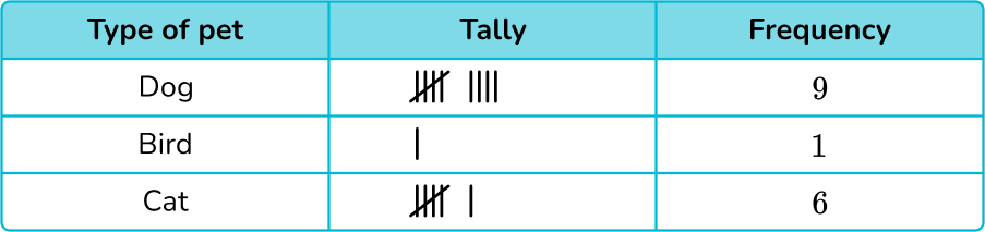
(a) How many students were asked about their favorite pet?
(b) How many more students wanted a cat as a pet than a bird?
(a) How many students were asked about their favorite pet?
(b) How many more students wanted a cat as a pet than a bird?
(a) How many students were asked about their favorite pet?
To find the total number of students asked about their favorite pet, you will add up the frequency of each category.
9+1+6=16
16 students were asked about their favorite pet.
(b) How many more students wanted a cat as a pet than a bird?
To find how many more students wanted a cat as a pet than a bird, you will subtract the frequencies.
6-1=5
5 more students wanted a cat as a pet than a bird.
Teaching tips for tally charts
- While tally chart worksheets can assist with repetition, encourage students to be creative and collect their own sets of data. Provide students with a printable tally chart template, and sentence stems to have students answer questions about the data they collected.
- Instead of just using workbooks or math worksheets to teach tally charts, incorporate interactive online resources and apps, such as interactive tally chart tools or math games, into your lesson plans to make learning fun and engaging.
Easy mistakes to make
- Confusing the number of categories with the total frequency
The number of categories is not the same as the total frequency. Be careful when asked for the total number. This means the total frequency NOT the number of categories.
For example,
In example 1, there are 3 different transport types – this is not the total frequency. The total frequency is 14+9+6=29.
- Incorrectly grouping the tally marks
A fifth tally line should be drawn through the previous four tally marks to group them together (a five bar gate).
For example,
To represent 7 :
➜ Correct:||||
➜ Incorrect: |||||||
Related represent and interpret data lessons
Practice tally chart questions
1) A children’s shoe shop took a survey of types of shoes sold over one day. Here is a list of their responses.
boots \quad \quad \, sneakers \quad sneakers \quad sneakers \quad sandals \quad \; boots
sandals \quad \; \, boots \quad \quad \, boots \quad \quad \, sandals \quad \; \, sneakers \;\;\; sneakers
sneakers \quad sandals \quad \; \, sandals \quad \; sneakers \quad \, boots \quad \quad sandals
Select the correct tally chart that represents the information above.

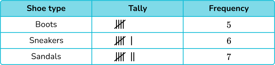


After counting the data points, the shoe store sold 5 pairs of boots, 7 pairs of sneakers and 6 pairs of sandals, which only leaves two answer choices:
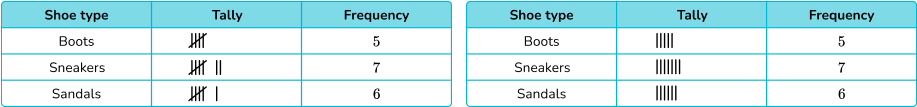
Five-bar gate notation should be used, which leaves only one correct tally chart:
2) Patrick flipped a coin 15 times. He recorded if the coin landed on heads or tails. Here is the data collected.

Select the correct tally chart that represents the information above.
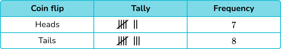

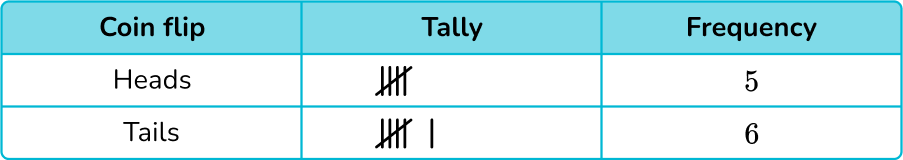
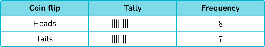
After counting the data points, Patrick flipped heads 8 times and tails 7 times, which only leaves two answer choices:

Five-bar gate notation should be used, which leaves only one correct tally chart:

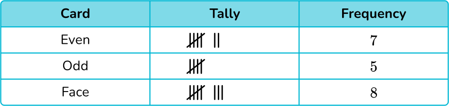
3) A third grade student picked 20 cards at random from a deck. By grouping them into either even numbers, odd numbers, or face cards, draw a tally chart of the results.
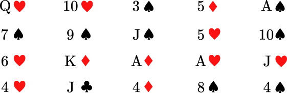
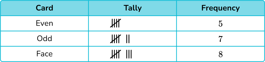
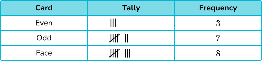

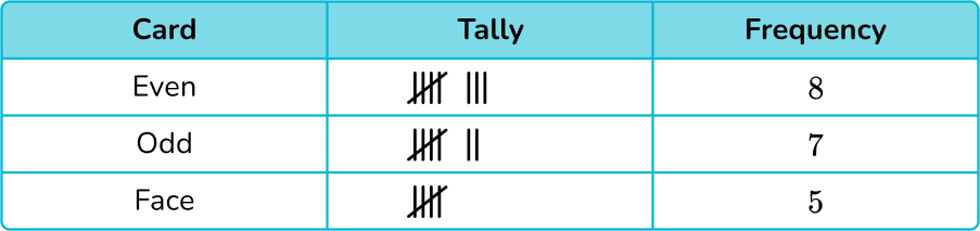
Five-bar gate notation was used on all tally charts.
After counting each type of card, there are 7 even numbered cards, 5 odd numbered cards and 8 face cards.
There was only one correct tally chart:
4) Below is a tally chart that represents the number of students who prefer the colors red, blue, or green.
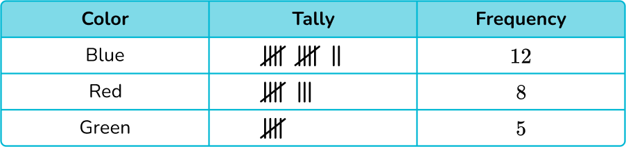
How many more students prefer blue over green?
7 students
3 students
4 students
8 students
To answer the question, you only need to focus on the colors blue and green.
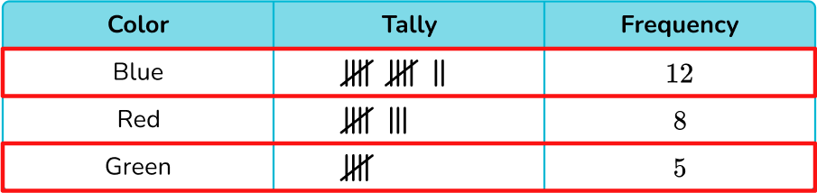
12 students chose blue and 5 students chose green. To find how many more preferred blue over green, you will subtract:
12-5=7
7 students prefer the color blue over the color green.
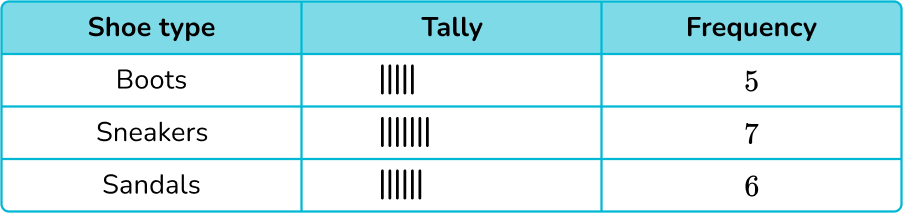
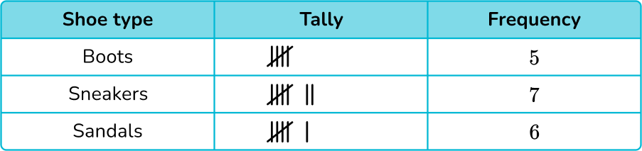
5) The tally chart below represents the types of shoes purchased in a children’s shoe store in one day.

How many pairs of shoes were sold in the shoe store this day?
21 pairs of shoes
13 pairs of shoes
11 pairs of shoes
18 pairs of shoes
To find the total number of pairs of shoes sold, you will add up the frequency of each shoe type.
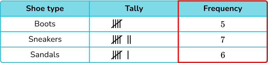
5+7+6=18
The shoe store sold 18 pairs of shoes.
6) The tally chart below shows the number of siblings students have in a primary school.
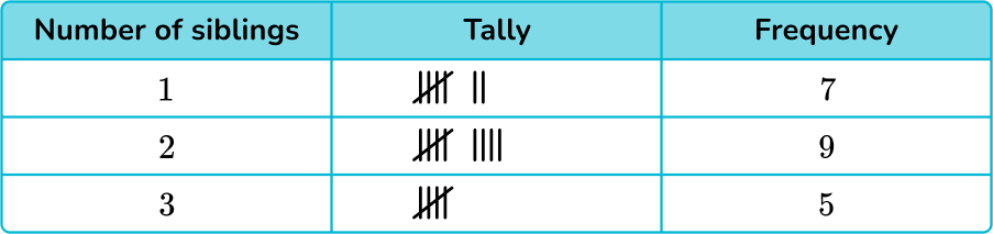
How many students have either 1 or 3 siblings?
16 students
12 students
21 students
2 students
To find the number of students that have 1 or 3 siblings, you will add the frequency for those:
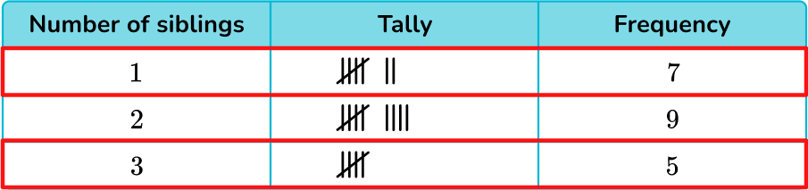
7+5=12
12 students have either 1 or 3 siblings.
Tally chart FAQs
Tally charts are typically used for counting and organizing data with whole numbers. However, you may encounter fractions when collecting data, such as someone’s shoe size or their height.
While some use the terms interchangeably, a picture graph uses images of the items being graphed (for example, a blue car represents the different colors of cars). A pictograph uses a symbol to represent the items being graphed.
The next lessons are
Still stuck?
At Third Space Learning, we specialize in helping teachers and school leaders to provide personalized math support for more of their students through high-quality, online one-on-one math tutoring delivered by subject experts.
Each week, our tutors support thousands of students who are at risk of not meeting their grade-level expectations, and help accelerate their progress and boost their confidence.

Find out how we can help your students achieve success with our math tutoring programs.
[FREE] Common Core Practice Tests (3rd to 8th Grade)
Prepare for math tests in your state with these 3rd Grade to 8th Grade practice assessments for Common Core and state equivalents.
Get your 6 multiple choice practice tests with detailed answers to support test prep, created by US math teachers for US math teachers!