High Impact Tutoring Built By Math Experts
Personalized standards-aligned one-on-one math tutoring for schools and districts
In order to access this I need to be confident with:
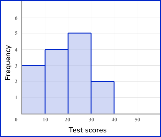
Units of measurement Types of data Frequency tableFrequency distribution
Here you will learn about frequency distributions, including what they are and how to construct them.
Students will first learn about frequency distributions as part of measurement and data in 2 nd grade and will expand their knowledge to more advanced frequency distributions as part of statistics and probability in 6 th grade.
What is a frequency distribution?
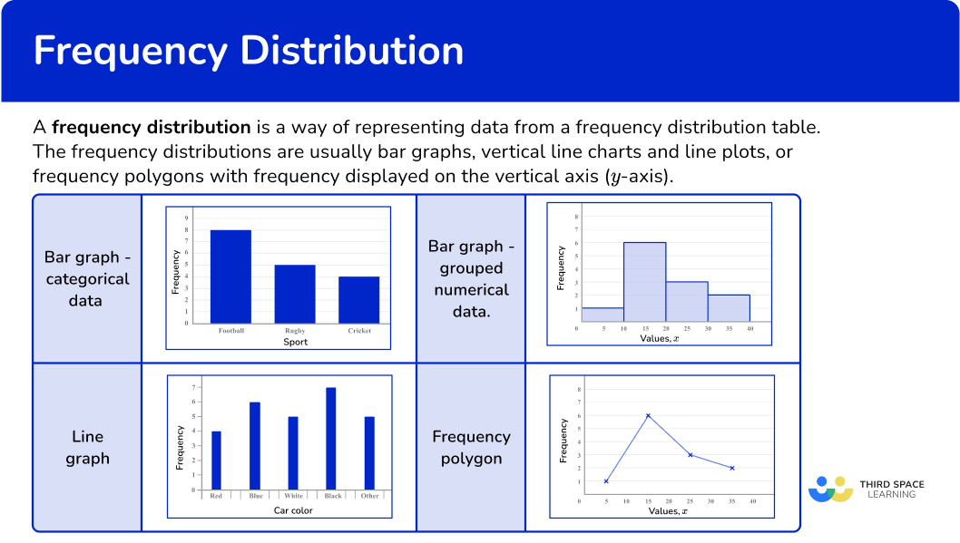
A frequency distribution is a way of representing data from a frequency distribution table.
Frequency distributions are usually bar graphs, vertical line charts, or frequency polygons with frequency displayed on the vertical axis ( y -axis).
![[FREE] Frequency Distribution Worksheet (Grade 2 to 6)](https://thirdspacelearning.com/wp-content/uploads/2025/01/Frequency-distribution-Worksheet-listing-image.png)
[FREE] Frequency Distribution Worksheet (Grade 2 to 6)
Use this worksheet to check your 2nd to 6th grade students’ understanding of frequency distribution. 15 questions with answers to identify areas of strength and support!
DOWNLOAD FREE [FREE] Frequency Distribution Worksheet (Grade 2 to 6)
Use this worksheet to check your 2nd to 6th grade students’ understanding of frequency distribution. 15 questions with answers to identify areas of strength and support!
DOWNLOAD FREEBar graphs and histograms
Bar graphs or bar charts represent data using rectangular bars that are the same width. They can be used for categorical variables (such as favorite color, types of food, or makes of car) or numerical data (such as goals scored, height, or time).
Bar graphs can also be used for grouped numerical data. This type of bar graph can be called a Histogram.
Vertical line charts
Vertical line charts represent data by drawing straight lines to a given frequency. They can be used for ungrouped numerical data.
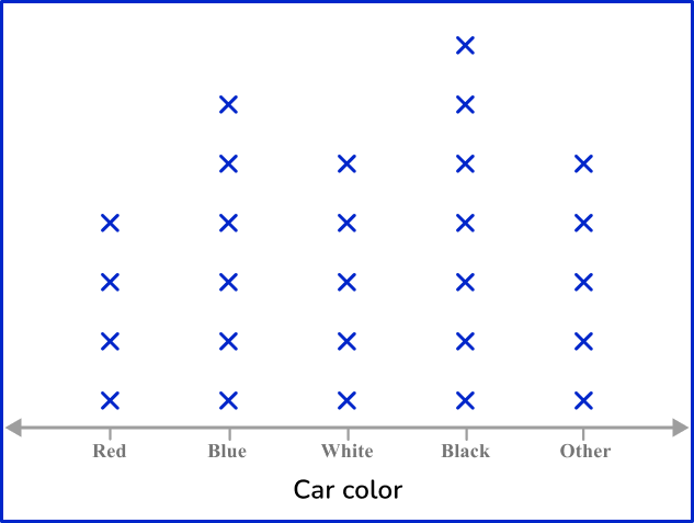
Line plots represent data by showing a vertical line of Xs, or other symbols, to show the number of times each individual data point occurs in the data set. Note that line plots differ from the other frequency distributions on this page as a line plot only uses the horizontal axis ( x -axis).
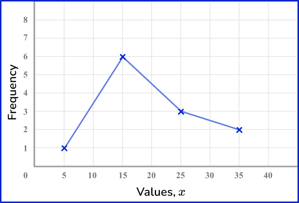
Frequency polygons
A frequency polygon is a graph that shows the frequencies of grouped data. It is a type of frequency distribution that plots the midpoints of the class intervals against the frequencies and then joins up the points with straight lines.
What is a frequency distribution?
Common Core State Standards
How does this relate to elementary math?
- Grade 2 – Measurement and Data (2.MD.D.9)
Generate measurement data by measuring lengths of several objects to the nearest whole unit, or by making repeated measurements of the same object. Show the measurements by making a line plot, where the horizontal scale is marked off in whole-number units.
- Grade 3 – Measurement and Data (3.MD.B.4)
Generate measurement data by measuring lengths using rulers marked with halves and fourths of an inch. Show the data by making a line plot, where the horizontal scale is marked off in appropriate units—whole numbers, halves, or quarters.
- Grade 4 – Measurement and Data (4.MD.B.4)
Make a line plot to display a data set of measurements in fractions of a unit (\cfrac{1}{2},\cfrac{1}{4},\cfrac{1}{8} \, ). Solve problems involving addition and subtraction of fractions by using information presented in line plots. For example, from a line plot find and interpret the difference in length between the longest and shortest specimens in an insect collection.
- Grade 5 – Measurement and Data (5.MD.B.2)
Make a line plot to display a data set of measurements in fractions of a unit (\cfrac{1}{2},\cfrac{1}{4},\cfrac{1}{8} \, ). Solve problems involving addition and subtraction of fractions by using information presented in line plots. For example, from a line plot find and interpret the difference in length between the longest and shortest specimens in an insect collection.
- Grade 6 – Statistics and Probability (6.SP.B.4)
Display numerical data in plots on a number line, including dot plots, histograms, and box plots.
How to draw a frequency distribution
In order to draw a frequency distribution:
- Draw a pair of axes and label them.
- Draw a bar (or vertical line) for each of the items.
Frequency distribution examples
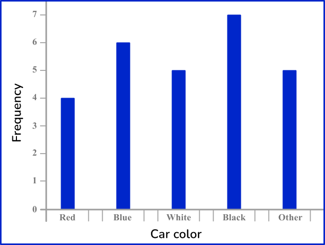
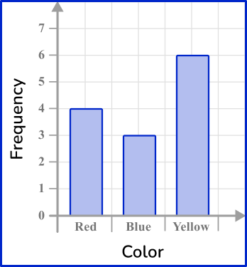
Example 1: categorical data – bar graph
Draw a bar graph for this data:
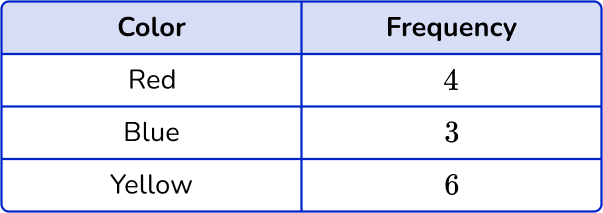
Notice that the first column shows the category (color) and the second column shows the frequency. This is typically how a frequency distribution table is set up. The numerical data can also be shown using tally marks.
- Draw a pair of axes and label them.
Look at what the highest frequency is. The vertical axis ( y -axis) for the frequency needs to go up at least as high as this frequency. The categories should be evenly spaced along the horizontal axis ( x -axis).
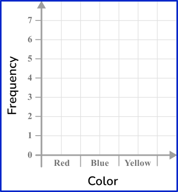
2Draw a bar (or vertical line) for each of the items.
The heights of the bars need to correspond with their frequencies. The bars should have equal width.
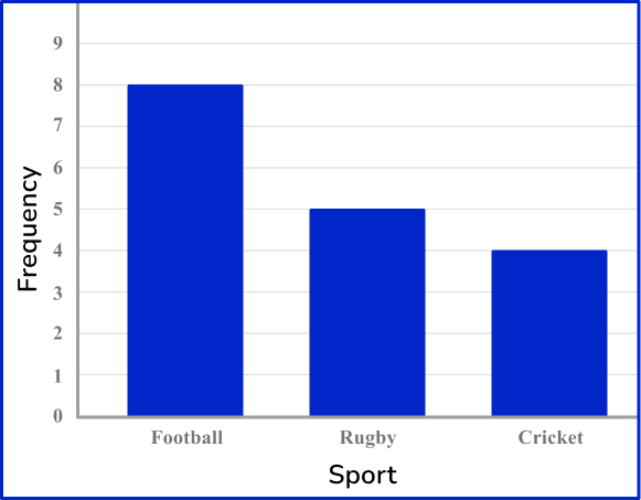
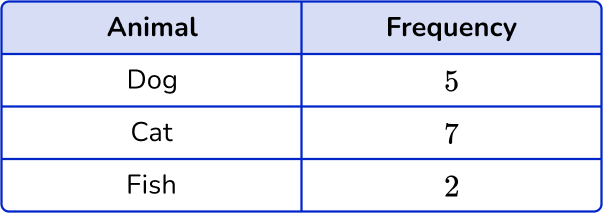
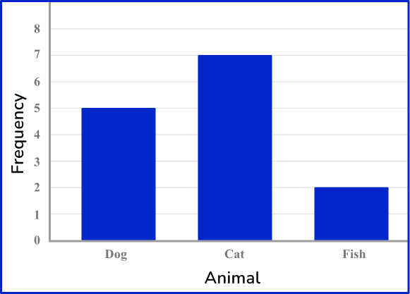
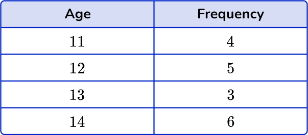
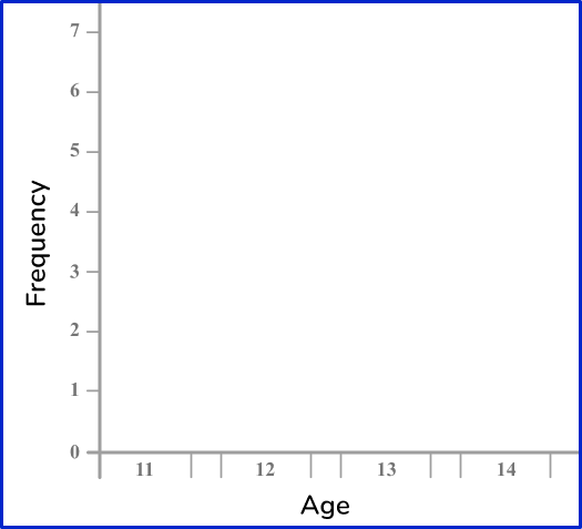
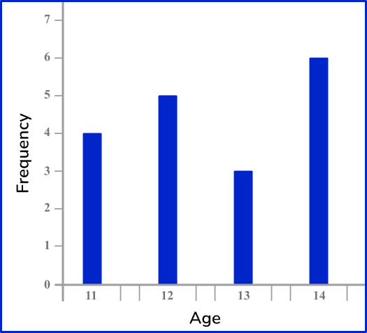
Example 2: categorical data – bar graph
Draw a bar graph for this data:
Look at what the highest frequency is. The vertical axis ( y -axis) for the frequency needs to go up at least as high as this frequency. The categories should be evenly spaced along the horizontal axis ( x -axis).
The heights of the bars need to correspond with their frequencies. The bars should have equal width.
Example 3: ungrouped numerical data – vertical line chart
Draw a vertical line chart for this data:
Look at what the highest frequency is. The vertical axis ( y -axis) for the frequency needs to go up at least as high as this frequency. The categories should be evenly spaced along the horizontal axis ( x -axis).
The heights of the vertical lines need to correspond with their frequencies.
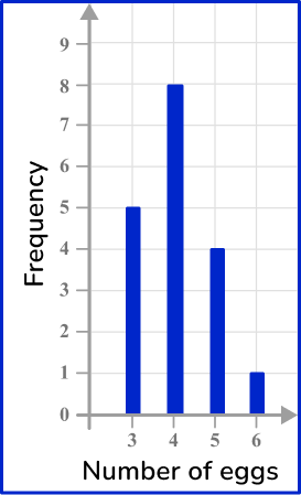
Example 4: ungrouped numerical data – vertical line chart
Draw a vertical line chart for this data:
Look at what the highest frequency is. The vertical axis ( y -axis) for the frequency needs to go up at least as high as this frequency. The categories should be evenly spaced along the horizontal axis ( x -axis).
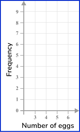
The heights of the vertical lines need to correspond with their frequencies.
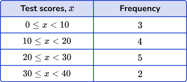
Example 5: grouped numerical data – histogram
Draw a histogram for this grouped data:
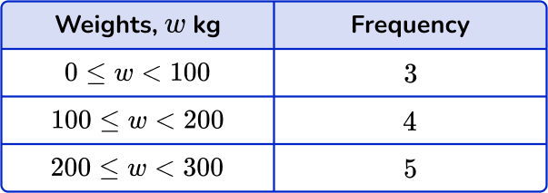
Look at what the highest frequency is. The vertical axis ( y -axis) for the frequency needs to go up at least as high as this frequency. Use the ends of the class intervals to help put the numbers on the horizontal axis ( x -axis) – 0, 100, 200 and so on.
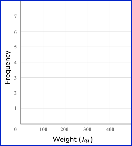
The heights of the bars need to correspond with their frequencies.
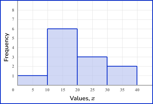
Example 6: grouped numerical data – histogram
Draw a histogram for this grouped data:
Look at what the highest frequency is. The vertical axis ( y -axis) for the frequency needs to go up at least as high as this frequency. Use the ends of the class intervals to help put the numbers on the horizontal axis ( x -axis) – 0, 10, 20 and so on.
The heights of the bars need to correspond with their frequencies.
Teaching tips for frequency distribution
- Use a variety of visual aids such as bar graphs or histograms to demonstrate frequency distributions. Show students how to count the frequencies (number of possible values) and create the graphical representations.
- Utilize educational apps or online tools that allow students to input data and automatically generate frequency distributions, such as Microsoft Excel. This interactive approach makes learning more enjoyable.
- Encourage students to explore different datasets, containing a small and large number of observations, to create frequency distributions. This helps them become more comfortable with handling various types of data.
Easy mistakes to make
- Not drawing equal widths
The bars for frequency distributions should all have the same width. The vertical lines should also have the same thickness.
- Thinking that frequencies can be non-whole numbers
Since frequencies are a count of how many times an item occurs, they will always be integers. They are not decimals.
- Not leaving gaps between bars on a bar graph
For categorical data, there should be a gap between each bar on a bar graph. This allows the data to be easier to interpret.
Related frequency graph lessons
Practice frequency distribution questions
1. Choose the correct frequency table for the following frequency distribution:
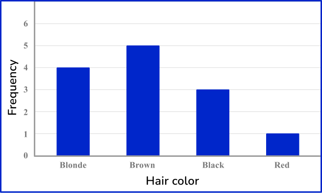


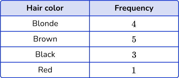


The frequency for Blonde is 4, the frequency for Brown is 5, the frequency for Black is 3 and the frequency for Red is 1.
2. Choose the correct frequency table for the following frequency distribution:
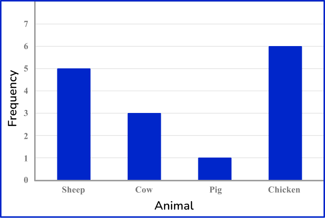
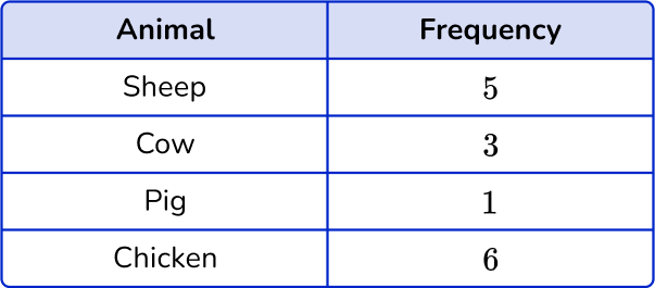

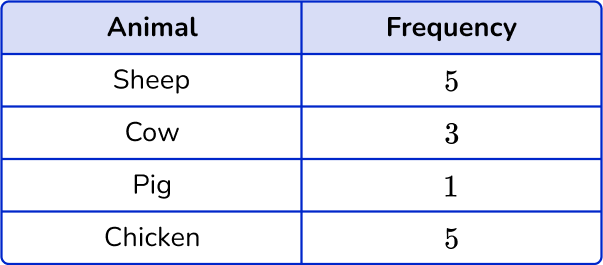
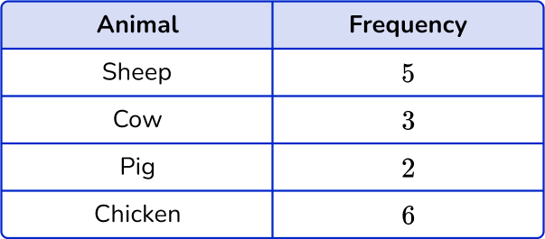
The frequency for Sheep is 5, the frequency for Cow is 3, the frequency for Pig is 1 and the frequency for Chicken is 6.
3. Choose the correct frequency table for the following frequency distribution:
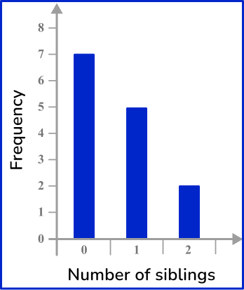
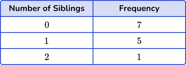
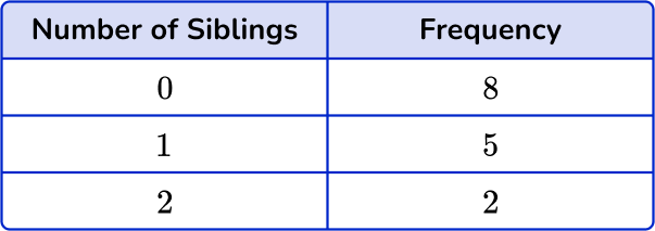

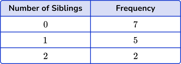
The frequency for 0 siblings is 7, the frequency for 1 sibling is 5 and the frequency for 2 siblings is 2.
4. Choose the correct frequency table for the following frequency distribution:
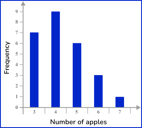
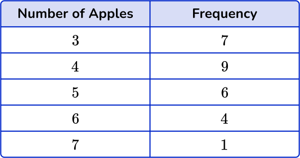


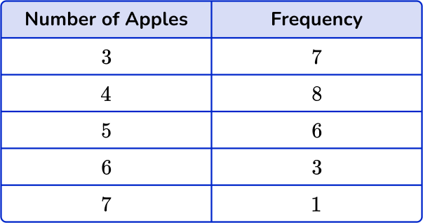
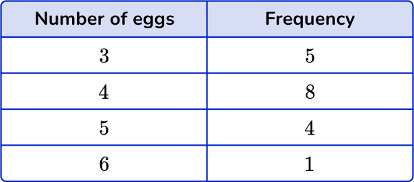
The frequency for 3 apples is 7, the frequency for 4 apples is 9, the frequency for 5 apples is 6, the frequency for 6 apples is 3, and the frequency for 7 apples is 1.
5. Choose the correct grouped frequency table for the following grouped frequency distribution:
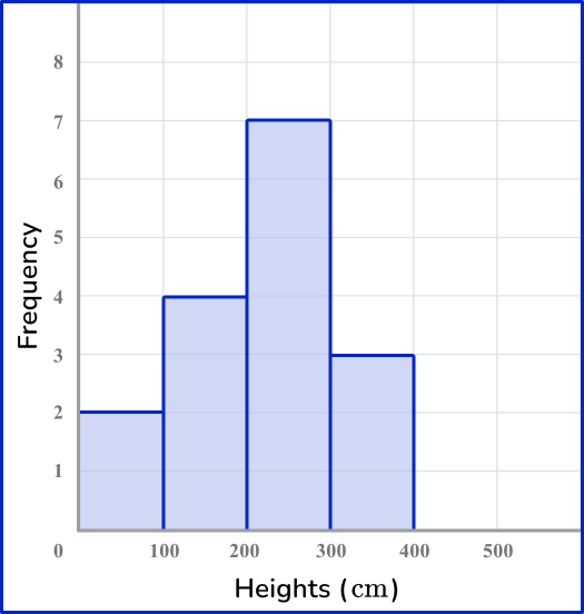

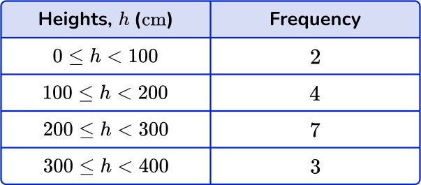


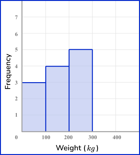
The frequency is 2 for values in the range 0-100 \, cm, the frequency is 4 for values in the range of 100-200 \, cm, the frequency is 7 for values in the range of 200-300 \, cm and the frequency is 3 for values in the range of 300-400 \, cm.
6. Choose the correct grouped frequency table for the following grouped frequency distribution:
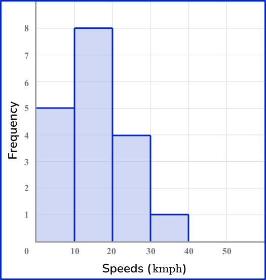


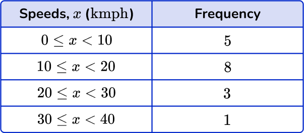
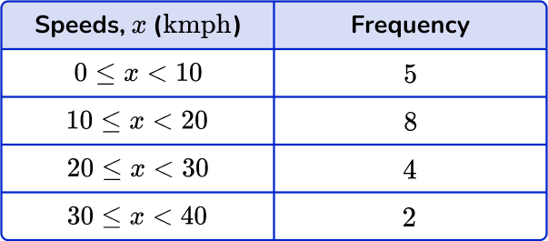
The frequency for 0-10 \text { kmph} is 5, the frequency for 10-20 \text { kmph} is 8, the frequency for 20-30 \text { kmph} is 4 and the frequency for 30-40 \text { kmph} is 1.
Frequency distribution FAQs
A frequency distribution is a simple way of organizing data that shows the number of times each data value or category appears in a dataset. It presents the data in a table (tabular form) or chart format, making it easier to understand the distribution and patterns within the data.
While a frequency distribution displays the individual frequencies for each value, a cumulative frequency distribution shows the total frequencies up to a given value.
While a frequency distribution displays the actual counts of values, a relative frequency distribution shows the proportions or percentages of values relative to the total number of data points. An example of this would be a pie chart.
Frequency is the rate at which something occurs, or the number of occurrences, over a period of time or within a given data set.
There are many different types of frequency distribution that will be discussed in higher grade levels, including grouped frequency distribution, ungrouped frequency distribution, cumulative frequency distribution, relative frequency distribution, and cumulative relative frequency distribution.
The next lessons are
- Sampling methods
- Probability
- Compound probability
- Percent
- Represent and interpret data
- Ratio
Still stuck?
At Third Space Learning, we specialize in helping teachers and school leaders to provide personalized math support for more of their students through high-quality, online one-on-one math tutoring delivered by subject experts.
Each week, our tutors support thousands of students who are at risk of not meeting their grade-level expectations, and help accelerate their progress and boost their confidence.

Find out how we can help your students achieve success with our math tutoring programs.
[FREE] Common Core Practice Tests (3rd to 8th Grade)
Prepare for math tests in your state with these 3rd Grade to 8th Grade practice assessments for Common Core and state equivalents.
Get your 6 multiple choice practice tests with detailed answers to support test prep, created by US math teachers for US math teachers!