High Impact Tutoring Built By Math Experts
Personalized standards-aligned one-on-one math tutoring for schools and districts
Histogram
Here you will learn about a histogram, including how to create a histogram and how to interpret it.
Students will first learn about a histogram as part of statistics and probability in 6 th grade.
What is a histogram?
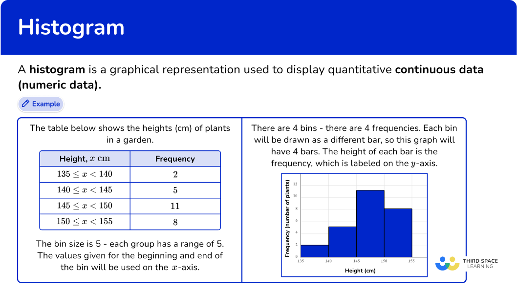
A histogram is a graphical representation used to display quantitative continuous data (numeric data).
To do this, you need to use the number of observations and the range of values to decide a bin size and the number of bins needed to include all data points.
Sometimes this information is already given to you.
For example,
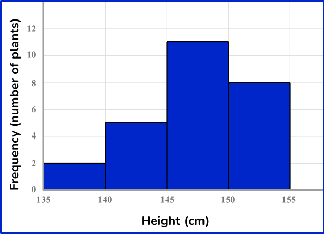
The table below shows the heights (cm) of plants in a garden.
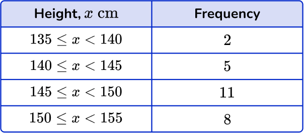
The bin size is 5 – each group has a range of 5. The values given for the beginning and end of the bin will be used on the x -axis.
There are 4 bins – there are 4 frequencies. Each bin will be drawn as a different bar, so this graph will have 4 bars. The height of each bar is the frequency, which is labeled on the y -axis.
For example,
One important benefit of a histogram, is that it can be used to show the frequency distribution shape of a data set.
Let’s explore this further by comparing the visualizations of a few histograms.
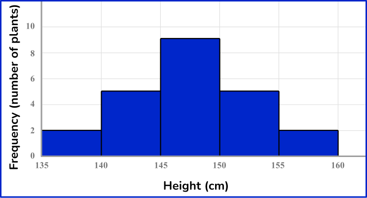
The histogram above falls within what is called a normal distribution. Notice how the data is evenly centered and consistently decreases on both sides of the center. This causes a symmetric shape.
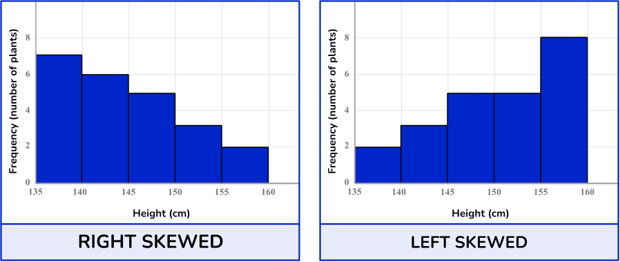
Notice how the two histograms above look different from the one that has a normal distribution. The distribution of data in these sets is NOT symmetric. Both have skewness. This can be caused by outliers or other factors, but skewness means that the data “leans” to the left or to the right.
![[FREE] Histogram Worksheet (Grade 6)](https://thirdspacelearning.com/wp-content/uploads/2025/01/Histogram-Worksheet-listing-image.png)
[FREE] Histogram Worksheet (Grade 6)
Use this worksheet to check your 6th grade students’ understanding of histogram. 15 questions with answers to identify areas of strength and support!
DOWNLOAD FREE [FREE] Histogram Worksheet (Grade 6)
Use this worksheet to check your 6th grade students’ understanding of histogram. 15 questions with answers to identify areas of strength and support!
DOWNLOAD FREEFinding the median bin
While it is impossible to know the exact range or mean of the data set when only given the histogram, you can identify in which bin the median lies.
For example,
Consider the number of data points in each bin.
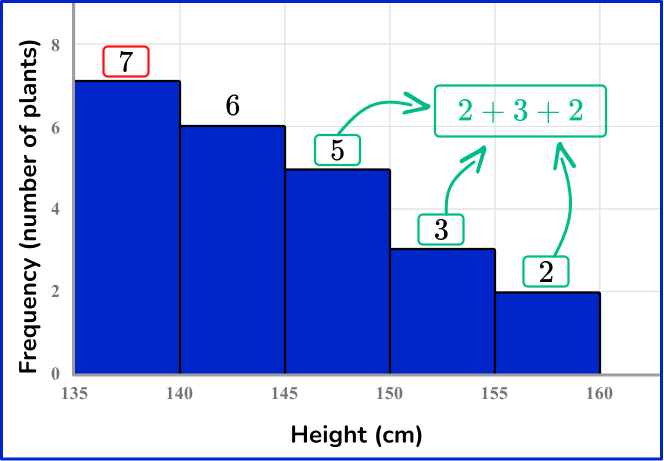
The bins of the histogram are already in order from smallest to largest. This means the first bin (135-140) has the 7 smallest data points – shown in red. The larger bins (155-160, 150-155 and 145-150) have the 7 largest data points – shown in green.
Notice that the 7 largest will include 2 from the middle bin (145-150).
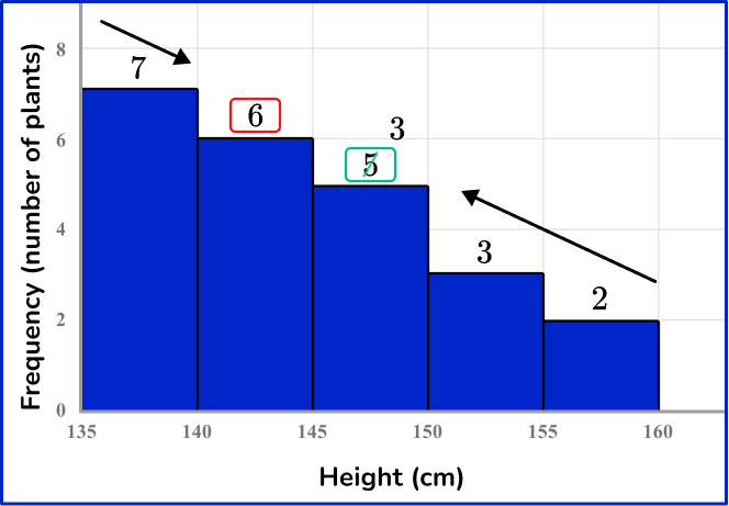
Continuing inward to find the median, if you take the 3 remaining data points in 145-150 and the smallest 3 remaining data points in 144-150, there would still be 3 data points in 140-145. This means the middle data point lies in this bin.
It is important to note that the exact median is NOT known, just what bin it belongs to.
Note: The class intervals (bin width) shown on this page will be equivalent, but this is not a requirement for histograms. In higher level mathematics courses, students explore histograms with varied bin sizes and frequency density.
What is a histogram?
Common Core State Standards
How does this relate to 6 th grade math?
- Grade 6 – Statistics and Probability (6.SP.B.4)
Display numerical data in plots on a number line, including dot plots, histograms, and box plots.
How to create a histogram
In order to create a histogram:
- Decide what bin size to use and how many bins are needed.
- Group the data by the bin sizes to find the frequency.
- Create bars based on the bin sizes and frequencies within the bins.
- Label the \textbf{x} and \textbf{y} axes with units.
Histogram examples
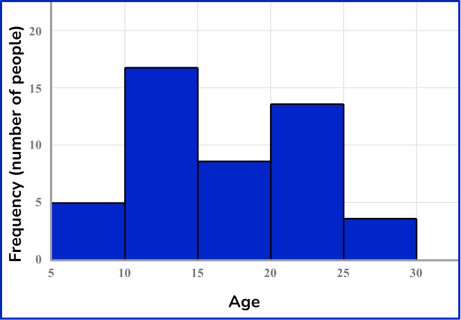
Example 1: creating a histogram from grouped data
The table shows information about the ages of people at a park.
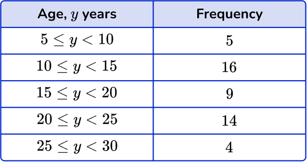
Use the information in the table to create a histogram.
- Decide what bin size to use and how many bins are needed.
In this case the data is already given to us in intervals, which will serve as the bin size.
2Group the data by the bin sizes to find the frequency.
In this case the frequency of each bin is given.
3Create bars based on the bin sizes and frequencies within the bins.
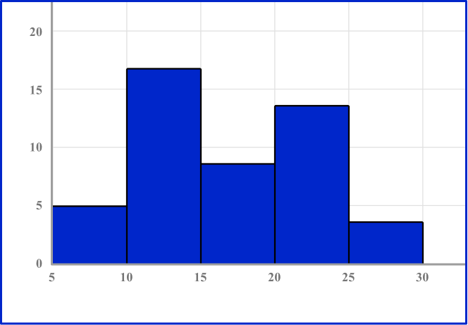
4Label the \textbf{x} and \textbf{y} axes with units.
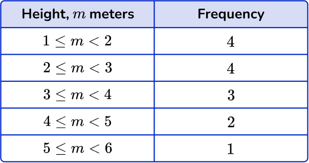
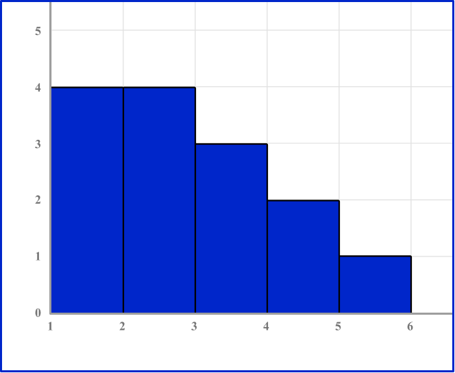
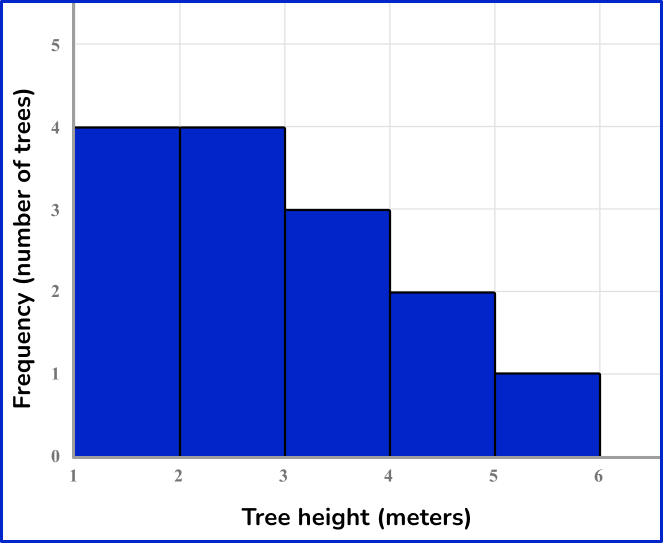
Example 2: creating a histogram from listed data
Create a histogram for a data set of tree heights (meters):
1.2, \, 2.3, \, 1.1, \, 1.2, \, 3.5, \, 4.5, \, 3.4, \, 2.3, \, 2, \, 3.3, \, 4.1, \, 2.3, \, 1.1, \, 5.6
The smallest data point is 1.1 and the largest is 5.6. Let’s use a bin size of 1.
*Note: 1 is not the only option. You can use any bin size that includes all values.
Example 3: creating a histogram from listed data
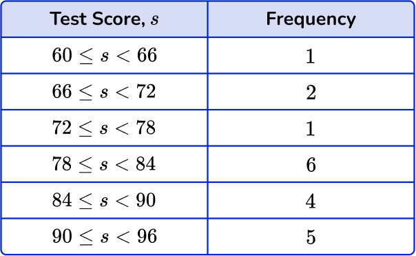
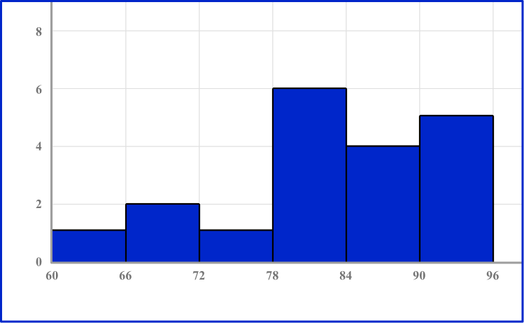
Create a histogram for a data set of test scores:
67, \, 79, \, 91, \, 93, \, 86, \, 74, \, 60, \, 78, \, 92, \, 88, \, 85, \, 90, \, 83, 79, \, 95, \, 66, \, 81, \, 80, \, 84
The smallest data point is 60 and the largest is 95. Let’s use a bin size of 6.
*Note: 6 is not the only option. You can use any bin size that includes all values.
How to interpret a histogram
In order to interpret a histogram:
- Find the bin that has the median.
- Describe the center and spread of the histogram within the context.
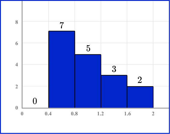
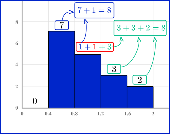
Example 4: interpreting center and spread of a histogram
Consider the following histogram. State the bin where the median lies and describe the center and spread of the data within context.
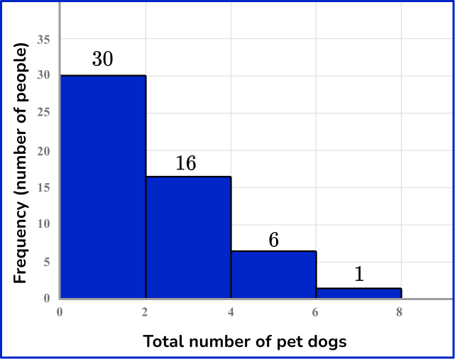
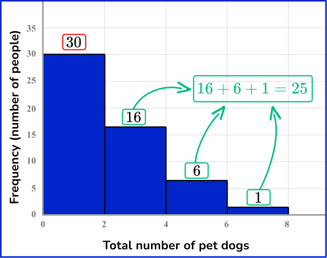
The first bin (0-2) has the 30 smallest values. The other bins have 25 values in all, which is less than half. This means the median value is in the first bin.
Over half of the data set (including the median) is in the first bin. The data overall is right-skewed, with most of the data falling within the first two bins. The value in the last bin (6-8) could be an outlier, since it is so far from the center of the data.
Considering the context, we can say that over half of the people have 0 or 1 dog and most of the people have less than 4 dogs.
Example 5: interpreting center and spread of a histogram
Consider the following histogram. State the bin where the median lies and describe the center and spread of the data within context.
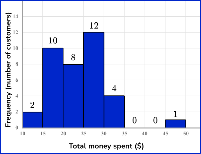
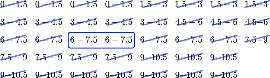
One way to find the median is to start with the lowest and highest bin and add a cross for each data point in the bin, working your way to the very middle. This is similar to finding the median of a set of numbers.
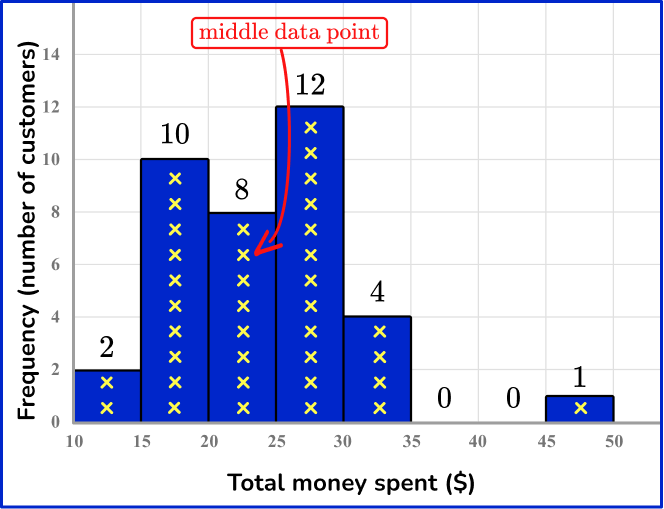
Most of the customers spent between \$15 and \$30. There was one customer who spent from \$45-\$50, which seems to be an outlier.
The data are somewhat symmetrical around the median, but there are a few more data points in the bins to the right of the median bin.
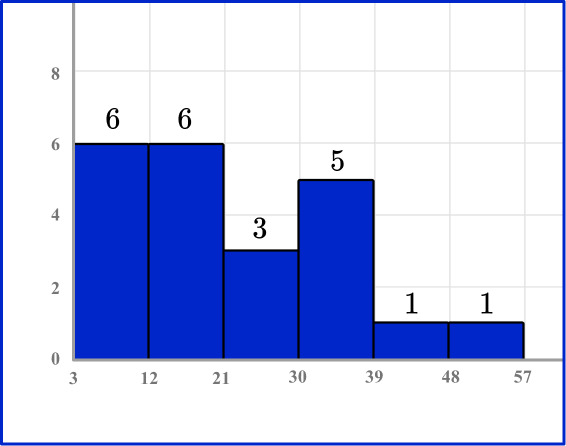
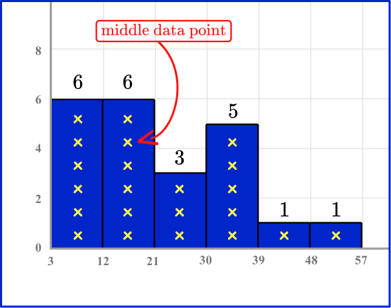
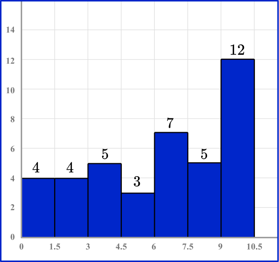
Example 6: interpreting center and spread of a histogram
Consider the following histogram. State the bin where the median lies and describe the center and spread of the data within context.
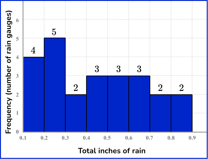
One way to find the median bin is to list out the bins, considering their frequency, in order from least to greatest.
The data set is even, so there are two data points (in this case their bins) in the middle. Since they are the same, we know that the median lies in the 0.4-0.5 bin.
There is no symmetry around the median in this histogram. It is a little right-skewed, but not much. After the first two bins, which are the two largest, the bins are very similar.
Teaching tips for histogram
- Creating a histogram requires many steps, so provide students with links to tutorials or the steps written out to refer to as they are learning how to create them.
- Utilize interactive programs like excel to allow students to spend time exploring how changing the bin size for a set of data affects the distribution of the data and therefore affecting the conclusions that might be drawn.
- It is important that students spend time creating histograms and analyzing them, instead of prioritizing one skill over another. The act of creating a histogram helps students analyze them, since they know how the data was grouped.
Analyzing histograms helps students think critically when creating them, particularly when considering what bin size is appropriate or what conclusions can or cannot be drawn based on how the data is displayed.
Easy mistakes to make
- Labeling the horizontal axis as discrete groups, rather than a continuous scale
The horizontal axis of a bar chart is divided into discrete categorical variables with gaps between the bars. Sometimes this knowledge is incorrectly transferred to histograms. A histogram plots values on a continuous scale, so there are no gaps between the bins.
- Thinking there is only one mode
A histogram may be multimodal, meaning it has more than one “peak” or highest bar.
For example,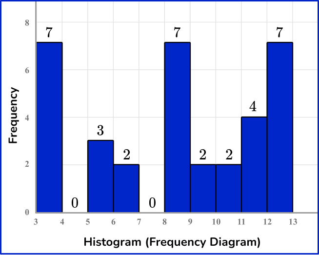
- Thinking that the histogram has to have vertical bars
While this is the most common representation, histogram bars can be drawn horizontally. It is important to read the axes labels to determine which axis names the thing being measured and which shows the frequency of occurrences.
For example,
The histograms below represent the same data set, but the frequency is graphed on different axes.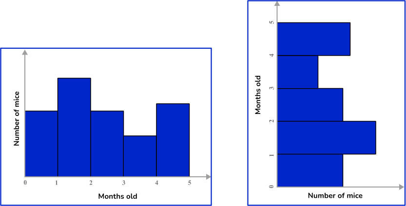
- Thinking there is only one “correct” bin size
When representing a set of data as a histogram, there is usually more than one appropriate bin size. Many programs that generate histograms have algorithms that automatically generate a bin size, but that does not automatically mean that the calculated bin size is the most appropriate. It is important to consider the context of the data and the purpose of the analysis.
Related frequency graph lessons
Practice histogram questions
1) Which histogram shows the data in the table?
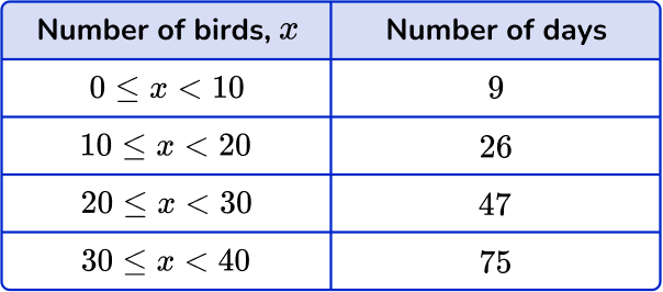


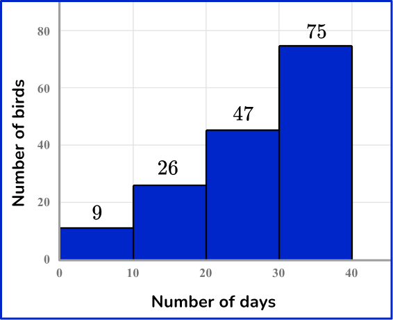

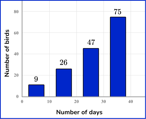
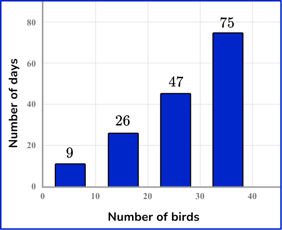
The number of birds is from 0-40 and shown on the x -axis. The number of days is from 9-75 and is shown on the y -axis. A histogram displays continuous data, so the bars are always connected.
2) Data set (total visitors per day):
120, \, 123, \, 122, \, 172, \, 168, \, 121, \, 145, \, 191, \, 177, \, 155, \, 120, \, 155
Which histogram shows the data set above?
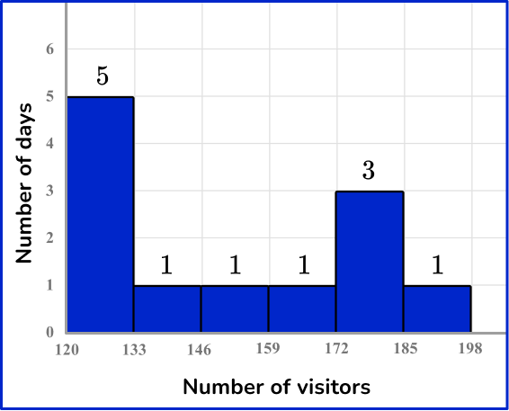
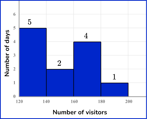
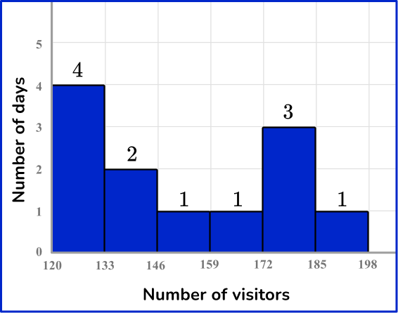
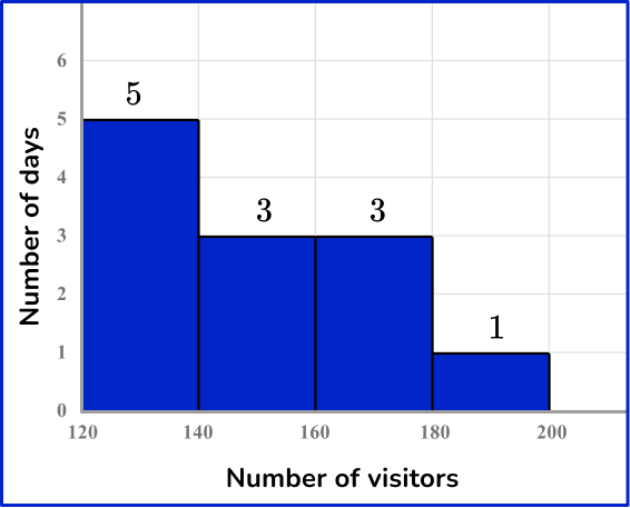
Organizing the data points from least to greatest in these groups:
120, \, 120, \, 121, \, 122, \, 123
145, \, 155, \, 155
168, \, 172, \, 177
191
Creates the following frequency table:
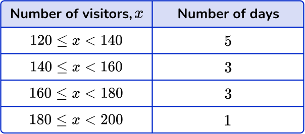
This is graphed with the number of visitors on the x -axis and number of days on the y -axis.
3) Data set (total points per game):
15, \, 17, \, 3, \, 22, \, 25, \, 33, \, 10, \, 7, \, 21, \, 33, \, 37, \, 15, \, 10, \, 9
Which histogram shows the data set above?
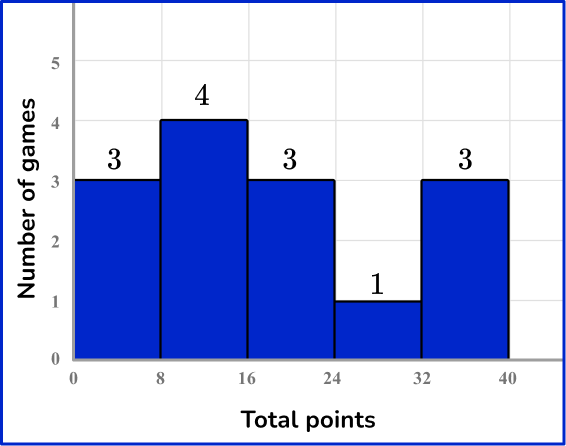
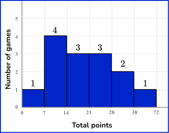
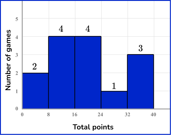
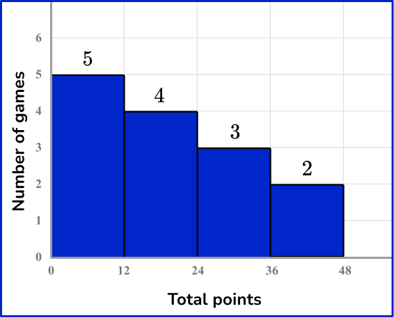
Organizing the data points from least to greatest in these groups:
3,
7, \, 9, \, 10, \, 10,
15, \, 15, \, 17,
21, \, 22, \, 25,
33, 33,
37
Creates the following frequency table:
This is graphed with the number of points on the x -axis and number of games on the y -axis.
4)
In which bin is the median in the histogram above?
One way to find the median is to start with the lowest and highest bin and add a cross for each data point in the bin, working your way to the very middle. This is similar to finding the median of a set of numbers.
5)
In the histogram above, which bin contains the median?
The first bin and 1 value from the second bin have the 8 smallest values.
The third and fourth bin, plus 3 values from the second bin have the 8 largest values. This leaves 1 value in the second bin (0.8-1.2) which will be the median.
6)
Which statement describing the spread of the histogram above is NOT true?
The bins smaller than the median have the least variation.
The data is left-skewed.
The largest bin is almost double the next largest bin.
The three largest bins are to the right of the median bin.
One way to find the median bin is to list out the bins, considering their frequency, in order from least to greatest.
The median is in the bin (6-7.5), which is the second largest bin.
This means the largest bin is to the right of the median bin and the median bin is the second largest bin. So, the three largest bins are NOT to the right of the median bin.
Histogram FAQs
Other graphs that can show how data is distributed are pie charts, which also group data into groups – but are not necessarily continuous. Line graphs can show how continuous data changes over time. Box plots group continuous data into a 5 number summary.
A bar chart (or bar graph) is used to display qualitative or quantitative discrete data – which is why the bars do not touch. It does not necessarily have numeric data, whereas a histogram always has continuous, numeric data – which is why the bars touch.
The next lessons are
- Sampling methods
- Probability
- Compound probability
- Units of measurement
- Represent and interpret data
- Percent
Still stuck?
At Third Space Learning, we specialize in helping teachers and school leaders to provide personalized math support for more of their students through high-quality, online one-on-one math tutoring delivered by subject experts.
Each week, our tutors support thousands of students who are at risk of not meeting their grade-level expectations, and help accelerate their progress and boost their confidence.

Find out how we can help your students achieve success with our math tutoring programs.
[FREE] Common Core Practice Tests (3rd to 8th Grade)
Prepare for math tests in your state with these 3rd Grade to 8th Grade practice assessments for Common Core and state equivalents.
Get your 6 multiple choice practice tests with detailed answers to support test prep, created by US math teachers for US math teachers!