High Impact Tutoring Built By Math Experts
Personalized standards-aligned one-on-one math tutoring for schools and districts
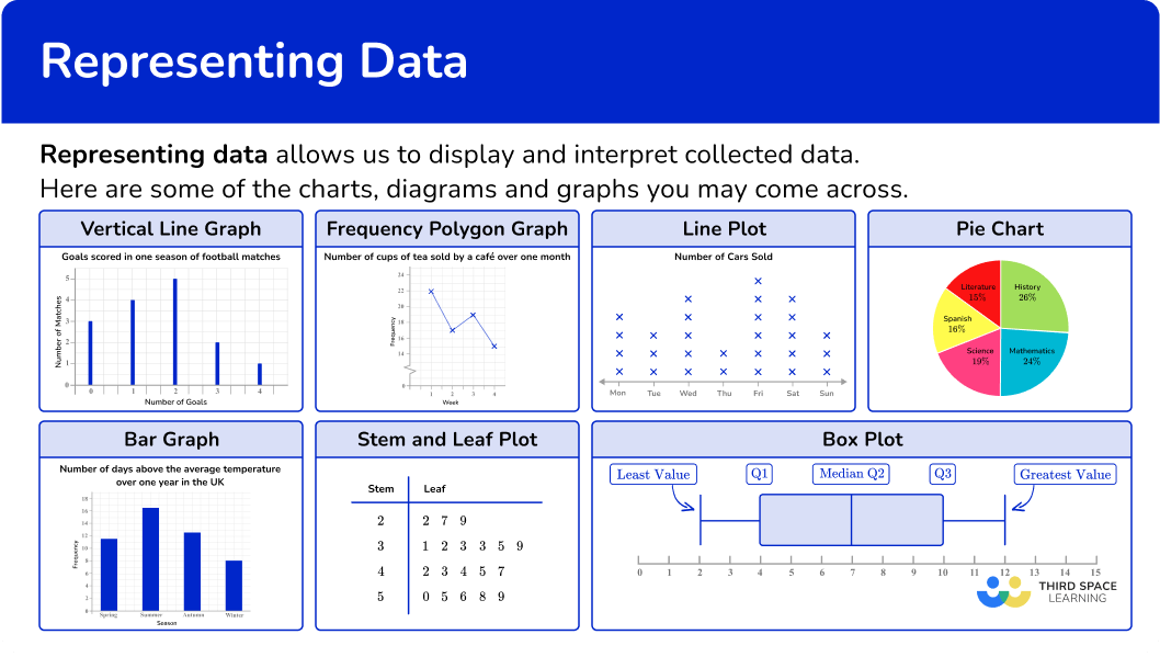
Representing data
Here you will learn about representing data, including how to create and interpret the different tables, charts, diagrams and graphs you can use to represent data.
Students first learn how to represent and interpret data in the first grade and expand their knowledge as they progress through elementary school, middle school and high school. Being data literate is essential for success in the real world.
What is representing data?
Representing data allows you to display and interpret collected data. Data literacy is essential to understanding the world around us.
There are different types of data that can be represented in different formats.
For example,
- Histograms
- Stem and leaf plot
- Frequency distribution (such as bar graphs, vertical line graphs & line plots)
- Cumulative frequency
- Pie chart
- Box plot
Let’s take a look in detail at some of the different ways to represent data.
![[FREE] Representing Data Worksheet (Grade 6 to 7)](https://thirdspacelearning.com/wp-content/uploads/2023/11/Representing-Data-listing-image.png)
[FREE] Representing Data Worksheet (Grade 6 to 7)
Use this quiz to check your grade 6th to 7th students’ understanding of representing data. 10+ questions with answers covering a range of grades 6 and 7 representing data topics to identify areas of strength and support!
DOWNLOAD FREE [FREE] Representing Data Worksheet (Grade 6 to 7)
Use this quiz to check your grade 6th to 7th students’ understanding of representing data. 10+ questions with answers covering a range of grades 6 and 7 representing data topics to identify areas of strength and support!
DOWNLOAD FREEHistogram
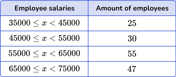
A histogram is a graphical representation used to display quantitative continuous data (numeric data). The graphical display uses bars that are different heights and each bar groups numbers into ranges. The horizontal axis represents the numerical range, and the vertical axis represents the frequency, which is the number of times the data falls in the particular numerical range.
For example, the frequency table shows the salaries of 157 employees at a small company. Create a histogram from the data.
Step by step guide: Histograms
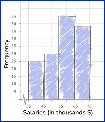
Stem and leaf plot
A stem and leaf plot is a method of organizing numerical data based on the place value of the numbers.
Each number is split into two parts.
The first digit(s) form the stem,
The last digit forms the leaf.
For example, the data below represents the age of all the employees at Millstown Elementary School. Create a stem and leaf plot from the data
Step by step guide: Stem and Leaf Plot
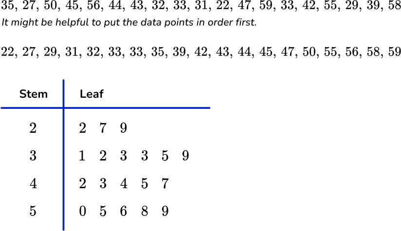
Frequency distribution
A frequency distribution is a way of representing data from a frequency distribution table. Frequency distributions can be represented by frequency graphs such as pie graphs, bar graphs, line plots, vertical line graphs, and/or frequency polygons where the frequency is displayed on the vertical axis (y- axis).
There are two types of data that can be represented using a frequency graph.
Categorical data – data that are words rather than numbers, for example, colors, makes of cars, types of music.
Numerical data – data that is in the form of numbers. There are two types of numerical data.
Here are some examples of frequency graphs:
Step by step guide: Frequency distribution
Step by step guide: Line graph
Cumulative frequency
A cumulative frequency graph, also called an ogive, shows the frequencies of each category accumulated together. This allows you to analyze the distribution of the data in more detail than if you used a frequency polygon and calculate statistics.
Here is an example of a cumulative frequency graph along with the data set.
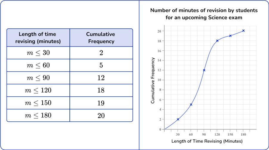
Similar to a frequency graph, the horizontal axis (x- axis) represents the numerical interval and the vertical axis (y- axis) represents the cumulative frequency.
Pie chart
A pie chart also known as a circle chart or pie graph is a visual representation of data that is made by a circle divided into sectors (pie slices). Each sector represents a part of the whole (whole pie). Pie charts are used to represent categorical data.
Here is an example of a pie chart that displays students’ favorite subjects in percentages at a particular school. Notice how each sector represents a percent of the whole circle.
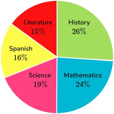
The sectors of the circle graphs can be represented as the number data points in the category or as percents.
Step by step guide: Pie chart
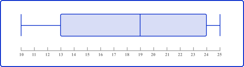
Box plot
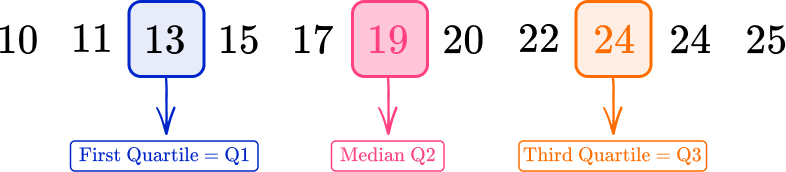
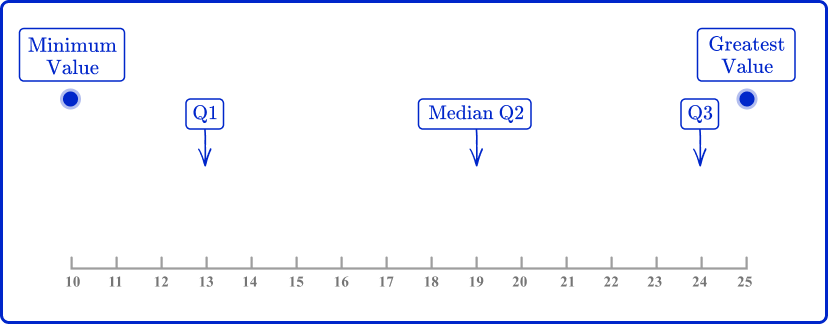
A box plot also known as a box and whisker plot is a graph that represents the five number summary of a set of data.
The five number summary includes the following:
- Lowest value or smallest value
- Lower quartile or first quartile (Q1)
- Median, middle number, middle value, or second quartile (M)
- Upper quartile or third quartile (Q3)
- Highest value or largest value
Here is an example of a box plot for the given data set:
7, \, 4, \, 5, \, 6, \, 3, \, 4, \, 7, \, 10, \, 11, \, 8, \, 9, \, 2, \, 3, \, 8, \, 11, \, 12, \, 10
Like with a stem and leaf plot, it is helpful to put the data points in order from least to greatest.
2, \, 3, \, 3, \, 4, \, 4, \, 5, \, 6, \, 7, \, 7, \, 8, \, 8, \, 9, \, 10, \, 10, \, 11, \, 11, \, 12
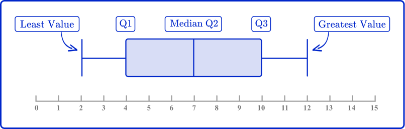
Quartiles are values that divide the data set into three quarters. From the box plot, you can see that the first quartile is the value where the 25\% of the data set falls under.
The median or the second quartile is the value where 50\% of the data falls under and the third quartile (Q3) is the value where 75\% of the data set falls under.
From the box plot, you can also determine the interquartile range (IQR) which is found by finding the difference between Q1 and Q3.
IQR=Q3-Q1
Step by step guide: Box plot
Step by step guide: Quartile
Step by step guide: Interquartile range
What is representing data?
Common Core State Standards
How does this relate to 6 th and 7 th grade math?
- Grade 6 – Statistics and Probability (6.SP.B.4)
Display numerical data in plots on a number line, including dot plots, histograms, and box plots. - Grade 6 – Statistics and Probability (6.SP.A.3)
Recognize that a measure of center for a numerical data set summarizes all of its values with a single number, while a measure of variation describes how its values vary with a single number. - Grade 6 – Ratios and Proportional Relationships (6.RP.3.c)
Find a percent of a quantity as a rate per 100 (for example, 30\% of a quantity means \cfrac{30}{100} times the quantity); solve problems involving finding the whole, given a part and the percent. - Grade 7 – Statistics and Probability (7.SP.B.3)
Informally assess the degree of visual overlap of two numerical data distributions with similar variabilities, measuring the difference between the centers by expressing it as a multiple of a measure of variability.
For example, the mean height of players on the basketball team is 10~{cm} greater than the mean height of players on the soccer team, about twice the variability (mean absolute deviation) on either team; on a dot plot, the separation between the two distributions of heights is noticeable. - Grade 7 – Statistics and Probability (7.SP.B.4)
Use measures of center and measures of variability for numerical data from random samples to draw informal comparative inferences about two populations. For example, decide whether the words in a chapter of a seventh-grade science book are generally longer than the words in a chapter of a fourth-grade science book.
How to represent data
For a more detailed step-by-step approach on how to represent data, go to the links highlighted in the “What is representing data” section above or follow the examples below.
Representing data examples
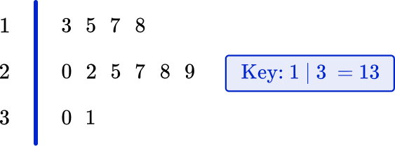
Example 1: stem and leaf diagram
The data below represents the heights of trees at a tree farm in feet.
20ft, \, 15ft, \, 17ft, \, 29ft, \, 22ft, \, 13ft, \, 30ft, \, 25ft, \, 18ft, \, 27ft, \, 31ft
- Order the numbers from smallest to largest.
13, \, 15, \, 17, \, 18, \, 20, \, 22, \, 25, \, 27, \, 29, \, 30, \, 31
2Split the numbers into two parts; the last part must be one digit only.
The numbers in the data will be split into tens and ones, so 13 will be 1 and 3 (1 represents 10 or 1 ten and 3 is 3 ones).
3Put the values into the diagram and create a key.
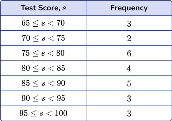
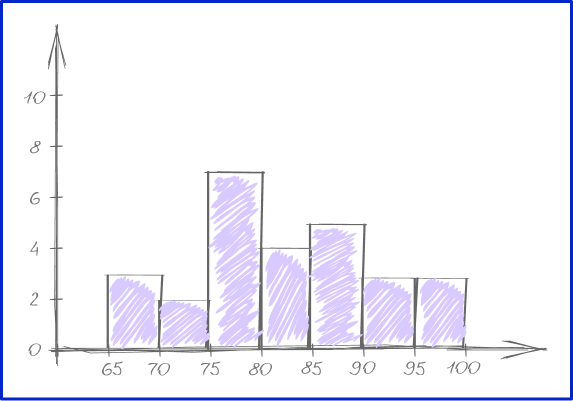
Example 2: histogram
Create histogram for the given test scores.
\begin{aligned} &82, \, 78, \, 77, \, 89, \, 90, \, 99, \, 97, \, 65, \, 66, \, 74, \, 78, \, 80, \, 78, \\ &92, \, 70, \, 85, \, 75, \, 85, \, 88, \, 79, \, 69, \, 88, \, 99, \, 84, \, 83, \, 91 \end{aligned}
Bin size is the same as interval size.
The lowest test score is 65 , and the highest test score is 100. Let’s use bins (intervals) of 5. There are 7 bins all together.
Example 3: pie chart
24 pupils were asked which subject was their favorite. Here is a pie chart to show the results. How many students said science was their favorite subject?
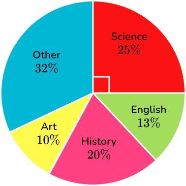
There are 5 categories, science 25\%, English 13\%, history 20\%, art 10\%, and other 32\%.
There are 24 students that were surveyed, and 25\% said that science was their favorite subject.
25\% =0.25
24 \times 0.25=6
6 students say that science is their favorite subject.
Example 4: box plot
Create a box plot for the data below.
15, \, 11, \, 24, \, 13, \, 22, \, 17, \, 20, \, 25, \, 19, \, 10, \, 24
Placing the data in order from least to greatest.
10, \, 11, \, 13, \, 15, \, 17, \, 19, \, 20, \, 22, \, 24, \, 24, \, 25
Example 5: frequency distribution
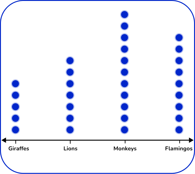
At the local zoo, the zoologist was taking a count of the animals.
Create a dot plot representing this data.
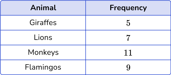
Create a dot plot representing this data.
This question asks you to create a dot plot to represent the data.
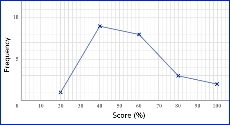
Example 6: frequency polygon
A vet weighs all the dogs she sees in a week. Here are the results.
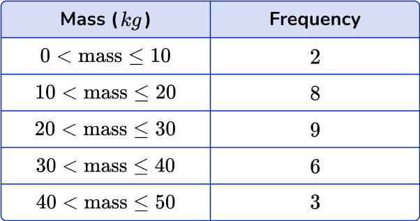
Draw a frequency polygon to show the results.
This question asks you to create a frequency polygon to represent the data.
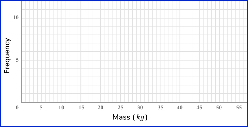
Use the midpoints of the groups representing mass, 5, \, 15, \, 25 and so on, to label the horizontal axis. The frequency is on the vertical axis.
Plot points with a sharp pencil and crosses to be accurate, and then connect the points to create the frequency polygon.

Teaching tips for representing data
- Utilize interactive programs like Excel to allow students to spend time exploring how changing the bin size for a set of data affects the distribution of the data, therefore affecting the conclusions that might be drawn.
- Use project based learning activities where students can collect their own raw data and create and interpret tables, diagrams, and graphs.
- Provide visual aids or display examples of data representation around the classroom for students to differentiate between graph types including stem and leaf plots, bar graphs, histograms, dot plots, and box plots.
Easy mistakes to make
- Knowing when to label the horizontal axis as discrete groups or having it be a continuous scale
The horizontal axis of a bar chart is divided into discrete categorical variables with gaps between the bars. Whereas on a histogram, values are on a continuous scale, so there are no gaps between the bins.
- Forgetting to order the data set before creating graphs
If you are given a data set to represent on a box plot, stem and leaf plot, histogram, line plots, and/or bar graphs, make sure the list of values is in order before you start finding the key values. Listing the data in order is always a good practice to use when graphing and analyzing data.
- Not being precise when labeling axes
When drawing graphs, diagrams, and charts, use a sharp pencil and a ruler so that you can be as accurate as possible. For pie charts, use a protractor to measure the angles accurately.
- Checking the scale
Check the scale and how it is broken up into smaller sections. Scales can come in a variety of styles.
Here is 0 to 100 split up into 10 equal sections, 5 equal sections and 4 equal sections.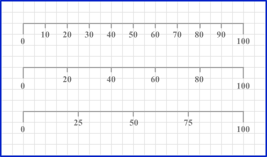
Practice representing data questions
1. Use the stem and leaf plot to determine the mode.
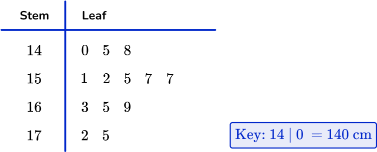


The value 157~{cm} occurs twice. Therefore, the mode is 157.
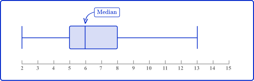
2. Use the box plot to determine the median.
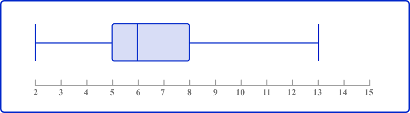
On a box plot, the line in the box represents the median.
3. Which histogram represents the data?
The table shows the number of deer Karen sees in her yard over the course of a month.
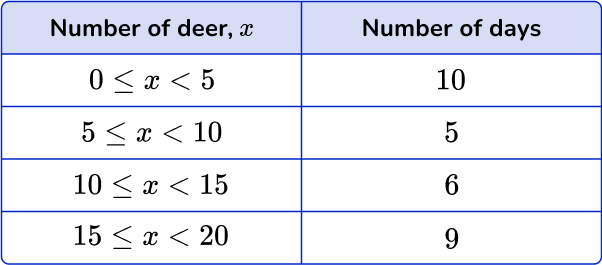
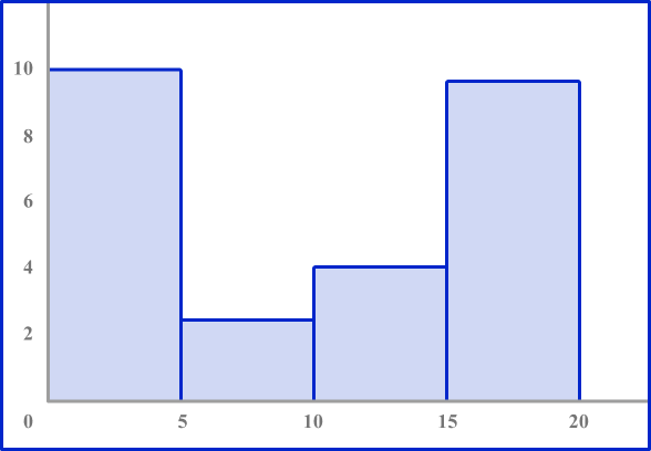
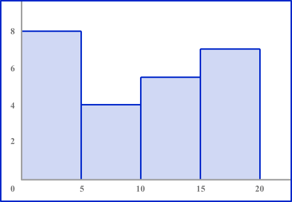
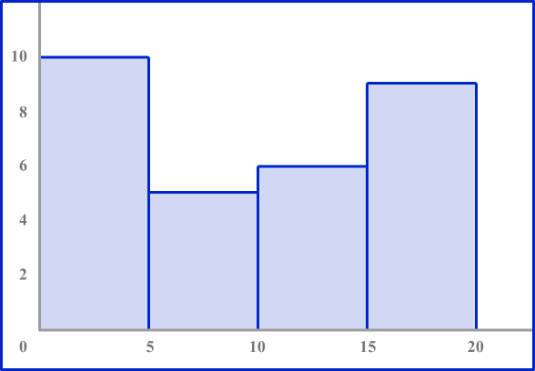
Look to make sure the axes are numbered correctly. The horizontal axis should be labeled 0 to 20 counting by 5’ s. The vertical axis should be numbered 0 to 10.
Each bar height should be equal to the frequency in each interval.
4. Which pie chart represents the data in this frequency table?
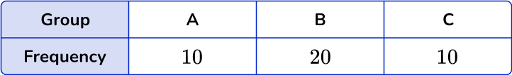
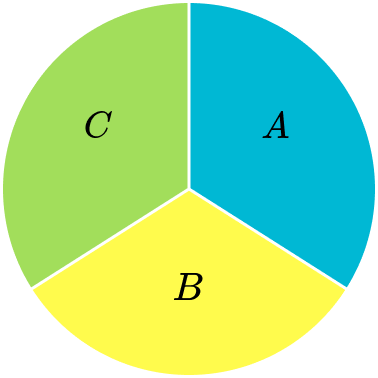
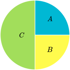
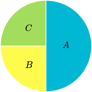
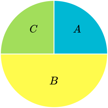
The total of the frequencies is 40. The frequency of A is 10, which is a quarter of 40. So, section A needs to be a quarter of the pie chart.
Similarly section C needs to be a quarter too. The frequency of B is 20, which is half of 40. Section B needs to be half of the pie chart.
5. The table below shows the number of flowers in a garden.
Which dot plot represents the data in the table?
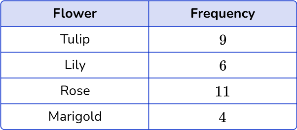
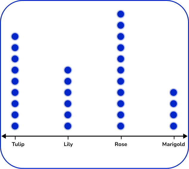
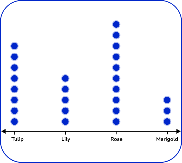
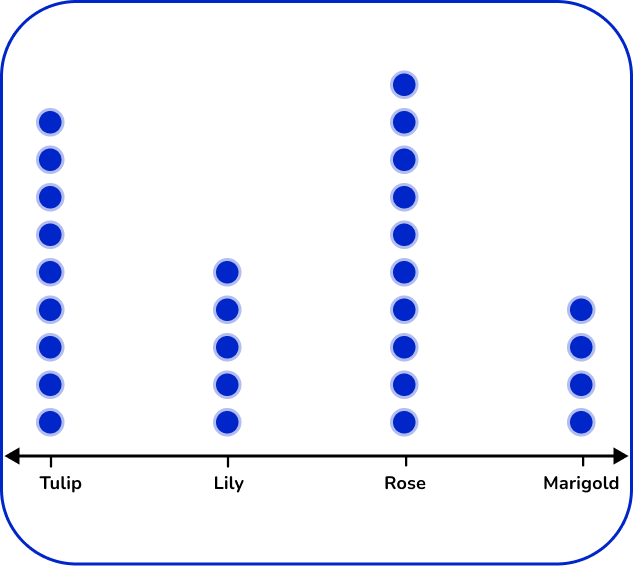
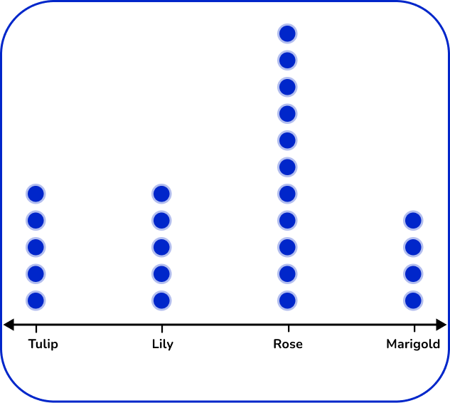
There are 4 types of flowers: tulip, lily, rose, and marigold. Label the horizontal axes with the flower types. For each flower, place the number of dots vertically that matches the frequency.
6. Which of these is the correct frequency polygon for the frequency table below?
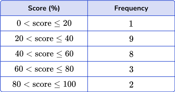
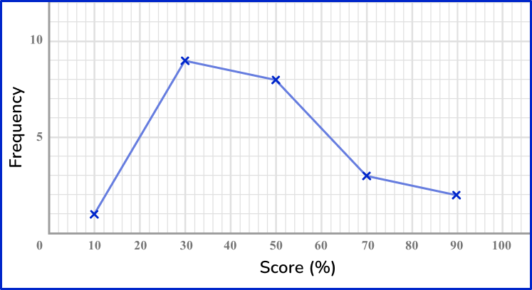
The points should be plotted using the midpoints of the groups: 10, \, 30, \, 50, \, 70 and 90. They should be plotted using the correct frequencies: 1, \, 9, \, 8, \, 3 and 2. The points need joining up, but NOT the last and the first points.
Representing data FAQs
Continuous data can be any value within a range of values or in an interval. Discrete data is a specific value within a range.
When you study algebra 1, you will learn how to create scatter plots. A straight line going through the points on a scatter plot is known as a line of best fit.
Step-by-step guide: Scatterplots
The next lessons are
- Frequency table
- Frequency graph
- Sampling methods
- Ratio
- Two way tables
- Time series graph
Still stuck?
At Third Space Learning, we specialize in helping teachers and school leaders to provide personalized math support for more of their students through high-quality, online one-on-one math tutoring delivered by subject experts.
Each week, our tutors support thousands of students who are at risk of not meeting their grade-level expectations, and help accelerate their progress and boost their confidence.

Find out how we can help your students achieve success with our math tutoring programs.
[FREE] Common Core Practice Tests (3rd to 8th Grade)
Prepare for math tests in your state with these 3rd Grade to 8th Grade practice assessments for Common Core and state equivalents.
Get your 6 multiple choice practice tests with detailed answers to support test prep, created by US math teachers for US math teachers!