High Impact Tutoring Built By Math Experts
Personalized standards-aligned one-on-one math tutoring for schools and districts
Box plot
Here you will learn about a box plot, including how to draw a box plot to represent a set of data, how to read data from a box plot, and how to interpret and compare box plots.
Students will first learn about box plots as part of statistics and probability in 6 th grade.
What is a box plot?
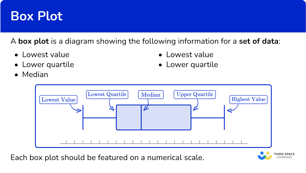
A box plot is a diagram showing the following information for a set of data:
- Lowest value or smallest value
- Lower quartile or first quartile (LQ\,\ or\,\ Q1)
- Median, middle number, middle value, or second quartile (M\,\ or\,\ Q2)
- Upper quartile or third quartile (UQ\,\ or\,\ Q3)
- Highest value or largest value
This set of descriptive statistics is called the five-number summary. The box plot must be featured on a scale to show these values clearly.
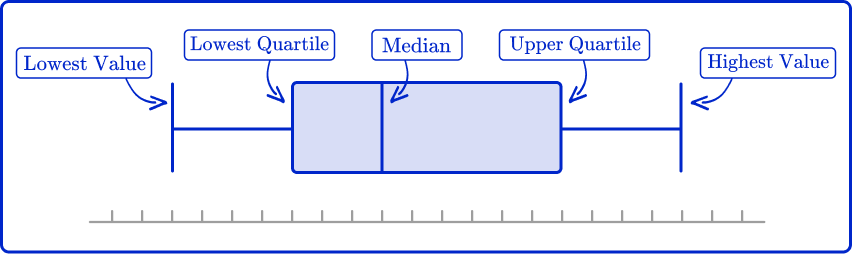
Each box plot should be featured on a numerical scale.
The lower quartile can also be referred to as the 25 th percentile.
The median can also be referred to as the 50 th percentile
The upper quartile can also be referred to as the 75 th percentile.
Box plots are sometimes called box and whisker plots, with the ‘whiskers’ being the ends representing the lowest and highest values.
Box plots are particularly useful for data analysis when comparing two or more data sets; it is easy to make visual comparisons of average (median) and spread (range and interquartile range).
When data is skewed (the data distribution is not symmetrical or near-symmetrical), or there are many outliers or extreme values, a box plot provides better data visualization than other chart types or graphs.
In high school, you will learn about measures of skewness that use the quartiles, and how to identify different types of skewness visually on a box plot. If a box plot is perfectly symmetrical, the data could have a normal distribution.
What is a box plot?
![[FREE] Box Plot Worksheet (Grade 6 and 7)](https://thirdspacelearning.com/wp-content/uploads/2025/01/Box-Plot-Worksheet-listing-image.png)
[FREE] Box Plot Worksheet (Grade 6 and 7)
Use this worksheet to check your 6th and 7th grade students’ understanding of box plot. 15 questions with answers to identify areas of strength and support!
DOWNLOAD FREE [FREE] Box Plot Worksheet (Grade 6 and 7)
Use this worksheet to check your 6th and 7th grade students’ understanding of box plot. 15 questions with answers to identify areas of strength and support!
DOWNLOAD FREECommon Core State Standards
How does this relate to 6 th and 7 th grade math?
- Grade 6 – Statistics and Probability (6.SP.B.4)
Display numerical data in plots on a number line, including dot plots, histograms, and box plots.
- Grade 7 – Statistics and Probability (7.SP.B.3)
Informally assess the degree of visual overlap of two numerical data distributions with similar variabilities, measuring the difference between the centers by expressing it as a multiple of a measure of variability.
For example, the mean height of players on the basketball team is 10 \, cm greater than the mean height of players on the soccer team, about twice the variability (mean absolute deviation) on either team; on a dot plot, the separation between the two distributions of heights is noticeable.
How to draw a box plot
In order to draw a box plot:
- Determine the median and quartiles.
- Draw a scale, and mark the five key values: minimum value, lower quartile \textbf{(LQ)} , median, upper quartile \textbf{(UQ)} , and maximum value.
- Join the lower quartile and upper quartile to form the box, and draw horizontal lines to the minimum and maximum values.
Box plot examples
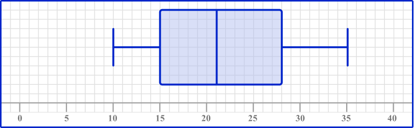
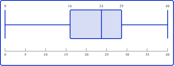
Example 1: drawing a box plot from a five-number summary
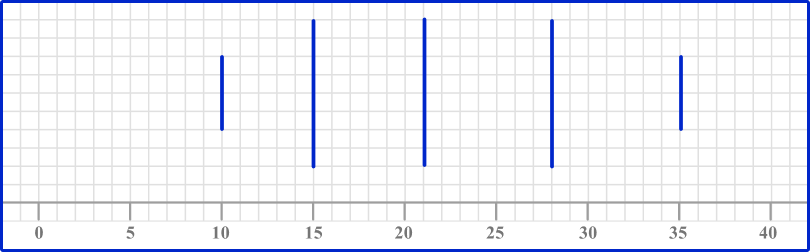
Draw a box plot using the following information.
| Minimum value | 10 |
| Lower quartile (Q1) | 15 |
| Median (Q2) | 21 |
| Upper quartile (Q3) | 28 |
| Maximum value | 35 |
- Determine the median and quartiles.
In this example, all of the values are given.
2Draw a scale, and mark the five key values: minimum value, lower quartile \textbf{(LQ)} , median, upper quartile \textbf{(UQ)} , and maximum value.
The scale needs to be long enough to mark the lowest and highest values, so in this example, the scale could be 0 to 40.
Mark the five key values with vertical lines.
3Join the lower quartile and upper quartile to form the box, and draw horizontal lines to the minimum and maximum values.
The box runs from the lower quartile (15) to the upper quartile (28). The whiskers join to the box; the lower whisker ends at the minimum value (10) and the upper whisker ends at the maximum value (35).
Example 2: drawing a box plot for a given data set
Draw a box plot for the following data points.
1, \, 1, \, 2, \, 3, \, 5, \, 7, \, 7, \, 8, \, 10, \, 12, \, 15
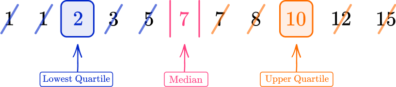
The five-number summary for this box plot is therefore
| Minimum value | 1 |
| Lower quartile (Q1) | 2 |
| Median (Q2) | 7 |
| Upper quartile (Q3) | 10 |
| Maximum value | 15 |
The scale needs to be long enough to mark the lowest and highest values, so in this example, the scale could be 0 to 20.
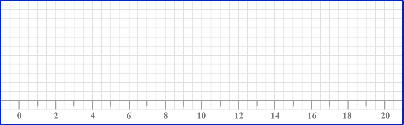
Mark the five key values with vertical lines.

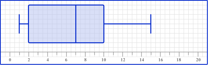
The box runs from the lower quartile (2) to the upper quartile (10). The whiskers join to the box; the lower whisker ends at the minimum value (1) and the upper whisker ends at the maximum value (15).
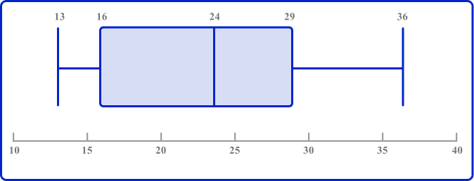
Example 3: drawing a box plot when all five key numbers are not given
This table shows some descriptive statistics for a set of data.
| Minimum value | 4 |
| Lower quartile (Q1) | 13 |
| Median (Q2) | 18 |
| Interquartile range (IQR) | 10 |
| Range (R) | 23 |
In this problem, you are given the IQR and range, and you need to find the upper quartile and maximum value.
U Q=L Q+I Q R \text {, so } U Q=13+10=23
Similarly, \text{range }=\text{highest value}-\text{lowest value}, so
\text{lowest value}+\text{range}=\text{highest value}
So you do 4+23=27; the highest value is 27.
The key values for the box plot are as follows.
| Minimum value | 4 |
| Lower quartile (Q1) | 13 |
| Median (Q2) | 18 |
| Upper quartile (Q3) | 23 |
| Maximum value | 27 |
The scale needs to be long enough to mark the lowest and highest values, so in this example, the scale could be 0 to 30.
Mark the five key values with vertical lines.
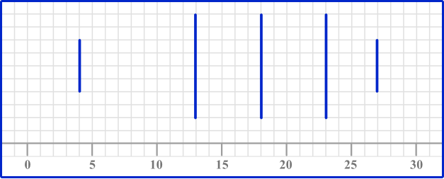
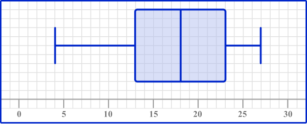
The box runs from the lower quartile (13) to the upper quartile (23). The whiskers join to the box; the lower whisker ends at the minimum value (4) and the upper whisker ends at the maximum value (27).
Comparison of data distributions
It is important to be able to read key information from a box plot, and also to compare data distributions of two box plots.
When comparing two box plots, you should make a comment about:
- The average (the median)), i.e., which is higher or larger on average;
- The spread or consistency (the interquartile range or IQR ): a greater IQR means that data points are more spread out, and therefore less consistent.
The comparison must be put into context of the question.
For example,
Box plot A shows the length of words in a book for a 5 year old child.
Box plot B shows the length of words in a book for an 8 year old child.
If the median is higher for box plot B, the contextual solution would be:
The median word length is longer in book B than in book A.
Or
The median word length is lower in book A than in book B.
When describing the spread of the data, if the interquartile range of the data is a larger value for book B than book A, the contextual solution would be:
The word lengths in book B are more spread out than in book A.
Or
The word lengths in book A are more concise than in book B.
How to read a box plot
In order to read a box plot:
- Identify the five-number summary values.
- Calculate the interquartile range.
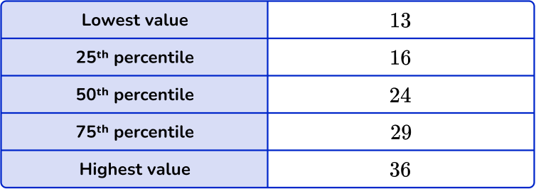
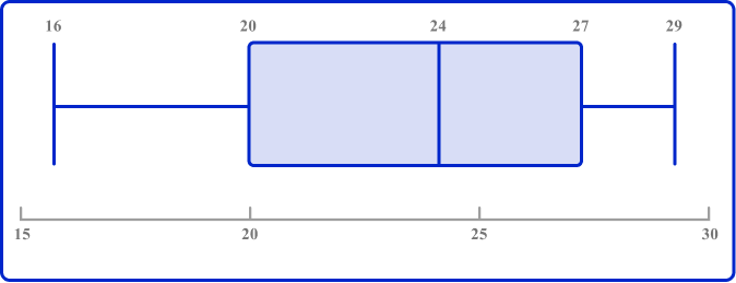
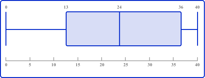
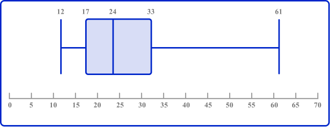
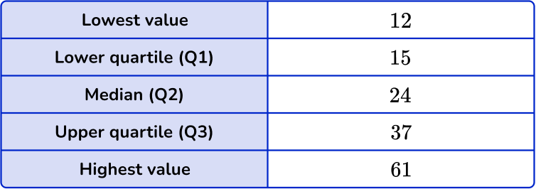
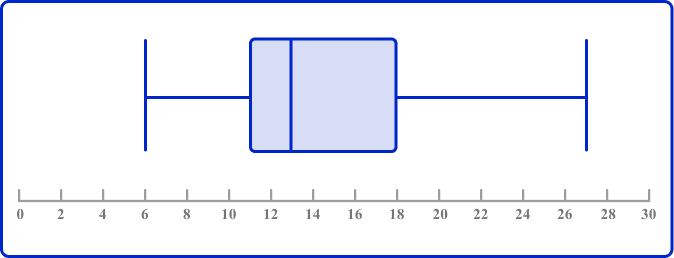
Example 4: reading information from a box plot
This table shows some descriptive statistics for a set of data.
| Minimum value | 5 |
| Lower quartile (Q1) | |
| Median (Q2) | 16 |
| Upper quartile (Q3) | |
| Maximum value |
This box plot represents the same set of data.
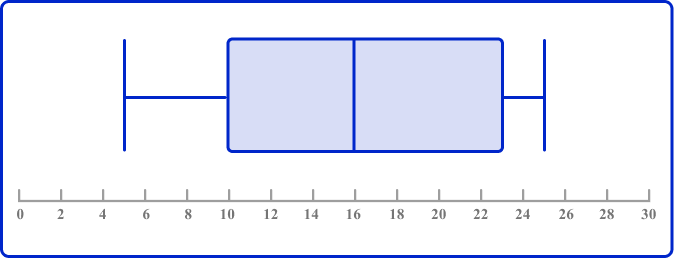
Use the box plot to fill in the missing information in the table.
The minimum value and median have already been provided.
The lower quartile is the vertical line on the box plot at the lower end (left end) of the box. Reading the data value off the x -axis, the lower quartile is 10.
The upper quartile is the vertical line at the upper end (right end) of the box. Reading the data value off the x -axis, the upper quartile is 23.
The upper whisker ends at the highest value; this is 25.
The completed table is therefore
| Minimum value | 5 |
| Lower quartile (Q1) | 10 |
| Median (Q2) | 16 |
| Upper quartile (Q3) | 23 |
| Maximum value | 25 |
The interquartile range is the difference between the upper quartile and the lower quartile.
IQR = 23-10 = 13.
How to compare box plots
In order to compare two box plots:
- Compare the medians and five-number summaries.
- Compare the \textbf{IQR} and overall range to comment on the spread or consistency.
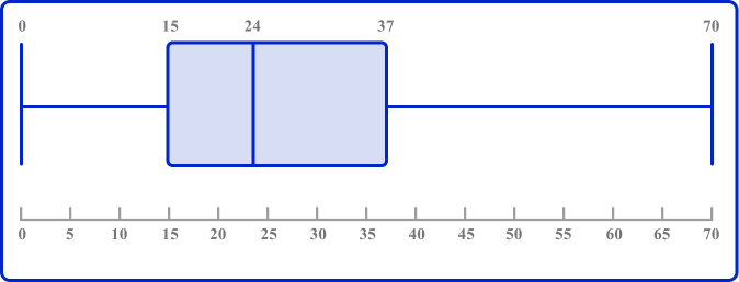
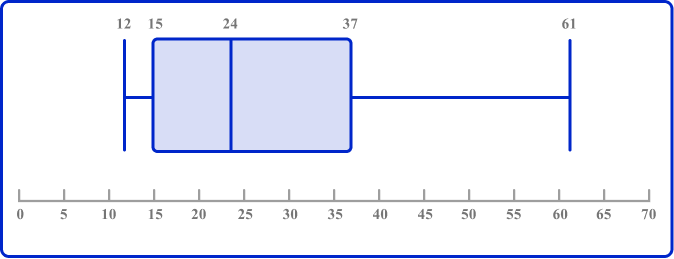
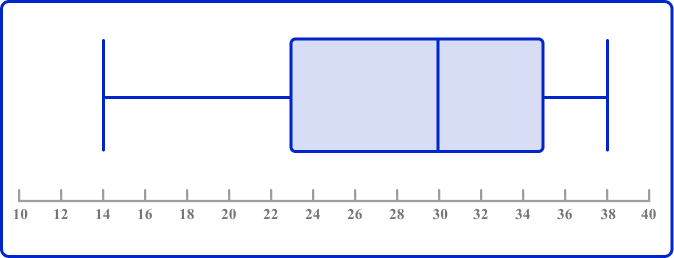
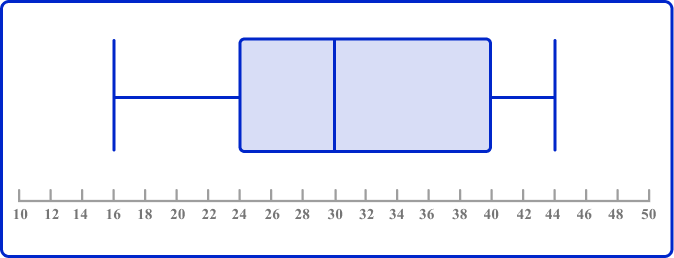
Example 5: comparing two box plots
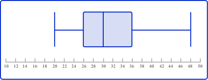
Two classes of students took the same math test. The two box plots below show a summary of their results rounded to the nearest whole number.
Class A

Class B
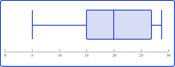
Compare these two sets of data.
The median for Class A is 14. In Class B, \, 14 is before Q1. This means that at least 75 \% of the data in Class B is greater than the median for Class A.
The median for Class B is 20. In Class A, \, 20 is after Q3. This means that between 25 \%-50 \% of the data in Class B is larger than any data point in Class A.
The interquartile range (IQR) for Class A is 6. The overall range for Class A is 16.
The IQR for Class B is 12. The overall range for Class B is 24.
In both values, Class A has less range. You can say that, ‘Class A was more consistent than Class B’. This just means that scores for Class A were more closely bunched together, whereas the scores for Class B were more spread out.
Alternatively, you could state ‘Class B had a larger interquartile range and overall range than Class A.’
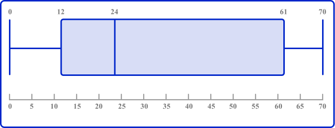
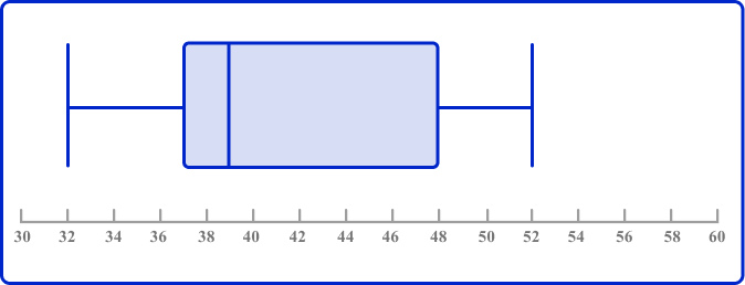
Example 6: comparing two box plots
Class A (see Example 5 ) also took an English test. Their scores are summarized below. Each test score is rounded to the nearest whole number. Compare the data distributions of scores on the math and English tests.
English
| Minimum value | 10 |
| Lower quartile (Q1) | 20 |
| Median (Q2) | 24 |
| Upper quartile (Q3) | 27 |
| Maximum value | 30 |
Math
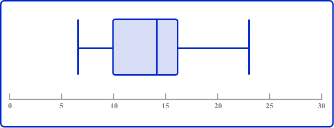
Before you can compare the box plots, you need to convert the data into the same format.
If you read the key data value from the math box plot, we get the following five-number summary for math scores:
| Minimum value | 7 |
| Lower quartile (Q1) | 10 |
| Median (Q2) | 14 |
| Upper quartile (Q3) | 16 |
| Maximum value | 23 |
The median value for English is 24. In Math, 24 over the maximum value. This means that at least 50 \% of the English scores were greater than any of the Math scores.
The median value for math is 14. In English, this is lower than the Q1 score. This means that at least 50 \% of the Math scores are below the bottom 25 \% of the English scores.
Remember, your answer must compare the two values; it is not sufficient to just state the two medians. You also need to give context, so in this example, refer to both of the subjects and scores on the tests rather than just ‘English has a smaller median.’
The IQR in English is 7 and the overall range is 20 and the IQR in math is 6 and the overall range is 16.
You could say that, ‘there was similar variability of scores in math and English.’ There was a similar bunching together of the middle 50 \% of the data and the overall data.
Remember, your answer must compare the two values; it is not sufficient to just state the two IQRs or ranges. You also need to give context, so in this example, refer to both of the subjects and marks scored on the tests rather than just ‘the IQRs are the same.’
Note that you could also answer this question by drawing a box plot of the English data – and it’s a very common type of assessment question to be asked to draw a box plot in the first part of a question, then compare this box plot with another in the second part of the question. Whichever method is required, the analysis is the same.
Teaching tips for box plot
- Discuss how box plots compare to other types of visualizations, such as histograms or bar charts. For example, show the same data set in each form and have students compare and contrast what each shows above the data as a whole. Highlight the unique insights that box plots offer, particularly in terms of summarizing and comparing multiple datasets.
- Explain to students that the number of data points in a sample affects the interpretation of a box plot. A larger sample size provides a more representative view of the population, while a smaller sample size may be less reliable. Provide examples of each.
Easy mistakes to make
- Drawing the ends of the whiskers right to the ends of the plot scale
The whiskers should run from the minimum value to the maximum value, not the full length of the scale.
- Forgetting to order the data set before finding the median or quartiles
If you are given a data set to represent on a box plot, make sure the list of values is in order before you start finding the key values.
- Not giving context when comparing box plots
Remember to refer to the context or topic in the question – for example, if the question asks about heights of children, your answer should be something like: ‘on average, the children in group A are taller than the children in group B.’
- Incomplete box plot
All of the five-number summary values should be featured on the box plot. Make sure your lines are clear on your diagram along with the scale.
Related representing data lessons
Practice box plot questions
1. Draw a box plot to show this five-number summary.


The ends of the whiskers are plotted at the minimum and maximum values. Draw lines for the QI, median (Q2), and Q3, and connect these to form the box.
2. Draw a box plot to show this set of data.
The data set is in order and so the five key values for the box plot are as follows:
The ends of the whiskers are plotted at the minimum and maximum values. Draw lines for the Q1, median (Q2), and Q3, and connect these to form the box. Draw the line from the lowest value to the lower quartile, and from the upper quartile to the highest value.
3. Look at this box plot.
Which could be the value of the lower quartile?
The lower quartile is the lower end of the box; it is somewhere between 10 and 12 so the value could be 11.
4. Look at this box plot.
What is the value of the median?
The median is the vertical line running through the middle of the box between the lower quartile and the upper quartile; the value is 30.
5. Look at these two box plots and choose the incorrect statement:
A:
B:
A and B have the same median.
A and B have the same range.
The maximum value of B is larger than the maximum value of A.
The interquartile range of A is smaller than the interquartile range of B.
The IQR of A is 40-24=16.
The IQR of B is 36-16=10.
So the IQR of A is larger than the IQR of B.
6. The two box plots show the English and math test results of a class of high school students. Choose the statement below that is incorrect.
English
Math
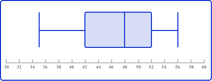
Up to 25 \% of the math scores were higher than the highest English score.
The highest score in English was greater than the highest score in math.
The lowest score in English was less than the lowest score in math.
There was similar variability in scores in English and math.
The highest score in English was 52.
The highest score in Math was 56.
Therefore, the highest score in English was less than the highest score in math, and the statement is incorrect.
Box plot FAQs
A box plot is a standardized way to represent a dataset that summarizes the key features based on the five-number summary: the minimum value, the first quartile, the median, the third quartile, and the maximum value.
Other names for a box plot are box and whisker plot and box and whisker diagram.
A box plot displays summary statistics of a dataset, such as the median and quartiles, while a violin plot combines a box plot with a density plot to show the data distribution more comprehensively.
The next lessons are
- Frequency table
- Frequency graph
- Sampling methods
- Represent and interpret data
- Percent
Still stuck?
At Third Space Learning, we specialize in helping teachers and school leaders to provide personalized math support for more of their students through high-quality, online one-on-one math tutoring delivered by subject experts.
Each week, our tutors support thousands of students who are at risk of not meeting their grade-level expectations, and help accelerate their progress and boost their confidence.

Find out how we can help your students achieve success with our math tutoring programs.
[FREE] Common Core Practice Tests (3rd to 8th Grade)
Prepare for math tests in your state with these 3rd Grade to 8th Grade practice assessments for Common Core and state equivalents.
Get your 6 multiple choice practice tests with detailed answers to support test prep, created by US math teachers for US math teachers!