High Impact Tutoring Built By Math Experts
Personalized standards-aligned one-on-one math tutoring for schools and districts
Scatterplots
Here you will learn about scatterplots, including how to plot scatterplots, describe correlation, draw an estimated line of best fit and interpolate and extrapolate data.
Students will first learn about scatterplots as part of statistics and probability in 8 th grade and continue to learn about scatterplots in high school.
What are scatterplots?
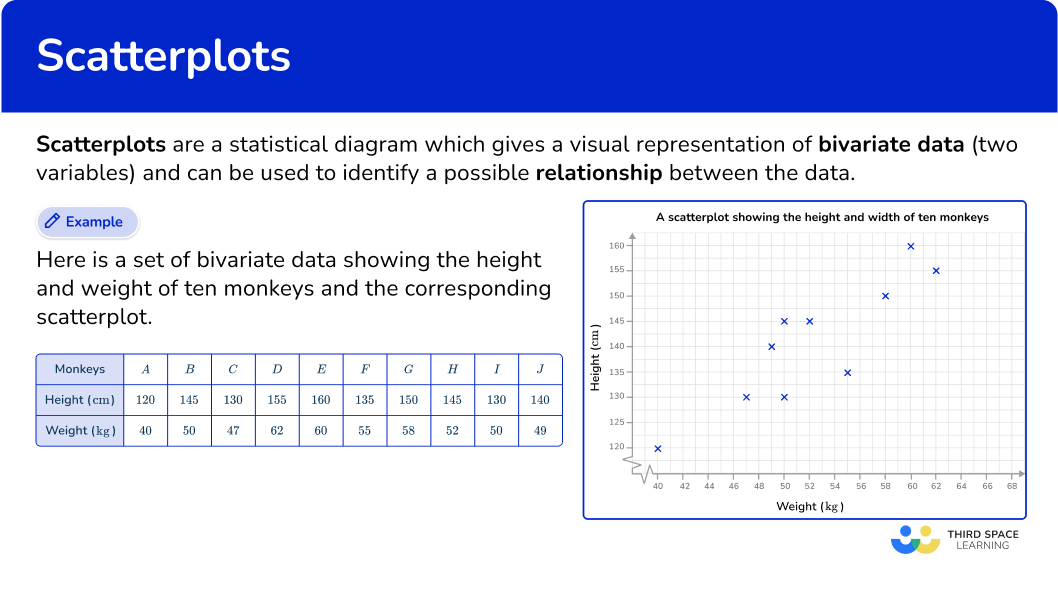
Scatterplots are a statistical diagram which gives a visual representation of bivariate data (two variables) and can be used to identify a possible relationship between the data. A scatterplot can also be referred to as a scatter diagram, scatter chart or scatter graph.
For example,
Here is a set of bivariate data showing the height and weight of ten monkeys and the corresponding scatterplot.
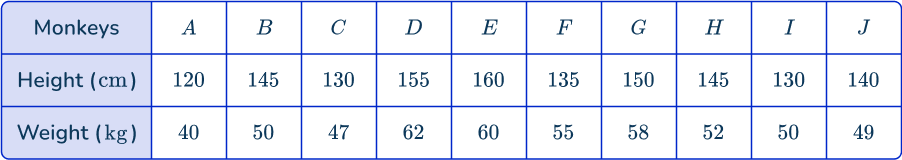
The graph helps us to see if there is a relationship between height and weight. Given this data, it seems like the taller a monkey is, the heavier a monkey tends to be.
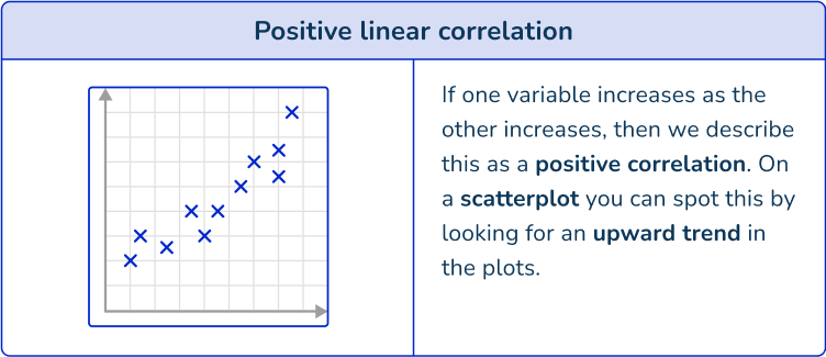
If there is a relationship for a set of bivariate data, it is referred to generally as an association. This graph shows a positive association. As weight increases, the height tends to increase.
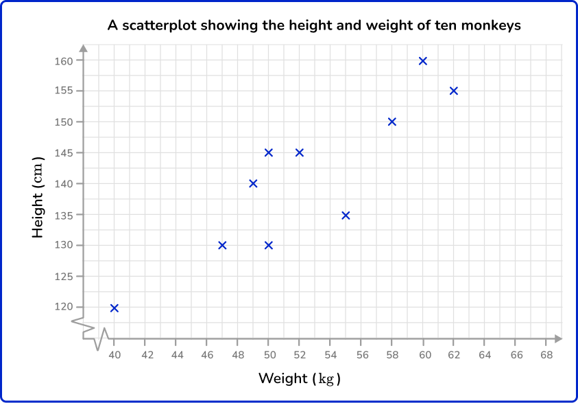
For data that appears to have an association, you can informally draw a straight line through the data in a scatterplot. This is an approximated line of best fit.
The aim is to draw a straight line in the direction of the association shown, with points distributed either side of the line as equally as possible along its length. Your line may also pass directly through a number of points.
![[FREE] Representing Data Worksheet (Grade 6 to 7)](https://thirdspacelearning.com/wp-content/uploads/2023/11/Representing-Data-listing-image.png)
[FREE] Representing Data Worksheet (Grade 6 to 7)
Use this quiz to check your grade 6 to 7 students’ understanding of representing data. 10+ questions with answers covering a range of 6th and 7th grade representing data topics to identify areas of strength and support!
DOWNLOAD FREE [FREE] Representing Data Worksheet (Grade 6 to 7)
Use this quiz to check your grade 6 to 7 students’ understanding of representing data. 10+ questions with answers covering a range of 6th and 7th grade representing data topics to identify areas of strength and support!
DOWNLOAD FREEA line of best fit can also be referred to as a trend line.
Statistical software (or complex equations) can be used to calculate the exact line of best fit. This method creates a line that minimizes the distance between itself and the actual data points. Note that both are typically written in the linear equation form y=mx+b.
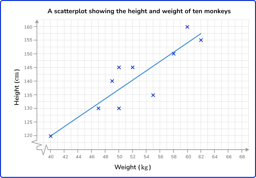
Once you have a line of best fit, approximate or exact, it can be used to estimate the value of one variable given a value of the other within the range of the highest and lowest data values. This is called interpolation.
For example,
Here, the line of best fit has been used to estimate the height of a monkey given that their weight is 56 \, kg.
This line of best fit estimates that a monkey weighing 56 \, kg will be approximately 147 \, cm tall.
If there is a strong association, then the line of best fit can provide relatively reliable estimates within the data set. If there is a weak association, then estimates will be less reliable.
In the graph below, the line of best fit has been extended so that it stretches beyond the data set (it is no longer surrounded by plotted points). If this section of the line is used to estimate the value of a variable given a value of the other, then this is known as extrapolation.
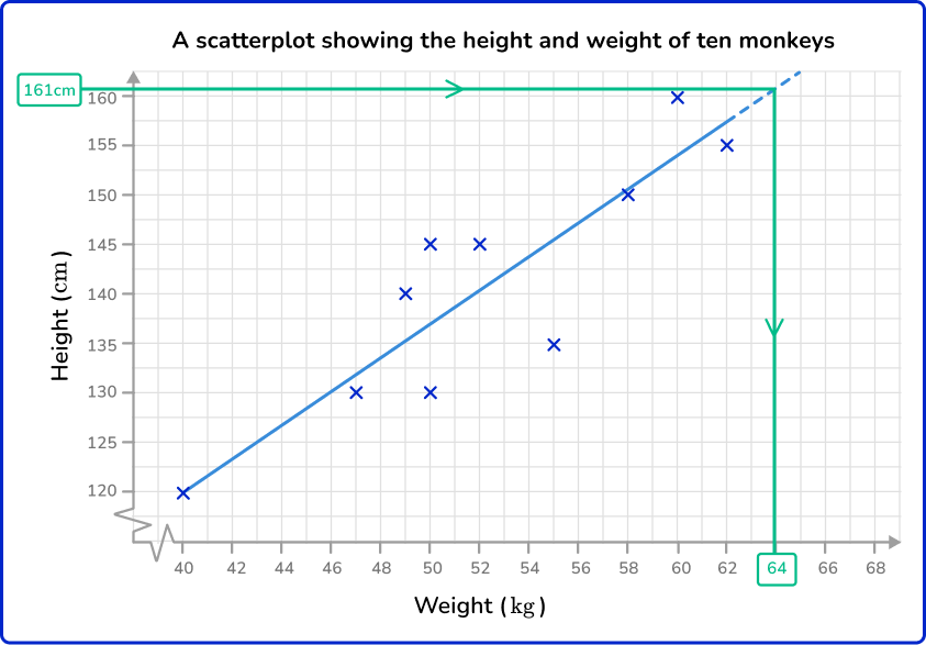
This line of best fit estimates that a monkey that is 161 \, cm tall will weigh approximately 64 \, kg. This is extrapolation and therefore this estimate comes with potential problems.
It is unknown whether the data will continue with the same trend beyond the recorded values. Therefore, extrapolated values should be treated with caution and are generally viewed as unreliable estimates.
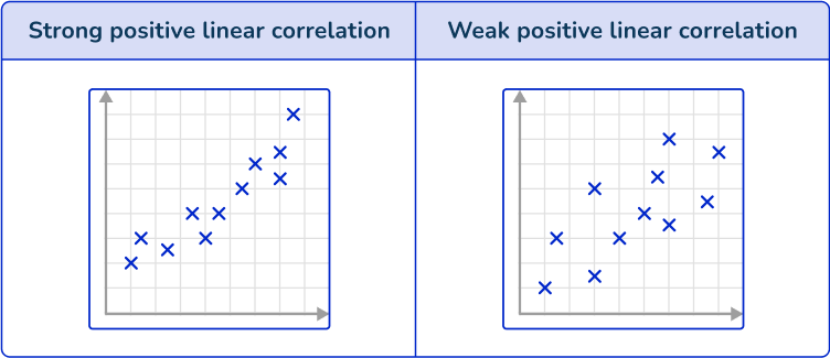
Correlation
Linear correlation is a specific association that refers to a linear relationship in bivariate data. Scatterplots visually show the correlation between two variables.
Linear correlation can vary in strength. Sometimes there is a strong relationship between data and other times the relationship is weak. You can see this visually on a scatterplot by observing how close the plots are together in forming a line.
What are scatterplots?
Common Core State Standards
How does this relate to 8 th grade math and high school math?
- Grade 8 – Statistics and Probability (8.SP.A.1)
Construct and interpret scatter plots for bivariate measurement data to investigate patterns of association between two quantities. Describe patterns such as clustering, outliers, positive or negative association, linear association, and nonlinear association.
- Grade 8 – Statistics and Probability (8.SP.A.2)
Know that straight lines are widely used to model relationships between two quantitative variables. For scatter plots that suggest a linear association, informally fit a straight line, and informally assess the model fit by judging the closeness of the data points to the line.
- Statistics and Probability – Interpreting Categorical and Quantitative data (HSS.ID.B.6)
Represent data on two quantitative variables on a scatter plot, and describe how the variables are related.
How to create scatterplots
In order to create scatterplots:
- Identify that the data is bivariate.
- Draw suitable axes and label them.
- Plot each pair of coordinates.
Scatterplots examples
Example 1: plotting a scatterplot
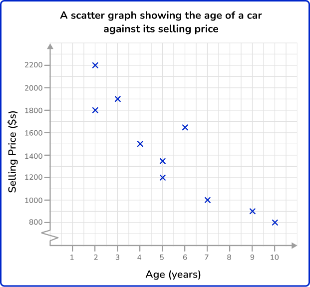
A garage sells second-hand cars. One week the garage sells ten cars. The table below shows the age and the selling price of each car.
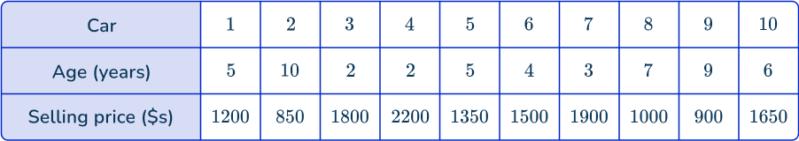
Represent this data on a scatterplot.
- Identify that the data is bivariate.
Bivariate data is a set of data which has two variables. In this question, the variables are the age and selling price of each car. Therefore, this is bivariate data.
2Draw suitable axes and label them.
Each axis should have one of the variables and the scale should be appropriate for the given values.
One axis will show the age of the car. This variable has the lowest value of 2 and highest of 10. A sensible scale would be 0 to 10 going up in unit steps.
The other axis will show the selling price of the car. This variable has the lowest value of 850 and highest value of 2,200. A sensible scale would be 800 to 2,200 in steps of 100. This will require drawing a break in the scale from the origin to 800.
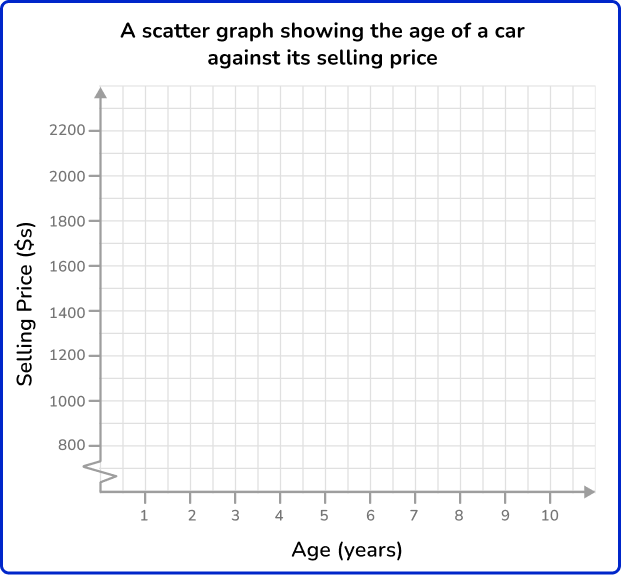
3Plot each pair of coordinates.
Plot each car as a cross on the graph one at a time. Make sure you read the scale carefully. Make sure you give your graph a suitable title.
To plot the coordinate for Car 1, locate 5 on the horizontal axis ( Age =5), and then travel vertically along that line until we locate \$ 1200 on the vertical axis ( Selling price =\$ 1200). Place an x at this point (5,1200).
Continuing this method, you get the following scatterplot:
Example 2: plotting a scatterplot
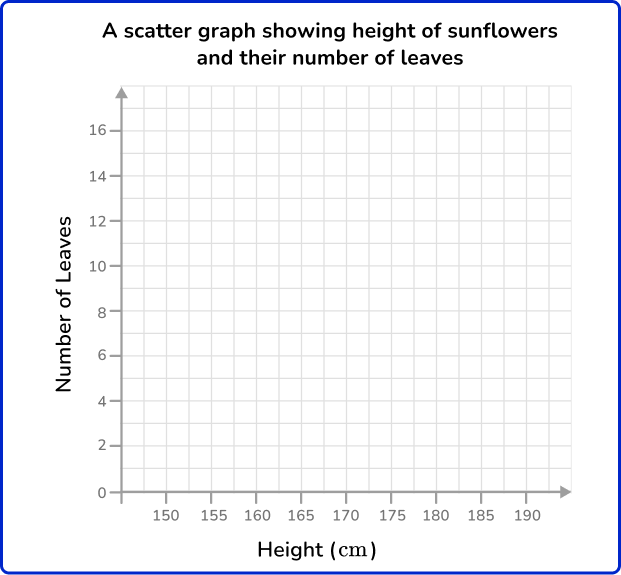
A gardener is researching a crop of sunflowers. He selects 6 sunflowers at random and measures their height and the number of leaves. The table below shows the results.
Represent this data using a scatterplot.
We have two variables for this data, height (cm) and number of leaves, so we have bivariate data.
Each axis should have one of the variables and the scale should be appropriate for the given values.
The range of heights is 154-181 \, cm and so draw the horizontal axis from 150-190 \, cm in 5 \, cm steps.
The range of the number of leaves is 8-14, so label the axis from 0-16 in steps of 2.
How to approximate line of best fit in scatterplot
In order to approximate a line of best fit in a scatterplot:
- Decide whether or not there is a linear association.
- If so, sketch a line that goes through the middle of the data; a line that is as close to all the data points as possible.
- Calculate the slope.
- Use a point on the line to calculate the \textbf{y} intercept.
- Write the approximated line of best fit equation in the form \textbf{y = mx + b}.
Example 3: approximating a line of best fit
A shop sells 14 different magazines. The shop manager decides to record the cost of each magazine and the number of pages it has. The manager then displays this information on a scatter graph.

Create the equation to represent an approximated line of best fit.
The data seems to increase linearly, so you can say it has some type of linear association.
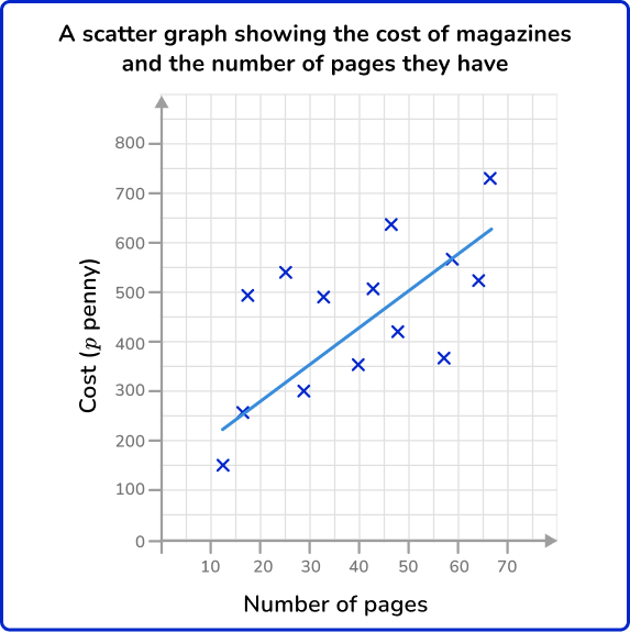
Choose two points that appear to be on the line of best fit. Remember, this is an approximation, so it is okay if your points are not exact.
The line seems to go through (35,400) and (55,550).
The formula for slope is m=\cfrac{y_{2}-y_{1}}{x_{2}-x_{1}}.
m=\cfrac{550-400}{55-35}=\cfrac{150}{20}=7.5
See also: How to find the slope of a line
In the equation y=mx+b, b is the y intercept. Substitute the slope, 7.5, and a point, (35,400) in the equation y=mx+b and solve.
Example 4: approximating a line of best fit
Below is a scatterplot that represents the number of ice cream sales against the outside temperature at midday during the month of July in the US.
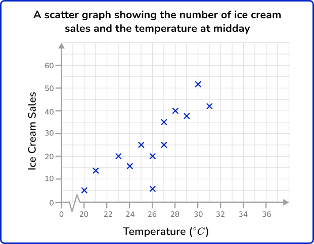
Create the equation to represent an approximated line of best fit.
The data seems to increase linearly, so you can say it has some type of linear association.
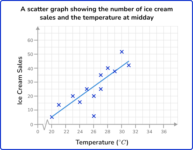
Choose two points that appear to be on the line of best fit. Remember, this is an approximation, so it is okay if your points are not exact.
The line seems to go through (21,10) and (28,35).
The formula for slope is m=\cfrac{y_{2}-y_{1}}{x_{2}-x_{1}}.
m=\cfrac{35-10}{28-21}=\cfrac{25}{7}=3 \cfrac{4}{7}
In the equation y=mx+b, b is the y intercept.
Substitute the slope, 3\cfrac{4}{7}, and a point, (21,10) in the equation y=mx+b and solve.
How to estimate values from a scatterplot
In order to estimate values from a scatterplot:
- Draw a line of best fit.
- Locate the given value on one of the two axes.
- Draw a vertical/horizontal line from the value to the line of best fit.
- Draw a vertical/horizontal line from the point on the line of best fit to the other axis.
- Read the value on the other axis.
Estimating values from scatterplots examples
Example 5: estimating a y value
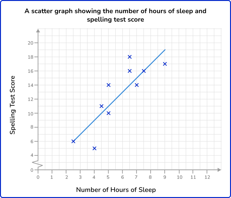
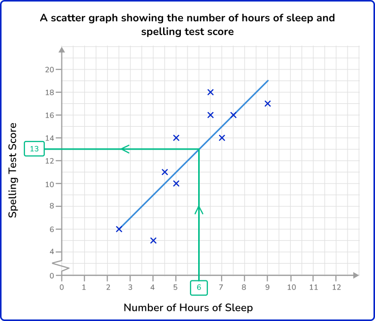
Below is a scatterplot that represents the number of hours of sleep per night of 10 students and the score they achieved in a spelling test.
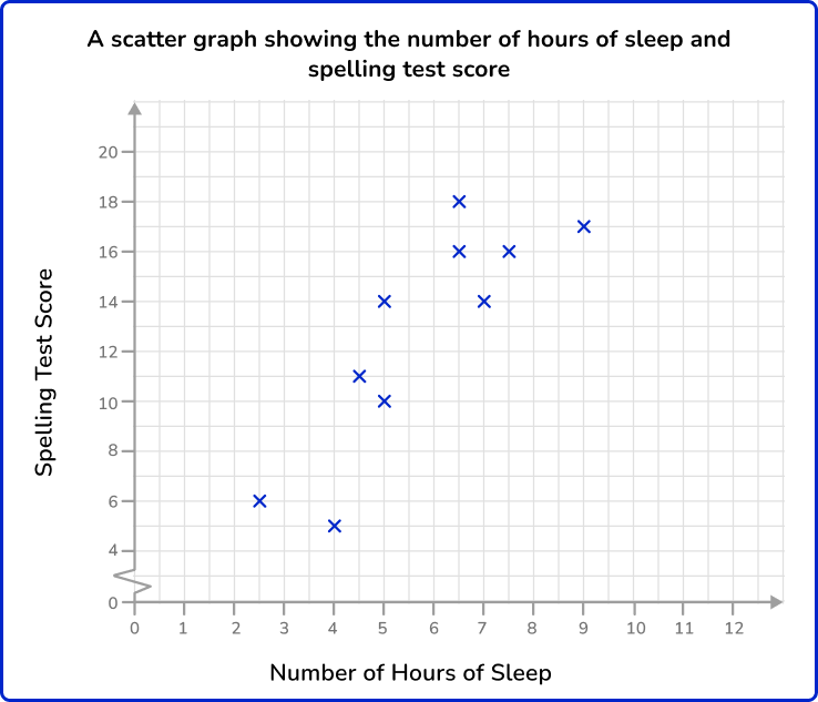
What spelling test score would you predict for a student who has an average of 6 hours of sleep per night?
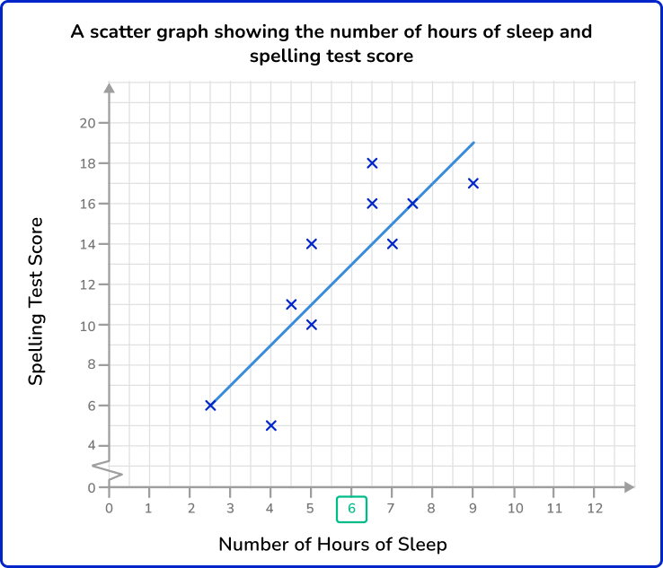
Locate 6 hours of sleep on the horizontal axis.
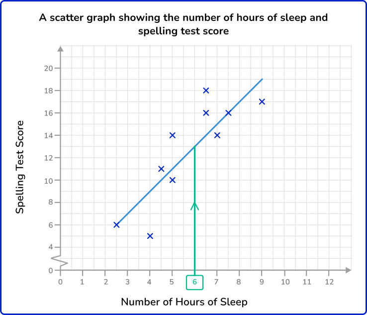
Draw a vertical line to get to the line of best fit.
Draw a horizontal line from the line of best fit to the other axis.
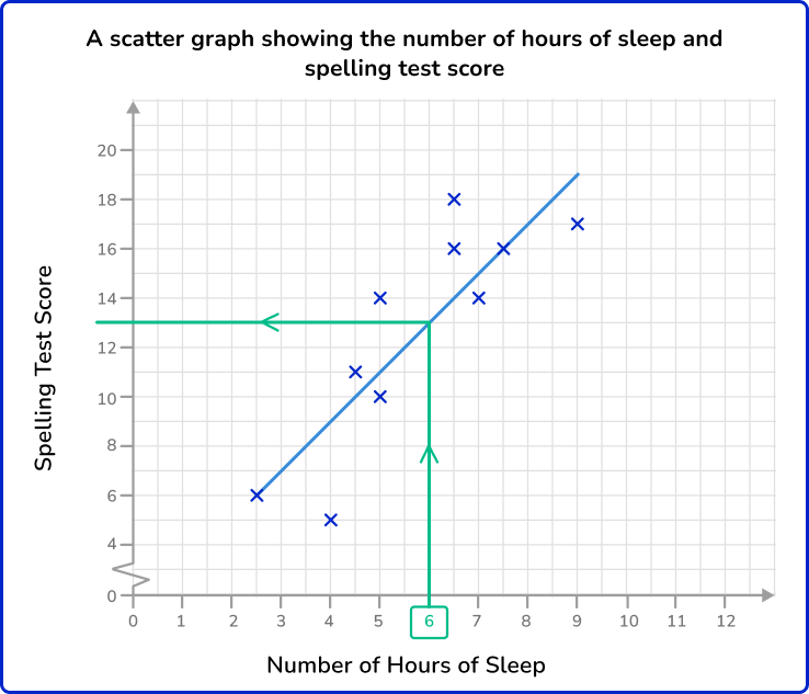
Here, the spelling test score is 13.
Example 6: estimating a y value
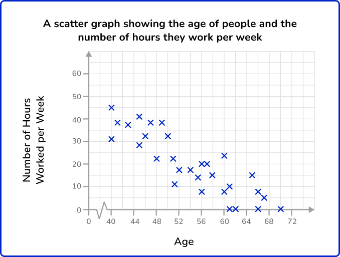
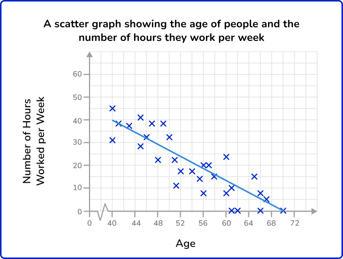
The scatterplot below represents the age of people and the number of hours they work per week.
How many hours of work would you predict for a person who is 64 years old?
Locate 64 on the horizontal axis.
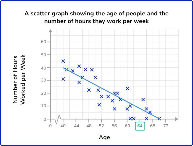

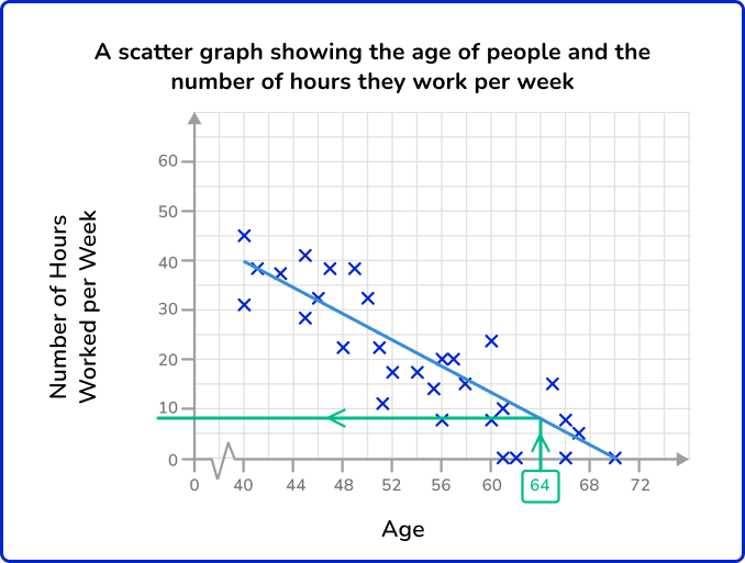
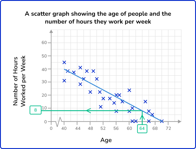
The estimated number of hours worked per week by a person aged 64 is about 8 hours.
Teaching tips for scatterplots
- Always draw attention to and clearly label the units on the x -axis and y -axis. This keeps the context of the data at the forefront.
- Expose students to different data structures and data visualizations, so they do not develop misconceptions about what forms data can take. This includes showing scatter plots that have all types of associations, correlations and data sets with outliers, gaps and clusters.
- Before introducing the line of best fit, make sure students have had plenty of practice identifying and writing linear equations. As they are learning about scatterplots, provide any necessary support to assist struggling students (such as step by step tutorials or linear equation apps). This will ensure that their main focus can be on learning about scatterplots, without being held back.
Easy mistakes to make
- Confusing the subject of bivariate data
Sometimes bivariate data can appear to have 3 variables and not just 2. For example, the table below shows information from a small independent electronics shop.
They have recorded the year, the number of TVs sold, and the amount of money spent on advertising. As the table has 3 rows of data it may appear to have 3 variables.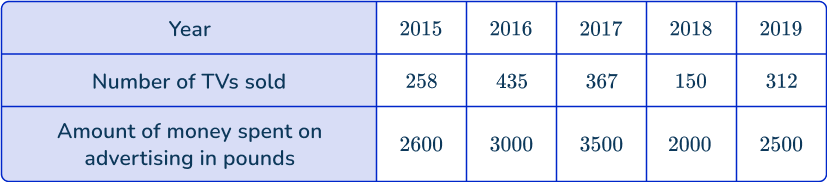
However, you must remember that bivariate data has a subject and two variables are recorded for each subject. In this case the subject is the year. For each year the number of TV sales and money spent on advertising has been recorded.
On a graph, one axis will be labeled as ‘number of TVs sold’, and the other as ‘amount of money spent on advertising’, and then each cross will indicate each year.
It is good to remember that the points on scatterplots represent subjects. The number of points on the graph tells us the number of subjects.
- Confusing correlation and causation
When interpreting scatterplots, it is important to know that correlation does not indicate causation. In other words, a relationship between two variables does not indicate that one variable causes another.
For example, you may find a positive correlation between temperature and the number of ice-creams sold. You can describe the relationship as the hotter the temperature, the greater the number of ice-creams sold.
It might then be tempting to say that this indicates that hot weather causes higher ice cream sales. However, there is not sufficient evidence for you to make this assumption both scientifically and statistically. In the same way you cannot say that higher ice cream sales cause hotter temperatures.
Related representing data lessons
Practice scatterplot questions
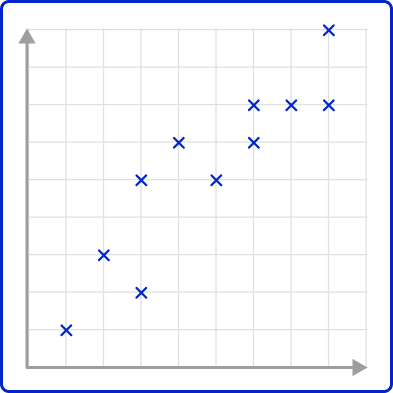
1. A student recorded how many glasses of water they drank and how many apples they ate each day for 3 days.
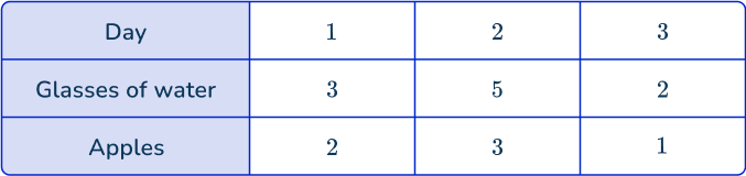
Which diagram shows this data correctly plotted on a scatterplot?
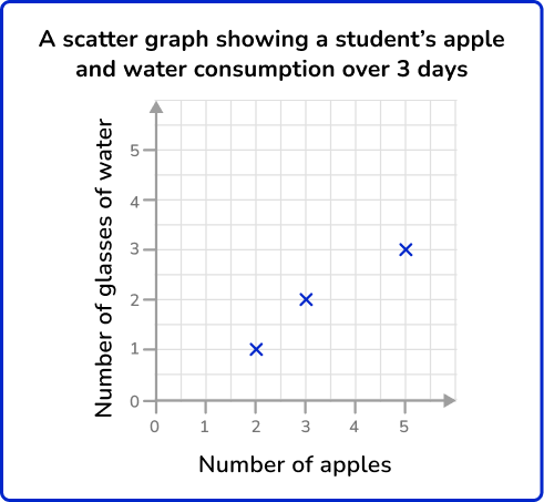

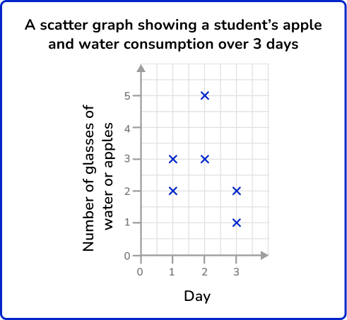
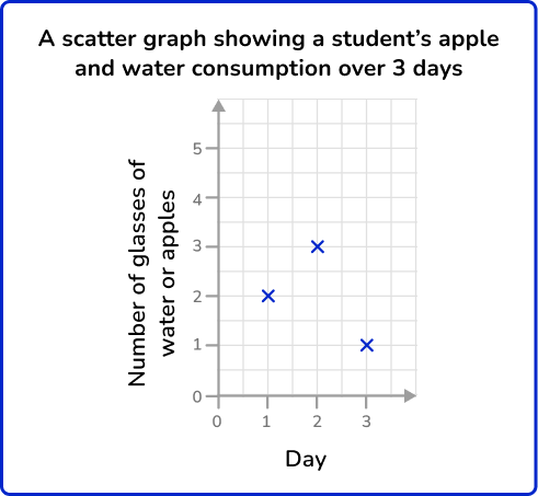
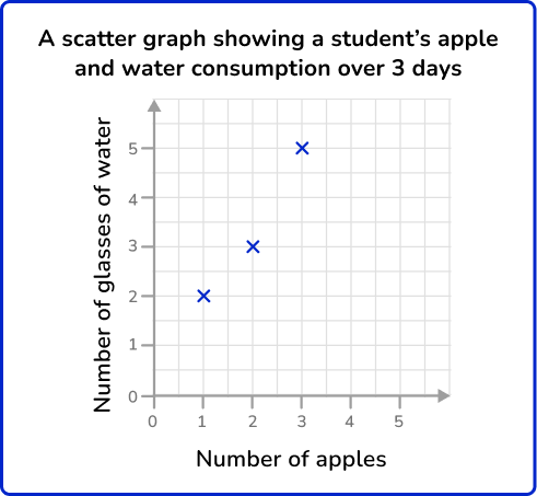

This is bivariate data. For each subject (each day), two pieces of information have been recorded (number of glasses of water and number of apples).
The axes should be labeled with the two variables (number of glasses of water and number of apples). The scale should be appropriate for the values.
When plotting the coordinates make sure to get them the correct way round. Each day is represented by a cross.
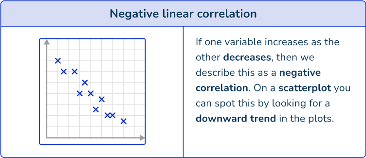
2. Which scatterplot shows a negative association?
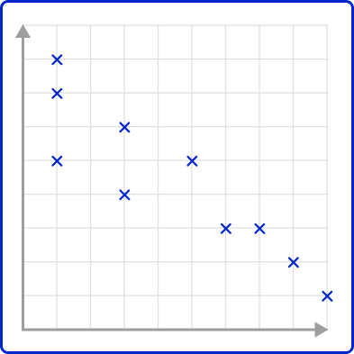
A negative association is shown on a scatterplot by the points forming a downward trend. As one variable increases, the other variable decreases.
3. Which scatterplot has the best estimated line of best fit?
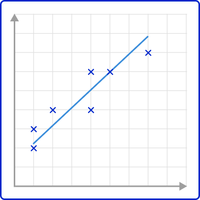
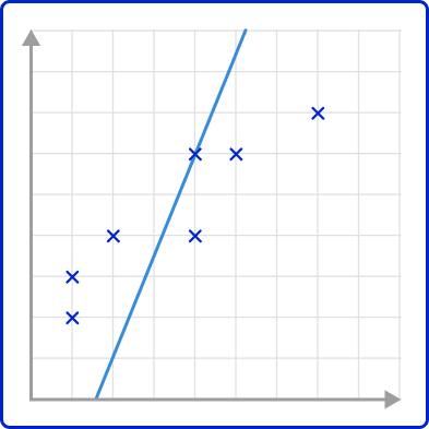
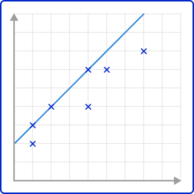
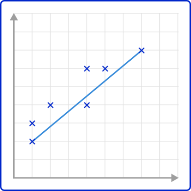
The line of best fit must minimize the distance between all points and the line.
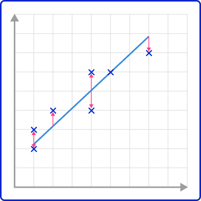
The line above appears to have the least amount of distance between itself and each point on the line.
4. Write an equation for the line of best fit shown in the scatterplot.
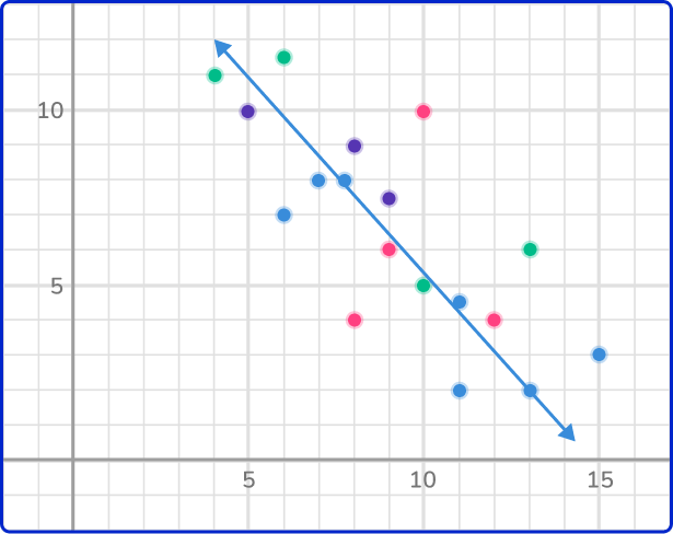
First, identify two points that fall on the line. Let’s use (5, 11) and (13,2).
The formula for slope is m=\cfrac{y_{2}-y_{1}}{x_{2}-x_{1}}.
m=\cfrac{2-11}{13-5}=\cfrac{-9}{8}=-1\cfrac{1}{8}
In the equation y=mx+b, b is the y intercept. Substitute the slope, -1\cfrac{1}{8}, and a point, (5,11) in the equation y=mx+b and solve.
\begin{aligned} 11&=-1\cfrac{1}{8}\cdot{5}+b\\\\ 11&=-5\cfrac{5}{8}+b\\\\ 16\cfrac{5}{8}&=b \end{aligned}
Write the approximated line of best fit equation in the form y=mx+b.
y=-1\cfrac{1}{8} \, x+16\cfrac{5}{8}
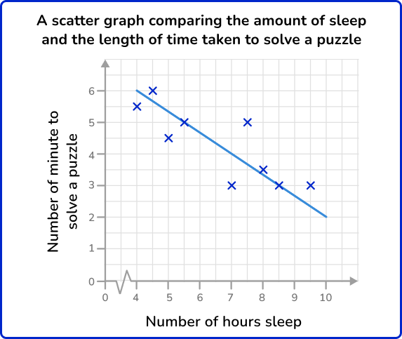
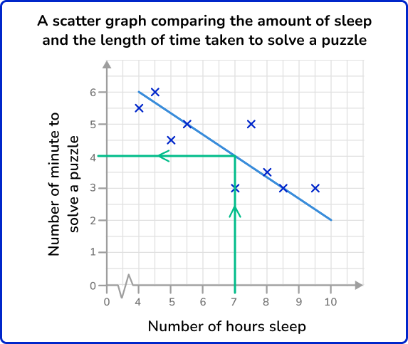
5. This scatterplot compares the number of hours of sleep 10 adults had the previous night, and the length of time taken to solve a puzzle. The line of best fit has also been drawn.
Use the line of best fit to predict the length of time it would take an adult to solve the puzzle if they had 7 hours sleep.
Draw a vertical line from 7 on the horizontal axis to the line of best fit, and then across to the other axis. The line of best fit predicts that a person who has 7 hours of sleep should solve the puzzle in 4 minutes.
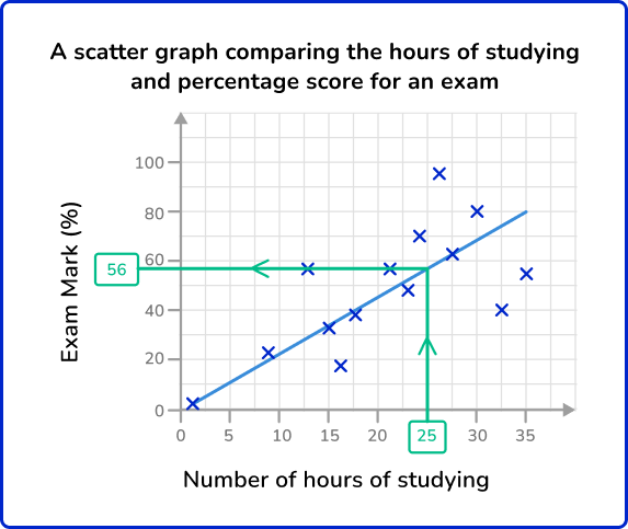
6. This scatterplot compares the number of hours of studying for an upcoming exam, and the score on the exam, as a percentage. The exam is out of 80. A line of best fit has been drawn on the scatterplot.
Use the line of best fit to predict the exam mark percentage of a student who studied for 25 hours for the exam.
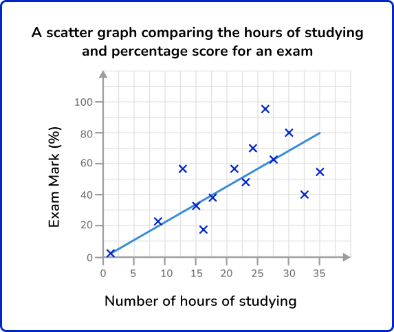
Since the student did 25 hours of studying, locate 25 hours on the horizontal axis. Draw a vertical line up to the line of best fit, and then across to the vertical axis. This shows us a percentage of 56 \%.
Scatterplot FAQs
No, scatterplots are created on a coordinate grid and therefore compare numerical data only. Categorical variables should be displayed on other types of graphs.
Linear regression is another name for finding the best-fit line for a set of data that has a linear relationship.
No, while they have commonalities; they are both graphed on a coordinate grid and have numerical variables; a line chart has no more than 1 value for each x and these values are connected with a continuous line.
It is a numerical measure of the population.
It is the variable whose outcome depends on the independent variable.
The next lessons are
- Frequency table
- Frequency graph
- Types of sampling
Still stuck?
At Third Space Learning, we specialize in helping teachers and school leaders to provide personalized math support for more of their students through high-quality, online one-on-one math tutoring delivered by subject experts.
Each week, our tutors support thousands of students who are at risk of not meeting their grade-level expectations, and help accelerate their progress and boost their confidence.

Find out how we can help your students achieve success with our math tutoring programs.
[FREE] Common Core Practice Tests (3rd to 8th Grade)
Prepare for math tests in your state with these 3rd Grade to 8th Grade practice assessments for Common Core and state equivalents.
Get your 6 multiple choice practice tests with detailed answers to support test prep, created by US math teachers for US math teachers!