High Impact Tutoring Built By Math Experts
Personalized standards-aligned one-on-one math tutoring for schools and districts
In order to access this I need to be confident with:
Coordinate planeLine graph
Here you will learn about line graphs, including drawing, reading, and interpreting them.
Students will first learn about line graphs as part of statistics and probability in high school.
What is a line graph?
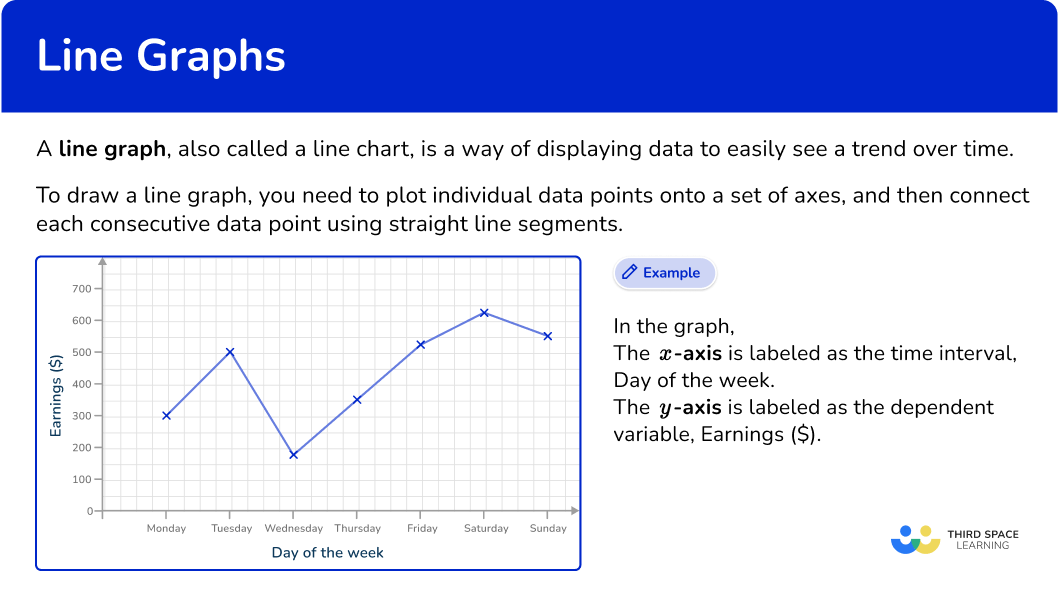
A line graph, also called a line chart, is a way of displaying data to easily see a trend over time.
To draw a line graph, you need to plot individual data points onto a set of axes, and then connect each consecutive data point using straight line segments.
The x -axis or horizontal axis is labeled as time, and the y -axis or vertical axis is the variable that is being measured or tracked (ice cream sales, hours spent on homework, earnings, number of births, etc).
The main benefit of this type of chart is that you can spot trends in the given data over time.
This is a really useful tool in business to show sales trends or profits and losses over time or in science to show the growth rate of bacteria, change of pH, or a change in temperature over time.
Patterns in data allow for more accurate predictions in the future.
![[FREE] Representing Data Quiz (Grade 6 to 7)](https://thirdspacelearning.com/wp-content/uploads/2023/11/Representing-Data-listing-image.png)
[FREE] Representing Data Quiz (Grade 6 to 7)
Use this quiz to check your grade 6 to 7 students’ understanding of representing data. 10+ questions with answers covering a range of 6th and 7th grade representing data topics to identify areas of strength and support!
DOWNLOAD FREE [FREE] Representing Data Quiz (Grade 6 to 7)
Use this quiz to check your grade 6 to 7 students’ understanding of representing data. 10+ questions with answers covering a range of 6th and 7th grade representing data topics to identify areas of strength and support!
DOWNLOAD FREEReading and interpreting line graphs
The purpose of drawing a line graph (or time series) is to spot trends over a period of time. This is much easier when looking at a plotted set of data, rather than data within a table.
How to read a value from a line graph
To read a value from a line graph, you need to identify which axis you are starting from, so the data value will be estimated from the other axis.
For example,
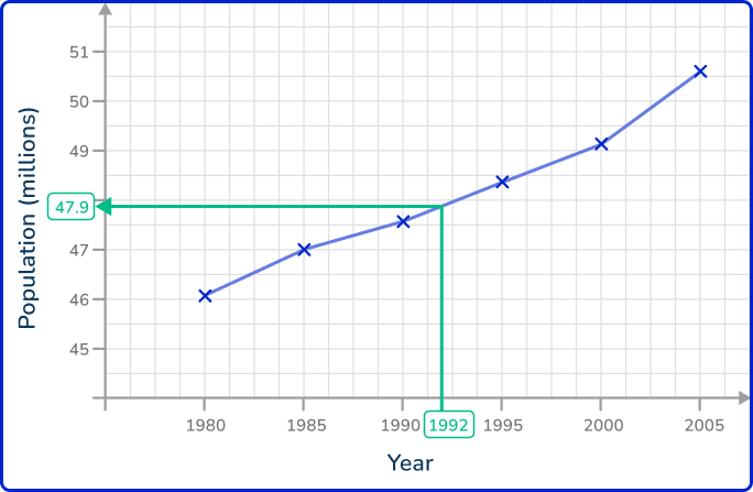
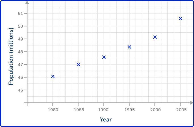
Using the line graph from Example 1, you have the line graph that represents the population of England in millions between 1980 and 2005.
If you wanted to estimate the population in 1992, you would find the value of 1992 on the axis (here the x -axis), draw a vertical line up to the coordinate on the line graph, and then draw a horizontal line from this coordinate to the y -axis.
This would state the estimate for the population in 1992 to be around 47.9 million people.
You can do the same if you want to find out which year the population exceeded 50 million people, by locating the value 50 on the y -axis and reversing the process.
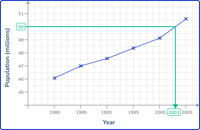
Here, the answer would be around the year 2003.
How to interpret a line graph
Interpreting a line graph is a key skill. Here, you need to spot trends or changes in the data that are significant, if not just noticeable.
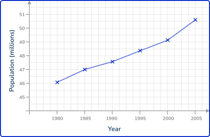
Looking at the same line graph from Example 1, you can state a clear trend in the data: the population of England between 1980 and 2005 has increased. This is because, every year, the value for the population is higher than the previous year.
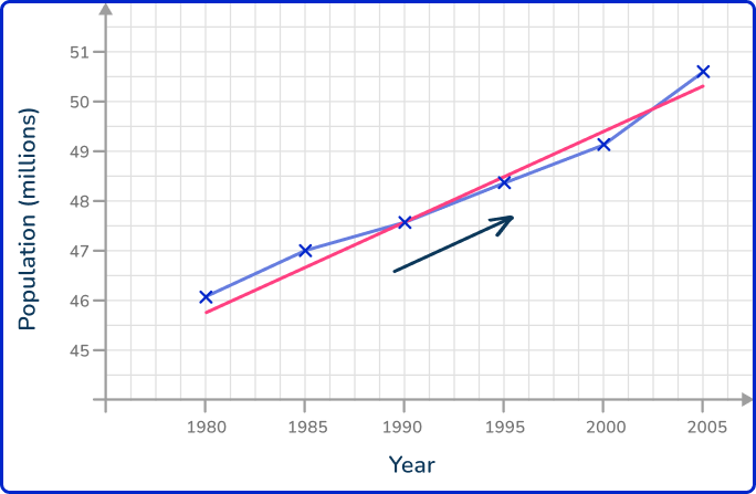
Here, the red line is a line of best fit for the population data, and the blue arrow indicates an upward trend. You may have to draw a line of best fit to represent the correlation of the data.
There are limitations to this that you have to consider. You only have the data for every 5 years. There may have been no population change at all between the year 2000 and the year 2004, and then the population suddenly increased in 2005.
You simply drew a straight line between 2000 and 2005, which assumes the population change over these 5 years was exactly the same every year, which is very unlikely!
This example of a limiting factor is one of the most common issues with a line graph (generalizations in the data / lack of accuracy / not enough data values, etc).
Time series can show seasonal fluctuations; for example, the sales of ice cream throughout a year are expected to be higher in the warm summer months than the cold winter months, so you would use a moving average.
What is a line graph?
Common Core State Standards
How does this relate to high school math?
- High School – Statistics and Probability – Interpreting Categorical & Quantitative Data (HS.S.ID.A.1)
Represent data with plots on the real number line (dot plots, histograms, and box plots).
How to draw a line graph
In order to draw a line graph:
- Label the axes and add an axis title.
- Plot each data point accurately.
- Connect each pair of consecutive points with a straight line.
Line graph examples
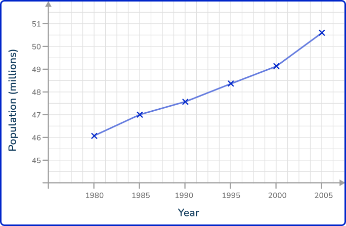
Example 1: population change
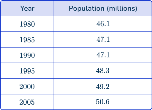
The data shows the population of England from 1980 to 2005. Draw a line graph to show the data in the table.
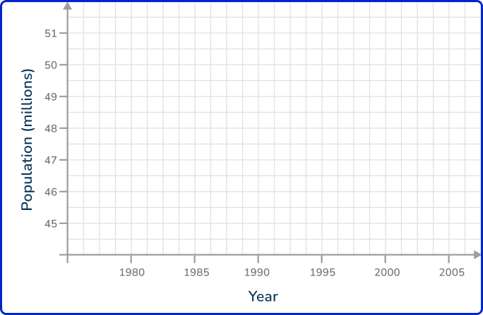
- Label the axes and add an axis title.
Here, the x -axis is labeled as the Year, and the y -axis is labeled as the Population (millions). Each axis value is spaced out equally, with enough room to place each data value in a more specific location, so the line graph is more accurate.
2Plot each data point accurately.
Plotting each point one at a time, you get the following plot:
3Connect each pair of consecutive points with a straight line.
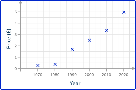
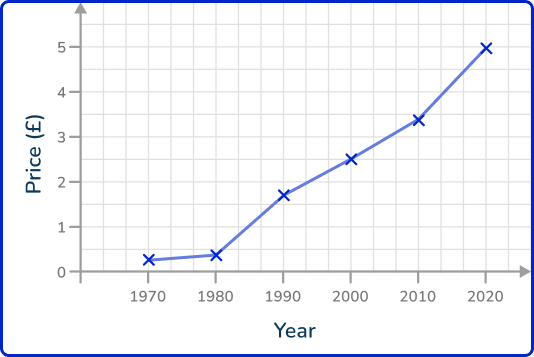
Example 2: price fluctuations
The table shows the average price of fish and chips in the UK over 50 years.
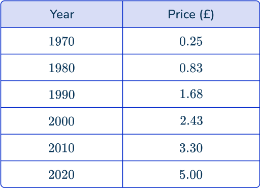
Draw a line graph to show this information.
Here, the x -axis is labeled as the Year, and the y -axis is labeled as the Price (£). Each axis value is spaced out equally, with enough room to place each data value in a more specific location, so the line graph maintains the accuracy within the data.
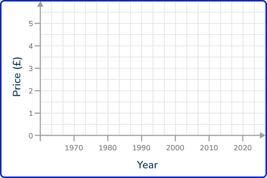
Plotting each point one at a time, you get the following plot:
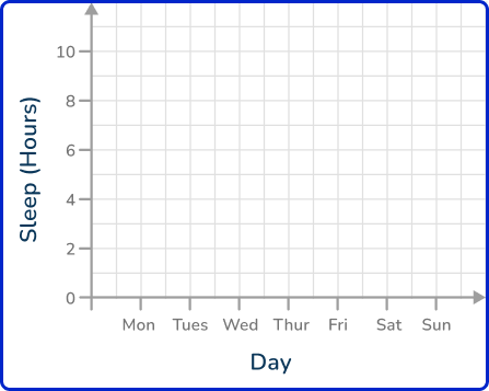
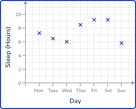
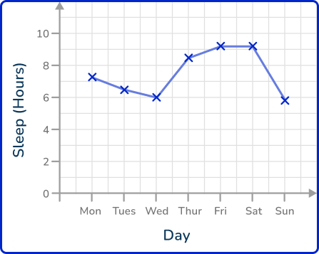
Example 3: hours of sleep
The following table of data values shows the amount of sleep in hours James had over one week.
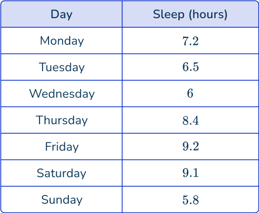
Draw a line graph to represent this data.
How to read a value from a line graph
In order to read a value from a line graph:
- Locate the value on the appropriate axis.
- Draw a horizontal / vertical line to the data point on the line graph.
- Draw a horizontal / vertical line from the data point to the other axis.
- Read the value from the axis.
Reading line graphs examples
Example 4: reading line graphs – frequency of cars
The line graph shows the frequency of cars on a busy road between 5 am and 11 am. Estimate the number of cars on the road at 8\text{:}30 am.
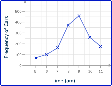
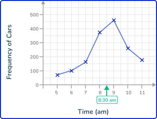
Here you will draw a vertical line to the data point on the line graph as time is on the x -axis.

As you need to reach the y -axis, you draw a horizontal line from the data point to the y -axis.
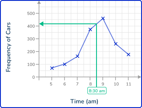
Here, the value on the y -axis is around 425.
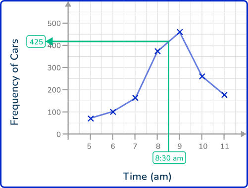
The frequency of cars on the road at 8\text{:}30 am is 425.
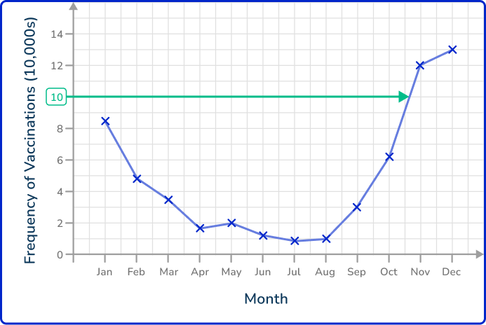
Example 5: reading line graphs – vaccinations
The line graph shows the number of people who received their flu vaccine per month over one year. The data was recorded on the last day of the month. What month did the number of people receiving their flu vaccine reach over 100,000?
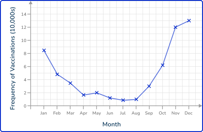
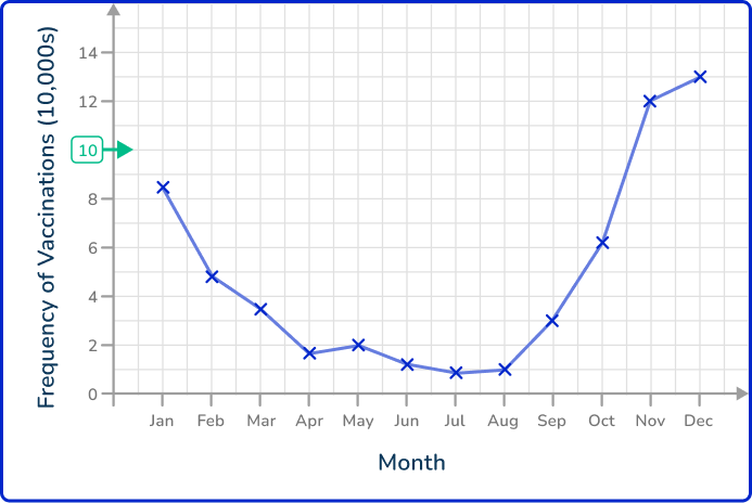
Here you will draw a horizontal line to the data point on the line graph as the frequency of vaccinations is on the y -axis.
As you need to reach the x -axis, you will draw a vertical line from the data point to the x -axis.
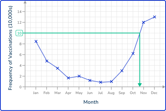
Here, the value on the x -axis is between October and November. This means that the number of vaccines reached over 100,000 in November as the previous data point recorded was on the last day in October.
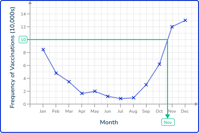
The number of vaccinations exceeded 100,000 per month in November.
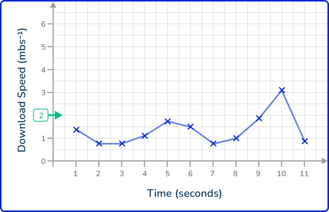
Example 6: reading line graphs – download speed
The time series shows the download speed of a video in megabytes per second (mbs^{-1}). The download speed was recorded every second for the length of the download.
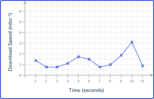
How many seconds did the download speed exceed 2\mathrm{~mbs^{-1}}?
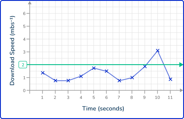
As you need to exceed 2\mathrm{~mbs^{-1}}, you need to locate 2\mathrm{~mbs^{-1}} on the y -axis.
Instead of drawing a horizontal line to the first point, you need to determine all the points that are above 2\mathrm{~mbs^{-1}} and so you draw a horizontal line across the entire plot.
Drawing a vertical line for each value where the line graph crosses our horizontal line, you get the following:
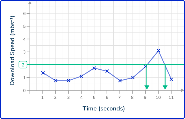
You have two values that you need to read from the axis. These are 9.1 and 10.5\text{:}
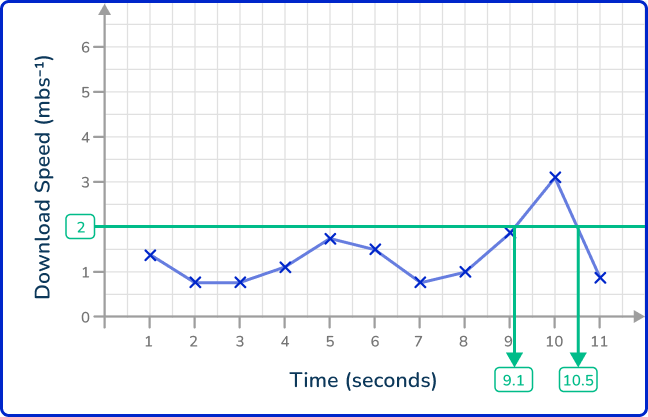
As the question asks for the length of time the download speed exceeded 2\mathrm{~mbs^{-1}}, you will calculate the range of these two values by calculating this value.
10.5-9.1=1.4\mathrm{~s}
The download speed exceeded 2\mathrm{~mbs^{-1}} for 1.4 seconds.
Teaching tips for line graph
- Be sure students can easily identify all parts of a line graph, including the x -axis (independent variable) and y -axis (dependent variable).
- When teaching line graphs with multiple datasets, use different colors for each line. This helps students easily distinguish between the datasets and reduces confusion.
- Teach students about different visualization techniques and best practices in graphing, such as avoiding clutter and choosing appropriate scales.
- Provide templates on worksheets that feature pre-labeled axes and a grid for plotting their data. This allows them to concentrate on understanding the relationships and trends in the data without being distracted by setup details.
- Utilize graphing calculators, apps, or computer software like Excel or Google Sheets to create and analyze line graphs.
Easy mistakes to make
- Thinking the line needs to connect to the \textbf{x} or \textbf{y} -axis
A line graph does not have to be connected to the axis every time. It all depends on the number the axis starts with.
- Taking exact values from the graph that are not plotted points
The values read in between plotted points on the graph are estimates because no exact values were collected at the times between the data points given. Any value taken from the graph that isn’t an exact plotted point is therefore an estimate.
- Not plotting time on the \textbf{x} -axis
The time must be plotted on the x -axis (horizontal axis).
Related representing data lessons
Practice line graph questions
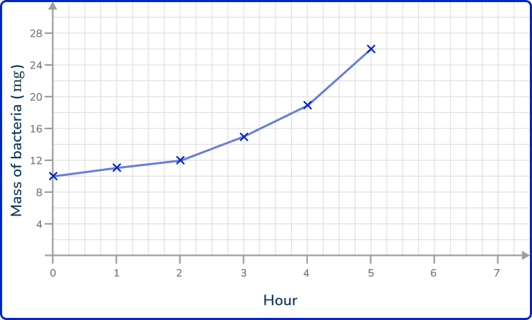
1. The data shows the mass of bacteria on a petri dish recorded every hour for 6 hours. Draw a line graph to represent the data.
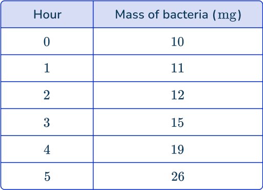
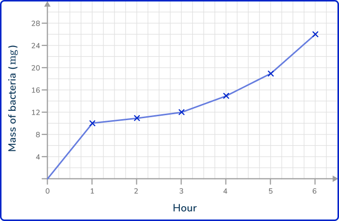

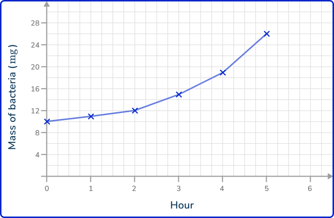

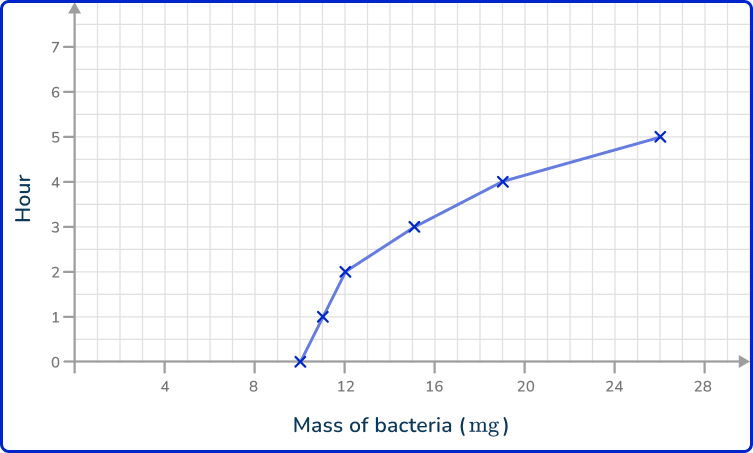
As time is always written on the x -axis, the mass of bacteria is therefore written on the y -axis. Plotting the points at the exact values and joining these together with straight lines, you get the solution:
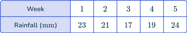
2. The data in the table below shows the average amount of rainfall in millimeters over 5 weeks in New York.
Draw a line graph to represent this data.
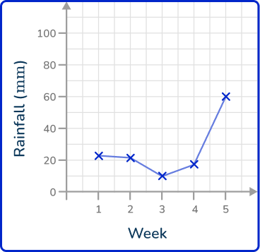
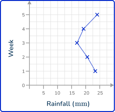
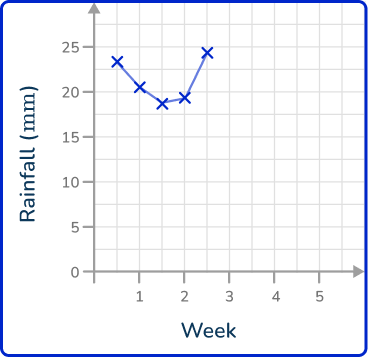
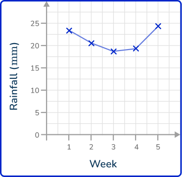
As time is always written on the x -axis, rainfall is written on the y -axis. Plotting the points at the exact values and joining these together with straight lines, you get the solution:

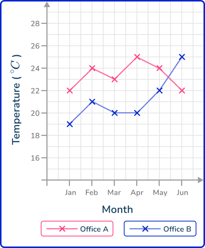
3. The table below shows the average temperature of two offices over 6 months.
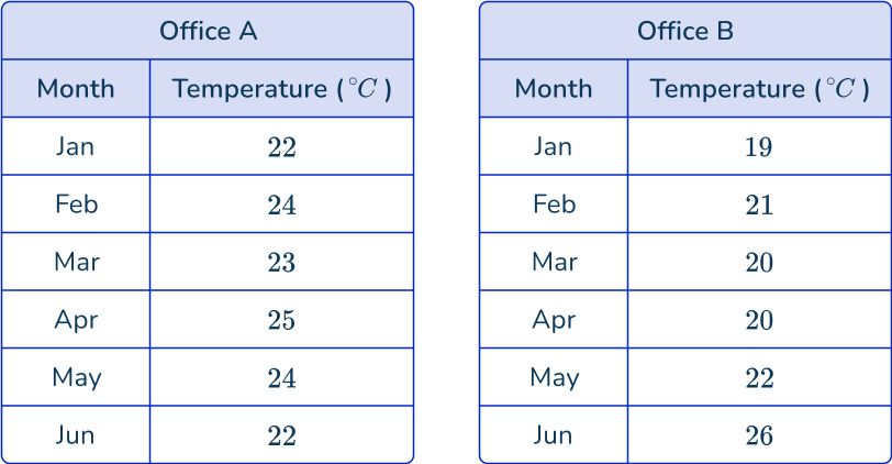
Draw a comparative line graph to represent each series of data points over the 6 month period.
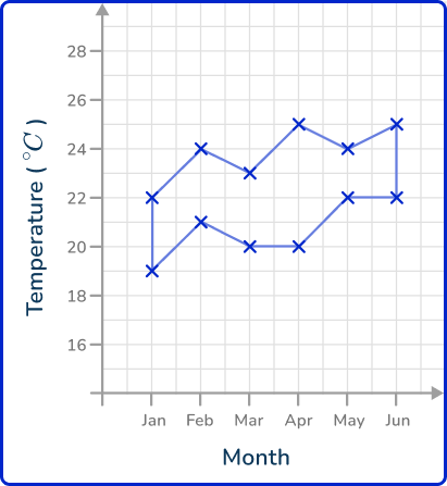
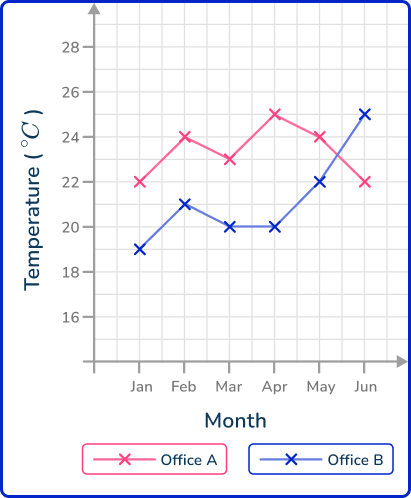
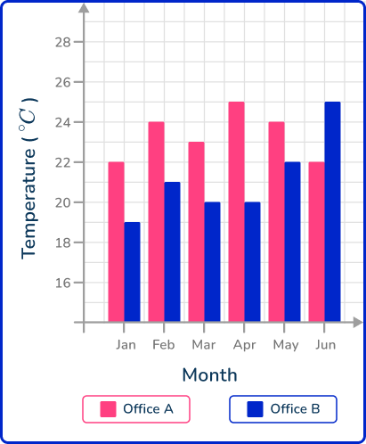

Draw each line graph separately. You plot the points for Office A first and connect them using straight lines. You then draw the plot for Office B on the same set of axes and join these consecutive points with straight lines. Do not connect the two plots together. This gives us the solution:
4. The line graph shows the number of ice creams sold by a vendor each day over one week in the middle of summer.
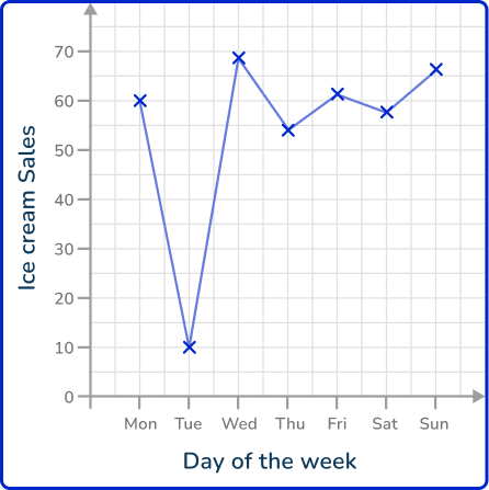
Which day of the week did it rain?
Monday
Tuesday
Wednesday
Saturday
As you would expect ice cream sales to correlate with the amount of warm sunshine (the more warm sunshine, the greater the number of ice cream sales), Tuesday has a very low number of ice creams sold so it is most likely to have rained that day.
5. A meteorologist was recording the temperature data from two different weather stations in a city. She recorded the temperature every 3 hours and plotted the results using a time series. Here are her results
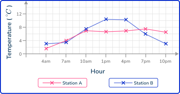
What is the highest temperature recorded in the city during this time period?
The highest temperature recorded during the day is the highest data point on the graph. This is at 1 pm at Station B, where the temperature was recorded at 10.8^{\circ}{C}.
6. Kevin wanted to build a new home. He tracked the costs of the build and recorded the data into a time series. The build started in January 2019 and was completed in May 2021.
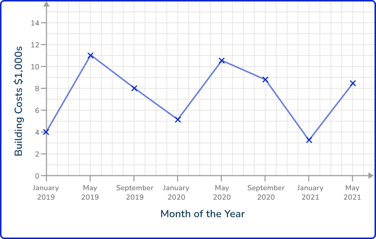
Estimate the average cost of the build, per month.
Adding up the numerical values for each item of data recorded, you get 4+10.9+8+5.3+10.5+8.8+3.4+8.5=59.4.
The mean for these 8 items of data is therefore:
59.4 \div 8=7.425
As the data is recorded in \$ 1,000s, \, 7.425\times{1,000}=\$ 7,425 per month.
Line graph FAQs
The different types of line graphs are simple line graphs, double line graphs or multiple line graphs, compound line graphs, broken line graphs, and logarithmic line graphs.
Line graphs can represent time-series data, categorical data, and continuous data.
A line graph connects data points with lines to show trends over time, while a line plot (or dot plot) displays individual data points without connecting lines, often used to show the frequency of values.
A line graph shows trends and changes over time or across continuous variables using connected data points, whereas a bar graph or bar chart uses bars of varying heights to compare discrete categories or data points at a specific time or point.
A line graph shows trends and changes over time with connected data points, whereas other data visualization tools like bar graphs compare discrete categories, pie charts show parts of a whole, and scatter plots display relationships between two variables.
The next lessons are
- Frequency table
- Frequency graph
- Types of sampling
Still stuck?
At Third Space Learning, we specialize in helping teachers and school leaders to provide personalized math support for more of their students through high-quality, online one-on-one math tutoring delivered by subject experts.
Each week, our tutors support thousands of students who are at risk of not meeting their grade-level expectations, and help accelerate their progress and boost their confidence.

Find out how we can help your students achieve success with our math tutoring programs.
[FREE] Common Core Practice Tests (3rd to 8th Grade)
Prepare for math tests in your state with these 3rd Grade to 8th Grade practice assessments for Common Core and state equivalents.
Get your 6 multiple choice practice tests with detailed answers to support test prep, created by US math teachers for US math teachers!